FMP Evaluation
Your name
Production Process Evaluation
Research
• The strengths of my research is that I made sure to cover the different products that I wanted
to include in my final major product. I made sure to cover album covers, posters,
merchandise and track lists, I went into great detail in each of these things and picked them
apart to show what they meant. This helped me as I then knew what to put into my products
to show what I wanted to show. I then could take inspiration from these different products to
try and make my products be the best I have ever made, as I wanted to make my products
look as professional as possible. Another strength of my research is that I did a survey this
time, this shows more precise and accurate results as it is directly from the target audience I
am aiming at. It helped me choose the right colours and different designs for things, as I
knew what my audience wanted from me.
• The weaknesses of my research is that I feel like I could have expanded a little more on what I
have researched. I have researched quite a wide range of products but I feel like I could have
done more, as I made more than I researched. I could have helped myself a lot more if I had
done more research, as I would have had a better idea of how to make things look how I
wanted them to, and how to portray what I wanted to within the different products. I could
have made my research a little more in depth and interesting, this would have helped with
my production and made it a lot smoother than it was, because I found myself a bit stuck at
times. When I jut didn’t know how to make what I wanted to make, in an artistic sense. This
would have had a positive effect on my product as it would have been made faster, and with
less pauses between parts I where I just couldn’t get what I wanted to do out of my head and
on to the computer.
Planning
• The strengths of my planning is that I had a range of plans, I had 3 different plans to
start with then I chose my favourite one. My plans at the start were, a documentary
about the Yorkshire museum, a fashion magazine, and then the musical artist idea. I
then had a range of knowledge as I looked into each one before carefully choosing my
idea. Another strength of my planning is that some of it was in detail, so I had a definite
idea of what I wanted within my product. My final plan was very detailed, as it was the
one I saw the most in my mind, compared to the other ones this plan was very
developed and detailed. This planning helped my product as because I knew what I
wanted to do, and because of how massively detailed my plan was, it was a lot easier to
go into my production as I knew what I was going to do, and I felt like I was most
passionate about this idea I had.
• The weaknesses of my planning was that even though my final plan was very detailed,
the one before weren’t very detailed at all. I should have developed these plans as I feel
like I liked the musical artist idea so much, I just decided I was doing that one and didn’t
give another idea a chance. I feel like if I had of given these ideas a chance then I might
have chosen a different idea, as they would have been more developed and my mind
would have been more open to change. This effect would have been massive as I could
have ended up choosing a completely different idea than what I did end up choosing in
the end.
Time Management
• I could have managed my time better than I did, as I was a little behind
with handing in my products with this unit. I feel like I put too much
pressure on myself to make it really good, and not enough pressure to do
it on time. I didn’t hand the project in on time, and my products were
good, but I thin that I could have made them better with more time, like
anything, it could’ve improved with time. If I had more time on my
products, I would have made more posters and made the work I have
better, as I have learnt more within this unit because I have been using
Photoshop so regularly. I have definitely got used to it now, and know how
to use it to its full extent.
Technical Qualities
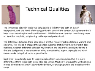
The similarities between these two song covers is that they are both on a plain
background, with the name of the song and artist towards the bottom. It is apparent that I
have taken some inspiration from this cover. I did this because I wanted to make my cover
art look this simplistic, yet pleasing to the eye and professional.
The differences between these song covers are that my cover art is a lot more vibrant, and
colourful. This was so it engaged the younger audience that maybe the other artist does
not have. Another difference between my cover art and the professionally made one is
that the background is more warm on mine, as I wanted to appeal to people and warm
colours make things look more approachable.
Next time I would make sure if I took inspiration from something else, that it is more
different as I think these both look a little too similar. Maybe if it was just the writing being
moved a little bit so it wasn’t towards the bottom, or changing where the model is on the
cover.
Aesthetic Qualities
I believe my products are made to a very good standard. I think this is because
compared to other professionally made products, mine fit in pretty well and are
visually pleasing. The colours go well together and are bright, this attracts my target
audience, being primarily young girls.
On the other hand, I feel like they are quite plain. I was going for the simplistic
aesthetic but it just ended up looking like there was something missing from the
posters instead. Maybe if I had just put a few more different dates on the tour poster,
it would have looked a lot more better and like it was actually finished.
I would change how simple my posters are. I would put in some more dates on my
poster to make it seem more full and less unfinished.
Audience Appeal
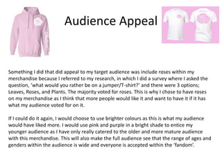
Something I did that did appeal to my target audience was include roses within my
merchandise because I referred to my research, in which I did a survey where I asked the
question, ‘what would you rather be on a jumper/T-shirt?’ and there were 3 options;
Leaves, Roses, and Plants. The majority voted for roses. This is why I chose to have roses
on my merchandise as I think that more people would like it and want to have it if it has
what my audience voted for on it.
If I could do it again, I would choose to use brighter colours as this is what my audience
would have liked more. I would use pink and purple in a bright shade to entice my
younger audience as I have only really catered to the older and more mature audience
with this merchandise. This will also make the full audience see that the range of ages and
genders within the audience is wide and everyone is accepted within the ‘fandom’.
Peer
Feedback
Feedback 1
• What did you like about the product?
– With the product I like that you have made the writing
with all the same font or similar ones but some are
different colours like pink or white. Also I like that you
have used the same logo through out all your designs
and the logo is three different colours across the
products
• What improvements could have been made to
the product?
– I would add that light pink colour across more then
one piece of work and then it might of varied the
work and made it stand out a bit more.
Feedback 2
• What did you like about the product?
• Clear synergy between all products through colours used
and fonts make it clear to the audience that they are part
of one brand. The images are clear and edited well and the
audience appeal is met through the use of bright colours
and more images over text for the teenage market.
• What improvements could have been made to the
product?
• The back cover to the CD is slightly a different shade
which detracts from the theme and possibly isolates it as
not part of the entire package for the artist. Maybe some
more playful or visually interesting merchendise ideas to
target the younger audience.
Feedback 3
• What did you like about the product?
- Like the colour scheme that you have used
because I think it suits the theme well.
• What improvements could have been made to
the product?
-I think your track list could be improved if you
used the same colour scheme as the rest of your
products
Peer Feedback Summary
• What do you agree with from your peer feedback?
– I agree that it all looks like one brand and that the colour
schemes appeal well to younger fans. I agree that the
pictures are edited well and clear, and IO agree that the
track list looks different to my other products, therefore
making it standout in a not so good way.
• What do you disagree with from your peer feedback?
– I disagree with nothing that was said as the criticism is all
things I agree with and the good things, are also things
that I agree with.
Peer Feedback Summary
The changes I would make after considering the points that the feedback has
given me are that I would use more bright colours such as bright pinks and
purples and make it more recognisable. This would then better suit my
audience because in my research I found that my target audience liked the
idea of more bright colours. It would appeal more to my audience as it would
cater to what they want more than my current product does. After
reconsidering it would be better to include these colours.
I would change the track list completely as it clearly is too different from any
of my other products and isolates itself from my other pieces of work
because of the colour scheme. The colour scheme has a grey and red basis,
and is shown to be a little more dark and not bright like the rest of my
products, this is why I would change it to a brighter setting with different
colours such as pink and purple, to further use the research and make a
lasting image of the franchise. I would change it because overall it would
make my work look more consistent and professional.

7. fmp evaluation

  • 1.
  • 2.
  • 3.
    Research • The strengthsof my research is that I made sure to cover the different products that I wanted to include in my final major product. I made sure to cover album covers, posters, merchandise and track lists, I went into great detail in each of these things and picked them apart to show what they meant. This helped me as I then knew what to put into my products to show what I wanted to show. I then could take inspiration from these different products to try and make my products be the best I have ever made, as I wanted to make my products look as professional as possible. Another strength of my research is that I did a survey this time, this shows more precise and accurate results as it is directly from the target audience I am aiming at. It helped me choose the right colours and different designs for things, as I knew what my audience wanted from me. • The weaknesses of my research is that I feel like I could have expanded a little more on what I have researched. I have researched quite a wide range of products but I feel like I could have done more, as I made more than I researched. I could have helped myself a lot more if I had done more research, as I would have had a better idea of how to make things look how I wanted them to, and how to portray what I wanted to within the different products. I could have made my research a little more in depth and interesting, this would have helped with my production and made it a lot smoother than it was, because I found myself a bit stuck at times. When I jut didn’t know how to make what I wanted to make, in an artistic sense. This would have had a positive effect on my product as it would have been made faster, and with less pauses between parts I where I just couldn’t get what I wanted to do out of my head and on to the computer.
  • 4.
    Planning • The strengthsof my planning is that I had a range of plans, I had 3 different plans to start with then I chose my favourite one. My plans at the start were, a documentary about the Yorkshire museum, a fashion magazine, and then the musical artist idea. I then had a range of knowledge as I looked into each one before carefully choosing my idea. Another strength of my planning is that some of it was in detail, so I had a definite idea of what I wanted within my product. My final plan was very detailed, as it was the one I saw the most in my mind, compared to the other ones this plan was very developed and detailed. This planning helped my product as because I knew what I wanted to do, and because of how massively detailed my plan was, it was a lot easier to go into my production as I knew what I was going to do, and I felt like I was most passionate about this idea I had. • The weaknesses of my planning was that even though my final plan was very detailed, the one before weren’t very detailed at all. I should have developed these plans as I feel like I liked the musical artist idea so much, I just decided I was doing that one and didn’t give another idea a chance. I feel like if I had of given these ideas a chance then I might have chosen a different idea, as they would have been more developed and my mind would have been more open to change. This effect would have been massive as I could have ended up choosing a completely different idea than what I did end up choosing in the end.
  • 5.
    Time Management • Icould have managed my time better than I did, as I was a little behind with handing in my products with this unit. I feel like I put too much pressure on myself to make it really good, and not enough pressure to do it on time. I didn’t hand the project in on time, and my products were good, but I thin that I could have made them better with more time, like anything, it could’ve improved with time. If I had more time on my products, I would have made more posters and made the work I have better, as I have learnt more within this unit because I have been using Photoshop so regularly. I have definitely got used to it now, and know how to use it to its full extent.
  • 6.
    Technical Qualities The similaritiesbetween these two song covers is that they are both on a plain background, with the name of the song and artist towards the bottom. It is apparent that I have taken some inspiration from this cover. I did this because I wanted to make my cover art look this simplistic, yet pleasing to the eye and professional. The differences between these song covers are that my cover art is a lot more vibrant, and colourful. This was so it engaged the younger audience that maybe the other artist does not have. Another difference between my cover art and the professionally made one is that the background is more warm on mine, as I wanted to appeal to people and warm colours make things look more approachable. Next time I would make sure if I took inspiration from something else, that it is more different as I think these both look a little too similar. Maybe if it was just the writing being moved a little bit so it wasn’t towards the bottom, or changing where the model is on the cover.
  • 7.
    Aesthetic Qualities I believemy products are made to a very good standard. I think this is because compared to other professionally made products, mine fit in pretty well and are visually pleasing. The colours go well together and are bright, this attracts my target audience, being primarily young girls. On the other hand, I feel like they are quite plain. I was going for the simplistic aesthetic but it just ended up looking like there was something missing from the posters instead. Maybe if I had just put a few more different dates on the tour poster, it would have looked a lot more better and like it was actually finished. I would change how simple my posters are. I would put in some more dates on my poster to make it seem more full and less unfinished.
  • 8.
    Audience Appeal Something Idid that did appeal to my target audience was include roses within my merchandise because I referred to my research, in which I did a survey where I asked the question, ‘what would you rather be on a jumper/T-shirt?’ and there were 3 options; Leaves, Roses, and Plants. The majority voted for roses. This is why I chose to have roses on my merchandise as I think that more people would like it and want to have it if it has what my audience voted for on it. If I could do it again, I would choose to use brighter colours as this is what my audience would have liked more. I would use pink and purple in a bright shade to entice my younger audience as I have only really catered to the older and more mature audience with this merchandise. This will also make the full audience see that the range of ages and genders within the audience is wide and everyone is accepted within the ‘fandom’.
  • 9.
  • 10.
    Feedback 1 • Whatdid you like about the product? – With the product I like that you have made the writing with all the same font or similar ones but some are different colours like pink or white. Also I like that you have used the same logo through out all your designs and the logo is three different colours across the products • What improvements could have been made to the product? – I would add that light pink colour across more then one piece of work and then it might of varied the work and made it stand out a bit more.
  • 11.
    Feedback 2 • Whatdid you like about the product? • Clear synergy between all products through colours used and fonts make it clear to the audience that they are part of one brand. The images are clear and edited well and the audience appeal is met through the use of bright colours and more images over text for the teenage market. • What improvements could have been made to the product? • The back cover to the CD is slightly a different shade which detracts from the theme and possibly isolates it as not part of the entire package for the artist. Maybe some more playful or visually interesting merchendise ideas to target the younger audience.
  • 12.
    Feedback 3 • Whatdid you like about the product? - Like the colour scheme that you have used because I think it suits the theme well. • What improvements could have been made to the product? -I think your track list could be improved if you used the same colour scheme as the rest of your products
  • 13.
    Peer Feedback Summary •What do you agree with from your peer feedback? – I agree that it all looks like one brand and that the colour schemes appeal well to younger fans. I agree that the pictures are edited well and clear, and IO agree that the track list looks different to my other products, therefore making it standout in a not so good way. • What do you disagree with from your peer feedback? – I disagree with nothing that was said as the criticism is all things I agree with and the good things, are also things that I agree with.
  • 14.
    Peer Feedback Summary Thechanges I would make after considering the points that the feedback has given me are that I would use more bright colours such as bright pinks and purples and make it more recognisable. This would then better suit my audience because in my research I found that my target audience liked the idea of more bright colours. It would appeal more to my audience as it would cater to what they want more than my current product does. After reconsidering it would be better to include these colours. I would change the track list completely as it clearly is too different from any of my other products and isolates itself from my other pieces of work because of the colour scheme. The colour scheme has a grey and red basis, and is shown to be a little more dark and not bright like the rest of my products, this is why I would change it to a brighter setting with different colours such as pink and purple, to further use the research and make a lasting image of the franchise. I would change it because overall it would make my work look more consistent and professional.

Editor's Notes

  • #4 What were the strengths of your research? How did your research help your product? What were the weaknesses of your research? What could you have done better/improve? What effect would this have had on your product?
  • #5 What were the strengths of your planning? How did your planning help your product? What were the weaknesses of your planning? What could you have done better/improve? What effect would this have had on your product?
  • #6 Did you manage your time well? Did you complete your project on time or would your products have improved with additional time? What would you have done if you had more time to produce your work?
  • #7 Compare your work to similar existing products and discuss the similarities and differences Put your final piece(s) in the centre of a page alongside an existing product Use text boxes and arrows
  • #8 Does your work look good? Was it creative? What aspects of your game’s visuals do you like? What would you improve? How would you improve it? Discuss the strengths and weaknesses Put your final piece(s) in the centre of a page and analyse them Use text boxes and arrows
  • #9 How have you appealed to your target audience? What specific bits of content would appeal to your target audience. Refer to your findings from your questionnaire. Put your final piece(s) in the centre of a page and analyse them Use text boxes and arrows
  • #15 What changes would you make to your product based upon your peer feedback and why?