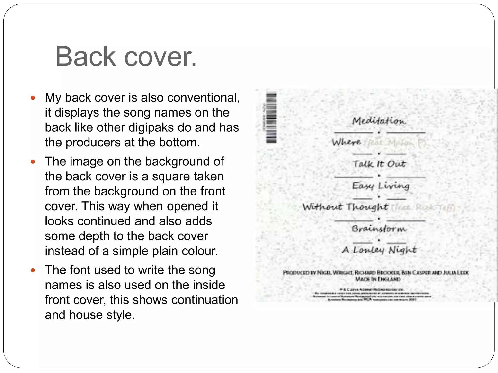
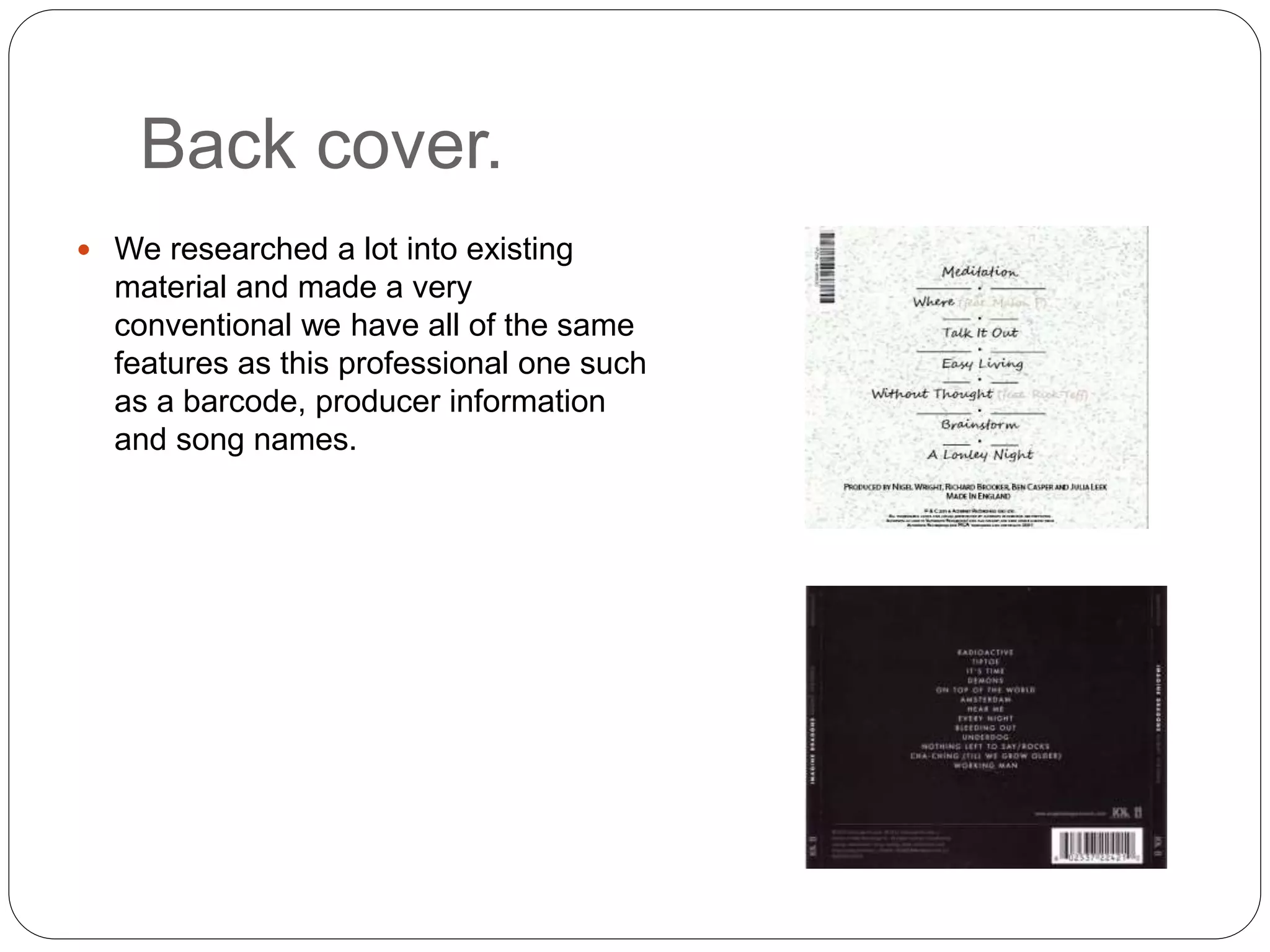
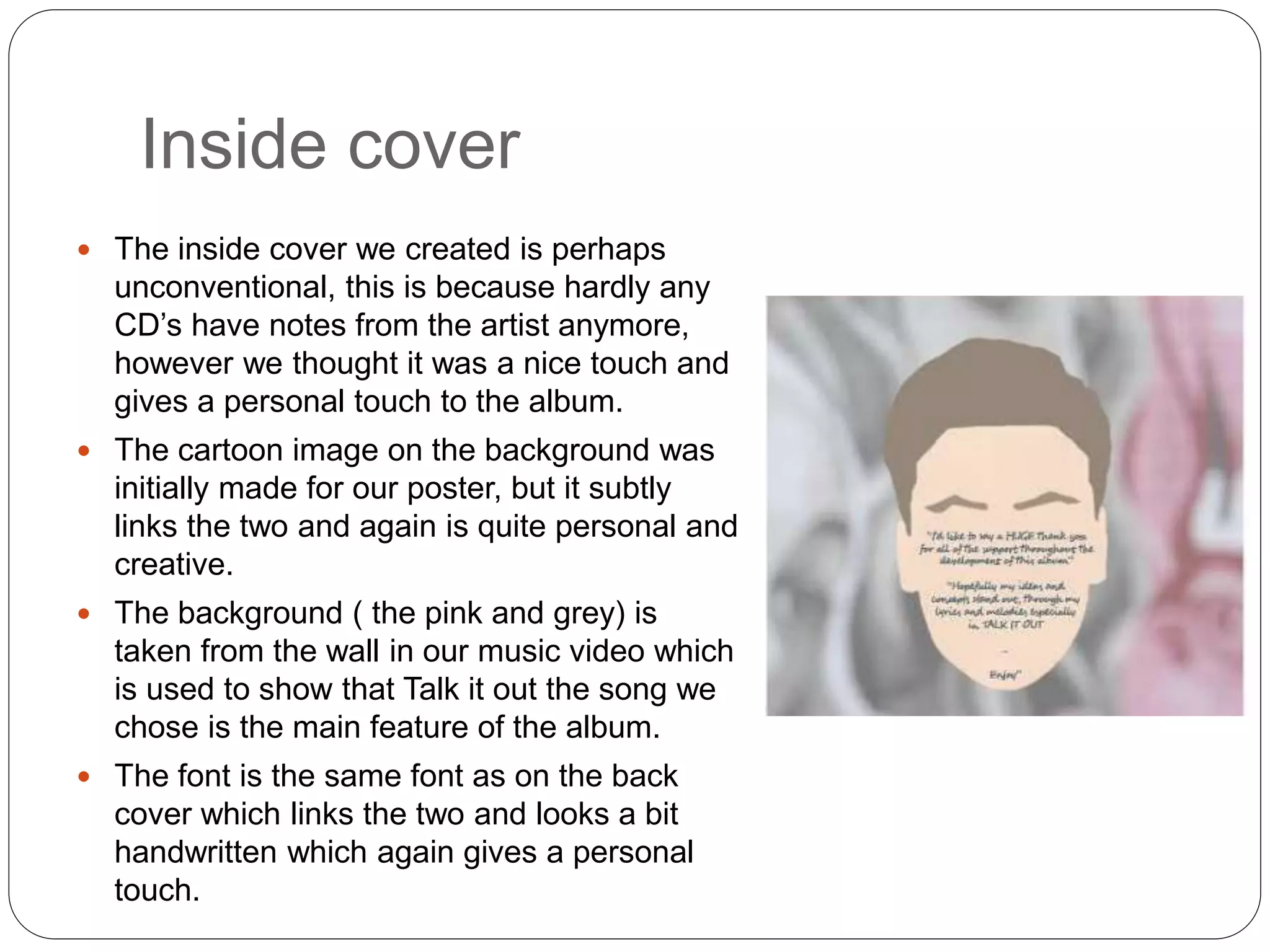
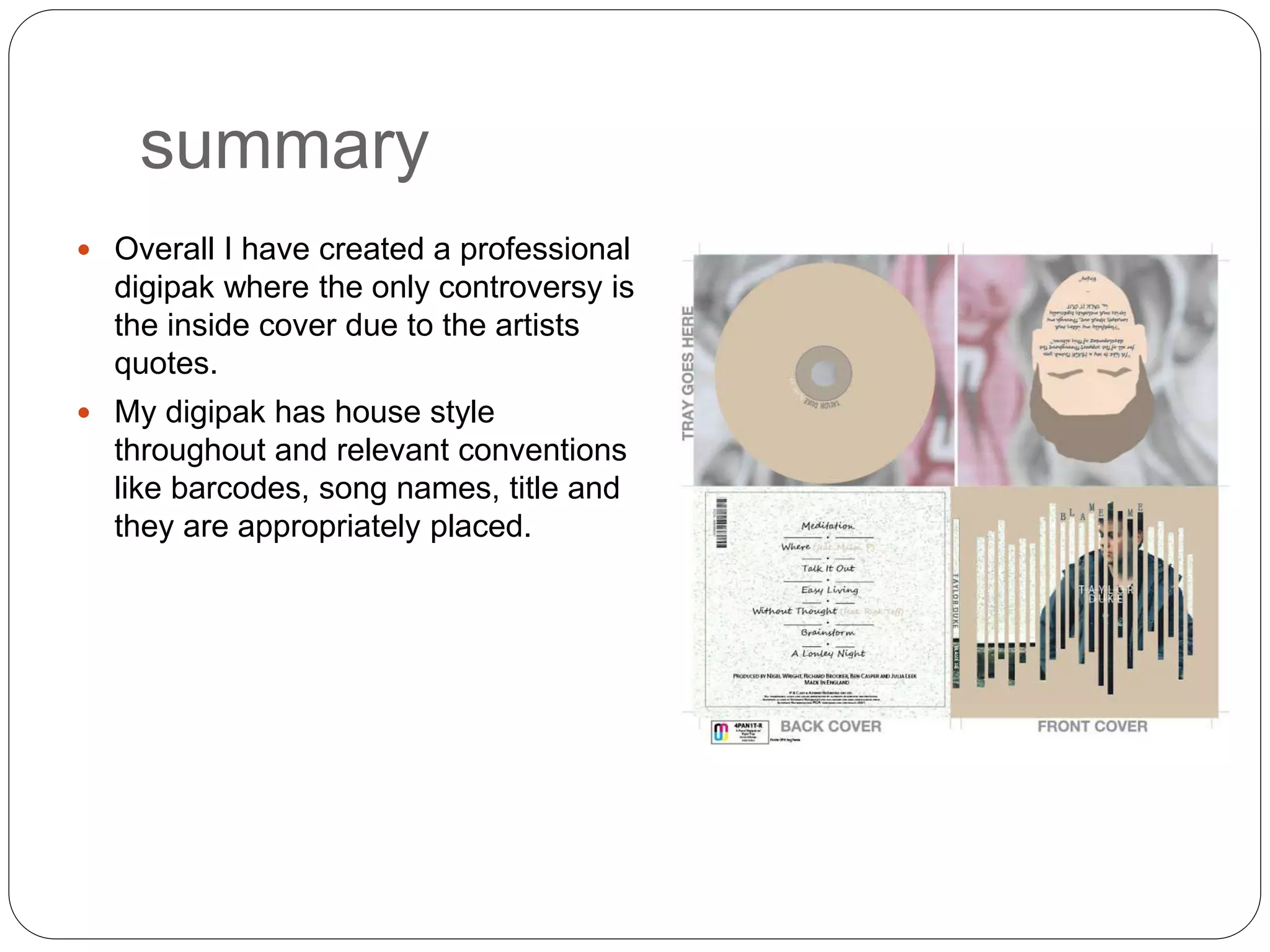
Digipak.
In what ways does your media
product use, develop or challenge
forms and conventions of real media
products?
Front cover.
The front cover of our digipak is
professional and is also very
conventional, it includes an image
of the artist, the artists name and
the name of the album, all which
appear on professional front
covers. Our image is appropriate
and has been displayed in a
creative form which also
represents our genre as it is
creative. The shot of the image is
also appropriate as he fits in
proportionally to the frame.
The colour theme for the whole
digipak is beige, white, navy and
pink. All of these colours go
together well and compliment each
Front cover.
 My research led to a lot of my front cover
choices, it had great influence on the style that
we chose and the type of image we took.
 Due to research we decided to go with an
image of the artist on the front cover rather
than a piece of art as more people liked the
idea of seeing the artist.
 When asked which cover do you prefer around
70% selected a digipak with the artist on. This
led us to decide to include an image of the
artist and have some art on the inside cover.
Back cover.
 My back cover is also conventional,
it displays the song names on the
back like other digipaks do and has
the producers at the bottom.
 The image on the background of
the back cover is a square taken
from the background on the front
cover. This way when opened it
looks continued and also adds
some depth to the back cover
instead of a simple plain colour.
 The font used to write the song
names is also used on the inside
front cover, this shows continuation
and house style.
Back cover.
 We researched a lot into existing
material and made a very
conventional we have all of the same
features as this professional one such
as a barcode, producer information
and song names.
Inside cover
 The inside cover we created is perhaps
unconventional, this is because hardly any
CD’s have notes from the artist anymore,
however we thought it was a nice touch and
gives a personal touch to the album.
 The cartoon image on the background was
initially made for our poster, but it subtly
links the two and again is quite personal and
creative.
 The background ( the pink and grey) is
taken from the wall in our music video which
is used to show that Talk it out the song we
chose is the main feature of the album.
 The font is the same font as on the back
cover which links the two and looks a bit
handwritten which again gives a personal
touch.
Inside cover
 We did a lot of experimenting and researching
to choose which cartoon idea to pick and use
when we decided it was to be going on our
digipak, we made a questionnaire to ask
which was preferred and the style on the right
was more popular so we used that one as it
was more simple, however we ditched the
speech mark as we added different text.
CD
 For our CD we kept it pretty simple, the
colour is the same colour as background of
the front cover and the background is the
same image as the back of the inside cover.
 The text on the CD is simple as there is a
lot going on already with the cartoon and
front cover. It combines all of the colours in
the digipak, white, pink, beige and navy.
This ties the whole digipak together.
CD
 This was the CD I used to base my ideas of, I copied
the place of where the writing is and made the artists
name bigger than the album name and used two
different colours.
summary
 Overall I have created a professional
digipak where the only controversy is
the inside cover due to the artists
quotes.
 My digipak has house style
throughout and relevant conventions
like barcodes, song names, title and
they are appropriately placed.

Cd analysis

  • 1.
    Digipak. In what waysdoes your media product use, develop or challenge forms and conventions of real media products?
  • 3.
    Front cover. The frontcover of our digipak is professional and is also very conventional, it includes an image of the artist, the artists name and the name of the album, all which appear on professional front covers. Our image is appropriate and has been displayed in a creative form which also represents our genre as it is creative. The shot of the image is also appropriate as he fits in proportionally to the frame. The colour theme for the whole digipak is beige, white, navy and pink. All of these colours go together well and compliment each
  • 4.
    Front cover.  Myresearch led to a lot of my front cover choices, it had great influence on the style that we chose and the type of image we took.  Due to research we decided to go with an image of the artist on the front cover rather than a piece of art as more people liked the idea of seeing the artist.  When asked which cover do you prefer around 70% selected a digipak with the artist on. This led us to decide to include an image of the artist and have some art on the inside cover.
  • 5.
    Back cover.  Myback cover is also conventional, it displays the song names on the back like other digipaks do and has the producers at the bottom.  The image on the background of the back cover is a square taken from the background on the front cover. This way when opened it looks continued and also adds some depth to the back cover instead of a simple plain colour.  The font used to write the song names is also used on the inside front cover, this shows continuation and house style.
  • 6.
    Back cover.  Weresearched a lot into existing material and made a very conventional we have all of the same features as this professional one such as a barcode, producer information and song names.
  • 7.
    Inside cover  Theinside cover we created is perhaps unconventional, this is because hardly any CD’s have notes from the artist anymore, however we thought it was a nice touch and gives a personal touch to the album.  The cartoon image on the background was initially made for our poster, but it subtly links the two and again is quite personal and creative.  The background ( the pink and grey) is taken from the wall in our music video which is used to show that Talk it out the song we chose is the main feature of the album.  The font is the same font as on the back cover which links the two and looks a bit handwritten which again gives a personal touch.
  • 8.
    Inside cover  Wedid a lot of experimenting and researching to choose which cartoon idea to pick and use when we decided it was to be going on our digipak, we made a questionnaire to ask which was preferred and the style on the right was more popular so we used that one as it was more simple, however we ditched the speech mark as we added different text.
  • 9.
    CD  For ourCD we kept it pretty simple, the colour is the same colour as background of the front cover and the background is the same image as the back of the inside cover.  The text on the CD is simple as there is a lot going on already with the cartoon and front cover. It combines all of the colours in the digipak, white, pink, beige and navy. This ties the whole digipak together.
  • 10.
    CD  This wasthe CD I used to base my ideas of, I copied the place of where the writing is and made the artists name bigger than the album name and used two different colours.
  • 11.
    summary  Overall Ihave created a professional digipak where the only controversy is the inside cover due to the artists quotes.  My digipak has house style throughout and relevant conventions like barcodes, song names, title and they are appropriately placed.