This document summarizes Benjamin Birney's personal project evaluating the production process of a band poster. The summary includes:
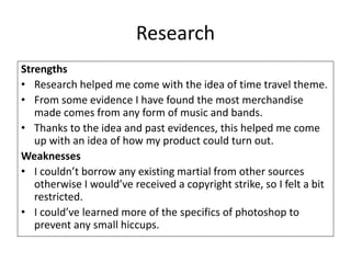
- Strengths of the research included ideas for a time travel theme and evidence that music merchandise is popular. Weaknesses included an inability to use outside materials and a need to learn Photoshop better.
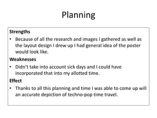
- Planning strengths were having images and a layout, weaknesses didn't account for sick days in the timeline.
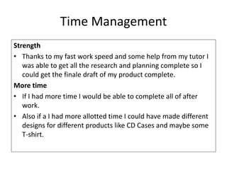
- Time management strengths allowed completing research and planning, more time would allow for additional designs.
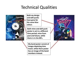
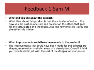
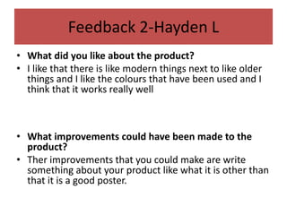
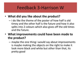
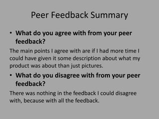
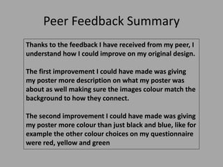
- Peer feedback suggested adding more description, colors, and matching image colors to backgrounds. The summary agrees more description and colors could improve the poster.