Slide Makeover #92: Comparing growth in Sales and Expense categories over time
Graphexamples how-to-do
1. 1
Examples of Data Representation
using Tables, Graphs and Charts
This document discusses how to properly display numerical data. It discusses the differences
between tables and graphs and it discusses various types of graphs.
Tables show quantitative data effectively. They may be used to communicate precise
magnitudes. Look through your engineering textbooks. What information is presented in
tables, what is presented in graphical form? Engineering design values, such as material
properties, are almost always represented numerically in tables. When the author is trying to
communicate relations, such as how displacement changes with respect to force, a graph
would likely be used. Graphs and charts are more visual (qualitative). They can be used
effectively to communicate trends, relations, are relative magnitudes.
The following pages give examples of different ways to display data. In all cases a table of
data is provided and then various graphs and charts are created using the data. Remember,
all tables and graphs require proper labeling. Always label each axis (or column) including
units! All tables and graphs require a description, and if they appear in a document, they
must be numbered. For example: Table 1 – costs of developing the widget.
Numbers and labels go ABOVE tables but they go BELOW graphs. The top goes to the
LEFT for figures that are in “landscape” orientation.
NOTE: all data shown in the following graphs and tables are fictitious.
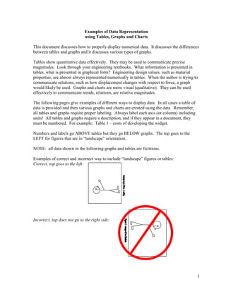
Examples of correct and incorrect way to include “landscape” figures or tables:
Correct, top goes to the left:
Incorrect, top does not go to the right side:
2. 2
Time (min.) Temperature (C)
0 21.5
0.5 28.2
1 32.5
1.5 35.3
2 37.7
2.5 39.2
3 40.1
4 41.2
5 42.2
7 43.6
10 45.6
Tables - communicate quantitative information but not trends.
Excel line graph – plots data in evenly spaced intervals (not with respect to the independent
variable). Not appropriate for these data because the intervals for the
independent variable are not constant. Generally, these are not useful.
Excel xy-scatter plot – plots dependent vs. independent variable. This graph shows these
data well.
0
5
10
15
20
25
30
35
40
45
50
0 2 4 6 8 10 12
Time (minutes)
Temperature(deg.C)
0
5
10
15
20
25
30
35
40
45
50
1 2 3 4 5 6 7 8 9 10 11
Temperature(deg.C)
3. 3
Costs Total
Development
Costs ($M)
Drafting 58.2
Analsyis 15.2
Test 38.8
Prototyping 22.6
Tooling 79.5
Overhead 120.5
Line graph – does not represent these data meaningfully. Bar chart - shows magnitudes
relative to each other
Pie chart – shows magnitude relative to the whole. Note that the gray scale printout of this
graph does not effectively delineate “Drafting” and “Overhead”.
0.0
20.0
40.0
60.0
80.0
100.0
120.0
140.0
Drafting
Analsyis
Test
Prototyping
Tooling
Overhead
DevelopmentCosts(Million$)
0.0
20.0
40.0
60.0
80.0
100.0
120.0
140.0
Drafting
Analsyis
Test
Prototype
Tooling
Overhead
DevelopmentCosts(Million$)
Appropriation of
Development Costs Drafting
17%
Analsyis
5%
Test
12%
Prototype
7%
Tooling
24%
Overhead
35%
4. 4
Force (N) Displacement
(mm)
0 0.0
10 6.0
20 8.9
30 16.1
40 21.0
50 24.2
Excel xy-scatter plot with lines “connecting the dots” – this graph does not indicate the trend
that the author may be trying to convey. Lines should show what should be expected, not
connect the data points.
Excel xy-scatter plot without data lines, rather a trendline has been added. This effectively
shows the expected trend (linear, not “zig-zag”). R2
shows how well the line represents the
data (R2
=1 perfect fit).
0.0
5.0
10.0
15.0
20.0
25.0
30.0
0 10 20 30 40 50 60
Force (N)
Displacement(mm)
y = 0.4949x + 0.3286
R2
= 0.989
0.0
5.0
10.0
15.0
20.0
25.0
30.0
0 10 20 30 40 50 60
Force (N)
Displacement(mm)
5. 5
Table 2 - Average rainfall since 1996
Year Rainfall (inches)
1996 48.2
1997 46.6
1998 49.7
This is a good table. Each column has a heading and units have been included. The table
number and title are above the table.
Figure 4 – Decrease in average annual rainfall from 1988 to 2000.
This is a good figure. Each axis has a heading and units have been included. The figure
number and title are below the figure. A trend line has been included to show that the
rainfall has generally been decreasing during the years shown. However, you should
avoid having gray backgrounds – they use up extra ink generally for no purpose.
0
10
20
30
40
50
60
1988 1990 1992 1994 1996 1998 2000 2002
Year
AverageRainfall(inches)
6. 6
Figure 4 – Decrease in average annual rainfall from 1988 to 2000.
Incorrect figure: Number and caption should be below the figure. A trend line rather than
“connect the dot” should be used if trying to convey a trend – “connect the dots” is
appropriate if this is not trying to show a trend. Also, this graph is missing units for the
vertical axis (rainfall in feet, meters, inches?) and there is no label on the horizontal
axis.
Good figure if being used in an oral presentation because there is no figure number and the
title is included on the graph. If this were to appear in a written document, the title
should be removed from the graph and placed, along with a figure number, below the
graph. Also note, the markers used to differentiate between Portland and Salem are
clearly different – remember, written work may be photocopied in black and white, so do
not rely on color to differentiate.
0
10
20
30
40
50
60
1988 1990 1992 1994 1996 1998 2000 2002
AverageRainfall
Average Rainfall in Portland, Oregon
and Salem, Oregon
1980-1998
0.0
10.0
20.0
30.0
40.0
50.0
60.0
70.0
1975 1980 1985 1990 1995 2000
Year
MeasuredRainfall(inches)
Portland, OR
Salem, OR