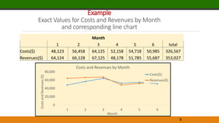
This document provides an overview of data visualization techniques. It discusses effective design techniques like data-ink ratio and principles for creating tables and charts. Specific chart types are explained, including scatter plots, line charts, bar charts, and sparklines. Examples demonstrate how to create pivot tables and charts in Excel to analyze relationships in data and make comparisons.


![Example
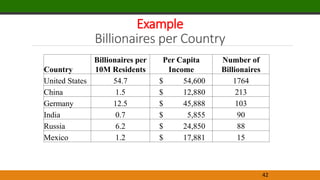
Billionaires per Country
44
Country
Billionaires per 10M
Residents Per Capita Income
Number of
Billionaires
United States 54.7 $ 54,600 1764
China 1.5 $ 12,880 213
Germany 12.5 $ 45,888 103
India 0.7 $ 5,855 90
Russia 6.2 $ 24,850 88
Mexico 1.2 $ 17,881 15
[CELLRANGE]
[CELLRANGE]
[CELLRANGE]
[CELLRANGE]
[CELLRANGE]
[CELLRANGE]
$(10,000)
$-
$10,000
$20,000
$30,000
$40,000
$50,000
$60,000
$70,000
-10 0 10 20 30 40 50 60 70
Per
Capita
Income
Billionaires per 10 million residents
Billionaires per Country
The size of each bubble is
proportionate to the number of
billionaires in that country](https://image.slidesharecdn.com/noteschapter3-221217022431-35851369/85/Notes-Chapter-3-pptx-44-320.jpg)