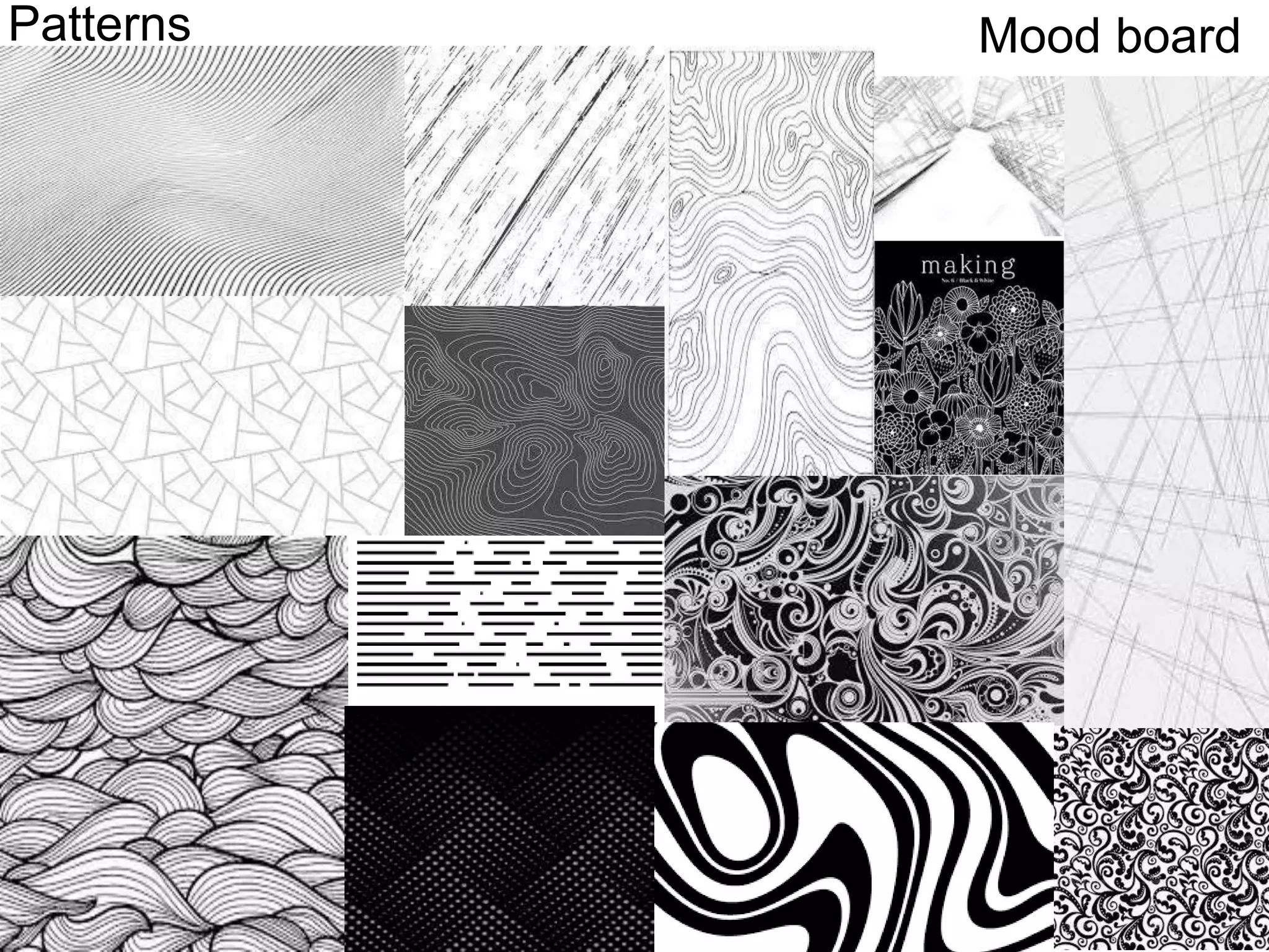
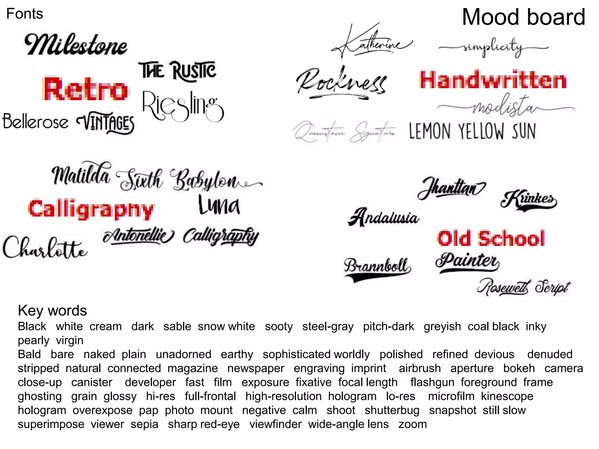
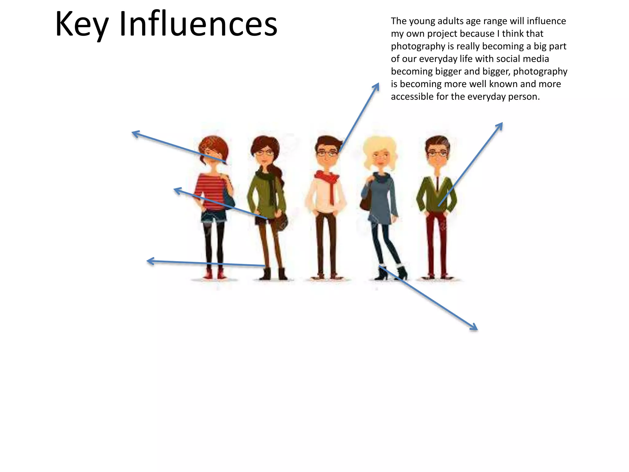
Initial Plans
Amy Foster
Pre-proposal
Skills Audit
Mood Board
I found these images on Google after I searched a lot of different key words that
were related to the theme that I was going for that were almost connected to
the style for example, black and white, monochrome, grungy style photos and I
think that I chose a good selection to inspire me and motivate me towards the
goal of the end product that I actually want to create. From these photos there
are a lot of similarities in the different ways that they are taken and edited for
example a lot of the head shots are using the rule of three where the head is
never normally just in the center of the page and I think that this works well
especially for a magazine cover as it allows the creator to add more text and
make it more interesting to look at rather than just a picture with a title. In a
few of the images that I have chosen here you can see that they have used a
soft pop of colour to draw more attention towards a certain feature for example
in the brand name they might decide to put that in a deep red so that it still
blends in and looks good however it draws more attention for the reader to
look at that and maybe remember it for the future, I think that this technique is
good and I could see myself using this in my own work to draw more attention
to the more important parts of information that I want the reader to see more.
Mood Board
Mood board
Colours
When it came to the researching of the different colour schemes that I wanted
to use I found this part abit harder as because I had planned to do a
monochrome theme I thought that there would only be three main colours
which would be white, black and grey however the more in started looking at
the different colour schemes the more I really noticed that for each one of
those colours there were many different shades in each of the colours
therefore that is why I really made this colour mood board so that it inspired
me to look more into each of the different shades instead of just thinking
about a colour as just one. As you can see from my mood board I have chose a
wide range of different shades that I think that I might possibly use and I have
thrown in some dark blues , bluey greys and beiges however these would not
normally be classed under the category of monochrome but going back to the
previous slide I think that these could be used as the soft pop of colour to
draw attention to things without ruining and changing the whole theme.
Mood Board
Mood boardPatterns
• For the patterns mood board I found all these images on Google and on different
sites like Tumblr, Pinterest and I think that I found a good selection of some of the
different patterns that I am actually wanting to use and create in my own work. At
first I didn’t really know what I was wanting to look for as I didn’t think outside the
box and I just originally thought that a layout of different lines would look good
and I have included some of theme in the patterns mood board as I think that
putting these in will allow me to come back and use them as inspiration however
when I started to see some of the different patterns that I could use like with some
of the curves and bends I really thought that as a background very faintly these
would look good and I think that some of the curved ones create a whole different
look that just a few lines here and there. I think that using patterns in my work
would add a whole different approach as it would attract a wider audience purely
from the visuals and I think that I could tie a lot of different factors into just one
pattern for example I could contrast the picture and the angles to the pattern in
the background and this would really make my magazine look more professional
and more of a photography magazine rather than just a magazine with some
pictures on the front.
Mood Board
Mood boardFonts
Key words
Black white cream dark sable snow white sooty steel-gray pitch-dark greyish coal black inky
pearly virgin
Bald bare naked plain unadorned earthy sophisticated worldly polished refined devious denuded
stripped natural connected magazine newspaper engraving imprint airbrush aperture bokeh camera
close-up canister developer fast film exposure fixative focal length flashgun foreground frame
ghosting grain glossy hi-res full-frontal high-resolution hologram lo-res microfilm kinescope
hologram overexpose pap photo mount negative calm shoot shutterbug snapshot still slow
superimpose viewer sepia sharp red-eye viewfinder wide-angle lens zoom
For my fonts and keywords I used the website called Dafont.com to help me to locate
some of the different and unique fonts that I was looking for, I decided to go down the
route of the more hand written and simple fonts as I think that this will work well with
the theme, I also looked at many different styles and included them as I think that it
will be helpful when it comes to the production to be able to just look back and really
see what fonts are there and what to search to actually find them. I think that I will
use some of the calligraphy style as I think that this is simple whilst also still draws the
attention of the viewer and makes the actual word itself stand out more and I think
that it is still very clear and readable from a distance. For the key words I decided to
search some related words to find some more unusual words that I could potentially
use in my magazine as more so technical words would stand out to my audience who
would generally know what they mean. Finding some words like naked is a good way
to descirbe something whilst also attracting more people if you showcased that word
as they would want to know what is naked and why is it on the front of a magazine.
Mood Board
Mood Board Analysis
How does your mood board inspire your project?
In my opinion I think that creating a mood board has already started to inspire me with all the different approaches that I could take
for example looking into the already existing products and photographs has really started to motivate me to really start planning
what front cover am I going to go down as well as just influencing me to really get into what it is that I will be creating. From each of
my mood boards there are a lot of similarities and differences that I will take away from this for example the first mood board there
is defiantly a clear theme of dark colours however I really enjoy some of the photographs which add a pop of colour however this
isn’t this common in a lot of the monochrome magazines that I looked into as I think that it could be seen as too much going on,
saying this I think that in the photos that do have a random placement of colour look good and I can really see myself using this for
my own project as I think that it will draw the viewer into the magazine more as the colours can often be related to the mood of the
magazine. A clear running theme in the first mood board is the placement of the image and the image itself for example in nearly all
of the magazines and photographs there is a large head shot and I think that this is because this is the most typical magazine photo
as it works well, leading on from this the placement of the photo is very unique and only in magazines where they have used the rule
of three and placed the image of the model more so to the right/ left leaving more room in the middle of the page for information
however because it is a head shot it doesn’t look empty and it works well. In my second mood board where I explore all the different
colours that I am wanting to use I found that the shades played a big role, for example all the different colour schemes really go in
depth with the different ranges of shades and I think that this has really inspired me to look into the different shades as originally I
thought that when I was going to be creating a black and white magazine I thought that there would only really be 3 main colours
however this mood board has lead me to see that there are millions of different shades that I can use in my own work. When it came
to the pattern mood board I was definitely sceptical about if I was even going to use any different patterns but this mood board and
research has really inspired me to want to use some of the different patterns in my own work because I feel that it adds something
more artsy and more unique and I think that this would definitely appeal to my audience more as it would mean that there is more
to a photo with these patterns and designs. When it came to the font and key word mood board I was already really set on what
kind of font that I was going for, a more hand written , homely font however when it came to the researching different fonts I really
found a wide range and I ended up looking more into the calligraphy section as I think that this would overall work better with the
whole theme of my work.
How will your mood board influence your final product?
in my opinion I think that my mood boards will really influence my final product as I will use all the best bits and things that I have really noticed
to my advantage for example some of the clear similarities that work well and make the other product look good I will try to include this in my
own way to make a positive effect overall however saying this I still believe that I wont be copying any as I will try to make it my own. In my own
magazine I want to target a similar audience that most of the already existing products target therefore I will take this into account when I am
doing things to target my audience as I think that this could be helpful. Overall I think that each of these mood boards have and will continue to
influence my final product as I chose them to give me more inspiration and really help when it comes to the production itself as I believe that
having things already to inspire me and to give me a quick more easier route of finding things will help.
Key Influences At the top of the magazine they have
created a small unnoticeable box filled
with additional information that the
viewer might need to see. They have
used a pale blue which adds a slight bit
of colour however upon the naked eye
is bare visible.
For the masthead they have used a very
bold white that draws a lot of attention
to the words black and white, they have
used a very basic font that is very clear
and readable. The colour is a very bright
stark white that hasn’t really been used
much else on this whole magazine
They have used a much
thinner and smaller cross so
that a lot of attention is
focused on the words. I
think that this works well
and still is visible to read
just a lot more
unnoticeable.
In just one masthead they have
used 3 different types of fonts and
sizes and this really shows the
importance of each part of writing
for example the first bit is very
bold and in your face and really
grabs your attention with the very
thin small cross that is very
unnoticeable as well as the word
photography as you can still see
this and its very big and clear but
the colour is a lot more faded and I
think that this works well as you
can see what they want you to
focus on the most is the black,
white part.
Here they have used the rule of three to the
placement of the image and I think that this is
commonly used quite a lot as it allows the
editor to put a lot of information and text
around the side as well as still having a high
quality picture they get to add more text and
the whole magazine itself looks very full.
They have used a very close head shot that
is really in high focus and I think that when
using a really up-close picture this can make
the whole magazine seem a lot more
personal and close when you use these
kinds of photos.
They have used the monochrome to really make
certain features stand out for example his eyebrows
and cheekbones have been really shadowed to give
a more strong and rustic feel whereas some parts
like his arm have been lightened to a softer grey that
is a lot calmer and less intimidating.
There isn't a clear sense of what is in
the background as the monochrome
and shading make the image very just
focused on the actual man himself, I
think that this is good as it makes all
the focus on just the man and what he
is doing.
They have used a larger
number following with some
smaller text underneath the
number that is clearly less
important however the
number still stands out a lot
more.
Key Influences The shading on the models forehead
contrasts and black and white theme as a
lot of her other features have been
darkened to make them look more
structured and bolder than they really are.
The angle of this photograph has
been taken very low down so that
we get a nice shadow effect
Key Influences The young adults age range will influence
my own project because I think that
photography is really becoming a big part
of our everyday life with social media
becoming bigger and bigger, photography
is becoming more well known and more
accessible for the everyday person.

1. initial plans(2)

  • 1.
  • 2.
  • 3.
  • 4.
  • 5.
    I found theseimages on Google after I searched a lot of different key words that were related to the theme that I was going for that were almost connected to the style for example, black and white, monochrome, grungy style photos and I think that I chose a good selection to inspire me and motivate me towards the goal of the end product that I actually want to create. From these photos there are a lot of similarities in the different ways that they are taken and edited for example a lot of the head shots are using the rule of three where the head is never normally just in the center of the page and I think that this works well especially for a magazine cover as it allows the creator to add more text and make it more interesting to look at rather than just a picture with a title. In a few of the images that I have chosen here you can see that they have used a soft pop of colour to draw more attention towards a certain feature for example in the brand name they might decide to put that in a deep red so that it still blends in and looks good however it draws more attention for the reader to look at that and maybe remember it for the future, I think that this technique is good and I could see myself using this in my own work to draw more attention to the more important parts of information that I want the reader to see more. Mood Board
  • 6.
  • 7.
    When it cameto the researching of the different colour schemes that I wanted to use I found this part abit harder as because I had planned to do a monochrome theme I thought that there would only be three main colours which would be white, black and grey however the more in started looking at the different colour schemes the more I really noticed that for each one of those colours there were many different shades in each of the colours therefore that is why I really made this colour mood board so that it inspired me to look more into each of the different shades instead of just thinking about a colour as just one. As you can see from my mood board I have chose a wide range of different shades that I think that I might possibly use and I have thrown in some dark blues , bluey greys and beiges however these would not normally be classed under the category of monochrome but going back to the previous slide I think that these could be used as the soft pop of colour to draw attention to things without ruining and changing the whole theme. Mood Board
  • 8.
  • 9.
    • For thepatterns mood board I found all these images on Google and on different sites like Tumblr, Pinterest and I think that I found a good selection of some of the different patterns that I am actually wanting to use and create in my own work. At first I didn’t really know what I was wanting to look for as I didn’t think outside the box and I just originally thought that a layout of different lines would look good and I have included some of theme in the patterns mood board as I think that putting these in will allow me to come back and use them as inspiration however when I started to see some of the different patterns that I could use like with some of the curves and bends I really thought that as a background very faintly these would look good and I think that some of the curved ones create a whole different look that just a few lines here and there. I think that using patterns in my work would add a whole different approach as it would attract a wider audience purely from the visuals and I think that I could tie a lot of different factors into just one pattern for example I could contrast the picture and the angles to the pattern in the background and this would really make my magazine look more professional and more of a photography magazine rather than just a magazine with some pictures on the front. Mood Board
  • 10.
    Mood boardFonts Key words Blackwhite cream dark sable snow white sooty steel-gray pitch-dark greyish coal black inky pearly virgin Bald bare naked plain unadorned earthy sophisticated worldly polished refined devious denuded stripped natural connected magazine newspaper engraving imprint airbrush aperture bokeh camera close-up canister developer fast film exposure fixative focal length flashgun foreground frame ghosting grain glossy hi-res full-frontal high-resolution hologram lo-res microfilm kinescope hologram overexpose pap photo mount negative calm shoot shutterbug snapshot still slow superimpose viewer sepia sharp red-eye viewfinder wide-angle lens zoom
  • 11.
    For my fontsand keywords I used the website called Dafont.com to help me to locate some of the different and unique fonts that I was looking for, I decided to go down the route of the more hand written and simple fonts as I think that this will work well with the theme, I also looked at many different styles and included them as I think that it will be helpful when it comes to the production to be able to just look back and really see what fonts are there and what to search to actually find them. I think that I will use some of the calligraphy style as I think that this is simple whilst also still draws the attention of the viewer and makes the actual word itself stand out more and I think that it is still very clear and readable from a distance. For the key words I decided to search some related words to find some more unusual words that I could potentially use in my magazine as more so technical words would stand out to my audience who would generally know what they mean. Finding some words like naked is a good way to descirbe something whilst also attracting more people if you showcased that word as they would want to know what is naked and why is it on the front of a magazine. Mood Board
  • 12.
    Mood Board Analysis Howdoes your mood board inspire your project? In my opinion I think that creating a mood board has already started to inspire me with all the different approaches that I could take for example looking into the already existing products and photographs has really started to motivate me to really start planning what front cover am I going to go down as well as just influencing me to really get into what it is that I will be creating. From each of my mood boards there are a lot of similarities and differences that I will take away from this for example the first mood board there is defiantly a clear theme of dark colours however I really enjoy some of the photographs which add a pop of colour however this isn’t this common in a lot of the monochrome magazines that I looked into as I think that it could be seen as too much going on, saying this I think that in the photos that do have a random placement of colour look good and I can really see myself using this for my own project as I think that it will draw the viewer into the magazine more as the colours can often be related to the mood of the magazine. A clear running theme in the first mood board is the placement of the image and the image itself for example in nearly all of the magazines and photographs there is a large head shot and I think that this is because this is the most typical magazine photo as it works well, leading on from this the placement of the photo is very unique and only in magazines where they have used the rule of three and placed the image of the model more so to the right/ left leaving more room in the middle of the page for information however because it is a head shot it doesn’t look empty and it works well. In my second mood board where I explore all the different colours that I am wanting to use I found that the shades played a big role, for example all the different colour schemes really go in depth with the different ranges of shades and I think that this has really inspired me to look into the different shades as originally I thought that when I was going to be creating a black and white magazine I thought that there would only really be 3 main colours however this mood board has lead me to see that there are millions of different shades that I can use in my own work. When it came to the pattern mood board I was definitely sceptical about if I was even going to use any different patterns but this mood board and research has really inspired me to want to use some of the different patterns in my own work because I feel that it adds something more artsy and more unique and I think that this would definitely appeal to my audience more as it would mean that there is more to a photo with these patterns and designs. When it came to the font and key word mood board I was already really set on what kind of font that I was going for, a more hand written , homely font however when it came to the researching different fonts I really found a wide range and I ended up looking more into the calligraphy section as I think that this would overall work better with the whole theme of my work. How will your mood board influence your final product? in my opinion I think that my mood boards will really influence my final product as I will use all the best bits and things that I have really noticed to my advantage for example some of the clear similarities that work well and make the other product look good I will try to include this in my own way to make a positive effect overall however saying this I still believe that I wont be copying any as I will try to make it my own. In my own magazine I want to target a similar audience that most of the already existing products target therefore I will take this into account when I am doing things to target my audience as I think that this could be helpful. Overall I think that each of these mood boards have and will continue to influence my final product as I chose them to give me more inspiration and really help when it comes to the production itself as I believe that having things already to inspire me and to give me a quick more easier route of finding things will help.
  • 13.
    Key Influences Atthe top of the magazine they have created a small unnoticeable box filled with additional information that the viewer might need to see. They have used a pale blue which adds a slight bit of colour however upon the naked eye is bare visible. For the masthead they have used a very bold white that draws a lot of attention to the words black and white, they have used a very basic font that is very clear and readable. The colour is a very bright stark white that hasn’t really been used much else on this whole magazine They have used a much thinner and smaller cross so that a lot of attention is focused on the words. I think that this works well and still is visible to read just a lot more unnoticeable. In just one masthead they have used 3 different types of fonts and sizes and this really shows the importance of each part of writing for example the first bit is very bold and in your face and really grabs your attention with the very thin small cross that is very unnoticeable as well as the word photography as you can still see this and its very big and clear but the colour is a lot more faded and I think that this works well as you can see what they want you to focus on the most is the black, white part. Here they have used the rule of three to the placement of the image and I think that this is commonly used quite a lot as it allows the editor to put a lot of information and text around the side as well as still having a high quality picture they get to add more text and the whole magazine itself looks very full. They have used a very close head shot that is really in high focus and I think that when using a really up-close picture this can make the whole magazine seem a lot more personal and close when you use these kinds of photos. They have used the monochrome to really make certain features stand out for example his eyebrows and cheekbones have been really shadowed to give a more strong and rustic feel whereas some parts like his arm have been lightened to a softer grey that is a lot calmer and less intimidating. There isn't a clear sense of what is in the background as the monochrome and shading make the image very just focused on the actual man himself, I think that this is good as it makes all the focus on just the man and what he is doing. They have used a larger number following with some smaller text underneath the number that is clearly less important however the number still stands out a lot more.
  • 14.
    Key Influences Theshading on the models forehead contrasts and black and white theme as a lot of her other features have been darkened to make them look more structured and bolder than they really are. The angle of this photograph has been taken very low down so that we get a nice shadow effect
  • 15.
    Key Influences Theyoung adults age range will influence my own project because I think that photography is really becoming a big part of our everyday life with social media becoming bigger and bigger, photography is becoming more well known and more accessible for the everyday person.

Editor's Notes

  • #5 Collection of images related to your product/inspirational/visually interesting At least 15 needed. These should not just be just existing products. Anything and everything that inspires this project should be here. Make the theme obvious – make it clear what you’re trying to get across Use a combination of images sizes – or build around a larger central image Incorporate text Look beyond the internet – use books, your own photos, etc Be a curator – create links between the content, the ‘thread’ will make it easier to understand Make more than one! If you want to examine different themes or cover different aspects of the possible outcomes of your project, create multiple boards to convey you thoughts and intentions
  • #14 Identify at least 3 key influences and discuss how and why they will influence your project.
  • #15 Identify at least 3 key influences and discuss how and why they will influence your project.
  • #16 Identify at least 3 key influences and discuss how and why they will influence your project.