Evaluation
Alice Leeman
Research
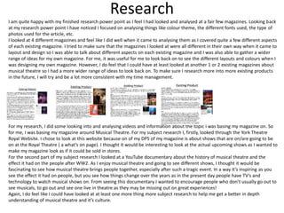
I am quite happy with my finished research power point as I feel I had looked and analysed at a fair few magazines. Looking back
at my research power point I have noticed I focused on analysing things like colour theme, the different fonts used, the type of
photos used for the article, etc.
I looked at 4 different magazines and feel like I did well when it came to analysing them as I covered quite a few different aspects
of each existing magazine. I tried to make sure that the magazines I looked at were all different in their own way when it came to
layout and design so I was able to talk about different aspects on each existing magazine and I was also able to gather a wider
range of ideas for my own magazine. For me, it was useful for me to look back on to see the different layouts and colours when I
was designing my own magazine. However, I do feel that I could have at least looked at another 1 or 2 existing magazines about
musical theatre so I had a more wider range of ideas to look back on. To make sure I research more into more existing products
in the future, I will try and be a lot more consistent with my time management.
For my research, I did some looking into and analysing videos and information about the topic I was basing my magazine on. So
for me, I was basing my magazine around Musical Theatre. For my subject research I, firstly, looked through the York Theatre
Royal Website. I chose to look at this website because on of my DPS of my magazine is about shows that are on/are going to be
on at the Royal Theatre ( a what’s on page). I thought it would be interesting to look at the actual upcoming shows as I wanted to
make my magazine look as if it could be sold in stores.
For the second part of my subject research I looked at a YouTube documentary about the history of musical theatre and the
effect it had on the people after WW2. As I enjoy musical theatre and going to see different shows, I thought it would be
fascinating to see how musical theatre brings people together, especially after such a tragic event. In a way it’s inspiring as you
see the effect it had on people, but you see how things change over the years as in the present day people have TV’s and
technology to watch musical shows on. From seeing this documentary I wanted to encourage people who don’t usually go out to
see musicals, to go out and see one live in theatre as they may be missing out on great experiences!
Again, I do feel like I could have looked at at least one more thing more subject research to help me get a better in depth
understanding of musical theatre and it’s culture.
Research
For my Primary Research I made a survey for friends and some people in my class. I made this survey so I could
get a better understanding of how the younger generation may feel about musical theatre. I was happy with the
results and I was able to analyze points from my answers. However, if I could change anything or add anything
on to my primary research, I probably would have asked people of an older age to complete the survey. This is
because I have noticed that it is mainly elderly people who show appreciation for musical theatre from first
hand experience which makes sense when you think about how the elderly didn’t have technology to watch
musicals when they were younger, so they probably appreciated musical theatre live more. If I did this survey
for elderly people I could have compared my answers from the younger generation to the older one and see the
difference between their answers.
For my Secondary Research I interviewed an actress who is involved in musical theatre. I wanted to gather
information from someone who clearly has a passion for musical theatre and find out how musical theatre
effects them from their perspective when playing the characters. I am happy with my interview questions as I
made sure I stayed on the topic of musical theatre and Bethany (the actress I was interviewing) had answered all
questions in detail and made it clear about her passion for Musical Theatre.
I was quite happy with my practical research. I used almost all of the techniques I used in my research for my
actual product. On one of my practical research slides I looked at how to add a new background to a picture.
This is something I didn’t know how to do before so it was very useful to learn how to do it and experiment with
it before I started my project.
Similarly, I chose a picture from the internet and started to edit it in Photoshop. I used things like brightness,
contrast, color saturation, etc. I used effects like these to help edit the photos I took. I did originally know how
to edit photos in Photoshop however it was useful to recap on these techniques, ready t6o use them in my FMP.
Planning
Part of my planning was creating a mood board and then analysing this. Looking back on this I feel like I
had done quite well when it came to gathering loads of pictures together and then talking about them in
detail. For this section I had picked out a few different pictures and talked about them. In my opinion, I
had done well when it came to analysing the pictures however I think that to improve my work I should
have done another slide on mood board analysis as I don’t think I wrote as much as I could have done. I
could have picked out some photos about how visually interesting they or and I could have picked out
some more and talked about how I could relate that to my product. Overall, I do think I analysed my work
well however I think there is room for improvement and I should have continued a bit further with this.
I did do a few slides where I talked about key influences. For these slides I made sure I picked a few
different influencing topics so I had different things to talk about. For one of my slides I chose 1 particular
musical, that influenced me personally, to talk about. With this I was able to talk about the musical and
it’s background. Looking back at my slide about this, however, I do feel like I could have defiantly written
more and talked more in detail about this musical. This is the same with my other slides, I think I could
have written in more detail to improve my work. For these key influence power points I had used online
sources. Looking back now, I think I could have found out more information through sources from
existing books/magazines.
For one of my key influencers I chose to look into the Grand Oprah House in York as this was a location I
was planning to take photos of. I talked about the different locations inside the Grand Oprah House
where I could visit and take photos of. This was actually fairly handy to have written down as for my
actual project I did go and visit the Grand Oprah House and arrange a time with a member of staff to go
and take pictures inside when it was empty. So I made sure I followed through with this idea when I
talked about it in my initial plans.
Time Management
I feel like for most of it, time was fairly well managed. I knew what I wanted to make and how to do it so I
wasn’t necessarily unprepared. However, throughout the making of my project I was absent quite a few
times due to a problem that affected my vision and concentration. So there will have possibly been some
days where I wasn’t working to the best of my ability, and days where I had to leave for hospital
appointments, etc. This was inconvenient during my project and would have affected my production
schedule.
Despite my absence, I do feel that I was never in a rush to finish my work as there were times when I
would finish off work in my free time when I felt I was able to concentrate properly on my work. I know
that if I didn’t have that problem during my project I could have spent more hours in class instead of
using up free time and there could have been chances of me having new ideas for my project in class that
I wasn’t able to think of outside of class, as as being in class is me being in a working environment.
If I had more time to complete my work I would have liked to have done an extra DPS. From looking back
at my research, initial plans and the existing products I had looked at, I feel like I could have put together
a good DPS from my own ideas. The DPS that I could have created could be a page dedicated to a certain
musical, such as the musical ‘Les Misérables’, that I wrote about in my initial plans PowerPoint in my Key
Influencers section.
Another piece of work that I could have done if I had more time could have been creating a poster of
some sort for a musical show that’s happening in York. For my project I had already collected some
existing leaflets/posters from the Grand Oprah House to help inspire me for my magazine. These could
have been useful for this extra piece of work.
Technical Qualities
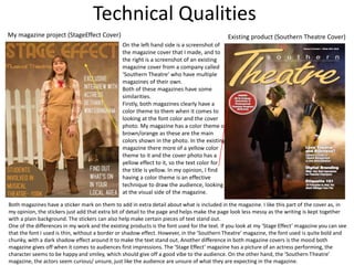
My magazine project (StageEffect Cover) Existing product (Southern Theatre Cover)
On the left hand side is a screenshot of
the magazine cover that I made, and to
the right is a screenshot of an existing
magazine cover from a company called
‘Southern Theatre’ who have multiple
magazines of their own.
Both of these magazines have some
similarities.
Firstly, both magazines clearly have a
color theme to them when it comes to
looking at the font color and the cover
photo. My magazine has a color theme of
brown/orange as these are the main
colors shown in the photo. In the existing
magazine there more of a yellow color
theme to it and the cover photo has a
yellow effect to it, so the text color for
the title is yellow. In my opinion, I find
having a color theme is an effective
technique to draw the audience, looking
at the visual side of the magazine.
Both magazines have a sticker mark on them to add in extra detail about what is included in the magazine. I like this part of the cover as, in
my opinion, the stickers just add that extra bit of detail to the page and helps make the page look less messy as the writing is kept together
with a plain background. The stickers can also help make certain pieces of text stand out.
One of the differences in my work and the existing products is the font used for the text. If you look at my ‘Stage Effect’ magazine you can see
that the font I used is thin, without a border or shadow effect. However, in the ’Southern Theatre’ magazine, the font used is quite bold and
chunky, with a dark shadow effect around it to make the text stand out. Another difference in both magazine covers is the mood both
magazine gives off when it comes to audiences first impressions. The ‘Stage Effect’ magazine has a picture of an actress performing, the
character seems to be happy and smiley, which should give off a good vibe to the audience. On the other hand, the ‘Southern Theatre’
magazine, the actors seem curious/ unsure, just like the audience are unsure of what they are expecting in the magazine.
Technical Qualities
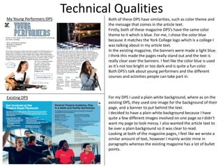
My Young Performers DPS
Existing DPS
Both of these DPS have similarities, such as color theme and
the message that comes in the article text.
Firstly, both of these magazine DPS’s have the same color
theme to it which is blue. For me, I chose the color blue
because it matches the York College logo which is a college I
was talking about in my article text.
In the existing magazine, the banners were made a light blue.
I think this made the pages really stand out and the text is
really clear over the banners. I feel like the color blue is used
as it’s not too bright or too dark and is quite a fun color.
Both DPS’s talk about young performers and the different
courses and activities people can take part in.
For my DPS I used a plain white background, where as on the
existing DPS, they used one image for the background of their
page, and a banner to put behind the text.
I decided to have a plain white background because I have
quite a few different images involved on one page so I didn’t
want my page to look messy. I also wanted the article text to
be over a plain background so it was clear to read.
Looking at both of the magazine pages, I feel like we wrote a
similar amount of text, however I mainly wrote mine in
paragraphs whereas the existing magazine has a lot of bullet
points.
Aesthetic Qualities
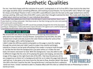
My second DPS was about young performers and aspiring actors/actresses
who wish to be involved in musical theatre. Compared to my first DPS, this DPS
looked more simple and only stuck to the color theme on blue for some of the
text and images, with a white background.
I didn’t make this DPS too colorful and graphic as this page is more for reading
through the article text and I didn’t want to make it too colorful and bright-
colored as I know it can be quite off putting if the reader is trying to read through
it. I do like the fact that the background is just plain white as it makes the text
look a lot clearer and easier to read. With this background, I was also able to add
in different images like the ones of Iris playing the guitar and singing, and also the
image of the stage on the right-hand side of the DPS. I like how the pictures of iris
are cropped out so there isn’t a background with her as it makes the page look tidy and
well laid out. It also gives a lot more room for the text to flow. Another detail I like about
this DPS is the font I used for the title ‘Young Performers’ and how the font is edited to
stand out more. I knew I wanted to add in a shadow effect with this title so I edited the text on Photoshop to make it
stand out more.
Second DPS
For me, I was fairly happy with the outcome of my work. Looking back on all 3 of my DPS’s I have stuck to the idea that
each page would be about something different, still involving musical theatre. For my first DPS I did a ‘What’s On’ page
for shows at the Royal Theatre in York. In this DPS I used different colors for the text so this page looked more colorful
and eye catching. With each title of the DPS I used a color that I thought matched the font. This made each show that I
talked about stand out and have it’s own individual description.
Even though I have added quite a lot of color in this DPS when it came to text and font, there is still a
color theme to it of blue and purple. I like these visuals as I feel like it brings out the color and creativity
that comes with musical theatre.
If I could improve anything about this DPS I would have probably changed the font of the description
writing as, looking back, it looks quite hard to read as the text is thin against such a colorful background.
It probably would’ve been clearer with a thicker/chunkier font.
Aesthetic Qualities
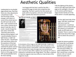
I made the banner gradient
so it looks like it just blends
in nicely with the picture. I
feel like this just added in
that extra bit of effect. If I
used a solid banner I feel
like it would have ruined the
picture a bit as it would
stand out quite a lot.
Looking back on my double
page spread now, I feel that
there are a few adjustments
I should have made.
The first thing I would
change is the colour of
some of the article text on
the left hand side on the
DPS. I said I wanted it to fit
into a colour scheme but it
doesn’t look like I did. If I
could, I would change the
text colour of the title
‘Interview with actress:
Bethany Winteringham’ and
I would probably choose a
light brown, or light red
colour for this. I would have
also used these colours for
the questions of the text.
These colours would have
matched the photo used on
the right and there would
be some sort of colour
theme on this page and the
DPS would probably look a
bit more exciting.
I am happy with the font I used for the title. I
wanted this page to look more simple but also
appealing. The font I used for the title stands out
quite well in my opinion, and same with the bold
font I used for the interview questions.
On the right hand side of the
page, I feel like I could have
had some room for
improvement. I could have
added in some article text on
this photo as it could have
made my DPS look more
detailed. There is room on the
right hand side of the image,
next to where the actress is
sat.
At the bottom of the image on the right hand side, I made sure I
gave credits to Bethany Winteringham, who is the actress in the
photo and the actress I interviewed. I think that adding this small
piece of information makes the page look more professional.
Also, on all of my other DPS’s I added in the small logo ‘SF’ which is
supposed to resemble the title ‘Stage Effects’. This logo is supposed
to make the magazine look more official so I like this part of the
magazines visuals.
I like the lighting of the photo I
used on the right hand side of the
page as the spotlight is focused
on the actress performing on
stage and she stands out in the
photo which is visually appealing.
Aesthetic Qualities
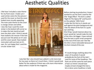
Before starting my production I knew I
wanted to use the font I used for the
title ‘Stage Effect’. The font is called
‘Night At The Opera-NF’ and found it
on the website ‘1001 Fonts’
I really like this font as it stands out
well against the plain background and
I like the detail of the font-it is quite
eye catching.
One thing I would improve about my
cover would be I would make the text
of the title a bit bigger. I have noticed
that the text is quite small compared
to the rest of the text and I feel like
the title is more noticeable because of
the font instead of the size.
I like how I included a color theme
for my front cover. I made sure I
used similar colors for the picture I
used for the cover so that the cover
looked more visually appealing.
The main color theme on the cover
is orange, brown and white.
I also like how I used the small
sticker in the bottom left corner as
it makes the text stand out well
over the plain color. I think it would
have looked a bit messier if the text
was put over the photo on it’s own
and the cover would. Have looked
more plain with just text on it’s
own. So I am happy that I used the
circular sticker tool.
If I could change anything about the
cover of my photo it would
probably be the font of the text I
used for some of the headlines. The
fonts are all the same for each piece
of text so I think I should have
maybe at least changed the text a
bit or done some headlines in bold.
I also feel like I also should have added in a bit more text
for my cover as there isn’t much there. I think it would look
better for the audience if there was a bit more information
about what is inside for the magazine.
Audience Appeal
My target audience was mainly focused on appealing to young people who are interested in musical theatre and
performing arts. I wanted these people to be able to feel inspired and understand what is available to them when it
comes to finding a career in musical theatre.
In one of my DPS’s, I talked about careers in musical theatre and performing arts
for young performers. I talked about the courses that were available at York College,
as my magazine was still based around theatre in the local area (which is York).
I then also talked about further education in musical theatre such as schools like
MTA School (Musical Theatre Academy) and also going into apprentices.
I feel like this DPS should inspire aspiring actors/actresses to carry on searching for
the right path to take in their future career and to pursue their passion in Musical
Theatre, performing arts, etc.
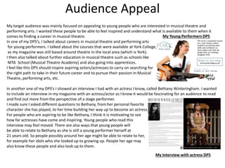
In another one of my DPS’s I showed an interview I had with an actress I know, called Bethany Winteringham. I wanted
to include an interview in my magazine with an actress/actor as I know it would be fascinating for an audience to read
and find out more from the perspective of a stage performer.
I made sure I asked different questions to Bethany, from her personal favorite
character she has played, to her time building her way up to become an actress.
For people who are aspiring to be like Bethany, I think it is motivating to see
how far actresses have come and inspiring. Young people who read this
interview may feel moved. There are also ways that young people will
be able to relate to Bethany as she is still a young performer herself at
21 years old. So people possibly around her age might be able to relate to her,
for example her idols who she looked up to growing up. People her age may
also know these people and also look up to them.
My Young Performers DPS
My interview with actress DPS
Feedback 1
• What did you like about the product?
– I really liked the magazine cover, I think it looks very interesting, the colours
are matching perfectly with the contents giving the magazine an excellent
appearance.
– I also liked the font that you used in the masthead.
– I think the background in the double page spread is really interesting but it
could have some effects to make it darker.
– The layout in the second double and the interview page are really well
organized.
• What improvements could have been made to the product?
– In the cover you could put the actress in front of the masthead. It also could
have more cover lines from different articles in the magazine so that it could
look more like an actual magazine.
– It could also have the month that the magazine is being released, June 2019,
for example.
– Some of the texts in the double page spread isn’t clear enough making the
reading hard.
– In the interview double page spread you could change the size of the font
because it’s too small.
Feedback 2
• What did you like about the product?
– The front page stays consistent to a colour scheme.
– The title font fits the image so well.
– The variety of photographs throughout the magazine really compliment
the piece.
– The use of facts compliment the articles.
– I really like the interview with the actress, the layout is sleek.
– The Barcode appears really realistic.
• What improvements could have been made to the
product?
– The final page’s image is out of focus
– The interview’s font is a bit small
– The white pages are really harsh and they melt into the t-shirt.
– There are too many different fonts and colours on the “What’s
on” page.
Feedback 3
• What did you like about the product?
• The dps titled interview with an actress looks very professional and the
layout makes it clear on which bits are questions and which are dialogue.
the images also look very professional.
• On the 'whats on' page, I really like how you've matched the font with the
film. it adds a nice effect and gives the page more character.
• Having your logo feature on each page is a good way to secure your brand
and identity.
•
• What improvements could have been made to the product?
• Some parts of the text are a little hard to see as they clash with the
background on the 'what's on' page.
• The cover seems slightly empty and could use a little bit more text.
Peer Feedback Summary
• What do you agree with from your peer feedback?
• Some of my peers have mentioned about the small logo I used in all of of my
pages which is something I was happy with using when creating my project. I am
glad that some of my audience feel that this looks more professional for the
brand.
• My peers have mentioned about liking the layout of my magazine DPS which
was something I was quite happy about and how the font matches the images
and layout which was the feedback I was hoping for the visual effects.
• What do you disagree with from your peer
feedback?
• There was a piece of feedback which recommended I made the background of
my DPS a bit darker, however I don’t feel like that would be necessary as I don’t
think the colours and lighting of the photo will look as vibrant as I feel they
should be.
Peer Feedback Summary
A lot of the feedback I got back from my peers was positive. Looking through my positive
feedback I notice that all my peers liked the layout of my Double Page Spread’s, for example
my ‘Young Performers’ Layout and my Interview Page. It was described as ‘sleek’ and ‘well
organised’.
My peers also mentioned about how the variety of photos I used made my magazine look
more captivating to read as each page was different so it was reassuring to know I hadn’t
made my magazine look too original or simple, focusing on one topic throughout it all.
My magazine did receive some feedback where my peers pointed out where there is room for
improvement.
I have noticed that more of my peers have mentioned about text being too small on my
interview Double Page Spread so in the future I may need to be careful about my text size so
it is more clearer to read.
A peer also mentioned about the white pages being quite harsh and ‘melting into the t-shirt’.
This means I could have either chosen a different plain background cover or I could have
edited the images to make the t shirt a bit darker or a different colour.
Overall, I feel like my magazine was fairly analysed and a lot of the feedback, I agree with. I
understand that there is room for improvement and the feedback will defiantly help me with
future projects.

FMP Magazine Evaluation

  • 1.
  • 2.
    Research I am quitehappy with my finished research power point as I feel I had looked and analysed at a fair few magazines. Looking back at my research power point I have noticed I focused on analysing things like colour theme, the different fonts used, the type of photos used for the article, etc. I looked at 4 different magazines and feel like I did well when it came to analysing them as I covered quite a few different aspects of each existing magazine. I tried to make sure that the magazines I looked at were all different in their own way when it came to layout and design so I was able to talk about different aspects on each existing magazine and I was also able to gather a wider range of ideas for my own magazine. For me, it was useful for me to look back on to see the different layouts and colours when I was designing my own magazine. However, I do feel that I could have at least looked at another 1 or 2 existing magazines about musical theatre so I had a more wider range of ideas to look back on. To make sure I research more into more existing products in the future, I will try and be a lot more consistent with my time management. For my research, I did some looking into and analysing videos and information about the topic I was basing my magazine on. So for me, I was basing my magazine around Musical Theatre. For my subject research I, firstly, looked through the York Theatre Royal Website. I chose to look at this website because on of my DPS of my magazine is about shows that are on/are going to be on at the Royal Theatre ( a what’s on page). I thought it would be interesting to look at the actual upcoming shows as I wanted to make my magazine look as if it could be sold in stores. For the second part of my subject research I looked at a YouTube documentary about the history of musical theatre and the effect it had on the people after WW2. As I enjoy musical theatre and going to see different shows, I thought it would be fascinating to see how musical theatre brings people together, especially after such a tragic event. In a way it’s inspiring as you see the effect it had on people, but you see how things change over the years as in the present day people have TV’s and technology to watch musical shows on. From seeing this documentary I wanted to encourage people who don’t usually go out to see musicals, to go out and see one live in theatre as they may be missing out on great experiences! Again, I do feel like I could have looked at at least one more thing more subject research to help me get a better in depth understanding of musical theatre and it’s culture.
  • 3.
    Research For my PrimaryResearch I made a survey for friends and some people in my class. I made this survey so I could get a better understanding of how the younger generation may feel about musical theatre. I was happy with the results and I was able to analyze points from my answers. However, if I could change anything or add anything on to my primary research, I probably would have asked people of an older age to complete the survey. This is because I have noticed that it is mainly elderly people who show appreciation for musical theatre from first hand experience which makes sense when you think about how the elderly didn’t have technology to watch musicals when they were younger, so they probably appreciated musical theatre live more. If I did this survey for elderly people I could have compared my answers from the younger generation to the older one and see the difference between their answers. For my Secondary Research I interviewed an actress who is involved in musical theatre. I wanted to gather information from someone who clearly has a passion for musical theatre and find out how musical theatre effects them from their perspective when playing the characters. I am happy with my interview questions as I made sure I stayed on the topic of musical theatre and Bethany (the actress I was interviewing) had answered all questions in detail and made it clear about her passion for Musical Theatre. I was quite happy with my practical research. I used almost all of the techniques I used in my research for my actual product. On one of my practical research slides I looked at how to add a new background to a picture. This is something I didn’t know how to do before so it was very useful to learn how to do it and experiment with it before I started my project. Similarly, I chose a picture from the internet and started to edit it in Photoshop. I used things like brightness, contrast, color saturation, etc. I used effects like these to help edit the photos I took. I did originally know how to edit photos in Photoshop however it was useful to recap on these techniques, ready t6o use them in my FMP.
  • 4.
    Planning Part of myplanning was creating a mood board and then analysing this. Looking back on this I feel like I had done quite well when it came to gathering loads of pictures together and then talking about them in detail. For this section I had picked out a few different pictures and talked about them. In my opinion, I had done well when it came to analysing the pictures however I think that to improve my work I should have done another slide on mood board analysis as I don’t think I wrote as much as I could have done. I could have picked out some photos about how visually interesting they or and I could have picked out some more and talked about how I could relate that to my product. Overall, I do think I analysed my work well however I think there is room for improvement and I should have continued a bit further with this. I did do a few slides where I talked about key influences. For these slides I made sure I picked a few different influencing topics so I had different things to talk about. For one of my slides I chose 1 particular musical, that influenced me personally, to talk about. With this I was able to talk about the musical and it’s background. Looking back at my slide about this, however, I do feel like I could have defiantly written more and talked more in detail about this musical. This is the same with my other slides, I think I could have written in more detail to improve my work. For these key influence power points I had used online sources. Looking back now, I think I could have found out more information through sources from existing books/magazines. For one of my key influencers I chose to look into the Grand Oprah House in York as this was a location I was planning to take photos of. I talked about the different locations inside the Grand Oprah House where I could visit and take photos of. This was actually fairly handy to have written down as for my actual project I did go and visit the Grand Oprah House and arrange a time with a member of staff to go and take pictures inside when it was empty. So I made sure I followed through with this idea when I talked about it in my initial plans.
  • 5.
    Time Management I feellike for most of it, time was fairly well managed. I knew what I wanted to make and how to do it so I wasn’t necessarily unprepared. However, throughout the making of my project I was absent quite a few times due to a problem that affected my vision and concentration. So there will have possibly been some days where I wasn’t working to the best of my ability, and days where I had to leave for hospital appointments, etc. This was inconvenient during my project and would have affected my production schedule. Despite my absence, I do feel that I was never in a rush to finish my work as there were times when I would finish off work in my free time when I felt I was able to concentrate properly on my work. I know that if I didn’t have that problem during my project I could have spent more hours in class instead of using up free time and there could have been chances of me having new ideas for my project in class that I wasn’t able to think of outside of class, as as being in class is me being in a working environment. If I had more time to complete my work I would have liked to have done an extra DPS. From looking back at my research, initial plans and the existing products I had looked at, I feel like I could have put together a good DPS from my own ideas. The DPS that I could have created could be a page dedicated to a certain musical, such as the musical ‘Les Misérables’, that I wrote about in my initial plans PowerPoint in my Key Influencers section. Another piece of work that I could have done if I had more time could have been creating a poster of some sort for a musical show that’s happening in York. For my project I had already collected some existing leaflets/posters from the Grand Oprah House to help inspire me for my magazine. These could have been useful for this extra piece of work.
  • 6.
    Technical Qualities My magazineproject (StageEffect Cover) Existing product (Southern Theatre Cover) On the left hand side is a screenshot of the magazine cover that I made, and to the right is a screenshot of an existing magazine cover from a company called ‘Southern Theatre’ who have multiple magazines of their own. Both of these magazines have some similarities. Firstly, both magazines clearly have a color theme to them when it comes to looking at the font color and the cover photo. My magazine has a color theme of brown/orange as these are the main colors shown in the photo. In the existing magazine there more of a yellow color theme to it and the cover photo has a yellow effect to it, so the text color for the title is yellow. In my opinion, I find having a color theme is an effective technique to draw the audience, looking at the visual side of the magazine. Both magazines have a sticker mark on them to add in extra detail about what is included in the magazine. I like this part of the cover as, in my opinion, the stickers just add that extra bit of detail to the page and helps make the page look less messy as the writing is kept together with a plain background. The stickers can also help make certain pieces of text stand out. One of the differences in my work and the existing products is the font used for the text. If you look at my ‘Stage Effect’ magazine you can see that the font I used is thin, without a border or shadow effect. However, in the ’Southern Theatre’ magazine, the font used is quite bold and chunky, with a dark shadow effect around it to make the text stand out. Another difference in both magazine covers is the mood both magazine gives off when it comes to audiences first impressions. The ‘Stage Effect’ magazine has a picture of an actress performing, the character seems to be happy and smiley, which should give off a good vibe to the audience. On the other hand, the ‘Southern Theatre’ magazine, the actors seem curious/ unsure, just like the audience are unsure of what they are expecting in the magazine.
  • 7.
    Technical Qualities My YoungPerformers DPS Existing DPS Both of these DPS have similarities, such as color theme and the message that comes in the article text. Firstly, both of these magazine DPS’s have the same color theme to it which is blue. For me, I chose the color blue because it matches the York College logo which is a college I was talking about in my article text. In the existing magazine, the banners were made a light blue. I think this made the pages really stand out and the text is really clear over the banners. I feel like the color blue is used as it’s not too bright or too dark and is quite a fun color. Both DPS’s talk about young performers and the different courses and activities people can take part in. For my DPS I used a plain white background, where as on the existing DPS, they used one image for the background of their page, and a banner to put behind the text. I decided to have a plain white background because I have quite a few different images involved on one page so I didn’t want my page to look messy. I also wanted the article text to be over a plain background so it was clear to read. Looking at both of the magazine pages, I feel like we wrote a similar amount of text, however I mainly wrote mine in paragraphs whereas the existing magazine has a lot of bullet points.
  • 8.
    Aesthetic Qualities My secondDPS was about young performers and aspiring actors/actresses who wish to be involved in musical theatre. Compared to my first DPS, this DPS looked more simple and only stuck to the color theme on blue for some of the text and images, with a white background. I didn’t make this DPS too colorful and graphic as this page is more for reading through the article text and I didn’t want to make it too colorful and bright- colored as I know it can be quite off putting if the reader is trying to read through it. I do like the fact that the background is just plain white as it makes the text look a lot clearer and easier to read. With this background, I was also able to add in different images like the ones of Iris playing the guitar and singing, and also the image of the stage on the right-hand side of the DPS. I like how the pictures of iris are cropped out so there isn’t a background with her as it makes the page look tidy and well laid out. It also gives a lot more room for the text to flow. Another detail I like about this DPS is the font I used for the title ‘Young Performers’ and how the font is edited to stand out more. I knew I wanted to add in a shadow effect with this title so I edited the text on Photoshop to make it stand out more. Second DPS For me, I was fairly happy with the outcome of my work. Looking back on all 3 of my DPS’s I have stuck to the idea that each page would be about something different, still involving musical theatre. For my first DPS I did a ‘What’s On’ page for shows at the Royal Theatre in York. In this DPS I used different colors for the text so this page looked more colorful and eye catching. With each title of the DPS I used a color that I thought matched the font. This made each show that I talked about stand out and have it’s own individual description. Even though I have added quite a lot of color in this DPS when it came to text and font, there is still a color theme to it of blue and purple. I like these visuals as I feel like it brings out the color and creativity that comes with musical theatre. If I could improve anything about this DPS I would have probably changed the font of the description writing as, looking back, it looks quite hard to read as the text is thin against such a colorful background. It probably would’ve been clearer with a thicker/chunkier font.
  • 9.
    Aesthetic Qualities I madethe banner gradient so it looks like it just blends in nicely with the picture. I feel like this just added in that extra bit of effect. If I used a solid banner I feel like it would have ruined the picture a bit as it would stand out quite a lot. Looking back on my double page spread now, I feel that there are a few adjustments I should have made. The first thing I would change is the colour of some of the article text on the left hand side on the DPS. I said I wanted it to fit into a colour scheme but it doesn’t look like I did. If I could, I would change the text colour of the title ‘Interview with actress: Bethany Winteringham’ and I would probably choose a light brown, or light red colour for this. I would have also used these colours for the questions of the text. These colours would have matched the photo used on the right and there would be some sort of colour theme on this page and the DPS would probably look a bit more exciting. I am happy with the font I used for the title. I wanted this page to look more simple but also appealing. The font I used for the title stands out quite well in my opinion, and same with the bold font I used for the interview questions. On the right hand side of the page, I feel like I could have had some room for improvement. I could have added in some article text on this photo as it could have made my DPS look more detailed. There is room on the right hand side of the image, next to where the actress is sat. At the bottom of the image on the right hand side, I made sure I gave credits to Bethany Winteringham, who is the actress in the photo and the actress I interviewed. I think that adding this small piece of information makes the page look more professional. Also, on all of my other DPS’s I added in the small logo ‘SF’ which is supposed to resemble the title ‘Stage Effects’. This logo is supposed to make the magazine look more official so I like this part of the magazines visuals. I like the lighting of the photo I used on the right hand side of the page as the spotlight is focused on the actress performing on stage and she stands out in the photo which is visually appealing.
  • 10.
    Aesthetic Qualities Before startingmy production I knew I wanted to use the font I used for the title ‘Stage Effect’. The font is called ‘Night At The Opera-NF’ and found it on the website ‘1001 Fonts’ I really like this font as it stands out well against the plain background and I like the detail of the font-it is quite eye catching. One thing I would improve about my cover would be I would make the text of the title a bit bigger. I have noticed that the text is quite small compared to the rest of the text and I feel like the title is more noticeable because of the font instead of the size. I like how I included a color theme for my front cover. I made sure I used similar colors for the picture I used for the cover so that the cover looked more visually appealing. The main color theme on the cover is orange, brown and white. I also like how I used the small sticker in the bottom left corner as it makes the text stand out well over the plain color. I think it would have looked a bit messier if the text was put over the photo on it’s own and the cover would. Have looked more plain with just text on it’s own. So I am happy that I used the circular sticker tool. If I could change anything about the cover of my photo it would probably be the font of the text I used for some of the headlines. The fonts are all the same for each piece of text so I think I should have maybe at least changed the text a bit or done some headlines in bold. I also feel like I also should have added in a bit more text for my cover as there isn’t much there. I think it would look better for the audience if there was a bit more information about what is inside for the magazine.
  • 11.
    Audience Appeal My targetaudience was mainly focused on appealing to young people who are interested in musical theatre and performing arts. I wanted these people to be able to feel inspired and understand what is available to them when it comes to finding a career in musical theatre. In one of my DPS’s, I talked about careers in musical theatre and performing arts for young performers. I talked about the courses that were available at York College, as my magazine was still based around theatre in the local area (which is York). I then also talked about further education in musical theatre such as schools like MTA School (Musical Theatre Academy) and also going into apprentices. I feel like this DPS should inspire aspiring actors/actresses to carry on searching for the right path to take in their future career and to pursue their passion in Musical Theatre, performing arts, etc. In another one of my DPS’s I showed an interview I had with an actress I know, called Bethany Winteringham. I wanted to include an interview in my magazine with an actress/actor as I know it would be fascinating for an audience to read and find out more from the perspective of a stage performer. I made sure I asked different questions to Bethany, from her personal favorite character she has played, to her time building her way up to become an actress. For people who are aspiring to be like Bethany, I think it is motivating to see how far actresses have come and inspiring. Young people who read this interview may feel moved. There are also ways that young people will be able to relate to Bethany as she is still a young performer herself at 21 years old. So people possibly around her age might be able to relate to her, for example her idols who she looked up to growing up. People her age may also know these people and also look up to them. My Young Performers DPS My interview with actress DPS
  • 12.
    Feedback 1 • Whatdid you like about the product? – I really liked the magazine cover, I think it looks very interesting, the colours are matching perfectly with the contents giving the magazine an excellent appearance. – I also liked the font that you used in the masthead. – I think the background in the double page spread is really interesting but it could have some effects to make it darker. – The layout in the second double and the interview page are really well organized. • What improvements could have been made to the product? – In the cover you could put the actress in front of the masthead. It also could have more cover lines from different articles in the magazine so that it could look more like an actual magazine. – It could also have the month that the magazine is being released, June 2019, for example. – Some of the texts in the double page spread isn’t clear enough making the reading hard. – In the interview double page spread you could change the size of the font because it’s too small.
  • 13.
    Feedback 2 • Whatdid you like about the product? – The front page stays consistent to a colour scheme. – The title font fits the image so well. – The variety of photographs throughout the magazine really compliment the piece. – The use of facts compliment the articles. – I really like the interview with the actress, the layout is sleek. – The Barcode appears really realistic. • What improvements could have been made to the product? – The final page’s image is out of focus – The interview’s font is a bit small – The white pages are really harsh and they melt into the t-shirt. – There are too many different fonts and colours on the “What’s on” page.
  • 14.
    Feedback 3 • Whatdid you like about the product? • The dps titled interview with an actress looks very professional and the layout makes it clear on which bits are questions and which are dialogue. the images also look very professional. • On the 'whats on' page, I really like how you've matched the font with the film. it adds a nice effect and gives the page more character. • Having your logo feature on each page is a good way to secure your brand and identity. • • What improvements could have been made to the product? • Some parts of the text are a little hard to see as they clash with the background on the 'what's on' page. • The cover seems slightly empty and could use a little bit more text.
  • 15.
    Peer Feedback Summary •What do you agree with from your peer feedback? • Some of my peers have mentioned about the small logo I used in all of of my pages which is something I was happy with using when creating my project. I am glad that some of my audience feel that this looks more professional for the brand. • My peers have mentioned about liking the layout of my magazine DPS which was something I was quite happy about and how the font matches the images and layout which was the feedback I was hoping for the visual effects. • What do you disagree with from your peer feedback? • There was a piece of feedback which recommended I made the background of my DPS a bit darker, however I don’t feel like that would be necessary as I don’t think the colours and lighting of the photo will look as vibrant as I feel they should be.
  • 16.
    Peer Feedback Summary Alot of the feedback I got back from my peers was positive. Looking through my positive feedback I notice that all my peers liked the layout of my Double Page Spread’s, for example my ‘Young Performers’ Layout and my Interview Page. It was described as ‘sleek’ and ‘well organised’. My peers also mentioned about how the variety of photos I used made my magazine look more captivating to read as each page was different so it was reassuring to know I hadn’t made my magazine look too original or simple, focusing on one topic throughout it all. My magazine did receive some feedback where my peers pointed out where there is room for improvement. I have noticed that more of my peers have mentioned about text being too small on my interview Double Page Spread so in the future I may need to be careful about my text size so it is more clearer to read. A peer also mentioned about the white pages being quite harsh and ‘melting into the t-shirt’. This means I could have either chosen a different plain background cover or I could have edited the images to make the t shirt a bit darker or a different colour. Overall, I feel like my magazine was fairly analysed and a lot of the feedback, I agree with. I understand that there is room for improvement and the feedback will defiantly help me with future projects.

Editor's Notes

  • #3 What were the strengths of your research? How did your research help your product? What were the weaknesses of your research? What could you have done better/improve? What effect would this have had on your product?
  • #5 What were the strengths of your planning? How did your planning help your product? What were the weaknesses of your planning? What could you have done better/improve? What effect would this have had on your product?
  • #6 Did you manage your time well? Did you complete your project on time or would your products have improved with additional time? What would you have done if you had more time to produce your work?
  • #7 Compare your work to similar existing products and discuss the similarities and differences Put your final piece(s) in the centre of a page alongside an existing product Use text boxes and arrows
  • #8 Compare your work to similar existing products and discuss the similarities and differences Put your final piece(s) in the centre of a page alongside an existing product Use text boxes and arrows
  • #9 Does your work look good? Was it creative? What aspects of your magazine’s visuals do you like? What would you improve? How would you improve it? Discuss the strengths and weaknesses Put your final piece(s) in the centre of a page and analyse them Use text boxes and arrows
  • #10 Does your work look good? Was it creative? What aspects of your magazine’s visuals do you like? What would you improve? How would you improve it? Discuss the strengths and weaknesses Put your final piece(s) in the centre of a page and analyse them Use text boxes and arrows
  • #12 How have you appealed to your target audience? What specific bits of content would appeal to your target audience. Refer to your findings from your questionnaire. Put your final piece(s) in the centre of a page and analyse them Use text boxes and arrows
  • #17 What changes would you make to your product based upon your peer feedback and why?