The document provides an analysis of Demi Lovato's website design and navigation. It notes that the homepage features a saturated image to grab attention. The logo is light grey to stand out from the header. Social media icons allow audience interaction. Navigation tabs clearly categorize content. Throughout most pages, muted colors and black/white images keep it simple and avoid distraction. However, the lack of color could be boring for advertising merchandise.
1. Website planningDemi Lovato
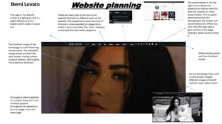
The forefront image of the
homepage is a shot featuring
mis-en scene. The saturated
image stands out from the
dark border, having a direct
mode of address, which gains
the audiences attention.
The Logo in the top left
corner is a light grey, this is a
slight difference to the
header which makes it stand
out.
The social medias in the top
right corner allows her
audience to interact with her
with her updates on other
social medias. This is a good
advertisement as her
demographic she targets use
social media a lot. When you
click onto the apps logo it
goes directly to her page
making it easier access to find
it.
There are many tabs at the top of the
website that links to different parts of the
website. The navigation is easier because of
this and is clearly worded to categories to
make it more accessible. The ‘store’ category
is also split into two more categories.
Throughout Demi's website
it is evident there isn’t a lot
of colour present
throughout her website to
the tour page, store and
news page.
On the homepage if you click
on the arrows it shows
different images of herself
and her music video covers.
White writing stands
out from the black
border.
2. The off white background has
a faded image in the
background of the artist.
The san serif font in black
capital letters.
When the mouse hovers over
the header selections, the
colour turns grey, like the
artist logo in the top left
corner.
This shows the prices of the
Merch she is selling
This gives the viewer a option
to show more products from
the account. When you click
onto this page the hyperlink
goes straight to her store
website which shows more of
her products she sells.
The black and white images
and muted colours are kept
the same in her website. This
makes it less distracting for
the viewer meaning you look
at everything on the page.
However, I believe the lack of
colour can be boring and
doesn’t advertise her clothing
sufficiently.
On her store website she has
a black and white image with
direct mode of address. This
grabs the audiences
attention.
3. Demi has another image that
is black and white, she is
standing behind a white
background thus makes it
look as though she is in front
of the web page.
Bio
Videos
She is seen wearing a
sophisticated black suit which
looks professional. This goes
against the female stereotype
of females as suits are
normally represented for
males. Van Zoonen says
females are sexualised within
the media to get male
attention, this is shown
through the revealing V cut
on her suit.
The black background is
different from her normal
theme in her website. The
change of colour makes it
more appealing as it looks
different.
The saturated colours stand
out fro the black background
making you want to click and
watch the music video.
Having this at the top of the
page and larger than the
other fonts it stands out.