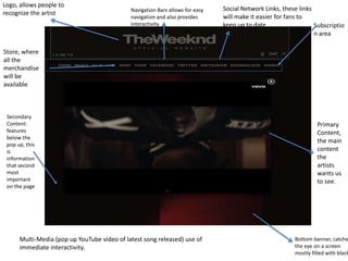
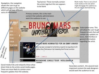
Music Websites Analysis 
Arthur Tumbare
Navigation Bars allows for easy 
navigation and also provides 
interactivity 
Logo, allows people to 
recognize the artist 
Primary 
Content, 
the main 
content 
the 
artists 
wants us 
to see. 
Social Network Links, these links 
will make it easier for fans to 
keep up to date 
Bottom banner, catches 
the eye on a screen 
mostly filled with black 
Store, where 
all the 
merchandise 
will be 
available 
Secondary 
Content: 
features 
below the 
pop up, this 
is 
information 
that second 
most 
important 
on the page 
Subscriptio 
n area 
Multi-Media (pop up YouTube video of latest song released) use of 
immediate interactivity.
The Weeknd 
The previous slide features a labelled screenshot of “The Weeknd” 
main page from his website. The main page is bursting with vivid 
colours. The use of the colours black and red resemble something dark 
and deep but also provides a hint of love. The colours contrast well 
with what we know about the artist himself and the music that he 
produces. Without knowing the artist you would predict that they 
make either rap or hip hop music just from the colours and vivid 
imagery used. Also having the artists name in white on black 
background sells the artist much more as his name stands out and is in 
the biggest and boldest font on the page. 
The primary data featured on the website is a pop up YouTube player. 
The player automatically plays the artists new video. Since the player 
does contains a black border it fits the colour scheme of the main page 
perfectly because then it does not look like a pop up at all but looks as 
if it was embedded into the website.
Logo. Identifies the 
band 
Store: allows the 
audience to buy the 
band merchandise 
Primary Content. 
The headline 
information the 
website homepage. 
With one direction 
they always have to 
be the main 
content for 
everything. 
Secondly content. The 
second most important 
content. In this case it is 
the bands new album. 
Top banner this particular banner 
supports the font of the logo 
Social Network 
sites, allow the 
audience have 
direct access to all 
social media 
pages the band 
has 
Newsletter/Subscription area/ Navigation Bars allow for more 
interactivity of the site and it will have different links that lead to 
different web pages 
Multimedia on 
the site engages 
the audience with 
the site and 
makes the site a 
little less boring 
and more 
interactive.
One Direction 
One directions website is what I would consider to be a typical teenage boy band 
website. The main focus on the website is about them. The main content on the site is 
a picture of all the boys smiling. The secondary content is the news about the new and 
upcoming album. The rest of the content visible on the main page of the site is all 
about the one direction life. The boy bands site has their logo in more than one place, 
this once again gives the impression that the main focus is them. 
From the website itself you really wouldn’t be able to deal the type of genre the boy 
band associate themselves with however from what the band are wearing I would 
probably associate them with pop music as they are dressed like very typical teenage 
boys who are all about having a laugh. There is plenty of navigating on the website 
which I think is a great feature to have as their target audience would be teenage girls, 
this means the audience will not get bored of the site as it provides interaction. 
The band has gone for a very basic colour scheme and have not really complicated 
things. Black and white provides a simple but yet elegant look.
Navigation, the navigation 
allows the user to go to 
different pages on the website 
which will all have different 
sorts of information 
Top banner. These normally contain 
the artists logo but this one appears 
to be blank 
Primary content, this is the main 
content that website administrators 
want the audience to see 
Secondary content , the second most 
important content the web designers 
would want the audience to see. 
Social media links and networks these allow 
direct links to the artists social media pages. 
These are more likely to contain more 
frequent updates than the website. 
Multi-media. There is not a lot of 
multi-media on the site which 
might disengage the audience as 
the site will be deemed boring. 
Subscription area. This 
will allow the user to get 
frequent emails that will 
contain any updates on 
tours, merchandise or 
general information 
regarding the artist.
Bruno Mars 
Bruno Mars website is a lot more plain and simple than the two 
described above. The website lacks interactivity and does not serve a 
real purpose. The colour scheme of the website is very obnoxious and 
doesn’t not have a clear layout. The red writing on the brown banner 
suggest to me that he probably makes western or country music. The 
title of the album also supports this “Unorthodox Jukebox” jukeboxes 
are a piece of equipment that were used to play music in pubs during 
the olden days. The layout of the website also has a very basic layout. 
Chances are that the target audience for this particular site is middle 
aged people or those that are a lot more mature. The lack on 
interactivity keeps the site very basic and easy to understand and use. 
As the older generation might not be up to date with technology like 
the current kids of our generation.

Analysis of websites

  • 1.
    Music Websites Analysis Arthur Tumbare
  • 2.
    Navigation Bars allowsfor easy navigation and also provides interactivity Logo, allows people to recognize the artist Primary Content, the main content the artists wants us to see. Social Network Links, these links will make it easier for fans to keep up to date Bottom banner, catches the eye on a screen mostly filled with black Store, where all the merchandise will be available Secondary Content: features below the pop up, this is information that second most important on the page Subscriptio n area Multi-Media (pop up YouTube video of latest song released) use of immediate interactivity.
  • 3.
    The Weeknd Theprevious slide features a labelled screenshot of “The Weeknd” main page from his website. The main page is bursting with vivid colours. The use of the colours black and red resemble something dark and deep but also provides a hint of love. The colours contrast well with what we know about the artist himself and the music that he produces. Without knowing the artist you would predict that they make either rap or hip hop music just from the colours and vivid imagery used. Also having the artists name in white on black background sells the artist much more as his name stands out and is in the biggest and boldest font on the page. The primary data featured on the website is a pop up YouTube player. The player automatically plays the artists new video. Since the player does contains a black border it fits the colour scheme of the main page perfectly because then it does not look like a pop up at all but looks as if it was embedded into the website.
  • 4.
    Logo. Identifies the band Store: allows the audience to buy the band merchandise Primary Content. The headline information the website homepage. With one direction they always have to be the main content for everything. Secondly content. The second most important content. In this case it is the bands new album. Top banner this particular banner supports the font of the logo Social Network sites, allow the audience have direct access to all social media pages the band has Newsletter/Subscription area/ Navigation Bars allow for more interactivity of the site and it will have different links that lead to different web pages Multimedia on the site engages the audience with the site and makes the site a little less boring and more interactive.
  • 5.
    One Direction Onedirections website is what I would consider to be a typical teenage boy band website. The main focus on the website is about them. The main content on the site is a picture of all the boys smiling. The secondary content is the news about the new and upcoming album. The rest of the content visible on the main page of the site is all about the one direction life. The boy bands site has their logo in more than one place, this once again gives the impression that the main focus is them. From the website itself you really wouldn’t be able to deal the type of genre the boy band associate themselves with however from what the band are wearing I would probably associate them with pop music as they are dressed like very typical teenage boys who are all about having a laugh. There is plenty of navigating on the website which I think is a great feature to have as their target audience would be teenage girls, this means the audience will not get bored of the site as it provides interaction. The band has gone for a very basic colour scheme and have not really complicated things. Black and white provides a simple but yet elegant look.
  • 6.
    Navigation, the navigation allows the user to go to different pages on the website which will all have different sorts of information Top banner. These normally contain the artists logo but this one appears to be blank Primary content, this is the main content that website administrators want the audience to see Secondary content , the second most important content the web designers would want the audience to see. Social media links and networks these allow direct links to the artists social media pages. These are more likely to contain more frequent updates than the website. Multi-media. There is not a lot of multi-media on the site which might disengage the audience as the site will be deemed boring. Subscription area. This will allow the user to get frequent emails that will contain any updates on tours, merchandise or general information regarding the artist.
  • 7.
    Bruno Mars BrunoMars website is a lot more plain and simple than the two described above. The website lacks interactivity and does not serve a real purpose. The colour scheme of the website is very obnoxious and doesn’t not have a clear layout. The red writing on the brown banner suggest to me that he probably makes western or country music. The title of the album also supports this “Unorthodox Jukebox” jukeboxes are a piece of equipment that were used to play music in pubs during the olden days. The layout of the website also has a very basic layout. Chances are that the target audience for this particular site is middle aged people or those that are a lot more mature. The lack on interactivity keeps the site very basic and easy to understand and use. As the older generation might not be up to date with technology like the current kids of our generation.