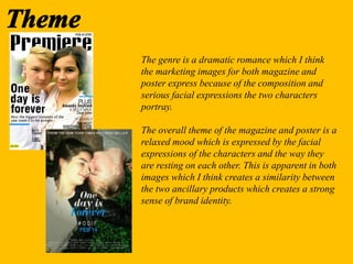
The genre is a dramatic romance which I think
the marketing images for both magazine and
poster express because of the composition and
serious facial expressions the two characters
portray.
The overall theme of the magazine and poster is a
relaxed mood which is expressed by the facial
expressions of the characters and the way they
are resting on each other. This is apparent in both
images which I think creates a similarity between
the two ancillary products which creates a strong
sense of brand identity.
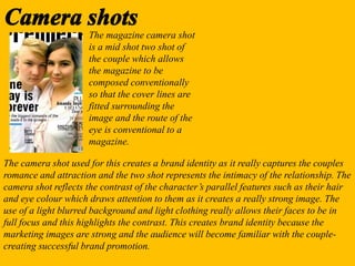
The magazine camera shot
is a mid shot two shot of
the couple which allows
the magazine to be
composed conventionally
so that the cover lines are
fitted surrounding the
image and the route of the
eye is conventional to a
magazine.
The camera shot used for this creates a brand identity as it really captures the couples
romance and attraction and the two shot represents the intimacy of the relationship. The
camera shot reflects the contrast of the character’s parallel features such as their hair
and eye colour which draws attention to them as it creates a really strong image. The
use of a light blurred background and light clothing really allows their faces to be in
full focus and this highlights the contrast. This creates brand identity because the
marketing images are strong and the audience will become familiar with the couple-
creating successful brand promotion.
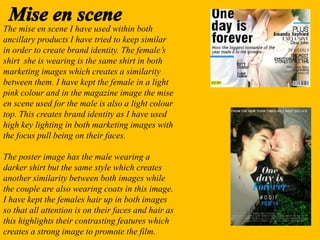
The mise en scene I have used within both
ancillary products I have tried to keep similar
in order to create brand identity. The female’s
shirt she is wearing is the same shirt in both
marketing images which creates a similarity
between them. I have kept the female in a light
pink colour and in the magazine image the mise
en scene used for the male is also a light colour
top. This creates brand identity as I have used
high key lighting in both marketing images with
the focus pull being on their faces.
The poster image has the male wearing a
darker shirt but the same style which creates
another similarity between both images while
the couple are also wearing coats in this image.
I have kept the females hair up in both images
so that all attention is on their faces and hair as
this highlights their contrasting features which
creates a strong image to promote the film.
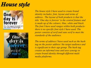
The house style I have used to create brand
identity includes; font, layout and terms of
address.. The layout of both products is that the
title ‘One day is forever’is the central feature and
is made up of the colours; blue, white and black.
The font I have used ranges within both products-
there is no specific font style I have used. The
poster consists of serif and sans serif to meet the
standards of the audience.
The terms of address I have used such as the hash
tag on the poster address’the target audience and
is significant to their age group. The hash tag
creates an informal tone and uses synergy to
create brand identity through different multi
media platforms.
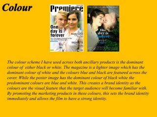
The colour scheme I have used across both ancillary products is the dominant
colour of either black or white. The magazine is a lighter image which has the
dominant colour of white and the colours blue and black are featured across the
cover. While the poster image has the dominant colour of black white the
predominant colours are blue and white. This creates a brand identity as the
colours are the visual feature that the target audience will become familiar with.
By promoting the marketing products in these colours, this sets the brand identity
immediately and allows the film to have a strong identity.
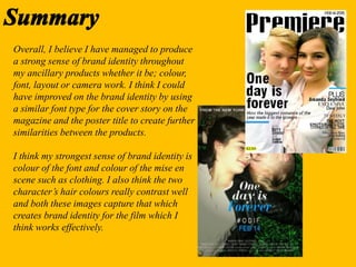
Overall, I believe I have managed to produce
a strong sense of brand identity throughout
my ancillary products whether it be; colour,
font, layout or camera work. I think I could
have improved on the brand identity by using
a similar font type for the cover story on the
magazine and the poster title to create further
similarities between the products.
I think my strongest sense of brand identity is
colour of the font and colour of the mise en
scene such as clothing. I also think the two
character’s hair colours really contrast well
and both these images capture that which
creates brand identity for the film which I
think works effectively.

How have i created brand identity

  • 2.
    The genre isa dramatic romance which I think the marketing images for both magazine and poster express because of the composition and serious facial expressions the two characters portray. The overall theme of the magazine and poster is a relaxed mood which is expressed by the facial expressions of the characters and the way they are resting on each other. This is apparent in both images which I think creates a similarity between the two ancillary products which creates a strong sense of brand identity.
  • 3.
    The magazine camerashot is a mid shot two shot of the couple which allows the magazine to be composed conventionally so that the cover lines are fitted surrounding the image and the route of the eye is conventional to a magazine. The camera shot used for this creates a brand identity as it really captures the couples romance and attraction and the two shot represents the intimacy of the relationship. The camera shot reflects the contrast of the character’s parallel features such as their hair and eye colour which draws attention to them as it creates a really strong image. The use of a light blurred background and light clothing really allows their faces to be in full focus and this highlights the contrast. This creates brand identity because the marketing images are strong and the audience will become familiar with the couple- creating successful brand promotion.
  • 4.
    The mise enscene I have used within both ancillary products I have tried to keep similar in order to create brand identity. The female’s shirt she is wearing is the same shirt in both marketing images which creates a similarity between them. I have kept the female in a light pink colour and in the magazine image the mise en scene used for the male is also a light colour top. This creates brand identity as I have used high key lighting in both marketing images with the focus pull being on their faces. The poster image has the male wearing a darker shirt but the same style which creates another similarity between both images while the couple are also wearing coats in this image. I have kept the females hair up in both images so that all attention is on their faces and hair as this highlights their contrasting features which creates a strong image to promote the film.
  • 5.
    The house styleI have used to create brand identity includes; font, layout and terms of address.. The layout of both products is that the title ‘One day is forever’is the central feature and is made up of the colours; blue, white and black. The font I have used ranges within both products- there is no specific font style I have used. The poster consists of serif and sans serif to meet the standards of the audience. The terms of address I have used such as the hash tag on the poster address’the target audience and is significant to their age group. The hash tag creates an informal tone and uses synergy to create brand identity through different multi media platforms.
  • 6.
    The colour schemeI have used across both ancillary products is the dominant colour of either black or white. The magazine is a lighter image which has the dominant colour of white and the colours blue and black are featured across the cover. While the poster image has the dominant colour of black white the predominant colours are blue and white. This creates a brand identity as the colours are the visual feature that the target audience will become familiar with. By promoting the marketing products in these colours, this sets the brand identity immediately and allows the film to have a strong identity.
  • 7.
    Overall, I believeI have managed to produce a strong sense of brand identity throughout my ancillary products whether it be; colour, font, layout or camera work. I think I could have improved on the brand identity by using a similar font type for the cover story on the magazine and the poster title to create further similarities between the products. I think my strongest sense of brand identity is colour of the font and colour of the mise en scene such as clothing. I also think the two character’s hair colours really contrast well and both these images capture that which creates brand identity for the film which I think works effectively.