SlideShare a Scribd company logo
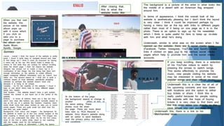
When you first visit
the website, this
picture of his latest
album pops up
with 4 icons which
if you click on
take you to a
page to purchase
the album (on
Apple Music,
Spotify, Google
Play or Amazon)
After closing that,
this is what the
website looks like:
The background is a picture of the artist in what looks like
the middle of a desert with an American flag wrapped
around him.
In terms of appearance, I think the overall look of the
website is aesthetically pleasing but I don’t think the layout
is very clear. I think it could be improved perhaps by
having a menu bar at the top with links to different pages
rather than most of it being on one page as it is in the
photo. There is an option to sign up for his newsletter
which I think is quite useful for fans to keep up –to-date
with him and what he’s doing.
Underneath, similar to what was on the screen when I fist
opened up the website, there are 5 social media icons
(Facebook, Twitter, Instagram, YouTube and Spotify) these
links if clicked on take you to his various social media
pages which help to promote him and his social media
accounts.
If you keep scrolling, there is a selection
of his YouTube videos to watch by
pressing the arrows to switch songs.
This works effectively to promote his
music, new people visiting his website
may be interested in some of his most
popular songs and their official music
videos which can be watched here.
Underneath this is a clear list of all of
his upcoming concerts and tour dates
with locations and the option to either
buy tickets or share. I think this is
really useful because for people visiting
the website with the hope of buying
tickets it is very clear to find them and
the link even takes you directly to the
page where you can purchase them.
Underneath this, there is a link to his
Merchandise store.
At the bottom of the page,
the background seems to change to
another photo of him, in
the same setting. These
photos must tile down
the page. There are more direct
links here to: RCA Records’ s
website, Sony Music’s website along
with an option to send feedback,
read the privacy policy and terms
and conditions.
Summary
Layout – overall I think the layout of the website is pretty
good, I found it quite easy to navigate around and clear
to find things but I think it could be improved by having
a menu bar at the top; this would make it easier for
visitors to find what they are looking for without scrolling
down the whole page. I think the reason the website
designer has chosen not to create a menu bar is a
combination of two things; the first being that there isn’t
enough information on the website to create different
pages containing different information such as ‘merch’ ‘tour
dates’ ect. The second reason as I think this is quite a
common aspect of most websites, specifically shopping
websites so perhaps this website doesn’t have one
because it is trying to be unique.
Usability – As for the usability of the website, I found it
easy to use which direct links to many different pages
being very helpful.
Grid System – This website doesn’t have a grid system.
Instead, the content is just layed out in the centre of the
website.
Buttons – In terms of buttons, there are a few but they
aren’t very clear like buttons you would normally expect to
see at the top of a website like headers. However, there
some small icons that when clicked on take you to social
media pages. These are quite small but other than the
size they are quite helpful.
Background, Font colour and images – the background for
the website is made up of two very similar images of the
artist creating a vibrant and bright mood. The images are
laid out one underneath the other. As for the font colour,
most of the font is either white, black or red matching
with the images used for the background.
Information – In terms of information, I think the basics
Summary
Layout – I think overall the
layout of the website is very clear
due to the menu bar which
allows anyone visiting the
website to easily navigate around it.
Usability - I found it easy to use which direct links to many
different pages being very helpful.
Grid System – This website doesn’t have a grid system, instead
similar to the previous website the content is just laid out in the
centre of the website and continues down the page.
Buttons - In terms of buttons, there are quite a few which are
very helpful in easy navigation of the website. However, there also
some icons like on the music page that when clicked on take you
to social media pages.
Background, Font colour and images – the background for the
website is dark and full of images of the artist an his albums. The
images are laid out one underneath the other. As for the font
colour, most of the font is either white, black or red matching with
the brand image.
Information – In terms of information, the basics are there like tour
dates, links to merchandise and selection of music videos but I think
there could be more information like maybe a section with information
about the artist and how he got to where he is etc..
Legal Information – The legal information can be found at the bottom
of the website such as: a link to the terms and conditions, privacy
When you first visit
the website, this is
what it looks like:
The background is
a snippet of his
most recent music
video ‘Secrets’
When you click on
the ‘Watch Now’
button is takes you
to a new page, still
on the website of
the video where you
can watch the
whole thing.
As for layout, I’d
say that it is quite
clear compared to
the previous website
I analysed as this
one has a menu
bar with several
links to different
pages within the
website such as:
News, Tour, Music,
Videos and Store.
There is also an
option to log in
meaning that fans
can sign up and
feel apart of a fan
base, receiving
emails and updates
from the website.
There is also a
checkout button
which is for
purchasing merch.
The ‘News’ page features a
selection of recent news
stories concerning music video
releases, announcement of
new merch collections and
information and pictures from
his most recent shows
allowing fans to follow him
and see what he’s doing.
Each of these small images
below, if clicked on take you
to the full story and give
details etc. of where to buy
the merch or how the concert
went etc..
As for the ‘Tour’ page, I was
quite disappointed with the
lack of information. On the
tour page there is a large
image with the name of his
tour on it but other than this,
there is no further information
concerning his tour dates or
how to eve get tickets for
any upcoming tours he has
going on. I tried clicking on
the image hoping that it
would be a link to another
page with information regarding
his tour but it wasn.t meaning
I found this page rather
pointless as it gives no actual
information.
The ‘Music’ page features a
large image of his most
recent album; STARBOY and
direct links to listen to it on
Spotify and album credits.
The layout underneath is
clear with all the songs from
the album which can be
listened to individually through
Spotify.
Underneath is all of his albums which are also available to listen to through Spotify.
Each image of the albums is a link to a page very similar to the previous excluding
the image and songs underneath the album.
The Videos page
is full of videos
of the artist,
ranging from
music videos and
in concert
performance
videos.
The last tab of the website is
Merchandise which when clicked on takes
you to a page which acts as a mini
website for the merchandise itself with its
own menu bar with ‘New Arrivals’,
‘Merchandise’, ‘Music’ and ‘All Products’.
Rihanna’s
WebsiteWhen you
first visit the
website, this
is what it
looks like:
Layout - There
is a clear
menu bar but
instead of
being at the
top of the
page it goes
down the left
side of the
website
Layout - The main page of the website is a collection of black and white
images. If you hover over any of the images text will pop up about the story
or news behind the image with the title and date. For example:
When clicked on, the
image takes you to a
separate web page
with more information.
For example, this
picture is about
Rihanna’s makeup line
and is the
announcement of new
lipsticks from her
collection as well as
a link to the Fenty
Beauty website and a
list of stores where
they can be bought.
Every one of these headings when clicked on,
takes you to another page or even website.
1. The ‘Now’ heading takes you to a page
with various news articles in date order
which when clicked on take you to these
web pages with more info
2. Videos takes you to a separate web
page with all videos of Rihanna or ones
she’s featured in like music videos and
behind the scenes videos which is set out
similarly to the first page you see when
you open the website.
3. The Photos page is very similar to the
videos page in the fact that it has the
same layout but instead of videos there
are pictures of Rihanna.
4. The music page features pictures of all of
her albums with the most recent albums
at the top. When clicked on, the picture
takes you to a separate page where you
can see all of the songs on the album
and even lyrics to each song
5. The ‘Beauty’ tab takes you directly to
another separate website for her makeup
collection where you can browse and buy
any of it.
6. The ‘Fashion’ tab takes you to a page
very similar to the ‘Now’, ‘Videos’ and
‘Photos’ tab where the page is made up
of a collection of images all regarding
fashion like: Rihanna’s own clothing line
including announcements with links of
8. The ‘Charity’ tab takes you to another separate website
for a charity called The Clara Lionel Foundation which is a
charity that Rihanna is associated with and supports. On
this website the option to donate money can be found and
through the website Rihanna is creating awareness for this
charity.
The rest of the tabs are: Bio, Shop,
Fragrance, Stance stocks, Sign Up and
More. These various tabs contain
information and further links to websites
where you can buy Rihanna’s perfumes,
her merch and an option to sign up to
a newsletter where fans can be kept
informed about what Rihanna is doing.
Summary
Layout – I think the layout
of the website was very
clear in terms of it was
very easy to navigate and
find what you were looking
for (mainly due to the
menu bar)
Usability – There is lots of
direct links to associated
pages and websites
Grid System – I’m not
entirely sure if this website
has a grid system but the
content is laid out all over
the screen in a neat
arrangement
Buttons – There are a
wide range of buttons on
this website like the ones
on the menu bar but also
icons like on the right that
provide direct links to the
artist’s social media pages
Background, Font and
images – the background
is light in colour however,
the images are all black
and white with gives the
website an overall dark
look. There is a wide
range of images of all
things to do with the artist
like her albums, images of
her, images of her merch
and makeup line. The font
colour is mainly white
throughout the whole
website brightening it up
slightly.
Information – There is a
lot of information on this

More Related Content

What's hot

Website textual analysis
Website textual analysisWebsite textual analysis
Website textual analysisLauren Barrett
 
Website Research Planning
Website Research PlanningWebsite Research Planning
Website Research Planning
faithkelly4
 
Website Research - Analysis of Genre Websites
Website Research - Analysis of Genre WebsitesWebsite Research - Analysis of Genre Websites
Website Research - Analysis of Genre WebsitesLarelleShay
 
Research into Music Websites
Research into Music WebsitesResearch into Music Websites
Research into Music Websitesbavickery
 
Digipaks analysis ancillary task - december
Digipaks analysis   ancillary task - decemberDigipaks analysis   ancillary task - december
Digipaks analysis ancillary task - december
erneststaszak
 
Website research
Website researchWebsite research
Website research
Molly Robinson
 
Website Research
Website Research Website Research
Website Research
ntorro1
 
Annotation of a Website’s Pages #2 – Eminem
Annotation of a Website’s Pages #2 – EminemAnnotation of a Website’s Pages #2 – Eminem
Annotation of a Website’s Pages #2 – Eminem
avinashmediastudies
 
Artsist Website Research
Artsist Website ResearchArtsist Website Research
Artsist Website Research
BronteDelasalle
 
Website Research & Analysis
Website Research & AnalysisWebsite Research & Analysis
Website Research & Analysis
Kai Walicka
 
Website analysis
Website analysisWebsite analysis
Website analysishfew9u8qfi
 
Digi pack analysis
Digi pack analysisDigi pack analysis
Digi pack analysis
lewiscurtis1999
 
Secondary research ancillary
Secondary research ancillarySecondary research ancillary
Secondary research ancillary
gr4cec
 
Analysis
AnalysisAnalysis
Analysis
meganomearaaa
 
Digipak (Album Cover) Analysis
Digipak (Album Cover) Analysis Digipak (Album Cover) Analysis
Digipak (Album Cover) Analysis
hlr1993
 
Media ppt website
Media ppt websiteMedia ppt website
Media ppt website
rpm96
 
Website analysis
Website analysisWebsite analysis
Website analysis
Sharon Li
 
Alaysis of albums
Alaysis of albumsAlaysis of albums
Alaysis of albums
meganomearaaa
 

What's hot (19)

Website textual analysis
Website textual analysisWebsite textual analysis
Website textual analysis
 
Website Research Planning
Website Research PlanningWebsite Research Planning
Website Research Planning
 
Website Research - Analysis of Genre Websites
Website Research - Analysis of Genre WebsitesWebsite Research - Analysis of Genre Websites
Website Research - Analysis of Genre Websites
 
Research into Music Websites
Research into Music WebsitesResearch into Music Websites
Research into Music Websites
 
Digipaks analysis ancillary task - december
Digipaks analysis   ancillary task - decemberDigipaks analysis   ancillary task - december
Digipaks analysis ancillary task - december
 
Website research
Website researchWebsite research
Website research
 
Website Research
Website Research Website Research
Website Research
 
Annotation of a Website’s Pages #2 – Eminem
Annotation of a Website’s Pages #2 – EminemAnnotation of a Website’s Pages #2 – Eminem
Annotation of a Website’s Pages #2 – Eminem
 
Artsist Website Research
Artsist Website ResearchArtsist Website Research
Artsist Website Research
 
CD Case Study 1
CD Case Study 1CD Case Study 1
CD Case Study 1
 
Website Research & Analysis
Website Research & AnalysisWebsite Research & Analysis
Website Research & Analysis
 
Website analysis
Website analysisWebsite analysis
Website analysis
 
Digi pack analysis
Digi pack analysisDigi pack analysis
Digi pack analysis
 
Secondary research ancillary
Secondary research ancillarySecondary research ancillary
Secondary research ancillary
 
Analysis
AnalysisAnalysis
Analysis
 
Digipak (Album Cover) Analysis
Digipak (Album Cover) Analysis Digipak (Album Cover) Analysis
Digipak (Album Cover) Analysis
 
Media ppt website
Media ppt websiteMedia ppt website
Media ppt website
 
Website analysis
Website analysisWebsite analysis
Website analysis
 
Alaysis of albums
Alaysis of albumsAlaysis of albums
Alaysis of albums
 

Similar to Website research - Abigail Baxter

Web site analysis
Web site analysisWeb site analysis
Web site analysis
Eeman Masood
 
Web site analysis
Web site analysisWeb site analysis
Web site analysis
Eeman Masood
 
Website Research
Website ResearchWebsite Research
Website Research
ntorro1
 
Website analysis
Website analysis Website analysis
Website analysis
Sandy Raii
 
Band website analysis
Band website analysisBand website analysis
Band website analysis
ewelina stefaniak
 
Conventions of Artists' Websites
Conventions of Artists' WebsitesConventions of Artists' Websites
Conventions of Artists' Websites
lswiftbsg
 
Unkush Chopra Website Content Pages Research
Unkush Chopra Website Content Pages Research Unkush Chopra Website Content Pages Research
Unkush Chopra Website Content Pages Research
ChopraUnkush
 
Websites Analysis
Websites AnalysisWebsites Analysis
Websites AnalysisDeclan
 
Website analysis
Website analysisWebsite analysis
Website analysis
Sandy Raii
 
Webpage analysis of R&B Artists
Webpage analysis of R&B ArtistsWebpage analysis of R&B Artists
Webpage analysis of R&B Artists
Aminatta21
 
Media website research
Media website researchMedia website research
Media website research
Mimi Lai
 
Disclosure’s website
Disclosure’s websiteDisclosure’s website
Disclosure’s websitesophielarkin
 
Evaluative commentary part 1
Evaluative commentary part 1Evaluative commentary part 1
Evaluative commentary part 1
mo_usman
 
Website Analysis
Website AnalysisWebsite Analysis
Website Analysis
Sunny Hassan
 
Coursework production 1 research task 3,4 graphic elements 1
Coursework production 1 research task 3,4  graphic elements 1Coursework production 1 research task 3,4  graphic elements 1
Coursework production 1 research task 3,4 graphic elements 1
ChopraUnkush
 
Website construction
Website constructionWebsite construction
Website construction
belleaj
 
Website anaylsis A2 media
Website anaylsis A2 mediaWebsite anaylsis A2 media
Website anaylsis A2 media
Roshan Usman
 
Research task 2 + 7.pptx
Research task 2 + 7.pptxResearch task 2 + 7.pptx
Research task 2 + 7.pptx
tristann3
 
Textual analysis website 1
Textual analysis website 1Textual analysis website 1
Textual analysis website 1
ryangriffiths1999
 

Similar to Website research - Abigail Baxter (20)

Web site analysis
Web site analysisWeb site analysis
Web site analysis
 
Web site analysis
Web site analysisWeb site analysis
Web site analysis
 
Website Research
Website ResearchWebsite Research
Website Research
 
Website analysis
Website analysis Website analysis
Website analysis
 
Band website analysis
Band website analysisBand website analysis
Band website analysis
 
Conventions of Artists' Websites
Conventions of Artists' WebsitesConventions of Artists' Websites
Conventions of Artists' Websites
 
Webiste analysis
Webiste analysisWebiste analysis
Webiste analysis
 
Unkush Chopra Website Content Pages Research
Unkush Chopra Website Content Pages Research Unkush Chopra Website Content Pages Research
Unkush Chopra Website Content Pages Research
 
Websites Analysis
Websites AnalysisWebsites Analysis
Websites Analysis
 
Website analysis
Website analysisWebsite analysis
Website analysis
 
Webpage analysis of R&B Artists
Webpage analysis of R&B ArtistsWebpage analysis of R&B Artists
Webpage analysis of R&B Artists
 
Media website research
Media website researchMedia website research
Media website research
 
Disclosure’s website
Disclosure’s websiteDisclosure’s website
Disclosure’s website
 
Evaluative commentary part 1
Evaluative commentary part 1Evaluative commentary part 1
Evaluative commentary part 1
 
Website Analysis
Website AnalysisWebsite Analysis
Website Analysis
 
Coursework production 1 research task 3,4 graphic elements 1
Coursework production 1 research task 3,4  graphic elements 1Coursework production 1 research task 3,4  graphic elements 1
Coursework production 1 research task 3,4 graphic elements 1
 
Website construction
Website constructionWebsite construction
Website construction
 
Website anaylsis A2 media
Website anaylsis A2 mediaWebsite anaylsis A2 media
Website anaylsis A2 media
 
Research task 2 + 7.pptx
Research task 2 + 7.pptxResearch task 2 + 7.pptx
Research task 2 + 7.pptx
 
Textual analysis website 1
Textual analysis website 1Textual analysis website 1
Textual analysis website 1
 

More from CoombeMedia1

Digipak
DigipakDigipak
Digipak
CoombeMedia1
 
Question 4 media evaluation
Question 4 media evaluationQuestion 4 media evaluation
Question 4 media evaluation
CoombeMedia1
 
Website research
Website researchWebsite research
Website research
CoombeMedia1
 
1975 Digipak
1975 Digipak1975 Digipak
1975 Digipak
CoombeMedia1
 
Treatment Feedback
Treatment FeedbackTreatment Feedback
Treatment Feedback
CoombeMedia1
 
Shot List
Shot ListShot List
Shot List
CoombeMedia1
 
Storyboard
StoryboardStoryboard
Storyboard
CoombeMedia1
 
Risk Assessment
Risk AssessmentRisk Assessment
Risk Assessment
CoombeMedia1
 
Treatment Plan
Treatment PlanTreatment Plan
Treatment Plan
CoombeMedia1
 
Production Schedule
Production ScheduleProduction Schedule
Production Schedule
CoombeMedia1
 
Inspiration and Extra Research
Inspiration and Extra ResearchInspiration and Extra Research
Inspiration and Extra Research
CoombeMedia1
 
Call Sheets
Call SheetsCall Sheets
Call Sheets
CoombeMedia1
 
Production schedule
Production scheduleProduction schedule
Production schedule
CoombeMedia1
 
Institutional research
Institutional researchInstitutional research
Institutional research
CoombeMedia1
 
Media theories in pictures
Media theories in picturesMedia theories in pictures
Media theories in pictures
CoombeMedia1
 
A* grade example 2
A* grade example 2A* grade example 2
A* grade example 2
CoombeMedia1
 
A* grade example 1
A* grade example 1A* grade example 1
A* grade example 1
CoombeMedia1
 
A grade example 2
A grade example 2A grade example 2
A grade example 2
CoombeMedia1
 
A grade example 1
A grade example 1A grade example 1
A grade example 1
CoombeMedia1
 

More from CoombeMedia1 (20)

Digipak
DigipakDigipak
Digipak
 
Question 4 media evaluation
Question 4 media evaluationQuestion 4 media evaluation
Question 4 media evaluation
 
Website research
Website researchWebsite research
Website research
 
1975 Digipak
1975 Digipak1975 Digipak
1975 Digipak
 
Treatment Feedback
Treatment FeedbackTreatment Feedback
Treatment Feedback
 
Shot List
Shot ListShot List
Shot List
 
Storyboard
StoryboardStoryboard
Storyboard
 
Risk Assessment
Risk AssessmentRisk Assessment
Risk Assessment
 
Treatment Plan
Treatment PlanTreatment Plan
Treatment Plan
 
Production Schedule
Production ScheduleProduction Schedule
Production Schedule
 
Inspiration and Extra Research
Inspiration and Extra ResearchInspiration and Extra Research
Inspiration and Extra Research
 
Call Sheets
Call SheetsCall Sheets
Call Sheets
 
Production schedule
Production scheduleProduction schedule
Production schedule
 
R&b
R&bR&b
R&b
 
Institutional research
Institutional researchInstitutional research
Institutional research
 
Media theories in pictures
Media theories in picturesMedia theories in pictures
Media theories in pictures
 
A* grade example 2
A* grade example 2A* grade example 2
A* grade example 2
 
A* grade example 1
A* grade example 1A* grade example 1
A* grade example 1
 
A grade example 2
A grade example 2A grade example 2
A grade example 2
 
A grade example 1
A grade example 1A grade example 1
A grade example 1
 

Recently uploaded

What Should be the Christian View of Anime?
What Should be the Christian View of Anime?What Should be the Christian View of Anime?
What Should be the Christian View of Anime?
Joe Muraguri
 
The Chakra System in our body - A Portal to Interdimensional Consciousness.pptx
The Chakra System in our body - A Portal to Interdimensional Consciousness.pptxThe Chakra System in our body - A Portal to Interdimensional Consciousness.pptx
The Chakra System in our body - A Portal to Interdimensional Consciousness.pptx
Bharat Technology
 
Homily: The Solemnity of the Most Holy Trinity Sunday 2024.docx
Homily: The Solemnity of the Most Holy Trinity Sunday 2024.docxHomily: The Solemnity of the Most Holy Trinity Sunday 2024.docx
Homily: The Solemnity of the Most Holy Trinity Sunday 2024.docx
James Knipper
 
Jude: Practical Exhortations_Jude 17-23.pptx
Jude: Practical Exhortations_Jude 17-23.pptxJude: Practical Exhortations_Jude 17-23.pptx
Jude: Practical Exhortations_Jude 17-23.pptx
Stephen Palm
 
St. John's Parish Magazine - June 2024 ..
St. John's Parish Magazine - June 2024 ..St. John's Parish Magazine - June 2024 ..
St. John's Parish Magazine - June 2024 ..
Chris Lyne
 
Kenneth Grant - Against the Light-Holmes Pub Grou Llc (1999).pdf
Kenneth Grant - Against the Light-Holmes Pub Grou Llc (1999).pdfKenneth Grant - Against the Light-Holmes Pub Grou Llc (1999).pdf
Kenneth Grant - Against the Light-Holmes Pub Grou Llc (1999).pdf
AlanBianch
 
Hebrew Gospel of Matthew by George Howard
Hebrew Gospel of Matthew by George HowardHebrew Gospel of Matthew by George Howard
Hebrew Gospel of Matthew by George Howard
GiovanniZdeOliveira
 
The Good News, newsletter for June 2024 is here
The Good News, newsletter for June 2024 is hereThe Good News, newsletter for June 2024 is here
The Good News, newsletter for June 2024 is here
NoHo FUMC
 
Deerfoot Church of Christ Bulletin 6 2 24
Deerfoot Church of Christ Bulletin 6 2 24Deerfoot Church of Christ Bulletin 6 2 24
Deerfoot Church of Christ Bulletin 6 2 24
deerfootcoc
 
The PBHP DYC ~ Reflections on The Dhamma (English).pptx
The PBHP DYC ~ Reflections on The Dhamma (English).pptxThe PBHP DYC ~ Reflections on The Dhamma (English).pptx
The PBHP DYC ~ Reflections on The Dhamma (English).pptx
OH TEIK BIN
 
Jesus Heals a Paralyzed Man for Children
Jesus Heals a Paralyzed Man for ChildrenJesus Heals a Paralyzed Man for Children
Jesus Heals a Paralyzed Man for Children
NelTorrente
 
English - The Book of Joshua the Son of Nun.pdf
English - The Book of Joshua the Son of Nun.pdfEnglish - The Book of Joshua the Son of Nun.pdf
English - The Book of Joshua the Son of Nun.pdf
Filipino Tracts and Literature Society Inc.
 
Qualifications in psychology _Dr.Navis.pdf
Qualifications in psychology _Dr.Navis.pdfQualifications in psychology _Dr.Navis.pdf
Qualifications in psychology _Dr.Navis.pdf
Oavis Or
 
TALABALESHWARA TEMPLE AND KODAVA AIN MANE.pdf
TALABALESHWARA TEMPLE AND KODAVA AIN MANE.pdfTALABALESHWARA TEMPLE AND KODAVA AIN MANE.pdf
TALABALESHWARA TEMPLE AND KODAVA AIN MANE.pdf
meharoof1
 
Lesson 9 - Resisting Temptation Along the Way.pptx
Lesson 9 - Resisting Temptation Along the Way.pptxLesson 9 - Resisting Temptation Along the Way.pptx
Lesson 9 - Resisting Temptation Along the Way.pptx
Celso Napoleon
 
Evangelization in the footsteps of Saint Vincent de Paul
Evangelization in the footsteps of Saint Vincent de PaulEvangelization in the footsteps of Saint Vincent de Paul
Evangelization in the footsteps of Saint Vincent de Paul
Famvin: the Worldwide Vincentian Family
 

Recently uploaded (16)

What Should be the Christian View of Anime?
What Should be the Christian View of Anime?What Should be the Christian View of Anime?
What Should be the Christian View of Anime?
 
The Chakra System in our body - A Portal to Interdimensional Consciousness.pptx
The Chakra System in our body - A Portal to Interdimensional Consciousness.pptxThe Chakra System in our body - A Portal to Interdimensional Consciousness.pptx
The Chakra System in our body - A Portal to Interdimensional Consciousness.pptx
 
Homily: The Solemnity of the Most Holy Trinity Sunday 2024.docx
Homily: The Solemnity of the Most Holy Trinity Sunday 2024.docxHomily: The Solemnity of the Most Holy Trinity Sunday 2024.docx
Homily: The Solemnity of the Most Holy Trinity Sunday 2024.docx
 
Jude: Practical Exhortations_Jude 17-23.pptx
Jude: Practical Exhortations_Jude 17-23.pptxJude: Practical Exhortations_Jude 17-23.pptx
Jude: Practical Exhortations_Jude 17-23.pptx
 
St. John's Parish Magazine - June 2024 ..
St. John's Parish Magazine - June 2024 ..St. John's Parish Magazine - June 2024 ..
St. John's Parish Magazine - June 2024 ..
 
Kenneth Grant - Against the Light-Holmes Pub Grou Llc (1999).pdf
Kenneth Grant - Against the Light-Holmes Pub Grou Llc (1999).pdfKenneth Grant - Against the Light-Holmes Pub Grou Llc (1999).pdf
Kenneth Grant - Against the Light-Holmes Pub Grou Llc (1999).pdf
 
Hebrew Gospel of Matthew by George Howard
Hebrew Gospel of Matthew by George HowardHebrew Gospel of Matthew by George Howard
Hebrew Gospel of Matthew by George Howard
 
The Good News, newsletter for June 2024 is here
The Good News, newsletter for June 2024 is hereThe Good News, newsletter for June 2024 is here
The Good News, newsletter for June 2024 is here
 
Deerfoot Church of Christ Bulletin 6 2 24
Deerfoot Church of Christ Bulletin 6 2 24Deerfoot Church of Christ Bulletin 6 2 24
Deerfoot Church of Christ Bulletin 6 2 24
 
The PBHP DYC ~ Reflections on The Dhamma (English).pptx
The PBHP DYC ~ Reflections on The Dhamma (English).pptxThe PBHP DYC ~ Reflections on The Dhamma (English).pptx
The PBHP DYC ~ Reflections on The Dhamma (English).pptx
 
Jesus Heals a Paralyzed Man for Children
Jesus Heals a Paralyzed Man for ChildrenJesus Heals a Paralyzed Man for Children
Jesus Heals a Paralyzed Man for Children
 
English - The Book of Joshua the Son of Nun.pdf
English - The Book of Joshua the Son of Nun.pdfEnglish - The Book of Joshua the Son of Nun.pdf
English - The Book of Joshua the Son of Nun.pdf
 
Qualifications in psychology _Dr.Navis.pdf
Qualifications in psychology _Dr.Navis.pdfQualifications in psychology _Dr.Navis.pdf
Qualifications in psychology _Dr.Navis.pdf
 
TALABALESHWARA TEMPLE AND KODAVA AIN MANE.pdf
TALABALESHWARA TEMPLE AND KODAVA AIN MANE.pdfTALABALESHWARA TEMPLE AND KODAVA AIN MANE.pdf
TALABALESHWARA TEMPLE AND KODAVA AIN MANE.pdf
 
Lesson 9 - Resisting Temptation Along the Way.pptx
Lesson 9 - Resisting Temptation Along the Way.pptxLesson 9 - Resisting Temptation Along the Way.pptx
Lesson 9 - Resisting Temptation Along the Way.pptx
 
Evangelization in the footsteps of Saint Vincent de Paul
Evangelization in the footsteps of Saint Vincent de PaulEvangelization in the footsteps of Saint Vincent de Paul
Evangelization in the footsteps of Saint Vincent de Paul
 

Website research - Abigail Baxter

  • 1. When you first visit the website, this picture of his latest album pops up with 4 icons which if you click on take you to a page to purchase the album (on Apple Music, Spotify, Google Play or Amazon) After closing that, this is what the website looks like: The background is a picture of the artist in what looks like the middle of a desert with an American flag wrapped around him. In terms of appearance, I think the overall look of the website is aesthetically pleasing but I don’t think the layout is very clear. I think it could be improved perhaps by having a menu bar at the top with links to different pages rather than most of it being on one page as it is in the photo. There is an option to sign up for his newsletter which I think is quite useful for fans to keep up –to-date with him and what he’s doing. Underneath, similar to what was on the screen when I fist opened up the website, there are 5 social media icons (Facebook, Twitter, Instagram, YouTube and Spotify) these links if clicked on take you to his various social media pages which help to promote him and his social media accounts. If you keep scrolling, there is a selection of his YouTube videos to watch by pressing the arrows to switch songs. This works effectively to promote his music, new people visiting his website may be interested in some of his most popular songs and their official music videos which can be watched here. Underneath this is a clear list of all of his upcoming concerts and tour dates with locations and the option to either buy tickets or share. I think this is really useful because for people visiting the website with the hope of buying tickets it is very clear to find them and the link even takes you directly to the page where you can purchase them. Underneath this, there is a link to his Merchandise store. At the bottom of the page, the background seems to change to another photo of him, in the same setting. These photos must tile down the page. There are more direct links here to: RCA Records’ s website, Sony Music’s website along with an option to send feedback, read the privacy policy and terms and conditions. Summary Layout – overall I think the layout of the website is pretty good, I found it quite easy to navigate around and clear to find things but I think it could be improved by having a menu bar at the top; this would make it easier for visitors to find what they are looking for without scrolling down the whole page. I think the reason the website designer has chosen not to create a menu bar is a combination of two things; the first being that there isn’t enough information on the website to create different pages containing different information such as ‘merch’ ‘tour dates’ ect. The second reason as I think this is quite a common aspect of most websites, specifically shopping websites so perhaps this website doesn’t have one because it is trying to be unique. Usability – As for the usability of the website, I found it easy to use which direct links to many different pages being very helpful. Grid System – This website doesn’t have a grid system. Instead, the content is just layed out in the centre of the website. Buttons – In terms of buttons, there are a few but they aren’t very clear like buttons you would normally expect to see at the top of a website like headers. However, there some small icons that when clicked on take you to social media pages. These are quite small but other than the size they are quite helpful. Background, Font colour and images – the background for the website is made up of two very similar images of the artist creating a vibrant and bright mood. The images are laid out one underneath the other. As for the font colour, most of the font is either white, black or red matching with the images used for the background. Information – In terms of information, I think the basics
  • 2. Summary Layout – I think overall the layout of the website is very clear due to the menu bar which allows anyone visiting the website to easily navigate around it. Usability - I found it easy to use which direct links to many different pages being very helpful. Grid System – This website doesn’t have a grid system, instead similar to the previous website the content is just laid out in the centre of the website and continues down the page. Buttons - In terms of buttons, there are quite a few which are very helpful in easy navigation of the website. However, there also some icons like on the music page that when clicked on take you to social media pages. Background, Font colour and images – the background for the website is dark and full of images of the artist an his albums. The images are laid out one underneath the other. As for the font colour, most of the font is either white, black or red matching with the brand image. Information – In terms of information, the basics are there like tour dates, links to merchandise and selection of music videos but I think there could be more information like maybe a section with information about the artist and how he got to where he is etc.. Legal Information – The legal information can be found at the bottom of the website such as: a link to the terms and conditions, privacy When you first visit the website, this is what it looks like: The background is a snippet of his most recent music video ‘Secrets’ When you click on the ‘Watch Now’ button is takes you to a new page, still on the website of the video where you can watch the whole thing. As for layout, I’d say that it is quite clear compared to the previous website I analysed as this one has a menu bar with several links to different pages within the website such as: News, Tour, Music, Videos and Store. There is also an option to log in meaning that fans can sign up and feel apart of a fan base, receiving emails and updates from the website. There is also a checkout button which is for purchasing merch. The ‘News’ page features a selection of recent news stories concerning music video releases, announcement of new merch collections and information and pictures from his most recent shows allowing fans to follow him and see what he’s doing. Each of these small images below, if clicked on take you to the full story and give details etc. of where to buy the merch or how the concert went etc.. As for the ‘Tour’ page, I was quite disappointed with the lack of information. On the tour page there is a large image with the name of his tour on it but other than this, there is no further information concerning his tour dates or how to eve get tickets for any upcoming tours he has going on. I tried clicking on the image hoping that it would be a link to another page with information regarding his tour but it wasn.t meaning I found this page rather pointless as it gives no actual information. The ‘Music’ page features a large image of his most recent album; STARBOY and direct links to listen to it on Spotify and album credits. The layout underneath is clear with all the songs from the album which can be listened to individually through Spotify. Underneath is all of his albums which are also available to listen to through Spotify. Each image of the albums is a link to a page very similar to the previous excluding the image and songs underneath the album. The Videos page is full of videos of the artist, ranging from music videos and in concert performance videos. The last tab of the website is Merchandise which when clicked on takes you to a page which acts as a mini website for the merchandise itself with its own menu bar with ‘New Arrivals’, ‘Merchandise’, ‘Music’ and ‘All Products’.
  • 3. Rihanna’s WebsiteWhen you first visit the website, this is what it looks like: Layout - There is a clear menu bar but instead of being at the top of the page it goes down the left side of the website Layout - The main page of the website is a collection of black and white images. If you hover over any of the images text will pop up about the story or news behind the image with the title and date. For example: When clicked on, the image takes you to a separate web page with more information. For example, this picture is about Rihanna’s makeup line and is the announcement of new lipsticks from her collection as well as a link to the Fenty Beauty website and a list of stores where they can be bought. Every one of these headings when clicked on, takes you to another page or even website. 1. The ‘Now’ heading takes you to a page with various news articles in date order which when clicked on take you to these web pages with more info 2. Videos takes you to a separate web page with all videos of Rihanna or ones she’s featured in like music videos and behind the scenes videos which is set out similarly to the first page you see when you open the website. 3. The Photos page is very similar to the videos page in the fact that it has the same layout but instead of videos there are pictures of Rihanna. 4. The music page features pictures of all of her albums with the most recent albums at the top. When clicked on, the picture takes you to a separate page where you can see all of the songs on the album and even lyrics to each song 5. The ‘Beauty’ tab takes you directly to another separate website for her makeup collection where you can browse and buy any of it. 6. The ‘Fashion’ tab takes you to a page very similar to the ‘Now’, ‘Videos’ and ‘Photos’ tab where the page is made up of a collection of images all regarding fashion like: Rihanna’s own clothing line including announcements with links of 8. The ‘Charity’ tab takes you to another separate website for a charity called The Clara Lionel Foundation which is a charity that Rihanna is associated with and supports. On this website the option to donate money can be found and through the website Rihanna is creating awareness for this charity. The rest of the tabs are: Bio, Shop, Fragrance, Stance stocks, Sign Up and More. These various tabs contain information and further links to websites where you can buy Rihanna’s perfumes, her merch and an option to sign up to a newsletter where fans can be kept informed about what Rihanna is doing. Summary Layout – I think the layout of the website was very clear in terms of it was very easy to navigate and find what you were looking for (mainly due to the menu bar) Usability – There is lots of direct links to associated pages and websites Grid System – I’m not entirely sure if this website has a grid system but the content is laid out all over the screen in a neat arrangement Buttons – There are a wide range of buttons on this website like the ones on the menu bar but also icons like on the right that provide direct links to the artist’s social media pages Background, Font and images – the background is light in colour however, the images are all black and white with gives the website an overall dark look. There is a wide range of images of all things to do with the artist like her albums, images of her, images of her merch and makeup line. The font colour is mainly white throughout the whole website brightening it up slightly. Information – There is a lot of information on this