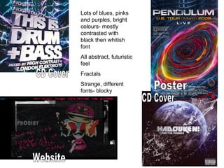
Lots of blues, pinks and purples, bright colours- mostly contrasted with black then whitish font All abstract, futuristic feel Fractals  Strange, different fonts- blocky CD Cover Website Poster CD Cover
Urban feel to it all  -arrows; like street signs Fancy swirling stuff to contrast Masks- mostly plainish but a couple are colourful Blacks in designs and clothes Cross genre appearance mirrors the combination of genres in their songs
This logo uses two fonts. The top logo is a reference to the so called glamorous life style of Hollywood by being gold edged. The second is more in your face and in a eroded font, in a similar way to a zombie would be Like the other logo this uses an eroded font. The bird on the logo relates to the idea of the lack of peace by carrying a hand grenade. The logo below looks similar to the directions on sign posts that you’d see on the road, giving it a more urban feel
I though the two fonts above would work well. They’re both easy to read and have the sort of zombie like feel of the ‘undead’ in the name of the band. I liked the second better since the font and the way it’s laid out is similar to the iconic letters on the hill in Hollywood. I also liked the font below but would not use it as it looks too cartoonish for the group.
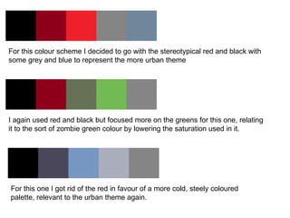
For this colour scheme I decided to go with the stereotypical red and black with some grey and blue to represent the more urban theme  I again used red and black but focused more on the greens for this one, relating it to the sort of zombie green colour by lowering the saturation used in it. For this one I got rid of the red in favour of a more cold, steely coloured palette, relevant to the urban theme again.

Presentation1

  • 1.
    Lots of blues,pinks and purples, bright colours- mostly contrasted with black then whitish font All abstract, futuristic feel Fractals Strange, different fonts- blocky CD Cover Website Poster CD Cover
  • 2.
    Urban feel toit all -arrows; like street signs Fancy swirling stuff to contrast Masks- mostly plainish but a couple are colourful Blacks in designs and clothes Cross genre appearance mirrors the combination of genres in their songs
  • 3.
    This logo usestwo fonts. The top logo is a reference to the so called glamorous life style of Hollywood by being gold edged. The second is more in your face and in a eroded font, in a similar way to a zombie would be Like the other logo this uses an eroded font. The bird on the logo relates to the idea of the lack of peace by carrying a hand grenade. The logo below looks similar to the directions on sign posts that you’d see on the road, giving it a more urban feel
  • 4.
    I though thetwo fonts above would work well. They’re both easy to read and have the sort of zombie like feel of the ‘undead’ in the name of the band. I liked the second better since the font and the way it’s laid out is similar to the iconic letters on the hill in Hollywood. I also liked the font below but would not use it as it looks too cartoonish for the group.
  • 5.
    For this colourscheme I decided to go with the stereotypical red and black with some grey and blue to represent the more urban theme I again used red and black but focused more on the greens for this one, relating it to the sort of zombie green colour by lowering the saturation used in it. For this one I got rid of the red in favour of a more cold, steely coloured palette, relevant to the urban theme again.