
Recommended
More Related Content
What's hot
What's hot (20)
Similar to SIMILAR PRODUCT RESEARCH (SPR) OF 3 FEATURE ARTICLES
Similar to SIMILAR PRODUCT RESEARCH (SPR) OF 3 FEATURE ARTICLES (20)
More from sammieharris
More from sammieharris (20)
Recently uploaded
Recently uploaded (20)
SIMILAR PRODUCT RESEARCH (SPR) OF 3 FEATURE ARTICLES
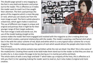
- 1. This double page spread is very engaging as the font is very bold and dynamic and jumps out to the reader. This is effective as it makes the reader want to read it as it has caught their attention. The font used portrays the genre of the magazine which is most like pop or rock, which you can clearly see from the main image as well. The font is white placed in a black box, which again makes it stand out. The use of different size images is unique and original and portrays that it might be for their younger range of their target audience. The main image is bold and stands out, the use of the model looking straight at the camera makes the reader feel more engaged and involved with the magazine as she is making direct eye contact which creates a personal relationship with the reader. The model is wearing a red flannel shirt which ties in the with the colour scheme of red, black and white which is a very typical colour scheme for a music magazine. The models makeup portrays the genre of rock which would attract the people who listen to this kind of music. The introduction to the article contains two red letters while the rest are black ‘Lily Allen’ this is the name of the model/artist. Creating these words to be bold make them stand out to the reader so that they are clear as to who she is, it also creates the page to be less boring as it is mainly just white and black. The article starts of with a very large and bold ‘I’ which takes up a majorty of the lines, this is effective as it tells you that It is her speaking making the reader want to read on, but it also makes it original and more creative.
- 2. This double page spread has the colour scheme of red, white and blue which is a commonly used colour scheme throughout music magazines especially this magazine ‘Q’. The main image of the left page is very seductive as the model lady GaGa is holding her breasts. The image is in a black and white effect which is original and unique and makes the page look very neutral and relaxing which would make it easier for the reader to relax while reading and take in the information and image. The model is making direct eye contact with the reader which creates a personal relationship. The image portrays that this magazine is for the older audience as the image may not be appropriate for the younger audience and also portrays that it is for both male and female people. The giant letter ‘L’ placed begins the article is effective as it is the only red thing on the page so I makes it stand out to the reader and it is very unique and original and effective. having it take u the whole page and article is also effective as it draws the reader in. the font used is very classy which again portrays its for the older audience. The title of this page is placed on the top right page, which when the reader turns the page they see the right hand side first, so this ensures that they will have a general understanding of the page when they are reading. The article has two letters that are bigger then the other which are placed in bolder fonts these are the firs letter of a new paragraph this is effective as it makes it look more classy at the bottom of the page there the logo for the magazine and the page number and the link to the magazines website page, this gives the reader all the information that they need.
- 3. The colour scheme for this double page spread Is white, pink and black which portrays that its for the younger target audience as pink you would stereotypically associate with young girls. The main image is really engaging to the reader as she is making direct eye contact to the reader creating a personal relationship. The outfit and accessories that she is wearing also highlight that fact that it could be for the younger female audience as the clothes she is wearing is quite unique and bold and very confident as you wouldn’t see someone wearing this out on the street. She is also placed somewhat centre of the page and taking up half the room and is also placed in front of part of the title portraying that she is a well-known artist. The title of the double page spread is “the gospel according to Nicki Minaj” the name Nicki Minaj is placed in a bigger bolder font than the rest of the title as this is the more important part as the name is so well known straight away the reader will know who she is, also the colour of this font is also a darker colour than the rest again making it stand out more. The beginning of the title is placed in a fancy, classy black font which contrasts to the rest of the title. The background of the double page spread is a baby pink colour which again portrays that age range. There is A slight white gradient effect that surrounds the title of the page this again further emphasises the title. In the introduction there are phrases that are bolder than the others this makes them stand out as they are more important than the rest. The article starts of with a ‘w’ being larger and a different colour to the rest of the article this makes it more engaging to read. The questions are in a bold font making them more visible to the reader and separate them from the rest of the writing.