
Recommended
More Related Content
What's hot
What's hot (16)
Viewers also liked
Viewers also liked (20)
Similar to My Album Cover
Similar to My Album Cover (20)
Recently uploaded
Recently uploaded (20)
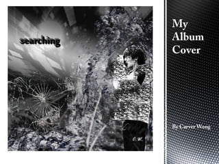
My Album Cover
- 2. I created my album cover using this size because it is a perfect square.
- 3. I created a gradient overlay using these settings so that I could potentially use it in the future.
- 4. This is what I did to change the colour spread of the gradient.
- 5. The next thing I did was add that dark fade at the bottom of my album and this is what I did. I did this so that it added a dark ominous feel.
- 6. What I did here was delete the background from a picture of myself, then I put it on the album cover.
- 7. Next, I put the image on the right into my album cover in a layer, behind the layer of myself. This is so that I could use it later on.
- 8. I decided that the dark blue background wasn’t what I was trying to convey, so I changed the colours so that it was a darkish grey colour.
- 9. What I did here was chose a brush and plotted a shadowy sort of feel on the layer of myself. So that it would create a dark misty effect.
- 10. I duplicated the layer of the image in Step 6, after that I created a mask and selected a black colour. I did this so that when I painted the black, the image would begin to appear and thus I created an image like the one above.
- 11. For this I did the same as above except I inverted the mask and used a white colour to create a different effect. The reason I did this effect was to add texture to the album cover.
- 12. For this I did the same effect as the last two except that I positioned it sideways along the bottom to that makes the effect come from the bottom.
- 13. I used five layers for the whole effect so it gave an ominous aura.
- 14. Next I found this image on the internet and inserted it above my album cover.
- 15. Firstly I changed the opacity so that it would blend nicely with the album cover.
- 16. After that I changed the black and whites of the photo to make it go with the theme.
- 17. Finally I moved it so that its layer was in front of the background layer but behind the others and then repositioned it. I chose to add this in because it gave a much more interesting background and when it coexists with the background gradient a, it creates a interesting gradient.
- 18. To cover up some space and leave a focus in the only blank space left (which is where the original gradient is), I took an image of cracked glass, changed its opacity and positioned it so that it fit nicely in the album cover.
- 19. To create a shadowy 3D effect typography I had to write the word in a text box and duplicate it many times (in this case 9). Then I had to individually move every layer a bit over to the left and up a bit so that it made it 3D. Lastly I had to change the colour for every single bit of text so that it looked like it was going down a gradient.
- 20. In the final step, I simply add my initials in the bottom right corner and change the colour to a bright white.