The document describes the Photoshop process used to design the front cover, contents page, and double page spread for a magazine. Key steps included:
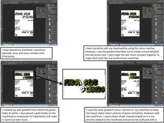
1) Adding elements like the masthead, coverlines, and issue details to the front cover and editing them using tools like gradients and textures.
2) Designing the contents page with a brick wall background, applying gradients to text, and adding page numbers and social media icons.
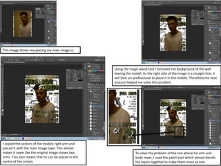
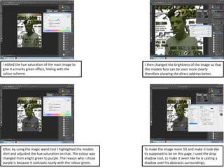
3) Editing the main image for the double page spread by adjusting lighting and composition and adding graffiti elements to the background.