3. I experimented with lighting for my digipak shoot. I used a
pink gel in the left light and a green gel in the right light.
This gave the effect I wanted however the gel’s are quite
dark in colour. This meant that the overall image was
quite dark. To fix this I used the brightening and contrast
tool to lighten the picture. This made the picture more
vibrant and eye catching.
I used the colour green as it coincides with the song
lyrics “green light”. However instead of the whole lighting
being green which I thought would be quite stereotypical
and boring, I contrasted this with the pink light. The pink
represents the love element to the song and the fun side
of the artist in the narrative.
4. Here are some other edits from the shoot
with the light gels. I experimented with the
strength of the lighting so the pink was more
prominent than the green and vice versa. The
same issue happened revolving the darkness
of the photos so I brightened them on
photoshop.
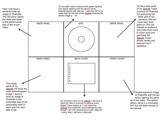
5. I began editing the images to create a cover for my digipak, I decided to do to the back cover. I knew I wanted my image to be partly black in
order for the track-list to be clear and stand out. I used a youtube tutorial to learn how to create a black gradient at the edge of the image.
I began by importing the image to
photoshop, I created a new layer.
I used the paint bucket tool to fill the new
layer black as I wanted the gradient to be
black.
I then went back to the original picture and
used the crop tool to crop it larger than what
it was.
The blank space from the crop then
showed the black layer behind it.
Using the gradient tool I dragged from the far
edge of the black side to about the middle of the
image.
This made a small gradient, I continued repeati
the gradient tool dragging process until it looked
how I wanted it to.
Finally, I cropped it into a square shape
so it fits the digipak.
6.
7. To create the text I used the text tool and selected an
area I thought the track-list would look best. I chose the
black area as then you can still clearly see the artists
face.
I chose a font I liked (Arial Narrow) and selected
the size of the font.
To make the glowing neon effect I right clicked on the layer and chose the outer glow option. There I
changed the glow to green (as it connects with the lyrics) and altered the size and spread of the glow
until I was happy with it.