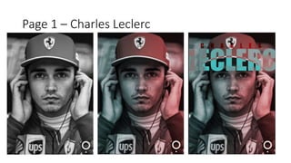
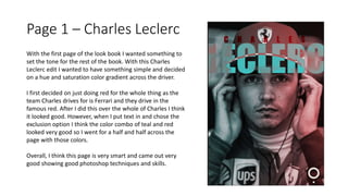
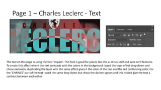
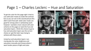
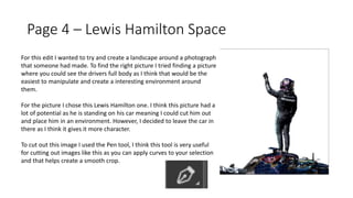
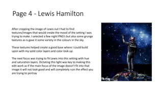
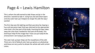
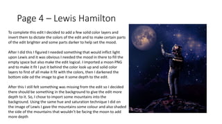
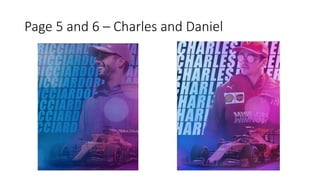
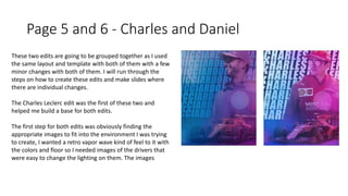
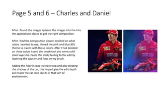
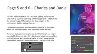
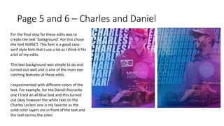
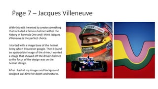
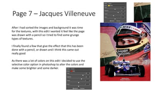
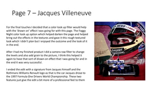
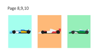
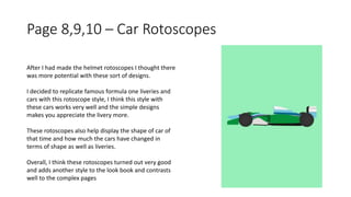
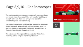
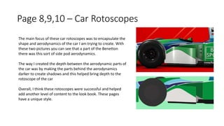
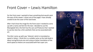
Production Reflection
Page 1 – Charles Leclerc
With the first page of the look book I wanted something to
set the tone for the rest of the book. With this Charles
Leclerc edit I wanted to have something simple and decided
on a hue and saturation color gradient across the driver.
I first decided on just doing red for the whole thing as the
team Charles drives for is Ferrari and they drive in the
famous red. After I did this over the whole of Charles I think
it looked good. However, when I put text in and chose the
exclusion option I think the color combo of teal and red
looked very good so I went for a half and half across the
page with those colors.
Overall, I think this page is very smart and came out very
good showing good photoshop techniques and skills.
Page 1 – Charles Leclerc - Text
The text on this page is using the font ‘Impact’. This font is good for pieces like this as it has serif and sans-serif features.
To create this effect where the text contrasts with the colors in the background I used the layer effect drop down and
chose exclusion, duplicating the layer with the same effect gives it the color of the teal and the red contrasting color. For
the ‘CHARLES’ part of the text I used the same drop down but chose the darken option and this helped give the text a
contrast between each other.
Page 1 – Charles Leclerc – Hue and Saturation
To get the color for this page right I tried to
use solid color masks to create the contrast
but as you can see in the second picture this
didn’t work that well. Solid color masks are
good for strong colors in photoshop work
however I wanted a more natural soft color
scheme on this page so I went for hue and
saturation layers. I think this choice to go to
hue and saturation layers was the correct
choice as I got the look I was trying to
achieve with these colors.
Using hue and saturation layers I can
manipulate the color, brightness and
saturation manually and choose where I
want harder pieces of light and color.
Page 2 – Senna Helmet
Page 2– Senna Helmet
With the second page I wanted it to be a rotoscope page. The
first thing I chose was this senna helmet to make. I found a
good picture of the helmet online where I could mask and
create my own.
The process was very simple and I think the final project turned
out well. Originally I was going to cut out the whole helmet and
mask every part of it but I looked back at my experiments and
looked at the other rotoscopes I did and I liked the idea of
having the main color as the whole page and then the actual
rotoscope being the details of the object. I think this effect
works really well with this helmet as this yellow is iconic around
the motorsport world and will look great in the final product.
Page 2 and 3 – Senna and Alesi Helmets
Both these pages follow the same concept of
rotoscoping and I think both turned out very good with
the effect I was going for.
The way I made these two pages was through the use
of masks and solid colour layers. The first thing I would
do was cut around a certain part of the helmet that I
wanted to colour in. In the Senna example I would get
the picture I chose and cut around the the green band
of the picture. Then I would then copy the selection of
that part to create new layer of just that bit of the
photo. After this, I would create a solid colour layer and
select a colour that would match the part I have just
out. After this I would clip the solid colour layer to the
layer of the part I had just cut out and that would
complete the way I would create these rotoscopes. I
would repeat these steps for every part of the helmets.
However, I left the visor of the helmets as the original
as I think that having that detail still works
Page 4 – Lewis Hamilton Space
For this edit I wanted to try and create a landscape around a photograph
that someone had made. To find the right picture I tried finding a picture
where you could see the drivers full body as I think that would be the
easiest to manipulate and create a interesting environment around
them.
For the picture I chose this Lewis Hamilton one. I think this picture had a
lot of potential as he is standing on his car meaning I could cut him out
and place him in an environment. However, I decided to leave the car in
there as I think it gives it more character.
To cut out this image I used the Pen tool, I think this tool is very useful
for cutting out images like this as you can apply curves to your selection
and that helps create a smooth crop.
Page 4 - Lewis Hamilton
After cropping the image of Lewis out I had to find
textures/images that would create the mood of the setting I was
trying to make. I selected a few night PNG’s but also some grunge
textures as is gave it some variety in the colours in the sky.
These textures helped create a good base where I could build
upon with my solid color layers and color look up.
The next focus was trying to fit Lewis into this setting with hue
and saturation layers. Dictating this light was key to making this
edit work as if the main focus of the image doesn’t fit into that
image it will not look good and will completely ruin the effect you
are trying to portray
Page 4 – Lewis Hamilton
This is where the edit started to take shape and go in the
direction I wanted to take it. Using hue and saturation layers
and also color look up it helped me shape this edit the way I
wanted.
The first step was the lighting and that was done by clipping a
hue and saturation layer that was colorized to the appropriate
color that is for that part of the body. Inverting the layer takes
away the color that I needed for that part of the body. This
technique helps fit the image that I have cut out really fit the
environment I am trying to put them in.
The color look up layer helps set the mood/tone of the edit.
There are a lot of default color look up options on photoshop
and these are very useful to dictate the whole edit with certain
colors.
Page 4 – Lewis Hamilton
To complete this edit I decided to add a few solid color layers and
invert them to dictate the colors of the edit and to make certain parts
of the edit brighter and some parts darker to help set the mood.
After I did this I figured I needed something that would inflict light
upon Lewis and it was obvious I needed the mood in there to fill the
empty space but also make the edit logical. I imported a moon PNG
and to make it fit I put it behind the color look up and solid color
layers to first of all make it fit with the colors, then I darkened the
bottom side od the image to give it some depth to the edit.
After this I still felt something was missing from the edit so I decided
there should be something in the background to give the edit more
depth to it. So, I chose to import some mountains into the
background. Using the same hue and saturation technique I did on
the image of Lewis I gave the mountains some colour and also shaded
the side of the mountains that wouldn’t be facing the moon to add
more depth
Page 5 and 6 – Charles and Daniel
Page 5 and 6 - Charles and Daniel
These two edits are going to be grouped together as I used
the same layout and template with both of them with a few
minor changes with both of them. I will run through the
steps on how to create these edits and make slides where
there are individual changes.
The Charles Leclerc edit was the first of these two and
helped me build a base for both edits.
The first step for both edits was obviously finding the
appropriate images to fit into the environment I was trying
to create, I wanted a retro vapor wave kind of feel to it with
the colors and floor so I needed images of the drivers that
were easy to change the lighting on them. The images
Page 5 and 6 – Charles and Daniel
After I found the images I placed the images into the into
the appropriate places to get the right composition.
After I had the composition down I decided on what
colors I wanted to use, I loved the pink and blue 80’s
theme so I went with those colors. After I had decided
on these colors I used the brush tool and some solid
color layers to create this misty feeling to the edit by
lowering the opacity and flow on my brush.
Adding the floor in was the next step and also creating
the shadow of the car, this helped give the edit depth
and made the car look like its in that sort of
environment.
Page 5 and 6 – Charles and Daniel
The next step was the hue and saturation lighting layers and the
color look up layers to really help with the depth of the edit to make
the car and image of Charles look like they are part of the
environment that I'm putting them in.
I also added this broken light texture to create a bit of disruption
within the edit and I think it adds some nice subtle features.
These two features are mainly to add depth to the edit and help it
come to life. However, after this I didn’t want to just put normal text
next to the driver as I think there is a lot of empty space next to
them so I decided to try and make the text a big part of the edit
Page 5 and 6 – Charles and Daniel
For the final step for these edits was to
create the text ‘background’. For this chose
the font IMPACT. This font is a good sans-
serif style font that I use a lot as I think it fits
a lot of my edits.
This text background was simple to do and
turned out well and is one of the main eye
catching features of these edits.
I experimented with different colors of the
text. For example, for the Daniel Ricciardo
one I tried an all blue text and this turned
out okay however the white text on the
Charles Leclerc one is my favorite as the
solid color layers are in front of the text and
the text carries the color.
Page 7 – Jacques Villeneuve
With this edit I wanted to create something
that included a famous helmet within the
history of Formula One and I think Jacques
Villeneuve is the perfect choice.
I started with a image base of the helmet
livery which I found on google. Then I found
an appropriate image of the driver, I wanted
a image that showed off the drivers helmet
so the focus of the design was on the
helmet design.
After I had all my images and background
design it was time for depth and textures.
Page 7 – Jacques Villeneuve
After I had sorted the images and background it was time
for the textures, with this edit I wanted it feel like the page
was drawn with a pencil so I tried to find some grunge
types of textures.
I finally found a few that give the effect that this has been
done with a pencil, or drawn and I think this came out
really good
As there was a lot of colors on this edit I decided to use the
selective color option in photoshop to alter the colors and
make some brighter and some darker.
Page 7 – Jacques Villeneuve
For the final touches I decided that a color look up filter would help
with the ‘drawn on’ effect I was going for with this page. The Foggy
Night color look up option which helped darken the page and helped
bring out the effects in the textures and gave it this rough textured
look which I didn’t plan but I enjoyed the outcome and the look of it
in the end.
After I had my finished product I did a camera raw filter to change
the levels and also add grain to the picture, I think this helped it
again to have that sort of drawn on effect that I was going for and in
the end it was very successful.
I ended the edit with a signature from Jacques himself and the
Rothmans Williams Renault logo as that is the car Jacques drove to
the 1997 Formula One Drivers World Championship. These two
features just give the edit a bit more of a professional feel to them
Page 8,9,10
Page 8,9,10 – Car Rotoscopes
After I had made the helmet rotoscopes I thought there
was more potential with these sort of designs.
I decided to replicate famous formula one liveries and
cars with this rotoscope style, I think this style with
these cars works very well and the simple designs
makes you appreciate the livery more.
These rotoscopes also help display the shape of car of
that time and how much the cars have changed in
terms of shape as well as liveries.
Overall, I think these rotoscopes turned out very good
and adds another style to the look book and contrasts
well to the complex pages
Page 8,9,10 – Car Rotoscopes
The way I created these rotoscopes was a simple process, and was
very easy to make. However, with the cars I needed to add layers
of depth so the cars shape and aerodynamics looked like
aerodynamic pieces and not the livery.
The steps to create theses rotoscopes was the same as the helmet
designs. Using the polygonal lasso tool I cut out parts of the car
and then copied the layer to add a solid color layer and clip it to
the copied layer to make the parts of the car.
This process was then repeated for every part of the car from
front wing to back wing and everything in between.
Page 8,9,10 – Car Rotoscopes
The main focus of these car rotoscopes was to encapsulate the
shape and aerodynamics of the car I am trying to create. With
these two pictures you can see that a part of the Benetton
there was this sort of side pod aerodynamics.
The way I created the depth between the aerodynamic parts of
the car was by making the parts behind the aerodynamics
darker to create shadows and this helped bring depth to the
rotoscope of the car
Overall, I think these rotoscopes were successful and helped
add another level of content to the look book. These pages
have a unique style.
Front Cover – Lewis Hamilton
For the front cover I wanted to have something that would catch
the eyes of the viewer. I chose one of the pages I have already
created to be the cover of the look book.
After I had chose the image for the front cover I needed to come
up with a name and font for the text. I decided to use the
Moonglade font, this font has the sans serif features that I wanted
to use but also has a thin aesthetic that can be associated with
art.
The title I came up with was ‘Velocita’ which is translated as
speed in Italian. I think this is a suitable name as the look book is
about racing/formula one and using an Italian translation of the
word speed as Italians are associated with fast super cars

Production reflection

  • 1.
  • 2.
    Page 1 –Charles Leclerc
  • 3.
    Page 1 –Charles Leclerc With the first page of the look book I wanted something to set the tone for the rest of the book. With this Charles Leclerc edit I wanted to have something simple and decided on a hue and saturation color gradient across the driver. I first decided on just doing red for the whole thing as the team Charles drives for is Ferrari and they drive in the famous red. After I did this over the whole of Charles I think it looked good. However, when I put text in and chose the exclusion option I think the color combo of teal and red looked very good so I went for a half and half across the page with those colors. Overall, I think this page is very smart and came out very good showing good photoshop techniques and skills.
  • 4.
    Page 1 –Charles Leclerc - Text The text on this page is using the font ‘Impact’. This font is good for pieces like this as it has serif and sans-serif features. To create this effect where the text contrasts with the colors in the background I used the layer effect drop down and chose exclusion, duplicating the layer with the same effect gives it the color of the teal and the red contrasting color. For the ‘CHARLES’ part of the text I used the same drop down but chose the darken option and this helped give the text a contrast between each other.
  • 5.
    Page 1 –Charles Leclerc – Hue and Saturation To get the color for this page right I tried to use solid color masks to create the contrast but as you can see in the second picture this didn’t work that well. Solid color masks are good for strong colors in photoshop work however I wanted a more natural soft color scheme on this page so I went for hue and saturation layers. I think this choice to go to hue and saturation layers was the correct choice as I got the look I was trying to achieve with these colors. Using hue and saturation layers I can manipulate the color, brightness and saturation manually and choose where I want harder pieces of light and color.
  • 6.
    Page 2 –Senna Helmet
  • 7.
    Page 2– SennaHelmet With the second page I wanted it to be a rotoscope page. The first thing I chose was this senna helmet to make. I found a good picture of the helmet online where I could mask and create my own. The process was very simple and I think the final project turned out well. Originally I was going to cut out the whole helmet and mask every part of it but I looked back at my experiments and looked at the other rotoscopes I did and I liked the idea of having the main color as the whole page and then the actual rotoscope being the details of the object. I think this effect works really well with this helmet as this yellow is iconic around the motorsport world and will look great in the final product.
  • 8.
    Page 2 and3 – Senna and Alesi Helmets Both these pages follow the same concept of rotoscoping and I think both turned out very good with the effect I was going for. The way I made these two pages was through the use of masks and solid colour layers. The first thing I would do was cut around a certain part of the helmet that I wanted to colour in. In the Senna example I would get the picture I chose and cut around the the green band of the picture. Then I would then copy the selection of that part to create new layer of just that bit of the photo. After this, I would create a solid colour layer and select a colour that would match the part I have just out. After this I would clip the solid colour layer to the layer of the part I had just cut out and that would complete the way I would create these rotoscopes. I would repeat these steps for every part of the helmets. However, I left the visor of the helmets as the original as I think that having that detail still works
  • 9.
    Page 4 –Lewis Hamilton Space
  • 10.
    Page 4 –Lewis Hamilton Space For this edit I wanted to try and create a landscape around a photograph that someone had made. To find the right picture I tried finding a picture where you could see the drivers full body as I think that would be the easiest to manipulate and create a interesting environment around them. For the picture I chose this Lewis Hamilton one. I think this picture had a lot of potential as he is standing on his car meaning I could cut him out and place him in an environment. However, I decided to leave the car in there as I think it gives it more character. To cut out this image I used the Pen tool, I think this tool is very useful for cutting out images like this as you can apply curves to your selection and that helps create a smooth crop.
  • 11.
    Page 4 -Lewis Hamilton After cropping the image of Lewis out I had to find textures/images that would create the mood of the setting I was trying to make. I selected a few night PNG’s but also some grunge textures as is gave it some variety in the colours in the sky. These textures helped create a good base where I could build upon with my solid color layers and color look up. The next focus was trying to fit Lewis into this setting with hue and saturation layers. Dictating this light was key to making this edit work as if the main focus of the image doesn’t fit into that image it will not look good and will completely ruin the effect you are trying to portray
  • 12.
    Page 4 –Lewis Hamilton This is where the edit started to take shape and go in the direction I wanted to take it. Using hue and saturation layers and also color look up it helped me shape this edit the way I wanted. The first step was the lighting and that was done by clipping a hue and saturation layer that was colorized to the appropriate color that is for that part of the body. Inverting the layer takes away the color that I needed for that part of the body. This technique helps fit the image that I have cut out really fit the environment I am trying to put them in. The color look up layer helps set the mood/tone of the edit. There are a lot of default color look up options on photoshop and these are very useful to dictate the whole edit with certain colors.
  • 13.
    Page 4 –Lewis Hamilton To complete this edit I decided to add a few solid color layers and invert them to dictate the colors of the edit and to make certain parts of the edit brighter and some parts darker to help set the mood. After I did this I figured I needed something that would inflict light upon Lewis and it was obvious I needed the mood in there to fill the empty space but also make the edit logical. I imported a moon PNG and to make it fit I put it behind the color look up and solid color layers to first of all make it fit with the colors, then I darkened the bottom side od the image to give it some depth to the edit. After this I still felt something was missing from the edit so I decided there should be something in the background to give the edit more depth to it. So, I chose to import some mountains into the background. Using the same hue and saturation technique I did on the image of Lewis I gave the mountains some colour and also shaded the side of the mountains that wouldn’t be facing the moon to add more depth
  • 14.
    Page 5 and6 – Charles and Daniel
  • 15.
    Page 5 and6 - Charles and Daniel These two edits are going to be grouped together as I used the same layout and template with both of them with a few minor changes with both of them. I will run through the steps on how to create these edits and make slides where there are individual changes. The Charles Leclerc edit was the first of these two and helped me build a base for both edits. The first step for both edits was obviously finding the appropriate images to fit into the environment I was trying to create, I wanted a retro vapor wave kind of feel to it with the colors and floor so I needed images of the drivers that were easy to change the lighting on them. The images
  • 16.
    Page 5 and6 – Charles and Daniel After I found the images I placed the images into the into the appropriate places to get the right composition. After I had the composition down I decided on what colors I wanted to use, I loved the pink and blue 80’s theme so I went with those colors. After I had decided on these colors I used the brush tool and some solid color layers to create this misty feeling to the edit by lowering the opacity and flow on my brush. Adding the floor in was the next step and also creating the shadow of the car, this helped give the edit depth and made the car look like its in that sort of environment.
  • 17.
    Page 5 and6 – Charles and Daniel The next step was the hue and saturation lighting layers and the color look up layers to really help with the depth of the edit to make the car and image of Charles look like they are part of the environment that I'm putting them in. I also added this broken light texture to create a bit of disruption within the edit and I think it adds some nice subtle features. These two features are mainly to add depth to the edit and help it come to life. However, after this I didn’t want to just put normal text next to the driver as I think there is a lot of empty space next to them so I decided to try and make the text a big part of the edit
  • 18.
    Page 5 and6 – Charles and Daniel For the final step for these edits was to create the text ‘background’. For this chose the font IMPACT. This font is a good sans- serif style font that I use a lot as I think it fits a lot of my edits. This text background was simple to do and turned out well and is one of the main eye catching features of these edits. I experimented with different colors of the text. For example, for the Daniel Ricciardo one I tried an all blue text and this turned out okay however the white text on the Charles Leclerc one is my favorite as the solid color layers are in front of the text and the text carries the color.
  • 19.
    Page 7 –Jacques Villeneuve
  • 20.
    Page 7 –Jacques Villeneuve With this edit I wanted to create something that included a famous helmet within the history of Formula One and I think Jacques Villeneuve is the perfect choice. I started with a image base of the helmet livery which I found on google. Then I found an appropriate image of the driver, I wanted a image that showed off the drivers helmet so the focus of the design was on the helmet design. After I had all my images and background design it was time for depth and textures.
  • 21.
    Page 7 –Jacques Villeneuve After I had sorted the images and background it was time for the textures, with this edit I wanted it feel like the page was drawn with a pencil so I tried to find some grunge types of textures. I finally found a few that give the effect that this has been done with a pencil, or drawn and I think this came out really good As there was a lot of colors on this edit I decided to use the selective color option in photoshop to alter the colors and make some brighter and some darker.
  • 22.
    Page 7 –Jacques Villeneuve For the final touches I decided that a color look up filter would help with the ‘drawn on’ effect I was going for with this page. The Foggy Night color look up option which helped darken the page and helped bring out the effects in the textures and gave it this rough textured look which I didn’t plan but I enjoyed the outcome and the look of it in the end. After I had my finished product I did a camera raw filter to change the levels and also add grain to the picture, I think this helped it again to have that sort of drawn on effect that I was going for and in the end it was very successful. I ended the edit with a signature from Jacques himself and the Rothmans Williams Renault logo as that is the car Jacques drove to the 1997 Formula One Drivers World Championship. These two features just give the edit a bit more of a professional feel to them
  • 23.
  • 24.
    Page 8,9,10 –Car Rotoscopes After I had made the helmet rotoscopes I thought there was more potential with these sort of designs. I decided to replicate famous formula one liveries and cars with this rotoscope style, I think this style with these cars works very well and the simple designs makes you appreciate the livery more. These rotoscopes also help display the shape of car of that time and how much the cars have changed in terms of shape as well as liveries. Overall, I think these rotoscopes turned out very good and adds another style to the look book and contrasts well to the complex pages
  • 25.
    Page 8,9,10 –Car Rotoscopes The way I created these rotoscopes was a simple process, and was very easy to make. However, with the cars I needed to add layers of depth so the cars shape and aerodynamics looked like aerodynamic pieces and not the livery. The steps to create theses rotoscopes was the same as the helmet designs. Using the polygonal lasso tool I cut out parts of the car and then copied the layer to add a solid color layer and clip it to the copied layer to make the parts of the car. This process was then repeated for every part of the car from front wing to back wing and everything in between.
  • 26.
    Page 8,9,10 –Car Rotoscopes The main focus of these car rotoscopes was to encapsulate the shape and aerodynamics of the car I am trying to create. With these two pictures you can see that a part of the Benetton there was this sort of side pod aerodynamics. The way I created the depth between the aerodynamic parts of the car was by making the parts behind the aerodynamics darker to create shadows and this helped bring depth to the rotoscope of the car Overall, I think these rotoscopes were successful and helped add another level of content to the look book. These pages have a unique style.
  • 27.
    Front Cover –Lewis Hamilton For the front cover I wanted to have something that would catch the eyes of the viewer. I chose one of the pages I have already created to be the cover of the look book. After I had chose the image for the front cover I needed to come up with a name and font for the text. I decided to use the Moonglade font, this font has the sans serif features that I wanted to use but also has a thin aesthetic that can be associated with art. The title I came up with was ‘Velocita’ which is translated as speed in Italian. I think this is a suitable name as the look book is about racing/formula one and using an Italian translation of the word speed as Italians are associated with fast super cars