Downloaded 205 times
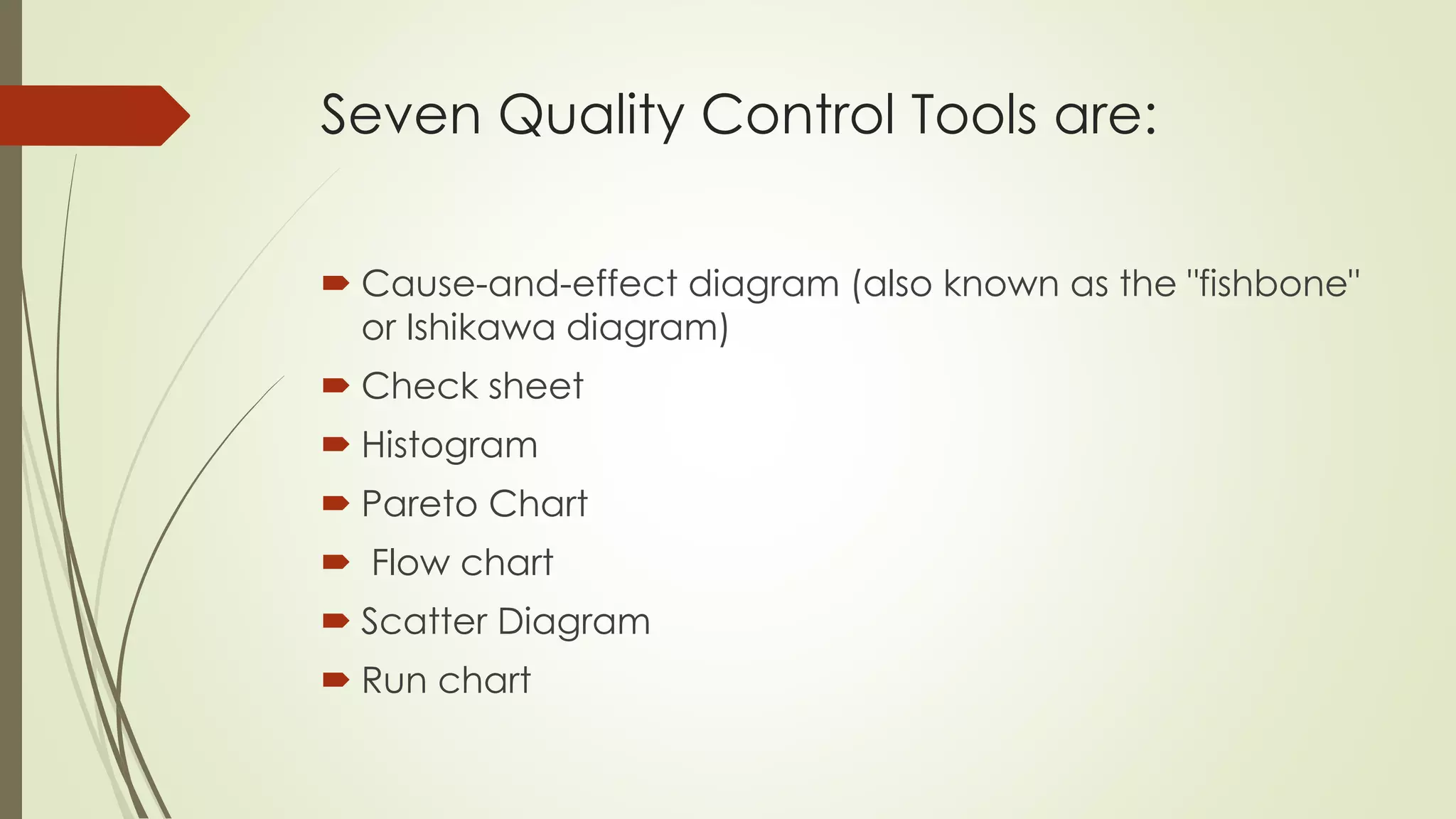
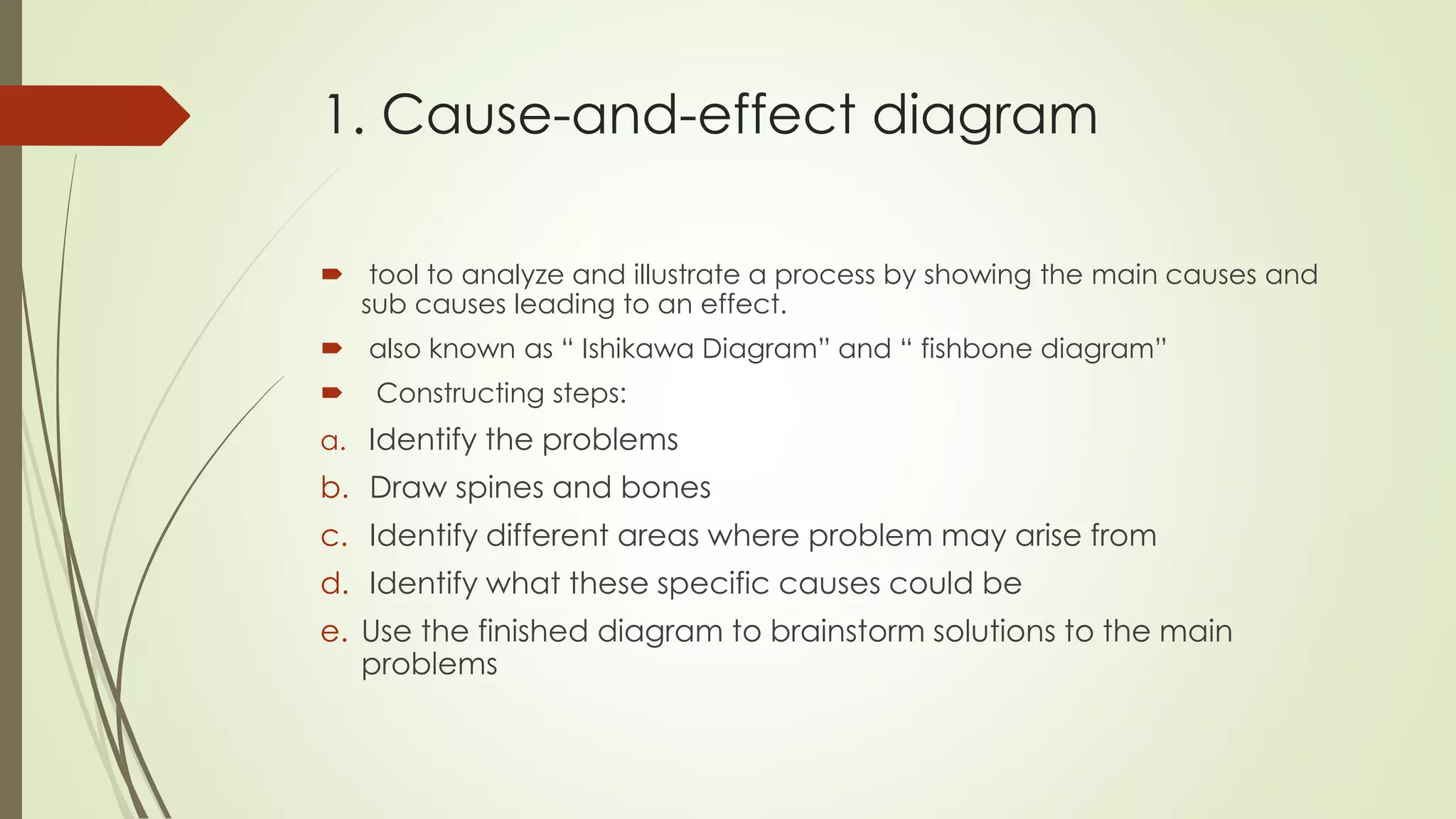
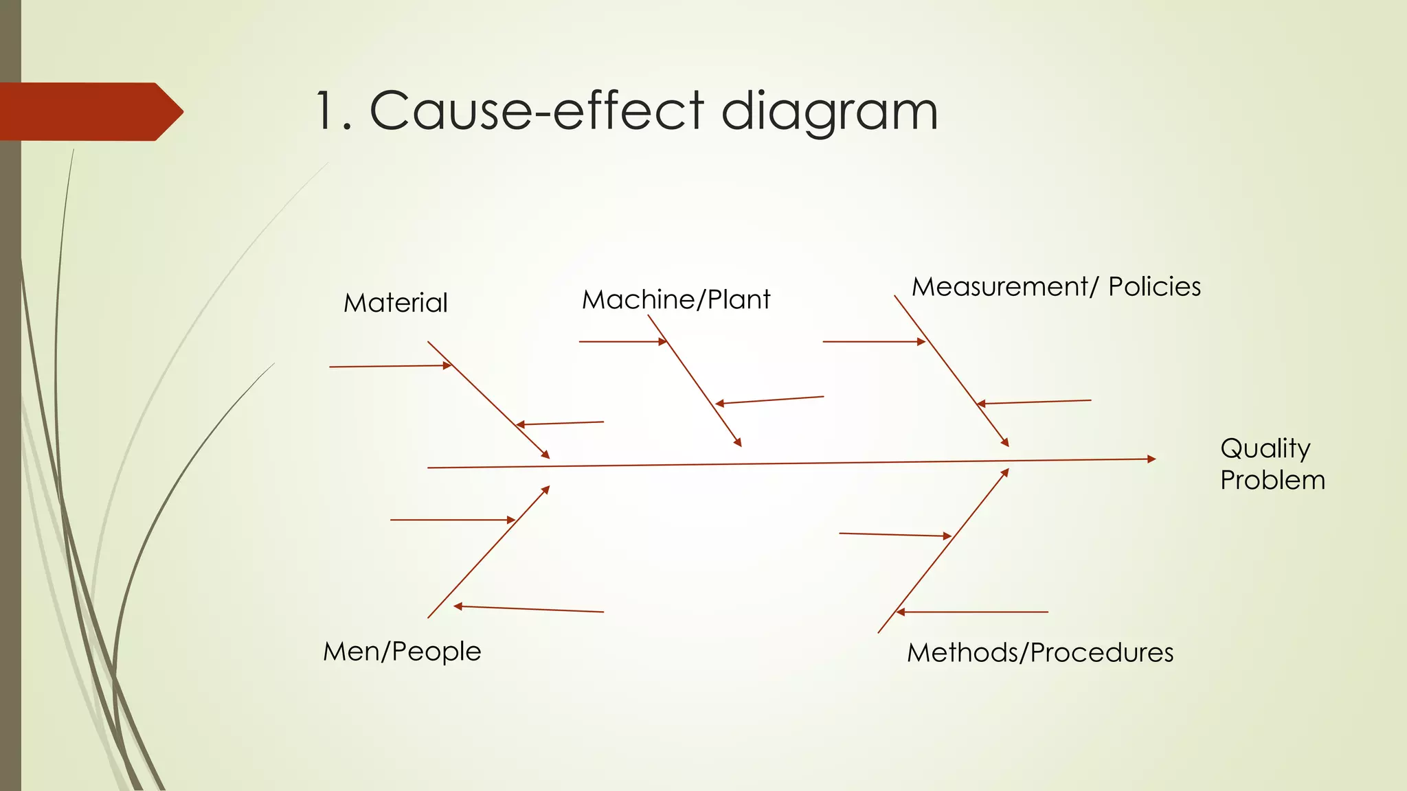
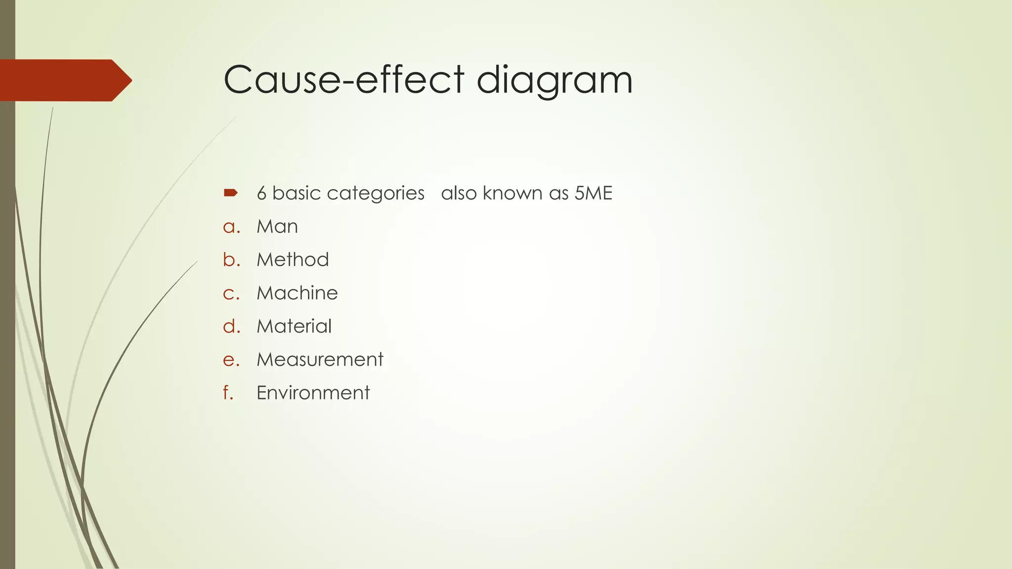


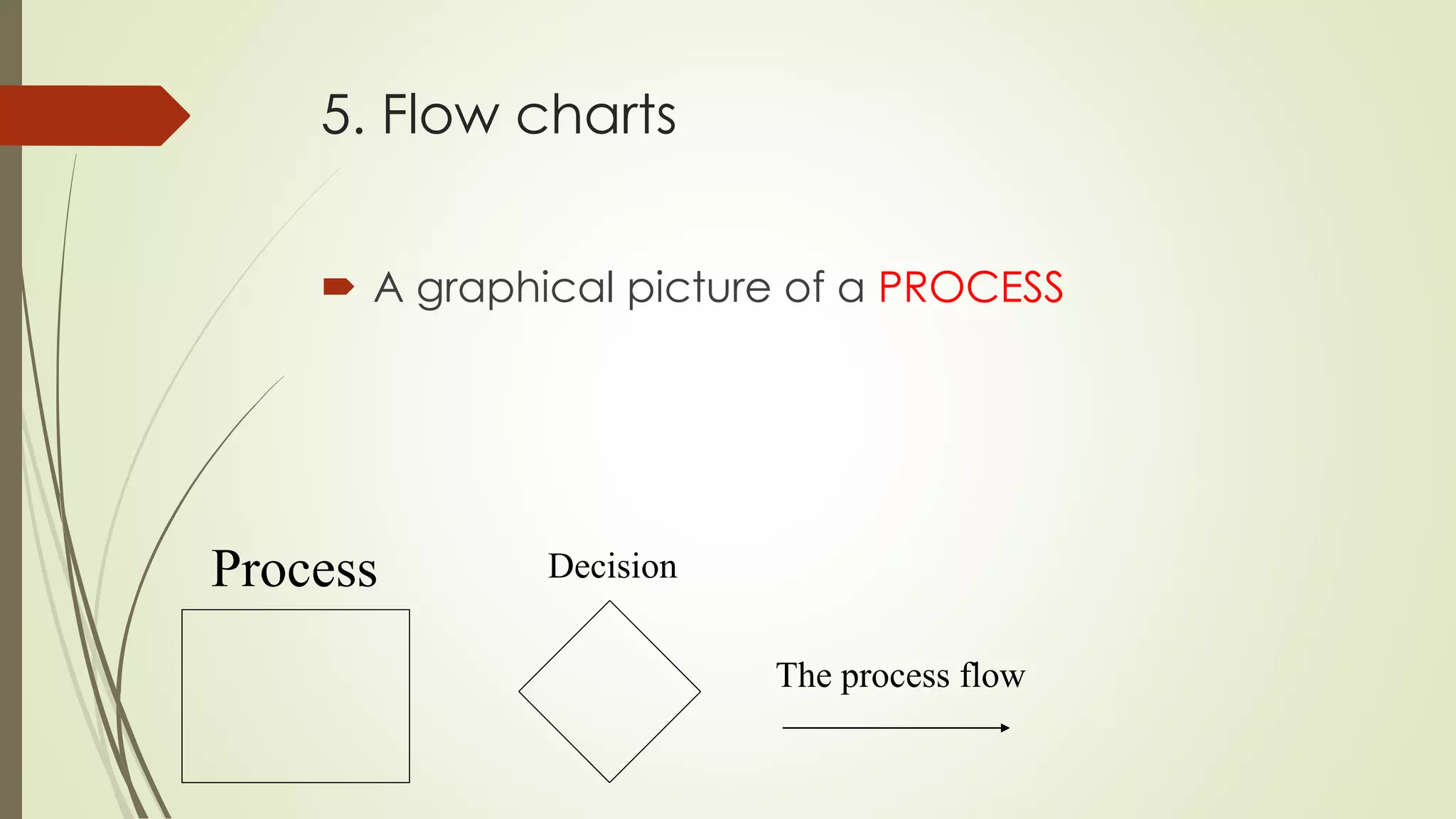
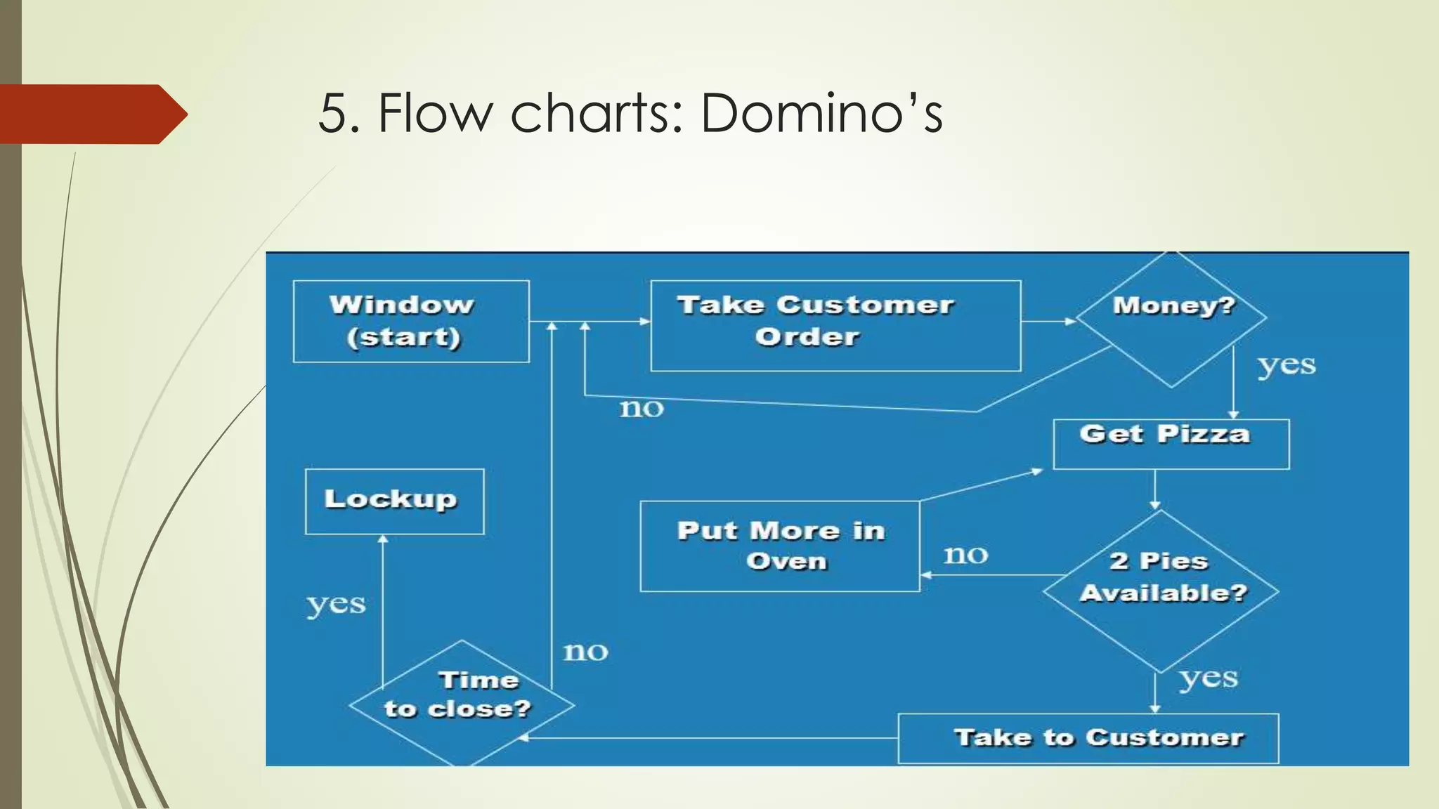
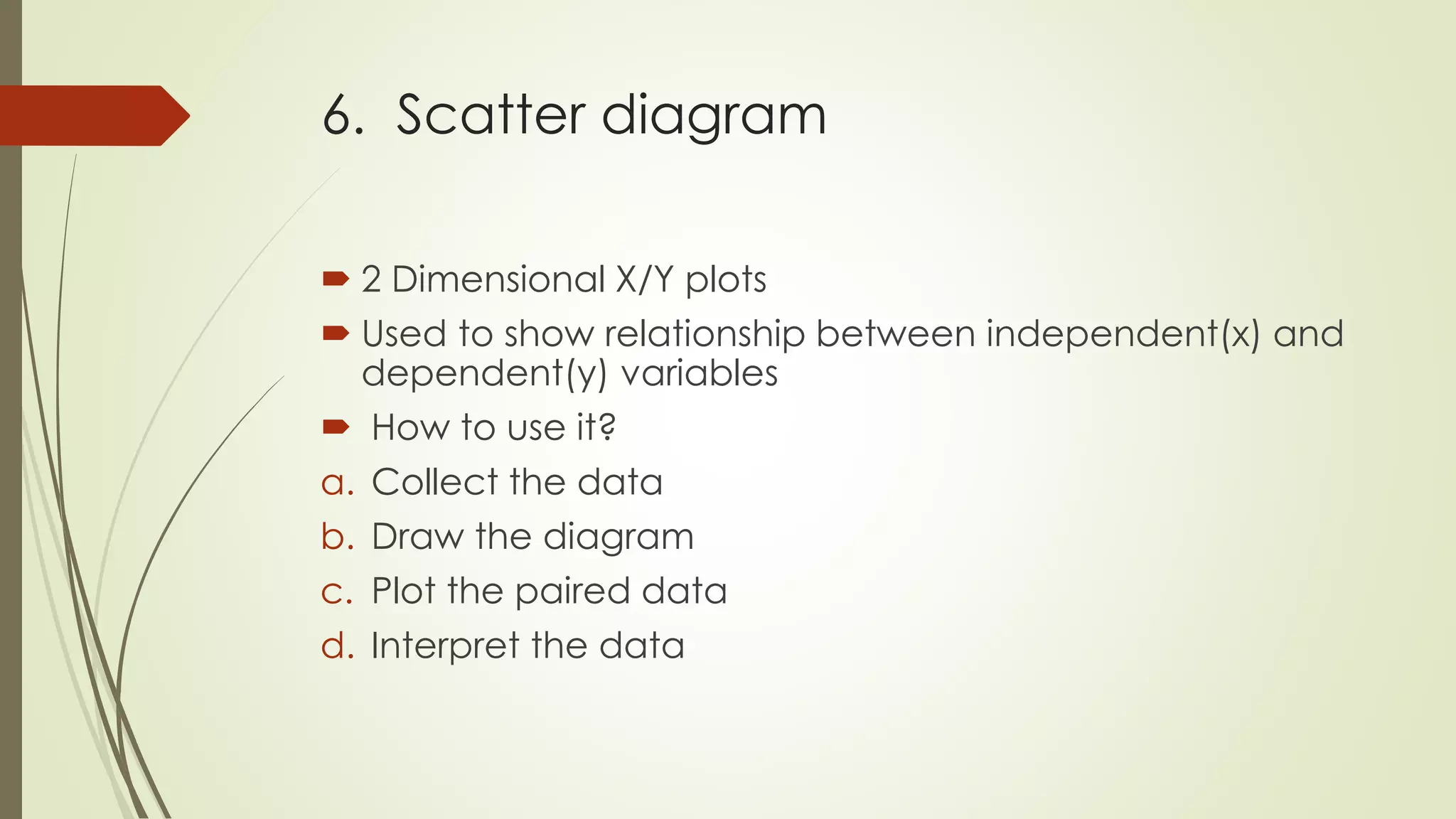
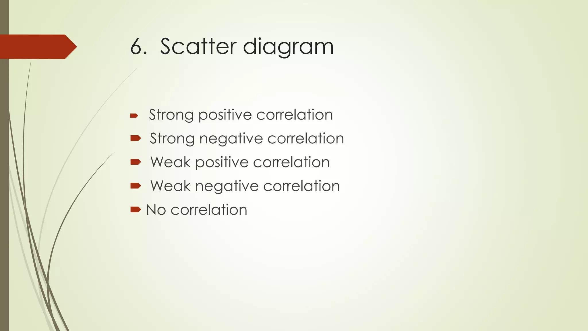
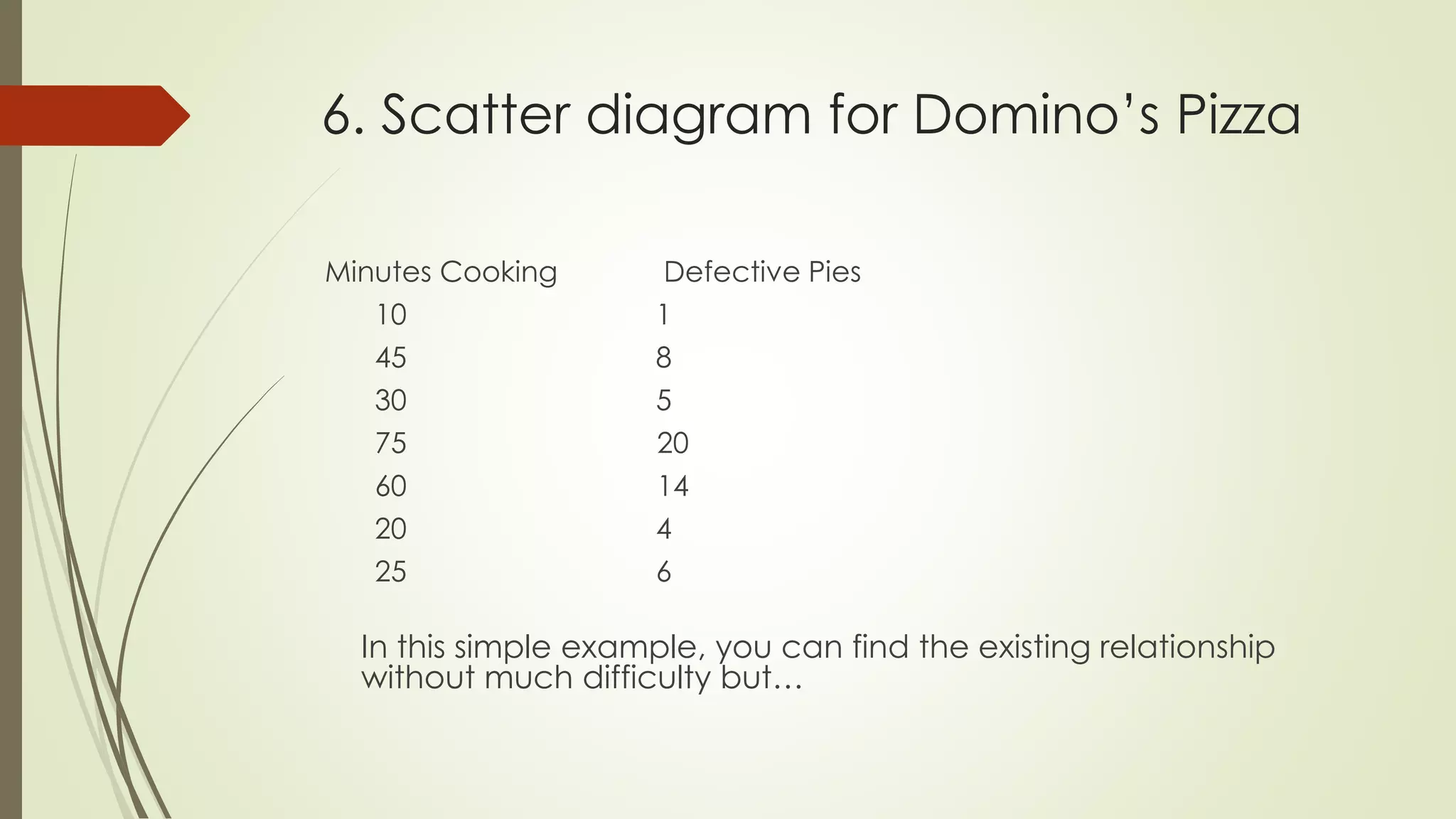
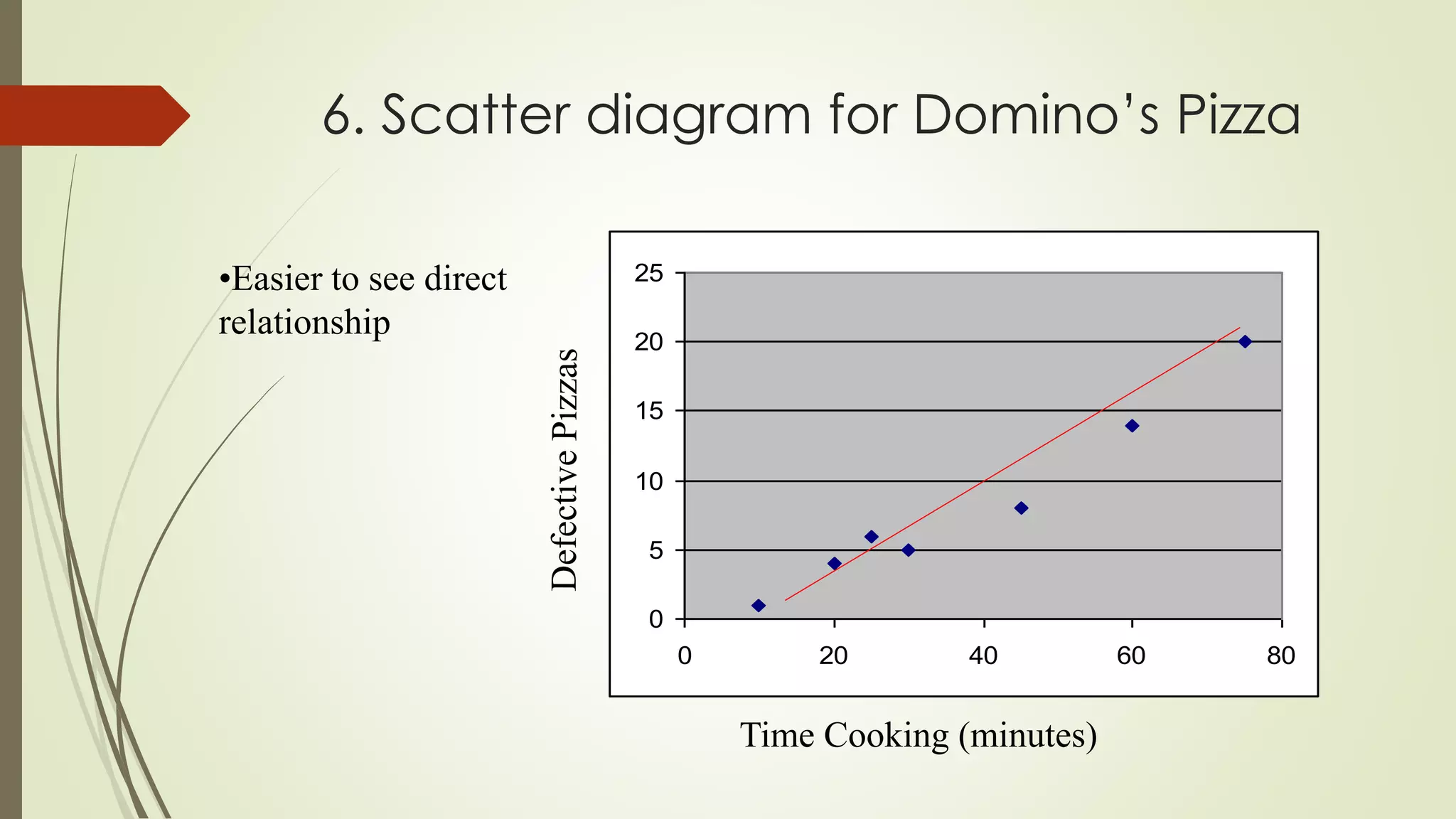
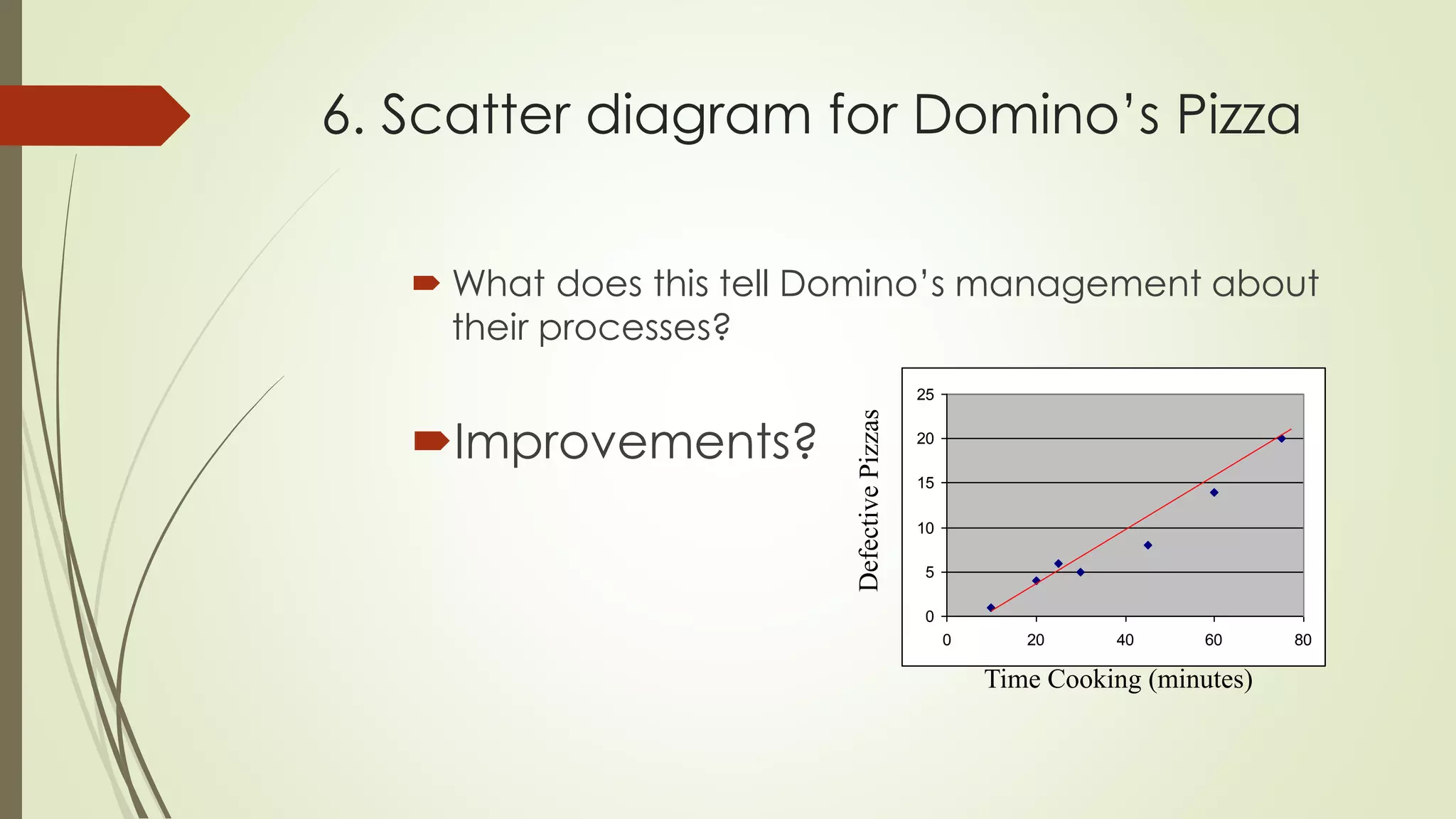
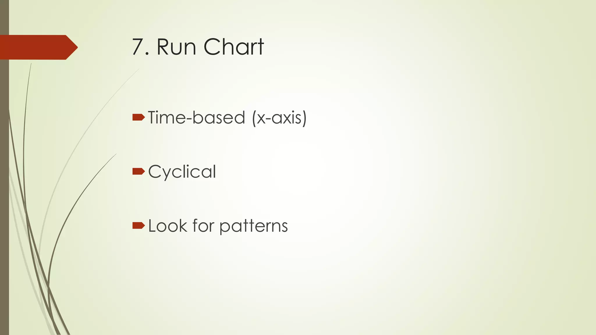
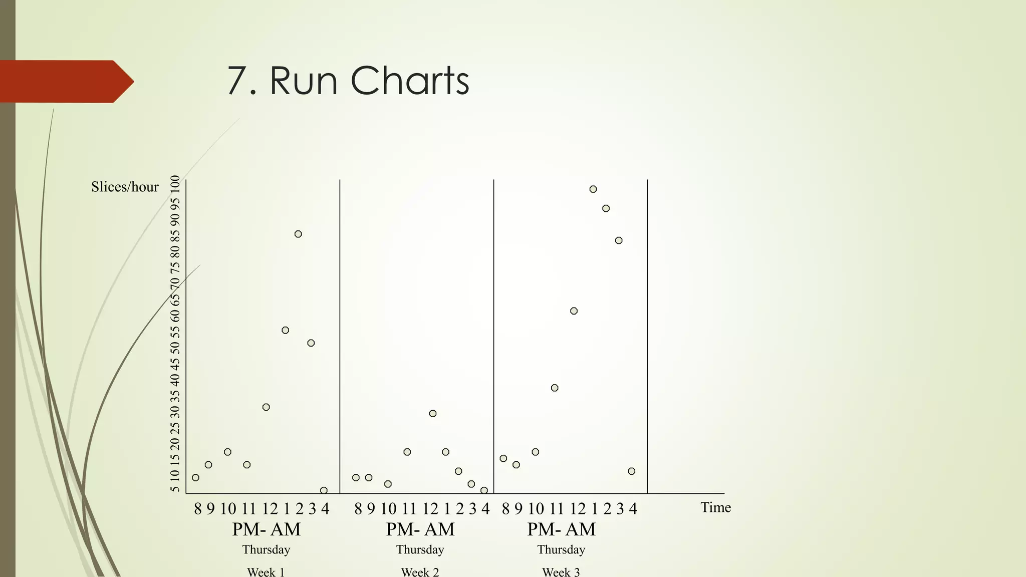

The document discusses 7 quality control tools: 1) cause-and-effect diagram, 2) check sheets, 3) histogram, 4) Pareto chart, 5) flow chart, 6) scatter diagram, and 7) run chart. These tools help identify issues, collect and analyze quality data, find root causes of problems, and monitor processes over time to ensure quality. The tools are graphical techniques that can be used with little formal training to solve most quality issues.


![7 qc tools training material[1]](https://cdn.slidesharecdn.com/ss_thumbnails/7qctoolstrainingmaterial1-120925054558-phpapp02-thumbnail.jpg?width=640&height=640&fit=bounds)


![7 Quality Control Tools (SQC Model) [MARCH 2009]](https://cdn.slidesharecdn.com/ss_thumbnails/cfakepath7qctools-100630225608-phpapp01-thumbnail.jpg?width=640&height=640&fit=bounds)


![7 qc tools[1] to print](https://cdn.slidesharecdn.com/ss_thumbnails/7qctools1toprint-191017092858-thumbnail.jpg?width=640&height=640&fit=bounds)


