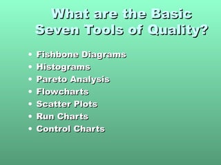
1. The Basic Seven (B7)The Basic Seven (B7)
Tools of QualityTools of Quality
A PowerPoint TrainingA PowerPoint Training
PresentationPresentation
ByBy
Kamleshwar PandeyKamleshwar Pandey
"As much as 95% of quality related problems in the factory can be solved"As much as 95% of quality related problems in the factory can be solved
with seven fundamental quantitative tools." - Kaoru Ishikawawith seven fundamental quantitative tools." - Kaoru Ishikawa
2. What are the BasicWhat are the Basic
Seven Tools of Quality?Seven Tools of Quality?
• Fishbone DiagramsFishbone Diagrams
• HistogramsHistograms
• Pareto AnalysisPareto Analysis
• FlowchartsFlowcharts
• Scatter PlotsScatter Plots
• Run ChartsRun Charts
• Control ChartsControl Charts
3. Where did the BasicWhere did the Basic
Seven come from?Seven come from?
Kaoru IshikawaKaoru Ishikawa
• Known for “Democratizing Statistics”Known for “Democratizing Statistics”
• The Basic Seven Tools made statisticalThe Basic Seven Tools made statistical
analysis less complicated for the averageanalysis less complicated for the average
personperson
• Good Visual Aids make statistical andGood Visual Aids make statistical and
quality control more comprehendible.quality control more comprehendible.
4. The Basic Seven (B7)The Basic Seven (B7)
Tools of QualityTools of Quality
Fishbone DiagramsFishbone Diagrams
• No statistics involvedNo statistics involved
• Maps out a process/problemMaps out a process/problem
• Makes improvement easierMakes improvement easier
• Looks like a “Fish Skeleton”Looks like a “Fish Skeleton”
5. Constructing a FishboneConstructing a Fishbone
DiagramDiagram
• Step 1 - Identify the ProblemStep 1 - Identify the Problem
• Step 2 - Draw “spine” and “bones”Step 2 - Draw “spine” and “bones”
Example:Example: High Inventory Shrinkage at local DrugHigh Inventory Shrinkage at local Drug
StoreStore
Shrinkage
6. Constructing aConstructing a
Fishbone DiagramFishbone Diagram
• Step 3 - Identify different areas whereStep 3 - Identify different areas where
problems may arise fromproblems may arise from
Ex. :Ex. : High Inventory Shrinkage at local Drug StoreHigh Inventory Shrinkage at local Drug Store
Shrinkage
employees
shoplifters
7. Constructing aConstructing a
Fishbone DiagramFishbone Diagram
• Step 4 - Identify what these specificStep 4 - Identify what these specific
causes could becauses could be
Ex. :Ex. : High Inventory Shrinkage at local Drug StoreHigh Inventory Shrinkage at local Drug Store
Shrinkage
shoplifters
Anti-theft tags poorly designed
Expensive merchandise out
in the open
No security/ surveillance
8. Constructing a FishboneConstructing a Fishbone
DiagramDiagram
• Ex. :Ex. : High Inventory Shrinkage at local Drug StoreHigh Inventory Shrinkage at local Drug Store
Shrinkage
shoplifters
Anti-theft tags poorly designed
Expensive merchandise out in the open
No security/ surveillance
employees
attitude
new trainee
training
benefits practices
9. Constructing a FishboneConstructing a Fishbone
DiagramDiagram
• Step 5 – Use the finished diagram toStep 5 – Use the finished diagram to
brainstorm solutions to the main problems.brainstorm solutions to the main problems.
10. The Basic Seven (B7)The Basic Seven (B7)
Tools of QualityTools of Quality
HistogramsHistograms
• Bar chartBar chart
• Used to graphically represent groupsUsed to graphically represent groups
of dataof data
11. ConstructingConstructing a Histograma Histogram
From a set of data computeFrom a set of data compute
• sumsum
• mean (x)mean (x)
• MaxMax
• MinMin
• Range (max-min)Range (max-min)
12. ConstructingConstructing a Histograma Histogram
• Use range to estimate beginningUse range to estimate beginning
and endand end
• Calculate the width of eachCalculate the width of each
column by dividing the range bycolumn by dividing the range by
the number of columnsthe number of columns
Range
# of Columns
= Width
14. Superb Pizza ExampleSuperb Pizza Example
Mean = 2.032258Mean = 2.032258
Max = 7Max = 7
Min = 0Min = 0
Range = 7Range = 7
QuestionQuestion
For 7 columns what would the widthFor 7 columns what would the width
be?be?
Range/Columns=7/7=1 slice
16. Constructing a HistogramConstructing a Histogram
How is this helpful to Superb?How is this helpful to Superb?
• 2 slices of pizza most common order2 slices of pizza most common order
placedplaced
• Distribution of sales useful forDistribution of sales useful for
forecasting next Thursday’s lateforecasting next Thursday’s late
night demandnight demand
If you were an Superb manager howIf you were an Superb manager how
could you apply this information?could you apply this information?
17. The Basic Seven (B7)The Basic Seven (B7)
Tools of QualityTools of Quality
Pareto AnalysisPareto Analysis
• Very similar to HistogramsVery similar to Histograms
• Use of the 80/20 ruleUse of the 80/20 rule
• Use of percentages to showUse of percentages to show
importanceimportance
19. Superb Pizza (part 2)Superb Pizza (part 2)
• The completed Pareto Analysis results in theThe completed Pareto Analysis results in the
following graph:following graph:
0
10
20
30
40
50
60
70
1 2 3 4 5 6 7
Slices of Pizza
#timesordered
2 1 4 3 7 5 6
20. Superb Pizza (part 2)Superb Pizza (part 2)
Critical ThinkingCritical Thinking
• How does the Pareto AnalysisHow does the Pareto Analysis
differ from the Histogram?differ from the Histogram?
• How can this be a useful tool toHow can this be a useful tool to
the Superb boss?the Superb boss?
21. The Basic Seven (B7)The Basic Seven (B7)
Tools of QualityTools of Quality
FlowchartsFlowcharts
• A graphical picture of a PROCESSA graphical picture of a PROCESS
Process Decision
The process flow
22. FlowchartsFlowcharts
Don’t Forget to:Don’t Forget to:
• Define symbols before beginningDefine symbols before beginning
• Stay consistentStay consistent
• Check that process is accurateCheck that process is accurate
23. Superb Pizza ExampleSuperb Pizza Example
(Flowchart)(Flowchart)
WindowWindow Take CustomerTake Customer Money?Money?
(start)(start) OrderOrder
Get PizzaGet Pizza
LockupLockup
Put More inPut More in
OvenOven 2 Pies2 Pies
Available?Available?
TimeTime
to close?to close?
Take to CustomerTake to Customer
no
yes
no
yes
no
yes
24. How can we use the flowchart toHow can we use the flowchart to
analyze improvement ideas fromanalyze improvement ideas from
the Histogram?the Histogram?
WindowWindow Take CustomerTake Customer Money?Money?
(start)(start) OrderOrder
Get PizzaGet Pizza
LockupLockup
Put More inPut More in
OvenOven 2 Pies2 Pies
Available?Available?
TimeTime
to close?to close?
Take to CustomerTake to Customer
no
yes
no
yes
no
yes
25. Want some practice?Want some practice?
Make a flowchart for:Make a flowchart for:
• Taking a showerTaking a shower
• Cooking dinnerCooking dinner
• Driving a carDriving a car
• Having a partyHaving a party
• Creating a FlowchartCreating a Flowchart
Any other processes you can think of?Any other processes you can think of?
26. The Basic Seven (B7)The Basic Seven (B7)
Tools of QualityTools of Quality
Scatter PlotsScatter Plots
• 2 Dimensional X/Y plots2 Dimensional X/Y plots
• Used to show relationshipUsed to show relationship
between independent(x) andbetween independent(x) and
dependent(y) variablesdependent(y) variables
27. Superb PizzaSuperb Pizza
(Scatter Diagram)(Scatter Diagram)
Minutes CookingMinutes Cooking Defective PiesDefective Pies
1010 11
4545 88
3030 55
7575 2020
6060 1414
2020 44
2525 66
In this simple example, you can find the existingIn this simple example, you can find the existing
relationship without much difficulty but…relationship without much difficulty but…
29. Scatter DiagramsScatter Diagrams
As a quality toolAs a quality tool
• What does this tell SuperbWhat does this tell Superb
management about theirmanagement about their
processes?processes?
• Improvements?Improvements?
0
5
10
15
20
25
0 20 40 60 80
Time Cooking (minutes)
DefectivePizzas
30. The Basic Seven (B7)The Basic Seven (B7)
Tools of QualityTools of Quality
Run chartsRun charts
• Time-based (x-axis)Time-based (x-axis)
• CyclicalCyclical
• Look for patternsLook for patterns
31. Run ChartsRun Charts
8 9 10 11 12 1 2 3 4 8 9 10 11 12 1 2 3 4 8 9 10 11 12 1 2 3 4
PM- AM PM- AM PM- AM
Thursday Thursday Thursday
5101520253035404550556065707580859095100
Slices/hour
Time
32. The Basic Seven (B7)The Basic Seven (B7)
Tools of QualityTools of Quality
Control ChartsControl Charts
• Deviation from MeanDeviation from Mean
• Upper and Lower Spec’sUpper and Lower Spec’s
• RangeRange
34. Control ChartsControl Charts
Superb Pizza Management wants to get
in on the control chart action
•Average Diameter = 16 inches
•Upper Limit = 17 inches
•Lower Limit = 15 inches
35. Superb exampleSuperb example
Control ChartsControl Charts
Upper LimitUpper Limit
17 inches17 inches
Lower LimitLower Limit
15 Inches15 Inches
Small Pie
X16 inches=
36. Superb example #50Superb example #50
Control ChartsControl Charts
•Pies within specifications were
acceptable
•One abnormally small pie is
“uncommon”
•Should be examined for quality control
37. SummarySummary
• Basic Seven Tools of QualityBasic Seven Tools of Quality
• Measuring dataMeasuring data
• Quality AnalysisQuality Analysis
• ““Democratized statistics”Democratized statistics”
38. BibliographyBibliography
• Foster, Thomas.Foster, Thomas. InternetInternet
• Stevenson, William.Stevenson, William. InternetInternet
• ““Dr Kaoru Ishikawa.” InternetDr Kaoru Ishikawa.” Internet ..
• ““Chemical and Process Engineering.”Chemical and Process Engineering.” Internet.Internet.
Editor's Notes
Quote taken from http://wit.ksc.nasa.gov/spc/7_tools.cfm
“Democratizing Statistics” refers to the will of Ishikawa to spread Quality control throughout the workplace. The desire to make Quality control comprehendible for all of the workers.
Also known as Ishikawa Diagrams and Cause and Effect Diagrams. By mapping out a company’s problem, new thoughts and ideas can arise to better the situation. Sheds light on situations.
Diagrams begin with the problem to be solved in a rectangle.
For the example Diagram, inventory shrinkage was used. This is a measure of the shoplifted, stolen, or broken goods at a store.
This is placed in a rectangle at the “head” of the fish.
Here “employees” and “shoplifters” were used as categories that problems may have come from. In other examples, it is acceptable to use Machines, Materials, Methods, and People as general categories(These are from Foster, see bibliography). These should encompass all aspects of the business.
The brainstorming process should continue until every angle is covered. Keeping asking for examples until no more exist. According to Foster, 5 causes should be enough for most categories.
With the completion of the diagram, several points have been made about inventory shrinkage’s possible sources. These may or may not have been obvious to management before this brainstorming process occurred.
At this time, you can go back to the previous slide and brainstorm with the class about solutions to these problems, or other causes. This is the utility of the Cause-and-Effect Diagram.
Moving expensive merchandise behind the counters and educating employees to their perks may be some solutions to this problem.
Histograms are used to show the different frequencies in a process. It is useful for identifying trends and relationships that can lead to quality improvements.
These numbers represent the customers order at the order window at the pizza store. For example, the first customer didn’t order any pizza, the second ordered 2 slices, the third ordered 1 and so on. It should be noticed that the highest order was 7 slices and the lowest was 0. This is used to find the range which is used to find the column width for the histogram.
With this information computed, all that is left to do is chart the histogram.
Helpful in showing orders frequencies and variation.
Most common types of orders placed is valuable information. Knowing that the average customer will order 2 slices of pizza can be implemented into Superb’s strategic plan. By taking at least 2 slices up to the window at peak hours, this can improve Superb’s customer service and speed. It makes the line move much faster making the perceived quality higher for the customer.
Vilfredo Pareto (1848-1923) originated the 80/20 Rule, which states that 80% of the problems comes from only 20% of the causes. Pareto Analysis is very similar to Histograms but it incorporates this theory into it. Pareto Analysis adds weight to the most frequently occurring things.
The % column represents the slices percentage of total frequency. This dictates the order of the Pareto diagram which is always scaled according to size.
This sheds light on the most frequently ordered quantities. It is also common to plot percentages on the same graph.
Answer #1: The Pareto Analysis Shows percentages. Is ordered to reflect frequency of occurrences.
Answer #2: Helps identify trends. Useful for quality improvements and planning processes.
The rectangle, diamond and line are the standard symbols for flowcharts. There can be extra/different symbols depending on the process/business. The important thing is that it is consistent and maps out the process efficiently. Once flowcharts are effectively drawn they can shed light on possible problems or improvements.
Superb’s flowchart
Answer: Since we know that 2 slices is the most common order we could possibly add a step between Time to close and take customer order. If we brought two slices up to the window during peak hours this would quicken service. There are multiple improvements that can be made on the process. The class can brainstorm on ways of improving this flowchart.
Note that a decision must be made at each triangle before the next step can begin.
Scatter plots take place on an X and Y graph. Whichever variable is on the bottom should be the dependent variable. This means that the Y variable changes according to changes in X. In the upcoming example, Minutes cooking the pizza’s will directly affect the number of defective pies that are produced.
Scatter plots are useful for finding direct or indirect relationships which can then be used to analyze/improve quality.
This is meant to show the data. It isn’t too difficult for students to see that there is a direct relationship between Minutes cooking and defects. But the Scatter Plot will make this easier to see.
There is a direct relationship between time spent cooking by employees and defects. As Time cooking increases, so does the amount of defects.
Answer: There is obviously some kind of process problem with the number of defective pies being produced. Maybe the cooks are getting sloppy from working too fast. Or maybe morale is low and there is just apathetic work being done. Whatever the case, if this was actually happening, quality improvements would have to be studied and implemented.
Run Charts are used to plot data based on time. It’s very useful for identifying trends and cycles. The X-axis is usually the time element and the y axis is the process to be tracked. The following slide shows another Superb example that should make this easy to understand.
Ask the class what trends they can identify. Week 2’s Thursday was a rainy day. Business Peaks between 1 and 3 each night so this is very valuable information to the management. Also with the exception of the rainy day, business seems to increase with warmer weather. Have the class come up with any other trends they can see or ideas to help improve quality based on this information. Such as higher staffing between 1 and 3 or higher inventory levels/preparation etc.
Control charts are a means of regulating a process. It tracks the output of a process and its conformance to the company’s standards. As long as the process stays within the upper and lower limits then the process is “safe” and normal. Any observations made outside of the limits are irregular and problematic. They need to be immediately researched to improve quality. A process that consistently stays “safe” is a good quality process.
X= mean
The majority of observations have fallen close the average. The one that’s under the lower limit is irregular, it needs to be examined and fixed.
The average Diameter can be calculated by taking the average of a sample number of pizzas. As long as the sample’s average is close enough to 16 inches to satisfy management (ex. Within +/- .01 inches) then the average can be said to be 16 inches. Then from that management can decide what is the biggest/smallest allowable pies that are acceptable.
Monitoring the pizza process, this example shows how almost every pie is within specifications. The process should be analyzed to discover why the one small pie was produced and corrected to improve quality.
Once the process is fixed the Control Chart continues to flow, any further abnormalities also need to be studied and fixed.
All of these tools together can provide great process tracking and analysis that can be very helpful for quality improvements. These tools make quality improvements easier to see, implement and track.