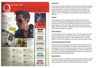
1. House Style
The banner across the top displays the masthead and the title of the page
in bold lettering, which attracts the eye of the reader. There are various
images laid out across the page to display the kind of bands that are
featured inside the magazine. The red colouring of the heading is the
signature colour of ‘Q’ magazine, and provides a contract between the
dark text.
Imagery
The photographs on the page display the kinds of bands/artists that
feature in the magazine. The photographs range from close up portrait
shots (Alex Turner, centre) to full body shots (Haim, right). The layout of
these images is central on the page, attracting the eye, and enticing
people to read the contents- making them want to see if any bands they
like are featured within the magazine.
Target Audience
The target audience for ‘Q’ magazine is 18+. I can tell this because of the
kinds of advertisements that are featured inside. The adverts include
alcoholic drinks and car insurance. I don’t think that there is a specific
gender in mind for this magazine as the adverts are quite gender neutral.
The Guttenberg Design Principle
The primary focal area displays the masthead for the magazine. The axis
shows the various images added to the page, as well as the contents of
the magazine. The terminal focal area presents some of the reviews that
are inside the magazine, possibly placed there to attract the attention of
the reader. The strong fallow field presents the title of the reviews, with
the weak fallow field including plain text.
Design Balance
The balance of words and images on the page is 50/50, providing an equal
balance with neither element overwhelming the other. The pictures are
large, attracting the reader’s eye and enticing them to read more.