This document discusses the key elements and conventions of a double page magazine spread. It notes that double page spreads usually feature a large central image of the celebrity or person being profiled. They also typically include an eye-catching quote to grab readers' attention. Additionally, the celebrity's name is prominently displayed to identify who the article is about. The text is usually organized into columns and includes elements like a stand first, headlines, and bylines. Color schemes are chosen to suit the magazine's target audience without distracting from the content.
La aventura es una de las grandes fascinaciones del género humano. La mejor manera de entusiasmar a un niño para que emprenda una nueva tarea es convencerlo de que es una aventura. Y, más tarde, el entusiasmo por las aventuras será el centro de la vida de muchos hombres y mujeres.
Sígueme en mis redes sociales:
Twitter: https://twitter.com/PiconPercy?lang=es
Linkedin: https://pe.linkedin.com/in/percy-reat...
Pinterest: https://www.pinterest.com/percyreateg...
Google Plus: https://plus.google.com/u/0/105147685...
Wordpress: https://percyreateguipiconblog.wordpr...
In the digital age, good design doesn’t just result in products, it results in new relationships.
What does it really mean to be “digital”? How do non-software organisations thrive in today’s disruptive landscape? What are the key components that make for a digital transformation?
In his keynote, Alvaro introduces the necessary components for today's organisations to thrive through Strategic Design and Experience Strategy.
This is Tom's answer to question 1 of the evaluation for our music magazine. The question is, "In what way does your media product use, develop or challenge codes and conventions of real media products?".
Transforming Brand Perception and Boosting Profitabilityaaryangarg12
In today's digital era, the dynamics of brand perception, consumer behavior, and profitability have been profoundly reshaped by the synergy of branding, social media, and website design. This research paper investigates the transformative power of these elements in influencing how individuals perceive brands and products and how this transformation can be harnessed to drive sales and profitability for businesses.
Through an exploration of brand psychology and consumer behavior, this study sheds light on the intricate ways in which effective branding strategies, strategic social media engagement, and user-centric website design contribute to altering consumers' perceptions. We delve into the principles that underlie successful brand transformations, examining how visual identity, messaging, and storytelling can captivate and resonate with target audiences.
Methodologically, this research employs a comprehensive approach, combining qualitative and quantitative analyses. Real-world case studies illustrate the impact of branding, social media campaigns, and website redesigns on consumer perception, sales figures, and profitability. We assess the various metrics, including brand awareness, customer engagement, conversion rates, and revenue growth, to measure the effectiveness of these strategies.
The results underscore the pivotal role of cohesive branding, social media influence, and website usability in shaping positive brand perceptions, influencing consumer decisions, and ultimately bolstering sales and profitability. This paper provides actionable insights and strategic recommendations for businesses seeking to leverage branding, social media, and website design as potent tools to enhance their market position and financial success.
You could be a professional graphic designer and still make mistakes. There is always the possibility of human error. On the other hand if you’re not a designer, the chances of making some common graphic design mistakes are even higher. Because you don’t know what you don’t know. That’s where this blog comes in. To make your job easier and help you create better designs, we have put together a list of common graphic design mistakes that you need to avoid.
Hello everyone! I am thrilled to present my latest portfolio on LinkedIn, marking the culmination of my architectural journey thus far. Over the span of five years, I've been fortunate to acquire a wealth of knowledge under the guidance of esteemed professors and industry mentors. From rigorous academic pursuits to practical engagements, each experience has contributed to my growth and refinement as an architecture student. This portfolio not only showcases my projects but also underscores my attention to detail and to innovative architecture as a profession.
Dive into the innovative world of smart garages with our insightful presentation, "Exploring the Future of Smart Garages." This comprehensive guide covers the latest advancements in garage technology, including automated systems, smart security features, energy efficiency solutions, and seamless integration with smart home ecosystems. Learn how these technologies are transforming traditional garages into high-tech, efficient spaces that enhance convenience, safety, and sustainability.
Ideal for homeowners, tech enthusiasts, and industry professionals, this presentation provides valuable insights into the trends, benefits, and future developments in smart garage technology. Stay ahead of the curve with our expert analysis and practical tips on implementing smart garage solutions.
Book Formatting: Quality Control Checks for DesignersConfidence Ago
This presentation was made to help designers who work in publishing houses or format books for printing ensure quality.
Quality control is vital to every industry. This is why every department in a company need create a method they use in ensuring quality. This, perhaps, will not only improve the quality of products and bring errors to the barest minimum, but take it to a near perfect finish.
It is beyond a moot point that a good book will somewhat be judged by its cover, but the content of the book remains king. No matter how beautiful the cover, if the quality of writing or presentation is off, that will be a reason for readers not to come back to the book or recommend it.
So, this presentation points designers to some important things that may be missed by an editor that they could eventually discover and call the attention of the editor.
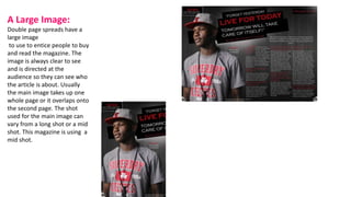
1. A Large Image:
Double page spreads have a
large image
to use to entice people to buy
and read the magazine. The
image is always clear to see
and is directed at the
audience so they can see who
the article is about. Usually
the main image takes up one
whole page or it overlaps onto
the second page. The shot
used for the main image can
vary from a long shot or a mid
shot. This magazine is using a
mid shot.
2. A quote
Another code and convention of a
double page spread is a quote. This
usually is big and says something
which will grab the audience’s
attention. Usually the quote is
presented at the top of the headline
or sometimes to break text up.
On this double page spread the
quote given is an example of what
Justin Bieber said in his ‘exclusive
interview’.
3. Celebrities name
The celebrities name is nearly always on the
double page spread in big writing. This
makes them stand out more as celebrities
and shows there importance . The
celebrities name also tells us who the article
is about, along with the image. This double
page spread is about ‘Rita Ora’, this is
someone who is very famous and well
recognised in the publics eye.
4. Stand first
A stand first it usually an
introduction to the celebrity. This
allows readers who are unsure on
who the celebrity is to gain an
insight into the celebrity before
reading an article about them.
5. The text
The text on a double page spread is usually set
into columns and sections, this makes the double
page spread look more organised on a whole. This
also makes the text structured. The font is usually
the same to fit the genre. There is also a Drop Cap
to show the reader where to start reading.
6. Images
The image on a double page spread could
be anywhere on the page however it is
commonly on the left hand side page, or
across both pages. The picture on the
Double Page Spread is usually of the person
the article is about, so that it is relevant.
7. By-lines, Headlines, Article
By-lines- These give credit to the writer or the photographer and usually are located under the text or
image.
Headline- The headline on a double page spread is often eye catching and try's to intrigue the reader. It is
usually short as this is more appealing.
Article- The article usually isn’t too formal depending on the target market or genre of the magazine. For
a music magazine the article is usually informal as it can make the reader feel at ease.
8. Colour scheme
The colour scheme to a double page spread is usually simple and is rather easy on the eye. The colour scheme
is usually calm colours so it doesn’t distract the attention from the article. Depending on the genre of the
magazine, the colour scheme will change to fit that Target Audience. For example, a teenage pop magazine
might use pink/purple tones, however a alternative music magazine might use dark and dull colours.