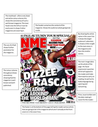
1. The masthead – often a red, black
and white colour scheme this
shows the consistency of such a
well known magazine. The mast
head is too the left so it can be
easily seen in shops if other
magazines are covering it.
Price, issue number and
the date making it
easier for the reader.
The header sumarises the content of the
magazine. Shows the audience whats going to be
inside.
By showing the artists
name in the cover line
it draws the target
audience’s attention.
It shows a little insight
to the main story in
the magazine and
then the smaller
stories.
The main image takes
up the whole of the
page. His facial
expression is positive
which will appeal to
the reader and make
them want to carry on
reading. As well as his
body language being
opening and
welcoming.
The footer is at the bottom of the page telling the reader various artists
that are going to be in this magazine which aren’t already on the front
cover or in the cover lines.
The use of a flash
shows further
promotion for
the magazine.
The colour scheme
throughout shows
consistency
showing that the
magazine is well
known and well
published.