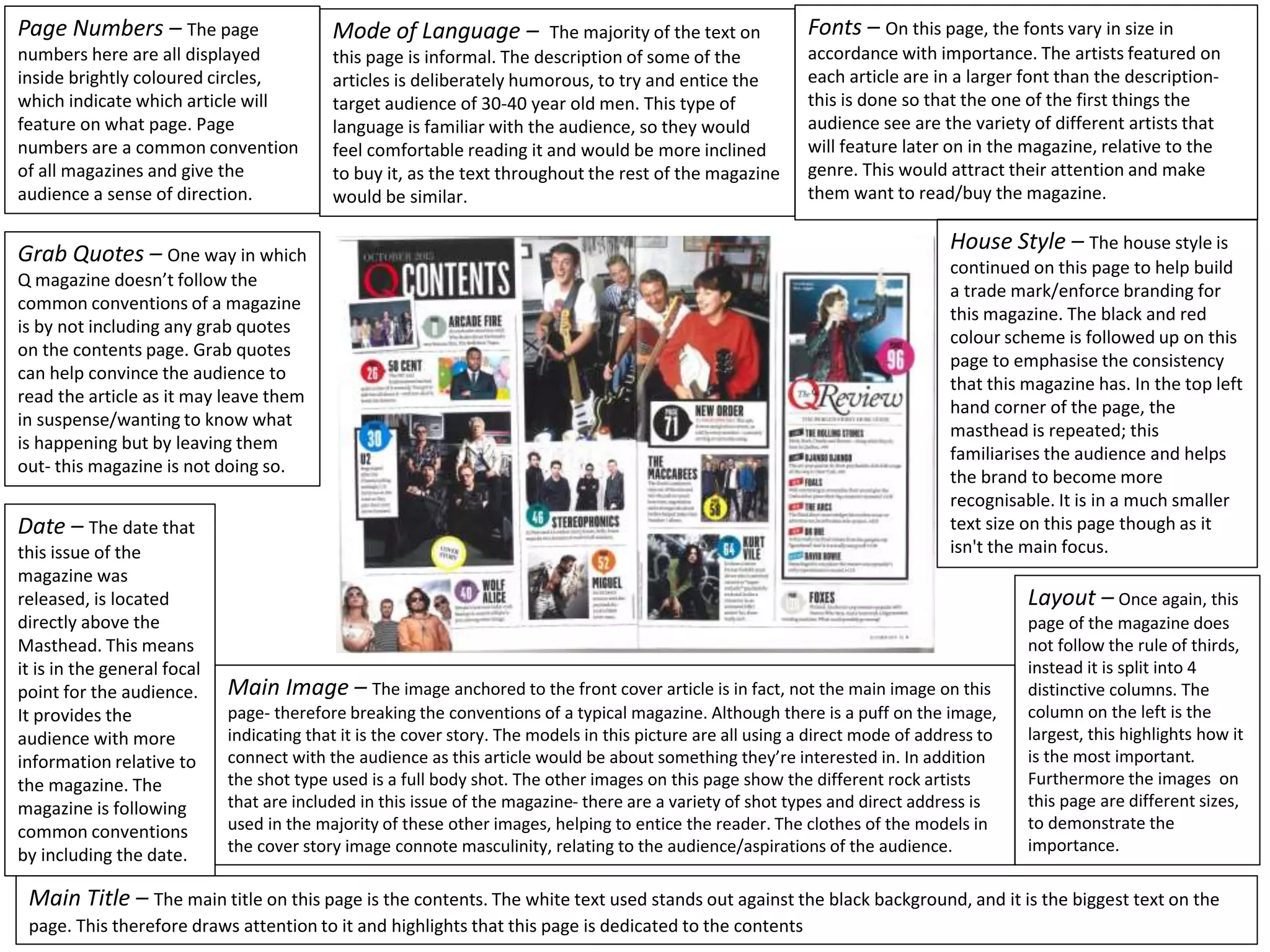
This document summarizes the key design elements and conventions used on the contents page of a magazine. It discusses how the page numbers, fonts, date, and language are designed and laid out. While some conventions are followed, like the masthead and color scheme, it breaks others like not including grab quotes. The layout uses columns instead of thirds. Images are various sizes to show importance. The cover story image is not the largest, breaking tradition, but still draws attention through a puff.
We all have good and bad thoughts from time to time and situation to situation. We are bombarded daily with spiraling thoughts(both negative and positive) creating all-consuming feel , making us difficult to manage with associated suffering. Good thoughts are like our Mob Signal (Positive thought) amidst noise(negative thought) in the atmosphere. Negative thoughts like noise outweigh positive thoughts. These thoughts often create unwanted confusion, trouble, stress and frustration in our mind as well as chaos in our physical world. Negative thoughts are also known as “distorted thinking”.
How to Make a Field invisible in Odoo 17Celine George
It is possible to hide or invisible some fields in odoo. Commonly using “invisible” attribute in the field definition to invisible the fields. This slide will show how to make a field invisible in odoo 17.
Unit 8 - Information and Communication Technology (Paper I).pdfThiyagu K
This slides describes the basic concepts of ICT, basics of Email, Emerging Technology and Digital Initiatives in Education. This presentations aligns with the UGC Paper I syllabus.
How to Create Map Views in the Odoo 17 ERPCeline George
The map views are useful for providing a geographical representation of data. They allow users to visualize and analyze the data in a more intuitive manner.
The Indian economy is classified into different sectors to simplify the analysis and understanding of economic activities. For Class 10, it's essential to grasp the sectors of the Indian economy, understand their characteristics, and recognize their importance. This guide will provide detailed notes on the Sectors of the Indian Economy Class 10, using specific long-tail keywords to enhance comprehension.
For more information, visit-www.vavaclasses.com
Welcome to TechSoup New Member Orientation and Q&A (May 2024).pdfTechSoup
In this webinar you will learn how your organization can access TechSoup's wide variety of product discount and donation programs. From hardware to software, we'll give you a tour of the tools available to help your nonprofit with productivity, collaboration, financial management, donor tracking, security, and more.
Palestine last event orientationfvgnh .pptxRaedMohamed3
An EFL lesson about the current events in Palestine. It is intended to be for intermediate students who wish to increase their listening skills through a short lesson in power point.
The French Revolution, which began in 1789, was a period of radical social and political upheaval in France. It marked the decline of absolute monarchies, the rise of secular and democratic republics, and the eventual rise of Napoleon Bonaparte. This revolutionary period is crucial in understanding the transition from feudalism to modernity in Europe.
For more information, visit-www.vavaclasses.com
1. Page Numbers – The page
numbers here are all displayed
inside brightly coloured circles,
which indicate which article will
feature on what page. Page
numbers are a common convention
of all magazines and give the
audience a sense of direction.
Fonts – On this page, the fonts vary in size in
accordance with importance. The artists featured on
each article are in a larger font than the description-
this is done so that the one of the first things the
audience see are the variety of different artists that
will feature later on in the magazine, relative to the
genre. This would attract their attention and make
them want to read/buy the magazine.
Date – The date that
this issue of the
magazine was
released, is located
directly above the
Masthead. This means
it is in the general focal
point for the audience.
It provides the
audience with more
information relative to
the magazine. The
magazine is following
common conventions
by including the date.
Mode of Language – The majority of the text on
this page is informal. The description of some of the
articles is deliberately humorous, to try and entice the
target audience of 30-40 year old men. This type of
language is familiar with the audience, so they would
feel comfortable reading it and would be more inclined
to buy it, as the text throughout the rest of the magazine
would be similar.
Grab Quotes – One way in which
Q magazine doesn’t follow the
common conventions of a magazine
is by not including any grab quotes
on the contents page. Grab quotes
can help convince the audience to
read the article as it may leave them
in suspense/wanting to know what
is happening but by leaving them
out- this magazine is not doing so.
House Style – The house style is
continued on this page to help build
a trade mark/enforce branding for
this magazine. The black and red
colour scheme is followed up on this
page to emphasise the consistency
that this magazine has. In the top left
hand corner of the page, the
masthead is repeated; this
familiarises the audience and helps
the brand to become more
recognisable. It is in a much smaller
text size on this page though as it
isn't the main focus.
Layout – Once again, this
page of the magazine does
not follow the rule of thirds,
instead it is split into 4
distinctive columns. The
column on the left is the
largest, this highlights how it
is the most important.
Furthermore the images on
this page are different sizes,
to demonstrate the
importance.
Main Image – The image anchored to the front cover article is in fact, not the main image on this
page- therefore breaking the conventions of a typical magazine. Although there is a puff on the image,
indicating that it is the cover story. The models in this picture are all using a direct mode of address to
connect with the audience as this article would be about something they’re interested in. In addition
the shot type used is a full body shot. The other images on this page show the different rock artists
that are included in this issue of the magazine- there are a variety of shot types and direct address is
used in the majority of these other images, helping to entice the reader. The clothes of the models in
the cover story image connote masculinity, relating to the audience/aspirations of the audience.
Main Title – The main title on this page is the contents. The white text used stands out against the black background, and it is the biggest text on the
page. This therefore draws attention to it and highlights that this page is dedicated to the contents