SlideShare a Scribd company logo
1 of 3
House Style
The house style is looks quiteinformal so,itwill
appeal to the target audiencewho are young
adults,however is still looks professional so,will
encourage them to read on to find out about
the artists featured. The main colour scheme
used uses the colours red,yellow, black and
white suggestingthe bands featured may be
rock bands as the colours used areoften
associated with this genre of music,as the
colour black symbolises thedarkness within the
music and,matches with the image bands
within this genre try to create.
DesignSymmetry
The design is divided horizontally atthe centre
with images in the top section and, mainly text
in the bottom which creates a professional look.
The bottom section of the page is clearly
divided into 5 columns which helps make the
contents easier for the reader to see and, find
an articlethey arelookingfor.
Use of Rule of Thirds
The main image is on the top left pointof the
grid usingthe ruleof thirds meaning itis one of
the main points people notice first.The
secondary images are also placed on or near
points within the grid so, the audiencenotice
these images quicker than the rest of the page.
The audience can tell from this that it is a
professionally designed magazineas they have
considered this rulewhen designingthe page.
Imagery
The main image used show the main artist
featured dressed in black gothic clothes which
are often associated with this genre of music.
The darkness of the image matches with the
house styleand, suggests the dark tone within
the music.The contents page also features
some secondary imagewhich mainly matches
with the dark colour scheme, creatinga
professional lookinghousestyle.Some of the
images show double page spreads from inside
the magazine so readers know what to expect,
which will help encourage them to read on and,
buy it.
Design Balance
The page try’s to create an even balance
between text and images.There is a large
amount of text within the bottom section which
provides to purpose of the contents page; to
informreaders what is in the magazineand the
correspondingpage numbers, whilethe top
section is predominantly images which makes
the page look more interestingto appeal to the
target audience, whilealso creatingan even
balancebetween text and images making itlook
more professional.The contents are separated
through highlighted black and,yellow headings
which help dividethe magazine into main
sections makingiteasier for the reader to
follow.The text is easily spaced over the
bottom of the page although itis packed more
tightly together within the editors section as it
doesn’t provideimportant information of the
audience.
House Style
The main colour scheme used is blue, black and
white, which would appeal to a more
mainstreampop audience. The colour blueis
seen as a calmingcolour which suggests what
the genre of music featured is often like. The
page uses a serif font which makes it seem less
formal which will appeal to the target audience
as they arelikely to not enjoy readingmore
formal media pieces such as newspapers,
meaning this font will make itlook different to
these types of media and, therefore more
appealingto the target audience.
Imagery
The contents pages uses images to illustrate
some of the articles within themagazine
meaning the audience can easily identify what
the main articles within the magazinewill be
about. The images used arequite bright in high
key lightingmatchingthe house styleof the rest
of the page, and also usewhite and,black
within them matchingthe colour scheme for
the magazine. The images followthe
conventions of what the target audienceexpect
by usingmainly pop singers which is the genre
of music the magazine mainly focuses on.
Design Balance
The design is informally balanced as onesideis
mainly text whilethe other features images.
There is a lot more text on the page than
images creatingan uneven balancesuggesting
that there is a lotof information insidewhich
may appeal to the audience as they think they
are getting more for their money as there will
be a lot of articles inside.This will appeal to the
target audienceas they are likely to be students
with low income so want good valuefor money
and, to find out a lot of information within the
magazine.
DesignSymmetry
The pages is clearly divided into two sections
with the left sidebeing a listof the different
articles within themagazine whilethe rightside
describes the main articles often with images
creatinga more informal look.The left sideis
divided further into two columns which
provides a lineof symmetry through the
contents table so, it’s easy to follow.
Use of Rule of Thirds
The page is divided into sections along the
left hand line and, the bottom line. The
magazine uses the lines to divide the page
to draw attentions to the various different
sections. The images used are also divided
using this method with the main points
within the image being on the points of
intersection.
Both contents pages have displayed a contents masthead at the top of the page. Kerrang’s masthead is displayed in
the top righthand corner which usingGuttenberg’s design principleis thefirstarea the reader will look at,compared
with Billboardswhich isdisplayed in a fallowarea drawingmore attention to these areas meaningall the spaceon
the page is utilised.Kerrang’s masthead follows the house stylefor the rest of the magazine by being in the same
font as the main masthead and, followingthe colour scheme by being yellow,relatingto the rock image. Similarly
Billboard’scontents masthead follows the colour scheme however is in a different font to the masthead and, rest of
the text so doesn’t directly followthe house style.
Both pages display thecontents within columns makingit easy to followfor the
reader so they can clearly seewhat articles featurewithin the magazine. This
gives the pages some structure givingthem a professional look which they will
want to create so the target audiencewill purchasethe magazine.
Kerrang fixtures an even
balancebetween images and,
text which fans of the genre of
music will likeas they want to
see largepictures within the
magazine, and looks more
appealingto the audience.In
comparison Billboard’s content
page is mainly text heavy to
informthe reader about all the
different articles within the
magazine, so they know exactly
what the articles areabout
encouragingthem to buy it.
Kerrang is divided horizontally
with the top section featuring
the images while the bottom
section is mainly text. Similarly
the images in Billboard arealso
mainly separated into the top
rightsection of the page
dividingthem between the
text.

More Related Content

What's hot

Codes and conventions contents
Codes and conventions contentsCodes and conventions contents
Codes and conventions contentsMichael Whitehead
 
Kerrang contents deconstruction
Kerrang contents deconstructionKerrang contents deconstruction
Kerrang contents deconstructionGeorgia Cummings
 
Classic rock contents deconstruction
Classic rock contents deconstructionClassic rock contents deconstruction
Classic rock contents deconstructionGeorgia Cummings
 
Classic rock dps deconstruction
Classic rock dps deconstruction Classic rock dps deconstruction
Classic rock dps deconstruction Georgia Cummings
 
Nme contents deconstruction
Nme contents deconstruction Nme contents deconstruction
Nme contents deconstruction Georgia Cummings
 
Contents Analysis
Contents AnalysisContents Analysis
Contents Analysismonah1
 
Promotional cover construction
Promotional cover  constructionPromotional cover  construction
Promotional cover constructionBaneTMB
 
Codes and conventions of contents page
Codes and conventions of contents pageCodes and conventions of contents page
Codes and conventions of contents pagenathan gkikas
 
Kerrang dps deconstruction
Kerrang dps deconstructionKerrang dps deconstruction
Kerrang dps deconstructionGeorgia Cummings
 
Drafts and analysis for magazine
Drafts and analysis for magazineDrafts and analysis for magazine
Drafts and analysis for magazineasmediae12
 
Content page analysis
Content page analysisContent page analysis
Content page analysisGeorgia Grant
 
Magazine analysis
Magazine analysisMagazine analysis
Magazine analysisAlice Bates
 
Media analysis thingies
Media analysis thingiesMedia analysis thingies
Media analysis thingiesEwanERich
 

What's hot (19)

Conents
ConentsConents
Conents
 
Question 1
Question 1Question 1
Question 1
 
Codes and conventions contents
Codes and conventions contentsCodes and conventions contents
Codes and conventions contents
 
Kerrang contents deconstruction
Kerrang contents deconstructionKerrang contents deconstruction
Kerrang contents deconstruction
 
Magazine Research
Magazine Research Magazine Research
Magazine Research
 
Classic rock contents deconstruction
Classic rock contents deconstructionClassic rock contents deconstruction
Classic rock contents deconstruction
 
Flat plan
Flat planFlat plan
Flat plan
 
Classic rock dps deconstruction
Classic rock dps deconstruction Classic rock dps deconstruction
Classic rock dps deconstruction
 
Nme contents deconstruction
Nme contents deconstruction Nme contents deconstruction
Nme contents deconstruction
 
Contents Analysis
Contents AnalysisContents Analysis
Contents Analysis
 
Promotional cover construction
Promotional cover  constructionPromotional cover  construction
Promotional cover construction
 
Nme cover deconstruction
Nme cover deconstructionNme cover deconstruction
Nme cover deconstruction
 
Codes and conventions of contents page
Codes and conventions of contents pageCodes and conventions of contents page
Codes and conventions of contents page
 
Kerrang dps deconstruction
Kerrang dps deconstructionKerrang dps deconstruction
Kerrang dps deconstruction
 
Question 1
Question 1Question 1
Question 1
 
Drafts and analysis for magazine
Drafts and analysis for magazineDrafts and analysis for magazine
Drafts and analysis for magazine
 
Content page analysis
Content page analysisContent page analysis
Content page analysis
 
Magazine analysis
Magazine analysisMagazine analysis
Magazine analysis
 
Media analysis thingies
Media analysis thingiesMedia analysis thingies
Media analysis thingies
 

Similar to House Style Magazine Contents Analysis

Contents Page Research
Contents Page ResearchContents Page Research
Contents Page Researchbeckyjay26
 
Annotations of contents pages
Annotations of contents pagesAnnotations of contents pages
Annotations of contents pageslucyvh
 
Contents analysis
Contents analysisContents analysis
Contents analysisjackahern11
 
Music magazine analysation
Music magazine analysationMusic magazine analysation
Music magazine analysationBethanyPhilippa
 
Music magazine analysation
Music magazine analysationMusic magazine analysation
Music magazine analysationBethanyPhilippa
 
Contents page analysis final
Contents page analysis finalContents page analysis final
Contents page analysis finaltashaa_smith
 
Task 1b - Contents Page Analysis
Task 1b - Contents Page AnalysisTask 1b - Contents Page Analysis
Task 1b - Contents Page Analysisasmediad14
 
Contents page analysis (main task)
Contents page analysis (main task)Contents page analysis (main task)
Contents page analysis (main task)EDPRICE93
 
Analysis of Contents Pages
Analysis of Contents PagesAnalysis of Contents Pages
Analysis of Contents PagesLterry95
 
Analysis of Contents Page
Analysis of Contents PageAnalysis of Contents Page
Analysis of Contents PageLterry95
 
Analysis of Contents Pages
Analysis of Contents PagesAnalysis of Contents Pages
Analysis of Contents PagesLterry95
 
Analysis of professional magazine pages contents page
Analysis of professional magazine pages  contents pageAnalysis of professional magazine pages  contents page
Analysis of professional magazine pages contents pageSarahKeefe123
 
Analysis of professional magazine pages contents page
Analysis of professional magazine pages  contents pageAnalysis of professional magazine pages  contents page
Analysis of professional magazine pages contents pageSarahKeefe123
 
Evaluation question 1
Evaluation question 1Evaluation question 1
Evaluation question 1Samjohnson98
 
Kerrang Magazine Contents Page Analysis
Kerrang Magazine Contents Page AnalysisKerrang Magazine Contents Page Analysis
Kerrang Magazine Contents Page Analysisamyfogarty
 
Magazine covers
Magazine coversMagazine covers
Magazine coversrj5453
 
research and planning presentation
research and planning presentationresearch and planning presentation
research and planning presentationsamanthakryder
 

Similar to House Style Magazine Contents Analysis (20)

Contents Page Research
Contents Page ResearchContents Page Research
Contents Page Research
 
Annotations of contents pages
Annotations of contents pagesAnnotations of contents pages
Annotations of contents pages
 
Contents analysis
Contents analysisContents analysis
Contents analysis
 
Music magazine analysis
Music magazine analysisMusic magazine analysis
Music magazine analysis
 
Music Magazine Analysis
Music Magazine AnalysisMusic Magazine Analysis
Music Magazine Analysis
 
Music magazine analysation
Music magazine analysationMusic magazine analysation
Music magazine analysation
 
Music magazine analysation
Music magazine analysationMusic magazine analysation
Music magazine analysation
 
Contents page analysis final
Contents page analysis finalContents page analysis final
Contents page analysis final
 
Task 1b - Contents Page Analysis
Task 1b - Contents Page AnalysisTask 1b - Contents Page Analysis
Task 1b - Contents Page Analysis
 
Contents page analysis (main task)
Contents page analysis (main task)Contents page analysis (main task)
Contents page analysis (main task)
 
Analysis of Contents Pages
Analysis of Contents PagesAnalysis of Contents Pages
Analysis of Contents Pages
 
Analysis of Contents Page
Analysis of Contents PageAnalysis of Contents Page
Analysis of Contents Page
 
Analysis of Contents Pages
Analysis of Contents PagesAnalysis of Contents Pages
Analysis of Contents Pages
 
Analysis of professional magazine pages contents page
Analysis of professional magazine pages  contents pageAnalysis of professional magazine pages  contents page
Analysis of professional magazine pages contents page
 
Analysis of professional magazine pages contents page
Analysis of professional magazine pages  contents pageAnalysis of professional magazine pages  contents page
Analysis of professional magazine pages contents page
 
Evaluation question 1
Evaluation question 1Evaluation question 1
Evaluation question 1
 
Kerrang Magazine Contents Page Analysis
Kerrang Magazine Contents Page AnalysisKerrang Magazine Contents Page Analysis
Kerrang Magazine Contents Page Analysis
 
Magazine covers
Magazine coversMagazine covers
Magazine covers
 
Magazine analysis
Magazine analysisMagazine analysis
Magazine analysis
 
research and planning presentation
research and planning presentationresearch and planning presentation
research and planning presentation
 

More from RyanDenner

What have you learnt about technologies from the process of constructing the ...
What have you learnt about technologies from the process of constructing the ...What have you learnt about technologies from the process of constructing the ...
What have you learnt about technologies from the process of constructing the ...RyanDenner
 
In what ways does your media product use, develop or challenge forms and conv...
In what ways does your media product use, develop or challenge forms and conv...In what ways does your media product use, develop or challenge forms and conv...
In what ways does your media product use, develop or challenge forms and conv...RyanDenner
 
Photo Manipulation
Photo ManipulationPhoto Manipulation
Photo ManipulationRyanDenner
 
Written Evaluation First Draft
Written Evaluation First DraftWritten Evaluation First Draft
Written Evaluation First DraftRyanDenner
 
Produce Raw Images
Produce Raw ImagesProduce Raw Images
Produce Raw ImagesRyanDenner
 
Written evaluation
Written evaluationWritten evaluation
Written evaluationRyanDenner
 
Double page spread article
Double page spread articleDouble page spread article
Double page spread articleRyanDenner
 
Double page spread analysis
Double page spread analysisDouble page spread analysis
Double page spread analysisRyanDenner
 
Final masthead designs
Final masthead designsFinal masthead designs
Final masthead designsRyanDenner
 
Magazine cover analysis_kasabian
Magazine cover analysis_kasabianMagazine cover analysis_kasabian
Magazine cover analysis_kasabianRyanDenner
 
Magazine cover analysis_adele
Magazine cover analysis_adeleMagazine cover analysis_adele
Magazine cover analysis_adeleRyanDenner
 
Questionnaire analysis
Questionnaire analysisQuestionnaire analysis
Questionnaire analysisRyanDenner
 
Magazine cover analysis_adele
Magazine cover analysis_adeleMagazine cover analysis_adele
Magazine cover analysis_adeleRyanDenner
 
Magazine cover analysis_rihanna
Magazine cover analysis_rihannaMagazine cover analysis_rihanna
Magazine cover analysis_rihannaRyanDenner
 
Magazine cover analysis_kasabian
Magazine cover analysis_kasabianMagazine cover analysis_kasabian
Magazine cover analysis_kasabianRyanDenner
 

More from RyanDenner (16)

What have you learnt about technologies from the process of constructing the ...
What have you learnt about technologies from the process of constructing the ...What have you learnt about technologies from the process of constructing the ...
What have you learnt about technologies from the process of constructing the ...
 
In what ways does your media product use, develop or challenge forms and conv...
In what ways does your media product use, develop or challenge forms and conv...In what ways does your media product use, develop or challenge forms and conv...
In what ways does your media product use, develop or challenge forms and conv...
 
Photo Manipulation
Photo ManipulationPhoto Manipulation
Photo Manipulation
 
Written Evaluation First Draft
Written Evaluation First DraftWritten Evaluation First Draft
Written Evaluation First Draft
 
Produce Raw Images
Produce Raw ImagesProduce Raw Images
Produce Raw Images
 
Written evaluation
Written evaluationWritten evaluation
Written evaluation
 
Double page spread article
Double page spread articleDouble page spread article
Double page spread article
 
Double page spread analysis
Double page spread analysisDouble page spread analysis
Double page spread analysis
 
Final masthead designs
Final masthead designsFinal masthead designs
Final masthead designs
 
Artist images
Artist imagesArtist images
Artist images
 
Magazine cover analysis_kasabian
Magazine cover analysis_kasabianMagazine cover analysis_kasabian
Magazine cover analysis_kasabian
 
Magazine cover analysis_adele
Magazine cover analysis_adeleMagazine cover analysis_adele
Magazine cover analysis_adele
 
Questionnaire analysis
Questionnaire analysisQuestionnaire analysis
Questionnaire analysis
 
Magazine cover analysis_adele
Magazine cover analysis_adeleMagazine cover analysis_adele
Magazine cover analysis_adele
 
Magazine cover analysis_rihanna
Magazine cover analysis_rihannaMagazine cover analysis_rihanna
Magazine cover analysis_rihanna
 
Magazine cover analysis_kasabian
Magazine cover analysis_kasabianMagazine cover analysis_kasabian
Magazine cover analysis_kasabian
 

House Style Magazine Contents Analysis

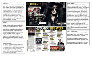
  • 1. House Style The house style is looks quiteinformal so,itwill appeal to the target audiencewho are young adults,however is still looks professional so,will encourage them to read on to find out about the artists featured. The main colour scheme used uses the colours red,yellow, black and white suggestingthe bands featured may be rock bands as the colours used areoften associated with this genre of music,as the colour black symbolises thedarkness within the music and,matches with the image bands within this genre try to create. DesignSymmetry The design is divided horizontally atthe centre with images in the top section and, mainly text in the bottom which creates a professional look. The bottom section of the page is clearly divided into 5 columns which helps make the contents easier for the reader to see and, find an articlethey arelookingfor. Use of Rule of Thirds The main image is on the top left pointof the grid usingthe ruleof thirds meaning itis one of the main points people notice first.The secondary images are also placed on or near points within the grid so, the audiencenotice these images quicker than the rest of the page. The audience can tell from this that it is a professionally designed magazineas they have considered this rulewhen designingthe page. Imagery The main image used show the main artist featured dressed in black gothic clothes which are often associated with this genre of music. The darkness of the image matches with the house styleand, suggests the dark tone within the music.The contents page also features some secondary imagewhich mainly matches with the dark colour scheme, creatinga professional lookinghousestyle.Some of the images show double page spreads from inside the magazine so readers know what to expect, which will help encourage them to read on and, buy it. Design Balance The page try’s to create an even balance between text and images.There is a large amount of text within the bottom section which provides to purpose of the contents page; to informreaders what is in the magazineand the correspondingpage numbers, whilethe top section is predominantly images which makes the page look more interestingto appeal to the target audience, whilealso creatingan even balancebetween text and images making itlook more professional.The contents are separated through highlighted black and,yellow headings which help dividethe magazine into main sections makingiteasier for the reader to follow.The text is easily spaced over the bottom of the page although itis packed more tightly together within the editors section as it doesn’t provideimportant information of the audience.
  • 2. House Style The main colour scheme used is blue, black and white, which would appeal to a more mainstreampop audience. The colour blueis seen as a calmingcolour which suggests what the genre of music featured is often like. The page uses a serif font which makes it seem less formal which will appeal to the target audience as they arelikely to not enjoy readingmore formal media pieces such as newspapers, meaning this font will make itlook different to these types of media and, therefore more appealingto the target audience. Imagery The contents pages uses images to illustrate some of the articles within themagazine meaning the audience can easily identify what the main articles within the magazinewill be about. The images used arequite bright in high key lightingmatchingthe house styleof the rest of the page, and also usewhite and,black within them matchingthe colour scheme for the magazine. The images followthe conventions of what the target audienceexpect by usingmainly pop singers which is the genre of music the magazine mainly focuses on. Design Balance The design is informally balanced as onesideis mainly text whilethe other features images. There is a lot more text on the page than images creatingan uneven balancesuggesting that there is a lotof information insidewhich may appeal to the audience as they think they are getting more for their money as there will be a lot of articles inside.This will appeal to the target audienceas they are likely to be students with low income so want good valuefor money and, to find out a lot of information within the magazine. DesignSymmetry The pages is clearly divided into two sections with the left sidebeing a listof the different articles within themagazine whilethe rightside describes the main articles often with images creatinga more informal look.The left sideis divided further into two columns which provides a lineof symmetry through the contents table so, it’s easy to follow. Use of Rule of Thirds The page is divided into sections along the left hand line and, the bottom line. The magazine uses the lines to divide the page to draw attentions to the various different sections. The images used are also divided using this method with the main points within the image being on the points of intersection.
  • 3. Both contents pages have displayed a contents masthead at the top of the page. Kerrang’s masthead is displayed in the top righthand corner which usingGuttenberg’s design principleis thefirstarea the reader will look at,compared with Billboardswhich isdisplayed in a fallowarea drawingmore attention to these areas meaningall the spaceon the page is utilised.Kerrang’s masthead follows the house stylefor the rest of the magazine by being in the same font as the main masthead and, followingthe colour scheme by being yellow,relatingto the rock image. Similarly Billboard’scontents masthead follows the colour scheme however is in a different font to the masthead and, rest of the text so doesn’t directly followthe house style. Both pages display thecontents within columns makingit easy to followfor the reader so they can clearly seewhat articles featurewithin the magazine. This gives the pages some structure givingthem a professional look which they will want to create so the target audiencewill purchasethe magazine. Kerrang fixtures an even balancebetween images and, text which fans of the genre of music will likeas they want to see largepictures within the magazine, and looks more appealingto the audience.In comparison Billboard’s content page is mainly text heavy to informthe reader about all the different articles within the magazine, so they know exactly what the articles areabout encouragingthem to buy it. Kerrang is divided horizontally with the top section featuring the images while the bottom section is mainly text. Similarly the images in Billboard arealso mainly separated into the top rightsection of the page dividingthem between the text.