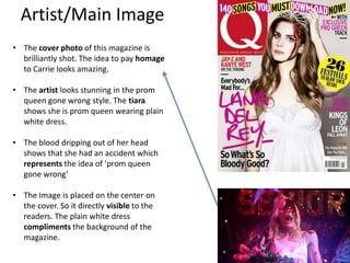
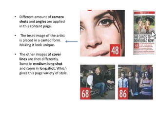
This document analyzes the first issue of Q magazine, a UK music magazine published since 1986.
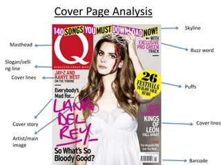
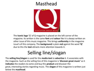
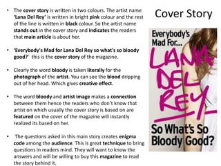
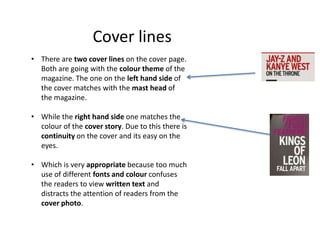
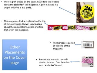
The summary analyzes key elements of the magazine's cover page layout, including the masthead, selling line, cover story about Lana Del Rey, her image in the center, additional cover lines and placement of other elements.
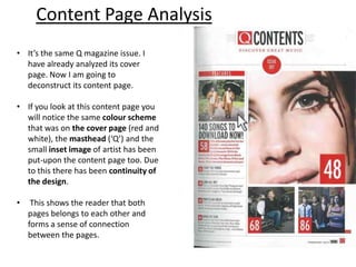
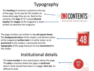
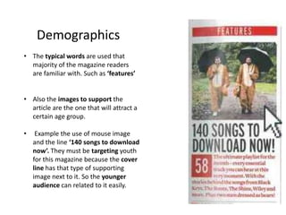
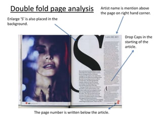
It also examines the continuity of design between the cover and content pages, including color scheme, images and masthead. Typography, page numbers, issue details and additional elements of the content page are described.