SlideShare a Scribd company logo
1 of 6
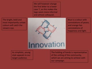
We will however change
the first letter to a lower
case ‘i’, as this makes the
logo seem more informal
and almost colloquial.
The bright, bold and
most importantly unisex
colours will catch the
viewers eye.

Its simplistic, young
style appeals to our
target audience.

Blue is a colour with
connotations of peace,
and orange has
connotations of
happiness and light.

The holding of hands is representative
of the uniting of the community,
which we are aiming to achieve with
our campaign.
In the centre of the
middle tree, it looks like a
map of the earth- which
suggests the bigger
picture, being the whole
world, as well as unity.
May confuse our target
audience as trees have
connotations of nature
and it could be mistaken
for the logo of an
environmental company.

Capital letter is
possibly too
formal.

The colour
green has
connotations of
peace and
nature,
particularly due
to Greenpeace.

Additionally, the
colour is also
unisex, appealing to
our target audience.
The people having contact through holding
each others hands is representative of uniting
the community and new friends being madepart of the main aims of our campaign.
The variety of
bright colours
appeals to our
target audience
as there is the
stereotypical
pink for girls and
blue for boys, as
well as unisex
colours.

However, it could be
seen as quite cliché,
and could be
mistaken for a
children’s charity.

There is not really a main colour, and having our company
name in black almost paints a duller picture, as there is no
particular house style with the logo and it doesn’t seem to
fit.
Despite being mostly black, the general idea of
the plug fitting together and creating a spark,
represents how when the community come
together, they can create something beneficial.
The predominant
colour is black,
which, although
unisex, is very
dull and dark,
and the idea of
regeneration is
breathing new
life into
something,
whereas black
has connotations
of death.

The use of the
single person
however, suggest
isolation, and this
is the total
opposite to what
our campaign
encourages.

This again could be mistaken for
an electricity company or
something in that line of work.
‘YCNY’ the abbreviation of
our campaign name ‘ your
community needs you’ is
catchy, easily remembered
and easier to say meaning
our target audience will
talk about it more as it is
less of a mouthful. The
‘YCNY’ also reinforces our
brand.

The font is fairly
informal and
therefore
appealing to the
audience
however looks
unprofessional
and untidy and
randomly
placed in the
middle of the
warning sign.

The white background of the logo
creates a great contrast between the
red and is therefore appealing to the
eye but however gives the logo an
almost ‘unfinished’ look.

The use of an image of Lord Kitchener, plays on his
WW1 recruitment drive and persuades the
audience to get involved as through the use of
direct address. However the image looks out of
place in the middle of the logo and therefore does
not look very professional.

The use of red engages the
audience as it is bright and
thus draws the eye to the
logo. It is also suitable for
the target audience as
stereotypically 11-17 year
olds are attracted to bright
colours.

Red is a colour
usually associated to
blood and death and
therefore creates a
‘shock tactic/effect’
which is reinforced
through the use of
the warning sign
which will intrigue
the audience as to
what the warning is
about.
The use of the colour sepia
although not bright (which could
therefore suggest it will not
appeal as much to the audience
compared to the previous logo)
almost creates a cool affect and
id very current and will thus
appeal to our target audience.

Lord Kitchener is pointing
directly at the audience
therefore using direct
address and appealing
directly to them. This will be
affective in persuading our
target audience to become
involved as they will feel
they are being directly
spoken to. They will
constantly be reminded of
this(of getting involved)
when seeing the logo on all
our products and is
therefore extremely
affective.

The use of the colour white for ‘YCNY’
creates a contrast and therefore appeals
to the audience and looks ‘cool’ against
the black and white sepia background.
The font is also bold and therefore stands
out, it is also appealing to the target
audience as it is not too formal however is
in capital letters which stresses the
urgency of our campaign.

The use of Lord
Kitchener as the
focal point and
image for our logo
reinforces our
campaign idea and
links to our
campaign name
‘your community
needs you’ which is
a play on his WW1
recruitment drive
and thus makes our
campaign
frequently
recognisable and
means everything is
linked.

‘YNCY’ is the abbreviation of our campaign ‘your community needs
you’ is easily remembered and much easier to say than the full
campaign name which therefore means the campaign will be
frequently spoke about . It is also catchy and creates a more formal
approach to our campaign.

More Related Content

What's hot

Interior Design Trends: Benjamin Moore Color of the Month (June)
Interior Design Trends: Benjamin Moore Color of the Month (June)Interior Design Trends: Benjamin Moore Color of the Month (June)
Interior Design Trends: Benjamin Moore Color of the Month (June)Robin Lechner Designs
 
Evaluation powerpoint
Evaluation powerpointEvaluation powerpoint
Evaluation powerpointsophiesykes
 
Billboard analysis 1
Billboard analysis 1Billboard analysis 1
Billboard analysis 1hollybeaty
 
Purposes & Impacts
Purposes & ImpactsPurposes & Impacts
Purposes & Impactscalandjess
 
Rihanna didgipak
Rihanna didgipakRihanna didgipak
Rihanna didgipakemilylouisej
 
Evaluation question 5
Evaluation question 5Evaluation question 5
Evaluation question 5beerogers
 
Colour scheme ideas
Colour scheme ideasColour scheme ideas
Colour scheme ideasLaurenHolyoak1
 
Evaluation question 5
Evaluation question 5Evaluation question 5
Evaluation question 5beerogers
 
Semiotic analysis
Semiotic analysis Semiotic analysis
Semiotic analysis chrissiebishop
 
VIBE front cover analysis
VIBE front cover analysisVIBE front cover analysis
VIBE front cover analysismaxnqy99
 
Homessless posters
Homessless postersHomessless posters
Homessless postersrachel1305
 
A2 Level Media Short Film Postcard Initial Design
A2 Level Media Short Film Postcard Initial Design A2 Level Media Short Film Postcard Initial Design
A2 Level Media Short Film Postcard Initial Design mimammedia
 
A2 Level Media Film Postcard Initial Design
A2 Level Media Film Postcard Initial DesignA2 Level Media Film Postcard Initial Design
A2 Level Media Film Postcard Initial DesignAnaVasilescu2
 
Interim review presentation kilve brief
Interim review presentation kilve briefInterim review presentation kilve brief
Interim review presentation kilve briefBradsanton01
 
Tinie tempah website analysis
Tinie tempah website analysisTinie tempah website analysis
Tinie tempah website analysisTyra' Wilson
 
How did you attract audience cover 3
How did you attract audience cover 3How did you attract audience cover 3
How did you attract audience cover 3khan122345
 

What's hot (20)

Interior Design Trends: Benjamin Moore Color of the Month (June)
Interior Design Trends: Benjamin Moore Color of the Month (June)Interior Design Trends: Benjamin Moore Color of the Month (June)
Interior Design Trends: Benjamin Moore Color of the Month (June)
 
THE portfolio
THE portfolioTHE portfolio
THE portfolio
 
Evaluation powerpoint
Evaluation powerpointEvaluation powerpoint
Evaluation powerpoint
 
Media Adverts Analysis
Media Adverts AnalysisMedia Adverts Analysis
Media Adverts Analysis
 
Billboard analysis 1
Billboard analysis 1Billboard analysis 1
Billboard analysis 1
 
Purposes & Impacts
Purposes & ImpactsPurposes & Impacts
Purposes & Impacts
 
Rihanna didgipak
Rihanna didgipakRihanna didgipak
Rihanna didgipak
 
Evaluation question 5
Evaluation question 5Evaluation question 5
Evaluation question 5
 
Colour scheme ideas
Colour scheme ideasColour scheme ideas
Colour scheme ideas
 
Evaluation question 5
Evaluation question 5Evaluation question 5
Evaluation question 5
 
Semiotic analysis
Semiotic analysis Semiotic analysis
Semiotic analysis
 
VIBE front cover analysis
VIBE front cover analysisVIBE front cover analysis
VIBE front cover analysis
 
Magazine analysis
Magazine analysisMagazine analysis
Magazine analysis
 
Homessless posters
Homessless postersHomessless posters
Homessless posters
 
James bond
James bondJames bond
James bond
 
A2 Level Media Short Film Postcard Initial Design
A2 Level Media Short Film Postcard Initial Design A2 Level Media Short Film Postcard Initial Design
A2 Level Media Short Film Postcard Initial Design
 
A2 Level Media Film Postcard Initial Design
A2 Level Media Film Postcard Initial DesignA2 Level Media Film Postcard Initial Design
A2 Level Media Film Postcard Initial Design
 
Interim review presentation kilve brief
Interim review presentation kilve briefInterim review presentation kilve brief
Interim review presentation kilve brief
 
Tinie tempah website analysis
Tinie tempah website analysisTinie tempah website analysis
Tinie tempah website analysis
 
How did you attract audience cover 3
How did you attract audience cover 3How did you attract audience cover 3
How did you attract audience cover 3
 

Viewers also liked

Macketly Logo Analysis
Macketly Logo AnalysisMacketly Logo Analysis
Macketly Logo Analysishsutcliffe
 
Defending my logo
Defending my logoDefending my logo
Defending my logoDillonBaker
 
Logo case studies
Logo case studiesLogo case studies
Logo case studiesthartwell123
 
Logo analysis
Logo analysisLogo analysis
Logo analysisDiego Cruz
 
Analysis of Logos
Analysis of LogosAnalysis of Logos
Analysis of Logosheatherlarkin1
 
Ad Sense
Ad SenseAd Sense
Ad SenseAshok
 
Differentiation strategy
Differentiation strategyDifferentiation strategy
Differentiation strategyMohamed Faiz
 
Logo and analysis of logos
Logo and analysis of logosLogo and analysis of logos
Logo and analysis of logosvyas vemuri
 
Semiotics Analysis of Apple Inc. logo
Semiotics Analysis of Apple Inc. logoSemiotics Analysis of Apple Inc. logo
Semiotics Analysis of Apple Inc. logoRohit Rohan
 

Viewers also liked (11)

Macketly Logo Analysis
Macketly Logo AnalysisMacketly Logo Analysis
Macketly Logo Analysis
 
Defending my logo
Defending my logoDefending my logo
Defending my logo
 
Logo case studies
Logo case studiesLogo case studies
Logo case studies
 
Baskin robbins
Baskin robbins Baskin robbins
Baskin robbins
 
Logo analysis
Logo analysisLogo analysis
Logo analysis
 
Analysis of Logos
Analysis of LogosAnalysis of Logos
Analysis of Logos
 
Ad Sense
Ad SenseAd Sense
Ad Sense
 
Brand positioning part 5
Brand positioning   part 5Brand positioning   part 5
Brand positioning part 5
 
Differentiation strategy
Differentiation strategyDifferentiation strategy
Differentiation strategy
 
Logo and analysis of logos
Logo and analysis of logosLogo and analysis of logos
Logo and analysis of logos
 
Semiotics Analysis of Apple Inc. logo
Semiotics Analysis of Apple Inc. logoSemiotics Analysis of Apple Inc. logo
Semiotics Analysis of Apple Inc. logo
 

Similar to GCSE Media Logo Analysis

Social action presentation
Social action presentationSocial action presentation
Social action presentationveggieburgers4lyf
 
Brainstorming slogans milli lamptey
Brainstorming slogans milli lampteyBrainstorming slogans milli lamptey
Brainstorming slogans milli lampteyrockinmole
 
Evaluation Question 2
Evaluation Question 2Evaluation Question 2
Evaluation Question 2cm161191
 
Energy drink research
Energy drink researchEnergy drink research
Energy drink researchchamahan
 
Task1- Research
Task1- ResearchTask1- Research
Task1- Researchchamahan
 
Brand identity and Mode of Address analysis
Brand identity and Mode of Address analysis Brand identity and Mode of Address analysis
Brand identity and Mode of Address analysis ClarizhNalzaro
 
Color psychology for designers.pdf
Color psychology for designers.pdfColor psychology for designers.pdf
Color psychology for designers.pdfthe-educatioist
 
Brainstorming slogans rosie anderson
Brainstorming slogans rosie andersonBrainstorming slogans rosie anderson
Brainstorming slogans rosie andersonrockinmole
 
Advert analysis
Advert analysisAdvert analysis
Advert analysisLauraamberr
 
What Color is Response? An Inside Look at How Color Improves Your Sales
What Color is Response? An Inside Look at How Color Improves Your SalesWhat Color is Response? An Inside Look at How Color Improves Your Sales
What Color is Response? An Inside Look at How Color Improves Your SalesVivastream
 
How colors matter more than size, and visuals!
How colors matter more than size, and visuals!How colors matter more than size, and visuals!
How colors matter more than size, and visuals!OgilvyOne Worldwide
 
Masthead analysis
Masthead analysis   Masthead analysis
Masthead analysis Amir Mohseny
 
grow Thoughts Issue 5
grow Thoughts Issue 5grow Thoughts Issue 5
grow Thoughts Issue 5anthony ryman
 
Advert analysis
Advert analysisAdvert analysis
Advert analysisLauraamberr
 
Question 2
Question 2 Question 2
Question 2 NcampbellB
 
Assignment 2 a star exemplar
Assignment 2 a star exemplarAssignment 2 a star exemplar
Assignment 2 a star exemplarharrisdulwichgirls
 
GCSE CROSS MEDIA ASSIGNMENT 2 exam board full marks example
GCSE CROSS MEDIA ASSIGNMENT 2 exam board full marks exampleGCSE CROSS MEDIA ASSIGNMENT 2 exam board full marks example
GCSE CROSS MEDIA ASSIGNMENT 2 exam board full marks exampleDB3igs
 

Similar to GCSE Media Logo Analysis (20)

Social action presentation
Social action presentationSocial action presentation
Social action presentation
 
Presentation
PresentationPresentation
Presentation
 
Brainstorming slogans milli lamptey
Brainstorming slogans milli lampteyBrainstorming slogans milli lamptey
Brainstorming slogans milli lamptey
 
Evaluation Question 2
Evaluation Question 2Evaluation Question 2
Evaluation Question 2
 
Energy drink research
Energy drink researchEnergy drink research
Energy drink research
 
Task1- Research
Task1- ResearchTask1- Research
Task1- Research
 
Brand identity and Mode of Address analysis
Brand identity and Mode of Address analysis Brand identity and Mode of Address analysis
Brand identity and Mode of Address analysis
 
Color psychology for designers.pdf
Color psychology for designers.pdfColor psychology for designers.pdf
Color psychology for designers.pdf
 
Brainstorming slogans rosie anderson
Brainstorming slogans rosie andersonBrainstorming slogans rosie anderson
Brainstorming slogans rosie anderson
 
Advert analysis
Advert analysisAdvert analysis
Advert analysis
 
What Color is Response? An Inside Look at How Color Improves Your Sales
What Color is Response? An Inside Look at How Color Improves Your SalesWhat Color is Response? An Inside Look at How Color Improves Your Sales
What Color is Response? An Inside Look at How Color Improves Your Sales
 
How colors matter more than size, and visuals!
How colors matter more than size, and visuals!How colors matter more than size, and visuals!
How colors matter more than size, and visuals!
 
Masthead analysis
Masthead analysis   Masthead analysis
Masthead analysis
 
Main task
Main taskMain task
Main task
 
Logo Research.pptx
Logo Research.pptxLogo Research.pptx
Logo Research.pptx
 
grow Thoughts Issue 5
grow Thoughts Issue 5grow Thoughts Issue 5
grow Thoughts Issue 5
 
Advert analysis
Advert analysisAdvert analysis
Advert analysis
 
Question 2
Question 2 Question 2
Question 2
 
Assignment 2 a star exemplar
Assignment 2 a star exemplarAssignment 2 a star exemplar
Assignment 2 a star exemplar
 
GCSE CROSS MEDIA ASSIGNMENT 2 exam board full marks example
GCSE CROSS MEDIA ASSIGNMENT 2 exam board full marks exampleGCSE CROSS MEDIA ASSIGNMENT 2 exam board full marks example
GCSE CROSS MEDIA ASSIGNMENT 2 exam board full marks example
 

Recently uploaded

Mastering the Unannounced Regulatory Inspection
Mastering the Unannounced Regulatory InspectionMastering the Unannounced Regulatory Inspection
Mastering the Unannounced Regulatory InspectionSafetyChain Software
 
POINT- BIOCHEMISTRY SEM 2 ENZYMES UNIT 5.pptx
POINT- BIOCHEMISTRY SEM 2 ENZYMES UNIT 5.pptxPOINT- BIOCHEMISTRY SEM 2 ENZYMES UNIT 5.pptx
POINT- BIOCHEMISTRY SEM 2 ENZYMES UNIT 5.pptxSayali Powar
 
Introduction to AI in Higher Education_draft.pptx
Introduction to AI in Higher Education_draft.pptxIntroduction to AI in Higher Education_draft.pptx
Introduction to AI in Higher Education_draft.pptxpboyjonauth
 
Alper Gobel In Media Res Media Component
Alper Gobel In Media Res Media ComponentAlper Gobel In Media Res Media Component
Alper Gobel In Media Res Media ComponentInMediaRes1
 
Hybridoma Technology ( Production , Purification , and Application )
Hybridoma Technology  ( Production , Purification , and Application  ) Hybridoma Technology  ( Production , Purification , and Application  )
Hybridoma Technology ( Production , Purification , and Application ) Sakshi Ghasle
 
ECONOMIC CONTEXT - LONG FORM TV DRAMA - PPT
ECONOMIC CONTEXT - LONG FORM TV DRAMA - PPTECONOMIC CONTEXT - LONG FORM TV DRAMA - PPT
ECONOMIC CONTEXT - LONG FORM TV DRAMA - PPTiammrhaywood
 
Contemporary philippine arts from the regions_PPT_Module_12 [Autosaved] (1).pptx
Contemporary philippine arts from the regions_PPT_Module_12 [Autosaved] (1).pptxContemporary philippine arts from the regions_PPT_Module_12 [Autosaved] (1).pptx
Contemporary philippine arts from the regions_PPT_Module_12 [Autosaved] (1).pptxRoyAbrique
 
URLs and Routing in the Odoo 17 Website App
URLs and Routing in the Odoo 17 Website AppURLs and Routing in the Odoo 17 Website App
URLs and Routing in the Odoo 17 Website AppCeline George
 
A Critique of the Proposed National Education Policy Reform
A Critique of the Proposed National Education Policy ReformA Critique of the Proposed National Education Policy Reform
A Critique of the Proposed National Education Policy ReformChameera Dedduwage
 
Separation of Lanthanides/ Lanthanides and Actinides
Separation of Lanthanides/ Lanthanides and ActinidesSeparation of Lanthanides/ Lanthanides and Actinides
Separation of Lanthanides/ Lanthanides and ActinidesFatimaKhan178732
 
Organic Name Reactions for the students and aspirants of Chemistry12th.pptx
Organic Name Reactions  for the students and aspirants of Chemistry12th.pptxOrganic Name Reactions  for the students and aspirants of Chemistry12th.pptx
Organic Name Reactions for the students and aspirants of Chemistry12th.pptxVS Mahajan Coaching Centre
 
Concept of Vouching. B.Com(Hons) /B.Compdf
Concept of Vouching. B.Com(Hons) /B.CompdfConcept of Vouching. B.Com(Hons) /B.Compdf
Concept of Vouching. B.Com(Hons) /B.CompdfUmakantAnnand
 
CARE OF CHILD IN INCUBATOR..........pptx
CARE OF CHILD IN INCUBATOR..........pptxCARE OF CHILD IN INCUBATOR..........pptx
CARE OF CHILD IN INCUBATOR..........pptxGaneshChakor2
 
Crayon Activity Handout For the Crayon A
Crayon Activity Handout For the Crayon ACrayon Activity Handout For the Crayon A
Crayon Activity Handout For the Crayon AUnboundStockton
 
mini mental status format.docx
mini    mental       status     format.docxmini    mental       status     format.docx
mini mental status format.docxPoojaSen20
 
KSHARA STURA .pptx---KSHARA KARMA THERAPY (CAUSTIC THERAPY)————IMP.OF KSHARA ...
KSHARA STURA .pptx---KSHARA KARMA THERAPY (CAUSTIC THERAPY)————IMP.OF KSHARA ...KSHARA STURA .pptx---KSHARA KARMA THERAPY (CAUSTIC THERAPY)————IMP.OF KSHARA ...
KSHARA STURA .pptx---KSHARA KARMA THERAPY (CAUSTIC THERAPY)————IMP.OF KSHARA ...M56BOOKSTORE PRODUCT/SERVICE
 
_Math 4-Q4 Week 5.pptx Steps in Collecting Data
_Math 4-Q4 Week 5.pptx Steps in Collecting Data_Math 4-Q4 Week 5.pptx Steps in Collecting Data
_Math 4-Q4 Week 5.pptx Steps in Collecting DataJhengPantaleon
 

Recently uploaded (20)

Mastering the Unannounced Regulatory Inspection
Mastering the Unannounced Regulatory InspectionMastering the Unannounced Regulatory Inspection
Mastering the Unannounced Regulatory Inspection
 
POINT- BIOCHEMISTRY SEM 2 ENZYMES UNIT 5.pptx
POINT- BIOCHEMISTRY SEM 2 ENZYMES UNIT 5.pptxPOINT- BIOCHEMISTRY SEM 2 ENZYMES UNIT 5.pptx
POINT- BIOCHEMISTRY SEM 2 ENZYMES UNIT 5.pptx
 
Introduction to AI in Higher Education_draft.pptx
Introduction to AI in Higher Education_draft.pptxIntroduction to AI in Higher Education_draft.pptx
Introduction to AI in Higher Education_draft.pptx
 
Alper Gobel In Media Res Media Component
Alper Gobel In Media Res Media ComponentAlper Gobel In Media Res Media Component
Alper Gobel In Media Res Media Component
 
Hybridoma Technology ( Production , Purification , and Application )
Hybridoma Technology  ( Production , Purification , and Application  ) Hybridoma Technology  ( Production , Purification , and Application  )
Hybridoma Technology ( Production , Purification , and Application )
 
Staff of Color (SOC) Retention Efforts DDSD
Staff of Color (SOC) Retention Efforts DDSDStaff of Color (SOC) Retention Efforts DDSD
Staff of Color (SOC) Retention Efforts DDSD
 
ECONOMIC CONTEXT - LONG FORM TV DRAMA - PPT
ECONOMIC CONTEXT - LONG FORM TV DRAMA - PPTECONOMIC CONTEXT - LONG FORM TV DRAMA - PPT
ECONOMIC CONTEXT - LONG FORM TV DRAMA - PPT
 
Model Call Girl in Bikash Puri Delhi reach out to us at 🔝9953056974🔝
Model Call Girl in Bikash Puri  Delhi reach out to us at 🔝9953056974🔝Model Call Girl in Bikash Puri  Delhi reach out to us at 🔝9953056974🔝
Model Call Girl in Bikash Puri Delhi reach out to us at 🔝9953056974🔝
 
Contemporary philippine arts from the regions_PPT_Module_12 [Autosaved] (1).pptx
Contemporary philippine arts from the regions_PPT_Module_12 [Autosaved] (1).pptxContemporary philippine arts from the regions_PPT_Module_12 [Autosaved] (1).pptx
Contemporary philippine arts from the regions_PPT_Module_12 [Autosaved] (1).pptx
 
URLs and Routing in the Odoo 17 Website App
URLs and Routing in the Odoo 17 Website AppURLs and Routing in the Odoo 17 Website App
URLs and Routing in the Odoo 17 Website App
 
A Critique of the Proposed National Education Policy Reform
A Critique of the Proposed National Education Policy ReformA Critique of the Proposed National Education Policy Reform
A Critique of the Proposed National Education Policy Reform
 
Model Call Girl in Tilak Nagar Delhi reach out to us at 🔝9953056974🔝
Model Call Girl in Tilak Nagar Delhi reach out to us at 🔝9953056974🔝Model Call Girl in Tilak Nagar Delhi reach out to us at 🔝9953056974🔝
Model Call Girl in Tilak Nagar Delhi reach out to us at 🔝9953056974🔝
 
Separation of Lanthanides/ Lanthanides and Actinides
Separation of Lanthanides/ Lanthanides and ActinidesSeparation of Lanthanides/ Lanthanides and Actinides
Separation of Lanthanides/ Lanthanides and Actinides
 
Organic Name Reactions for the students and aspirants of Chemistry12th.pptx
Organic Name Reactions  for the students and aspirants of Chemistry12th.pptxOrganic Name Reactions  for the students and aspirants of Chemistry12th.pptx
Organic Name Reactions for the students and aspirants of Chemistry12th.pptx
 
Concept of Vouching. B.Com(Hons) /B.Compdf
Concept of Vouching. B.Com(Hons) /B.CompdfConcept of Vouching. B.Com(Hons) /B.Compdf
Concept of Vouching. B.Com(Hons) /B.Compdf
 
CARE OF CHILD IN INCUBATOR..........pptx
CARE OF CHILD IN INCUBATOR..........pptxCARE OF CHILD IN INCUBATOR..........pptx
CARE OF CHILD IN INCUBATOR..........pptx
 
Crayon Activity Handout For the Crayon A
Crayon Activity Handout For the Crayon ACrayon Activity Handout For the Crayon A
Crayon Activity Handout For the Crayon A
 
mini mental status format.docx
mini    mental       status     format.docxmini    mental       status     format.docx
mini mental status format.docx
 
KSHARA STURA .pptx---KSHARA KARMA THERAPY (CAUSTIC THERAPY)————IMP.OF KSHARA ...
KSHARA STURA .pptx---KSHARA KARMA THERAPY (CAUSTIC THERAPY)————IMP.OF KSHARA ...KSHARA STURA .pptx---KSHARA KARMA THERAPY (CAUSTIC THERAPY)————IMP.OF KSHARA ...
KSHARA STURA .pptx---KSHARA KARMA THERAPY (CAUSTIC THERAPY)————IMP.OF KSHARA ...
 
_Math 4-Q4 Week 5.pptx Steps in Collecting Data
_Math 4-Q4 Week 5.pptx Steps in Collecting Data_Math 4-Q4 Week 5.pptx Steps in Collecting Data
_Math 4-Q4 Week 5.pptx Steps in Collecting Data
 

GCSE Media Logo Analysis

  • 1. We will however change the first letter to a lower case ‘i’, as this makes the logo seem more informal and almost colloquial. The bright, bold and most importantly unisex colours will catch the viewers eye. Its simplistic, young style appeals to our target audience. Blue is a colour with connotations of peace, and orange has connotations of happiness and light. The holding of hands is representative of the uniting of the community, which we are aiming to achieve with our campaign.
  • 2. In the centre of the middle tree, it looks like a map of the earth- which suggests the bigger picture, being the whole world, as well as unity. May confuse our target audience as trees have connotations of nature and it could be mistaken for the logo of an environmental company. Capital letter is possibly too formal. The colour green has connotations of peace and nature, particularly due to Greenpeace. Additionally, the colour is also unisex, appealing to our target audience.
  • 3. The people having contact through holding each others hands is representative of uniting the community and new friends being madepart of the main aims of our campaign. The variety of bright colours appeals to our target audience as there is the stereotypical pink for girls and blue for boys, as well as unisex colours. However, it could be seen as quite clichĂ©, and could be mistaken for a children’s charity. There is not really a main colour, and having our company name in black almost paints a duller picture, as there is no particular house style with the logo and it doesn’t seem to fit.
  • 4. Despite being mostly black, the general idea of the plug fitting together and creating a spark, represents how when the community come together, they can create something beneficial. The predominant colour is black, which, although unisex, is very dull and dark, and the idea of regeneration is breathing new life into something, whereas black has connotations of death. The use of the single person however, suggest isolation, and this is the total opposite to what our campaign encourages. This again could be mistaken for an electricity company or something in that line of work.
  • 5. ‘YCNY’ the abbreviation of our campaign name ‘ your community needs you’ is catchy, easily remembered and easier to say meaning our target audience will talk about it more as it is less of a mouthful. The ‘YCNY’ also reinforces our brand. The font is fairly informal and therefore appealing to the audience however looks unprofessional and untidy and randomly placed in the middle of the warning sign. The white background of the logo creates a great contrast between the red and is therefore appealing to the eye but however gives the logo an almost ‘unfinished’ look. The use of an image of Lord Kitchener, plays on his WW1 recruitment drive and persuades the audience to get involved as through the use of direct address. However the image looks out of place in the middle of the logo and therefore does not look very professional. The use of red engages the audience as it is bright and thus draws the eye to the logo. It is also suitable for the target audience as stereotypically 11-17 year olds are attracted to bright colours. Red is a colour usually associated to blood and death and therefore creates a ‘shock tactic/effect’ which is reinforced through the use of the warning sign which will intrigue the audience as to what the warning is about.
  • 6. The use of the colour sepia although not bright (which could therefore suggest it will not appeal as much to the audience compared to the previous logo) almost creates a cool affect and id very current and will thus appeal to our target audience. Lord Kitchener is pointing directly at the audience therefore using direct address and appealing directly to them. This will be affective in persuading our target audience to become involved as they will feel they are being directly spoken to. They will constantly be reminded of this(of getting involved) when seeing the logo on all our products and is therefore extremely affective. The use of the colour white for ‘YCNY’ creates a contrast and therefore appeals to the audience and looks ‘cool’ against the black and white sepia background. The font is also bold and therefore stands out, it is also appealing to the target audience as it is not too formal however is in capital letters which stresses the urgency of our campaign. The use of Lord Kitchener as the focal point and image for our logo reinforces our campaign idea and links to our campaign name ‘your community needs you’ which is a play on his WW1 recruitment drive and thus makes our campaign frequently recognisable and means everything is linked. ‘YNCY’ is the abbreviation of our campaign ‘your community needs you’ is easily remembered and much easier to say than the full campaign name which therefore means the campaign will be frequently spoke about . It is also catchy and creates a more formal approach to our campaign.