
Recommended
More Related Content
What's hot
What's hot (17)
Viewers also liked
Viewers also liked (18)
Similar to Billboard magazine brand identity and mode of address
Similar to Billboard magazine brand identity and mode of address (20)
Recently uploaded
Recently uploaded (20)
Billboard magazine brand identity and mode of address
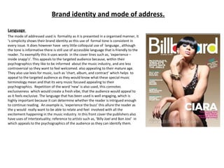
- 1. Brand identity and mode of address. Language The mode of addressed used is formality as it is presented in a organised manner, it ‘s simplicity shows their brand identity as this use of formal tone is consistent in every issue. It does however have very little colloquial use of language , although the tone is informative there is still use of accessible language that is friendly to the reader. To exemplify this it uses words in the cover lines such as, ‘experience – inside snapp’s’. This appeals to the targeted audience because, within their psychographics they like to be informed about the music industry, and are less controversial so they want to feel welcomed. also appealing to their mature age. They also use lexis for music, such as ‘chart, album, and contract’ which helps to appeal to the targeted audience as they would know what these special music terminology mean and that its very music focused appealing to their psychographics. Repetition of the word ‘new’ is also used, this connotes exclusiveness which would create a fresh vibe, that the audience would appeal to as it feels exclusive. The language that has been used is well engaging, which is highly important because it can determine whether the reader is intrigued enough to continue reading. An example is, ‘experience the buzz’ this allure the reader as the y would really want to be able to relate and feel involved with all the excitement happening in the music industry. In this front cover the publishers also have uses of intertextuality; reference to artists such as, ‘Billy Joel and Bon Jovi’ in which appeals to the psychographics of the audience as they can identify them.
- 2. Typography and colours. For the masthead the publishers have created a very simplistic look , the consistent use of sans serif styled font (relating to their house of style) in bolded, typically white, and fills the lettering red, blue and yellow creates a house of style that will appeal to their targeted female audience. This is because, sans serif connotes a relaxed, yet mature vibe which will relate to their mature psychographics of being employed people who love music. The font style also creates a fashionable appearance, to convey sophistication which relates to the female targeted audience. It also makes the magazine stand out when being placed on shelves as it has a differentiated style. The way Ciara (artist) is positioned in front of the masthead indicates that Billboard ‘s brand identity is well known to the audience for their conventions and specific elements.. For the coverlines the insignificant texts are in turquoise instead of white, smaller in size. However, for the important coverlines they are also kept embolden and are larger in size in comparison, for example, ‘Staind’s new amazon’ and ‘Ticketmaster looks beyond’ in order to create contrast and make the readers eye attract to the important ones more. White, pink and turquoise are also slightly darker shades rather than highlighted to give it a more mature, tone down vibe, but still connoting an exciting idea, relating to their brand identity of being lively, upbeat and formal, overall this is appealing to their target audience of young woman. As white is used majorly this would indicate to the audience that those texts are more important and are more likely to read it. The, ‘Chart Heat’ is also positioned in a puff to create more attention to it, because it is what provides information about content in the magazine. The colour scheme used on the front page, has a balance of appealing to both genders. The light brown background and the turquoise is appealing for both male and female, although the pink stereotypically appeals females it does not dominate the colour palette.
- 3. Image Through the use of a sleek black dress (costume)and body language, the image connotes poise yet style. the artist (Ciara) is viewed to be confident, from the way she uses her hand to hold her chin up high, creates a rhythmic vibe and makes the audience see her as independent, to the low angle shot used to make her seen as dominant and high level. She is looking into the camera, which means it is a direct mode of address. Ciara is a popular artist in the same age demographics as the targeted audience appealing to them due to familiarity, and also relates to the house of style as Billboard typically uses a popular artist to feature on the front cover. The chosen image and the created implication relates to the coverline ‘Ciara-takes charge’ because it connotes that strong, independent woman, this creates a house of style and a form of brand identity in personality, as all female artists featuring on the front page of Billboard are addressed in the same way. Her sparkly dress that makes her stand out from a plain background suggests to the audience to, not be afraid of differentiating yourself. The use of Ciara is effective to their brand identity as she majorly influences women to be strong, sophistication and have confidence within yourself. Which is what Billboard typically symbolises and typically offers a unique selling point to create that market and reach out to an young women; in a way that in comparison other magazines conventionally portray female artists as girly. However, Billboard creates an independent, strong, poise personality. The use of blue eyeshadow could relate to the colour palette (house of style) of red, blue and yellow, in order to create a house of style. Blue connotes happiness and suggests the idea of a positive point of view.
- 4. Contents page Language The mode of address is the same as the front page, it is formal, which makes it conventional as it is what the reader would expect to read . This helps to appeal to the target audience of young adults , as they are informative yet want to feel relaxed . It again has use of lexis such as, ‘charts, volume and songs’ appealing and relating to the targeted audience’s psychographics because, they have similar use of vocabulary which makes them feel intrigued. Through the use of bright colours like blue, gold, red, pink etc.. The tone created on the contents page is very welcoming and energetic which will appeal to the targeted audience as it sets a upbeat, uplifting mood. The language used is formal yet has a touch of colloquial language, an example of this is ‘beat goes on’ and ‘no fillers, no killers’ . This would appeal to the target as they get the impression that they are cool, because they have that similar use of daily vocab/ dialect and allures them into buying the magazine as this impression would be felt throughout the issue. In addition this also shown through the image on top left hand side.
- 5. Typography and colour. The typography used throughout the contents page are mainly sans serif but also uses very little serif fonts, following the house style across the magazine. This mixture achieves equilibrium which is relaxing to the eye of the reader. Billboard has a genre of all kinds, so the typography is a significance for creating an inviting impression especially on the first page. The minimal colours, blue, green and black were chosen to connote a welcoming vibe and are also appealing to both genders. Green associates with go, blue connotes happiness, and black is a simplistic colour that appeals to anyone and stands out in the background. Overall creating a modern, sleek look and an upbeat feel. It relates to their brand identity of being fun yet informative. This appeals to their targeted audience because it creates formal, inviting look which they would like due to it relating their psychographics and demographics. A larger size in font and embolden is applied to the significant texts, for instance the mastheads ‘contents’ and coverlines, which is too capitalised to create contrast, and suggest to the reader which text is more important. The typography overall is conventional for the formal theme it follows for their brand identity and especially for the targeted audience, it is what they expect within their age bracket to see .
- 6. Image and layout. Through this page brand identity is used by positioning the magazine’s logo on the left hand side of the page. Their mode of address is direct as the artist on the main image and all the other images is looking into the camera, which is conventional for this magazine . The images of the artists are also appealing to the targeted audience as they are celebrities they would identify, these images are too taken in mid-shot to also make it easier for them to recognise even from at a distance Their costumes are trendy which relates to their brand identity of being modern and stylish, appealing to the target audience as they would like this fashion sense. Although, their targeted audience is mainly female, the male artists used in this page insinuates that the are for all. The layout used in this page follows its house of style, it is consistently formal and organised neatly to give a mature, modern appearance. The significant articles are easier to easy as they are positioned on centre third (rule of thirds) to relate to their psychographics as they want to get on to reading the most informative articles.
- 7. Double page spread Language The language used follows the same house of style meaning the same mode of address which is formal. It uses very little colloquial language, which is just ‘girl, you’ll be a woman soon’ and ‘tween idol’ The title also relates to the targeted demographics and personal life of the audience, as they are females in the age bracket of 16-25 year olds meaning they are ‘transitioning’ from a ‘girl’ to a woman, making them feel like they can relate so it makes it intriguing enough for them to read the feature. The tone used for this is lively yet informative relating to their brand identity of being fun and informative, this will also appeal to their targeted audience as they like to know stuff about artists. There is also use of intertextuality such as ‘Disney channel-Hannah Montana’ and ‘Youtube’. This is to inform the reader who may know less about Miley’s (artist) filmography and music background, and/or to make them appeal to the magazine, because it relates to their psychographics so they are likely to know or familiarise with these references. In addition relates to their brand identity of being informative. Overall the language used is conventional as it is expected on a magazine, and for the magazines brand identity of being formal, informative and lively.
- 8. Typography and image The main font style used for the double page spread is sans serif connoting sophistication and formality which follows their house of style as it is used throughout the issue, mode of address of being formal and appeals to their targeted audience of young women. This modern appearance that is being created, makes the audience appeal as within their psychographics they love trends. The black used on the res t of the title insinuates Miley’s style and connotes her changing genre of music, the transition from pink to black could suggest the idea of growing up, relating it to the article based on ‘transitions’. The title is also capitalised which signifies its importance, and make s the reader drawn to it. Pink which is used for ‘GIRL’ is stereotypically very girly, the black used for ‘YOU’LL BE A WOMAN SOON’ connotes maturity which relates to the basis of the article; transitioning. Overall the typography is conventional for this targeted age bracket, and is also relates to their brand identity of being formal and lively with the variation in colours chosen conveys an energetic vibe. The image is captured at an eye-level angle, making a direct mode of address, which will appeal to the targeted audience because it creates a relationship between them, and in addition within their psychographics they are able to recognise Miley. This relates to their brand identity because for a reader they want them to feel more personalised, lively and informative rather than controversial. Key lighting is used on her to suggest the idea of her being watched as she is growing into adulthood. The image is very simplistic, there is no use of props however the costume plays a significant role for appealing their target audience and relating to their brand identity. Her costume is stylish , high heels are stereotypically worn by women representing her as her transition into maturity and relating to the female targeted audience and their brand identity of being latest and trendy.
- 9. Layout and colour. The layout used for the double page spread is simple and formal, in order to relate to their brand identity and their formal mode of and to convey the idea of simplicity and sophistication. It is very spaced out; it has used areas around the page. It unconventionally doesn’t use the route of the eye, however it does use the principle of the rule of thirds. The centre third going across being the dominant side as it is where all the main elements are positioned, (image, feature, title, and byline). Which relates to their mode of address being formal and direct, appealing o their house of style being formal, modern and stylish. The colour scheme used for this spread is minimal being a convention for them. The colours used are black, white, pink and yellow, which follows the house of style for this issue as on the front cover and on the contents page, there is use of this colour palette, Pink connotes feminine which appeals to their targeted gender, it connotes upbeat and happiness which relates to their brand identity of being lively. Black makes the title and the kicker stand out, it also a simple colour that appeals to both gender and relates to their brand identity. White is used on the full article, it connotes purity and could create a feeling of exclusive information which the targeted audience would appeal to, in addition relating to their brand identity of being informative. Yellow is used on the, ‘Just Read’ part, it connotes happiness and a feeling of being welcomed, which helps appeal to their target audience, it is also a colour that is stereotyped for one gender; any gender can appeal to it and ‘read it’ .
- 10. Layout and colour. The layout used for the double page spread is simple and formal, in order to relate to their brand identity and their formal mode of and to convey the idea of simplicity and sophistication. It is very spaced out; it has used areas around the page. It unconventionally doesn’t use the route of the eye, however it does use the principle of the rule of thirds. The centre third going across being the dominant side as it is where all the main elements are positioned, (image, feature, title, and byline). Which relates to their mode of address being formal and direct, appealing o their house of style being formal, modern and stylish. The colour scheme used for this spread is minimal being a convention for them. The colours used are black, white, pink and yellow, which follows the house of style for this issue as on the front cover and on the contents page, there is use of this colour palette, Pink connotes feminine which appeals to their targeted gender, it connotes upbeat and happiness which relates to their brand identity of being lively. Black makes the title and the kicker stand out, it also a simple colour that appeals to both gender and relates to their brand identity. White is used on the full article, it connotes purity and could create a feeling of exclusive information which the targeted audience would appeal to, in addition relating to their brand identity of being informative. Yellow is used on the, ‘Just Read’ part, it connotes happiness and a feeling of being welcomed, which helps appeal to their target audience, it is also a colour that is stereotyped for one gender; any gender can appeal to it and ‘read it’ .