1. Text:
Big, bold text attracts the
reader as it instantly
captures their attention . It
dominates the page as the
title is significantly important
in persuading the reader to
buy the trainers. The font
used is san serif which makes
it look modern and more
urban. The fact that the
background is plain and
white helps to make the text
stand out. The full stop at the
end of the text suggests a
statement and makes it more
effective as it creates a
dramatic effect. This reflects
the idea of the trainers as
they are designed to be a
fashion statement.
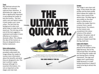
Image:
The image is very clear and
large. It also shows the side
profile and the back profile
which allows the readers to
have a clear visual of the
whole shoe. The Nike logo is
very visible on the shoe
which is effective as it
notifies the reader that it is
a trainer from a world
known brand. The colours
on the trainers also
compliment the colour
scheme of the advert.
However, the green sole of
the shoe is green which
creates an impact much like
the big, bold text.
Logo and slogan:
The logo and slogan is
placed at the bottom of the
page because, due to the
natural eye flow, this will be
the last thing the reader will
see leaving them a lasting
impression. The logo and
slogan aren’t particularly
large because it is a well
known brand thus it doesn't
need to be big to attract the
reader.
Extra Information:
The extra information
provided underneath the
image allows the reader to
receive more information
about the benefits and what
they are designed to do. This
text is written in grey
because although it is
essential information, it is
not as important as the
slogan and main text.
2. Catchphrase:
The audience is attracted by the short, big, bold caption . Like the previous Nike advert, the san serif font makes the advert look modern
and more urban. This urban feel is further supported by the image as all the characterised pills look like modern day, urban individuals.
The fact that the background is white helps creates more of an impact as it makes the images and text stand out. The full stop at the end
of the caption also implies a statement and makes it more effective as it creates a dramatic effect. This dramatic effect is once again
supported by the image of the hand gesture of the black pill as it seems to suggest that the pill is proud of the fact that he is “small but
loud.”
Logo:
The speech bubble used to contain the name is
representative of the pills talking as they are designed to
project music. The fact that it is red makes it stand out
as red is a very dominating and eye catching colour. The
font used for the “beats” is the original beats font which
makes the advert instantly recognisable as it is a well
known brand. However, the word “pills” is written in a
more playful font which creates a contrast and
compliments the overall fun mood of the advert.
Image:
The images dominate the page which makes
them the main focus. The product (speakers)
have been made to look ‘cartoon-like’ to
make the advert/product look more fun and
appeal to a younger audience. The target
audience of this is young adults who enjoy
music, socialising, and having big gatherings.
Thus the advert has been made to look more
entertaining to reflect their target audiences
personalities.
In addition to this,
the hand gestures of
the beats pills also
reflects various
peoples attitudes
e.g. the black beats
pill suggests the
“cool,” “urban” and
“street” guy, thus it
appeals to all type
of individuals. The
various colours used
appeals to both
males and females.