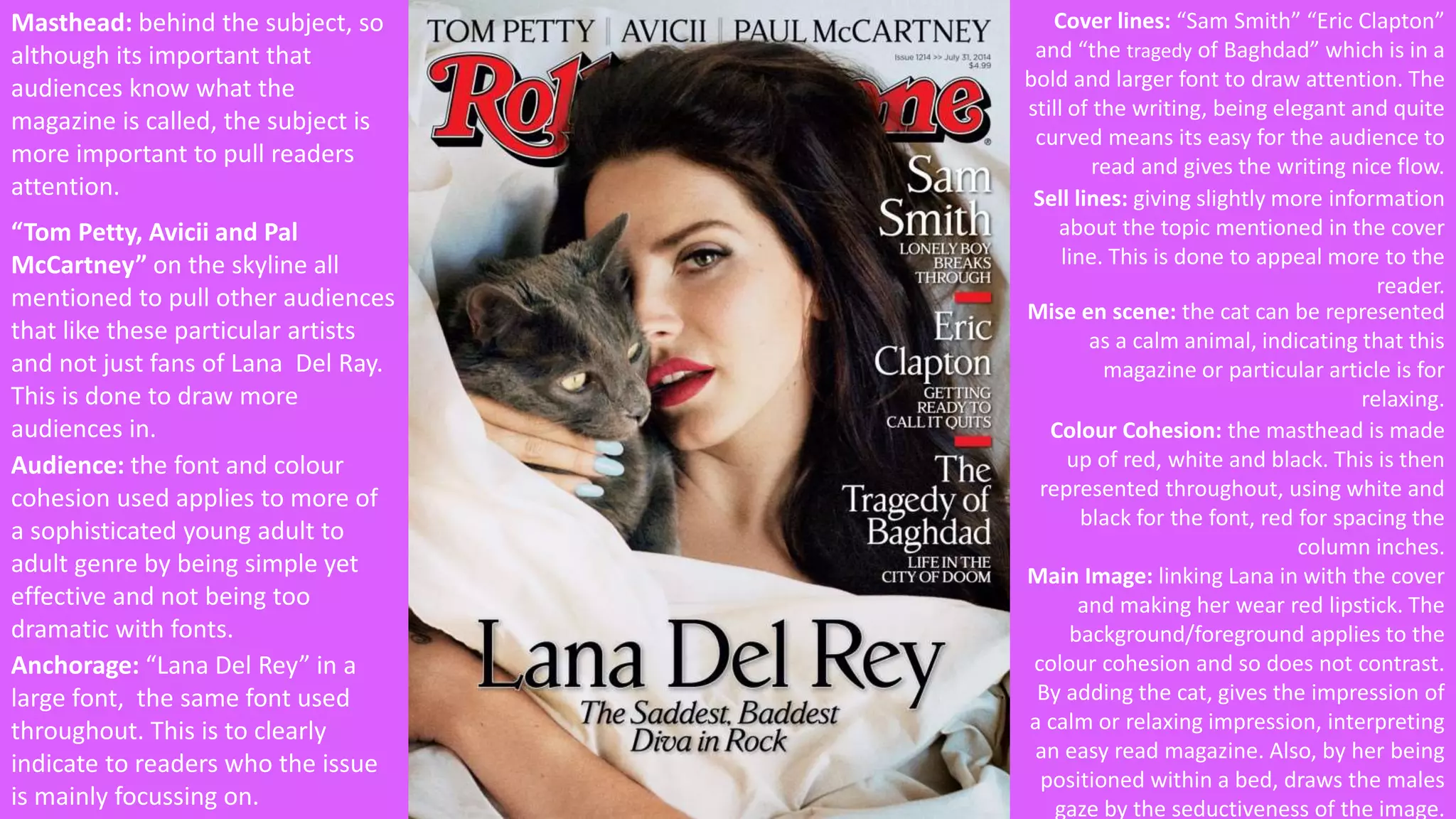
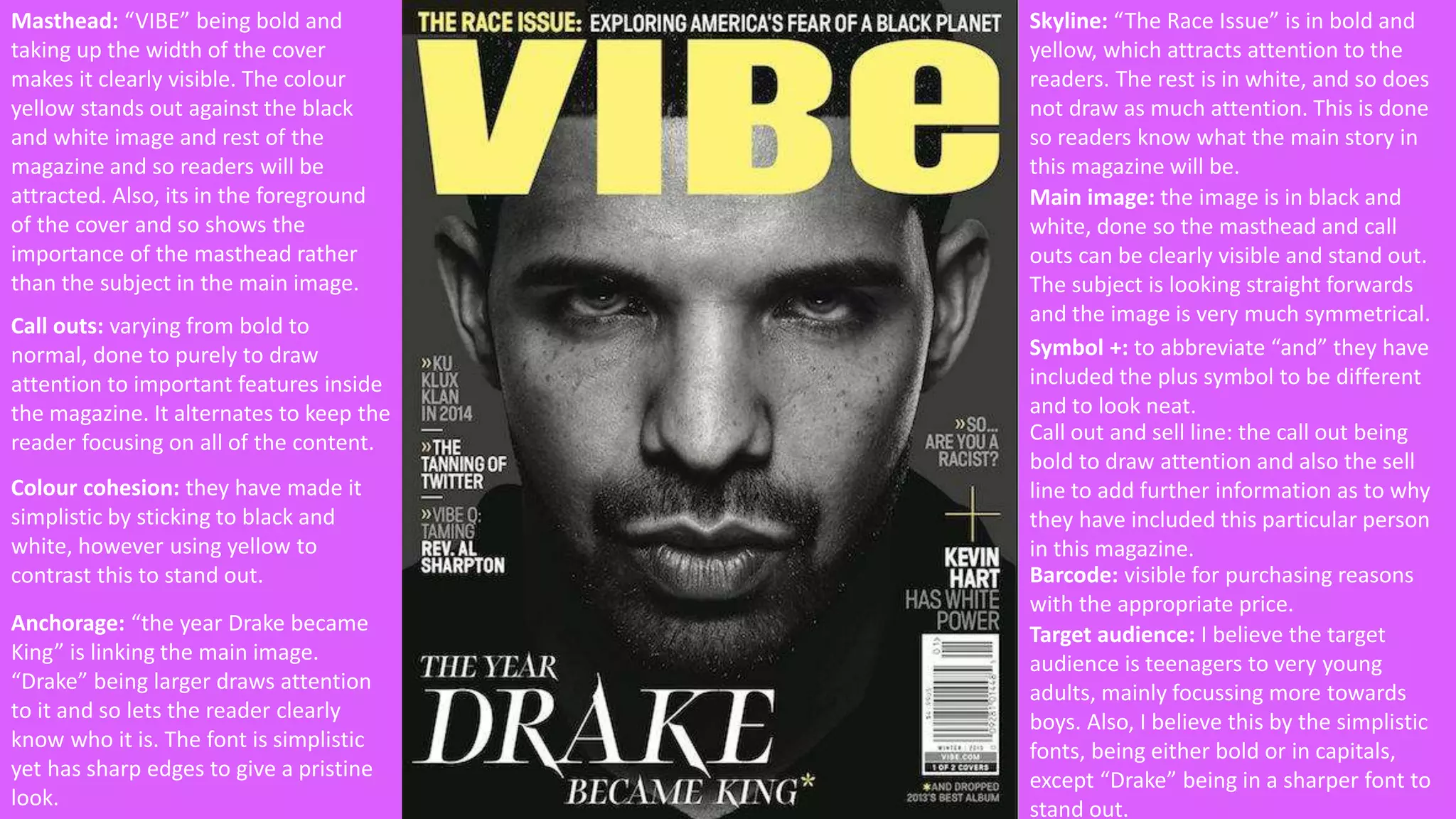
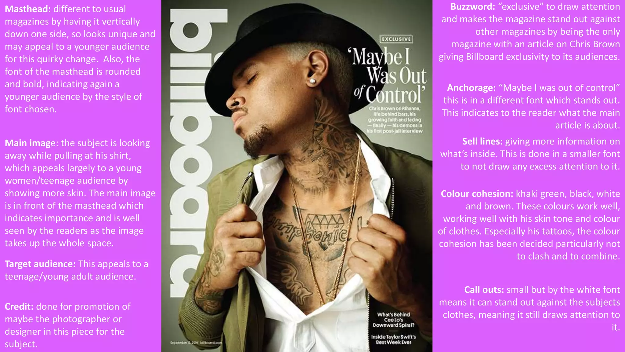
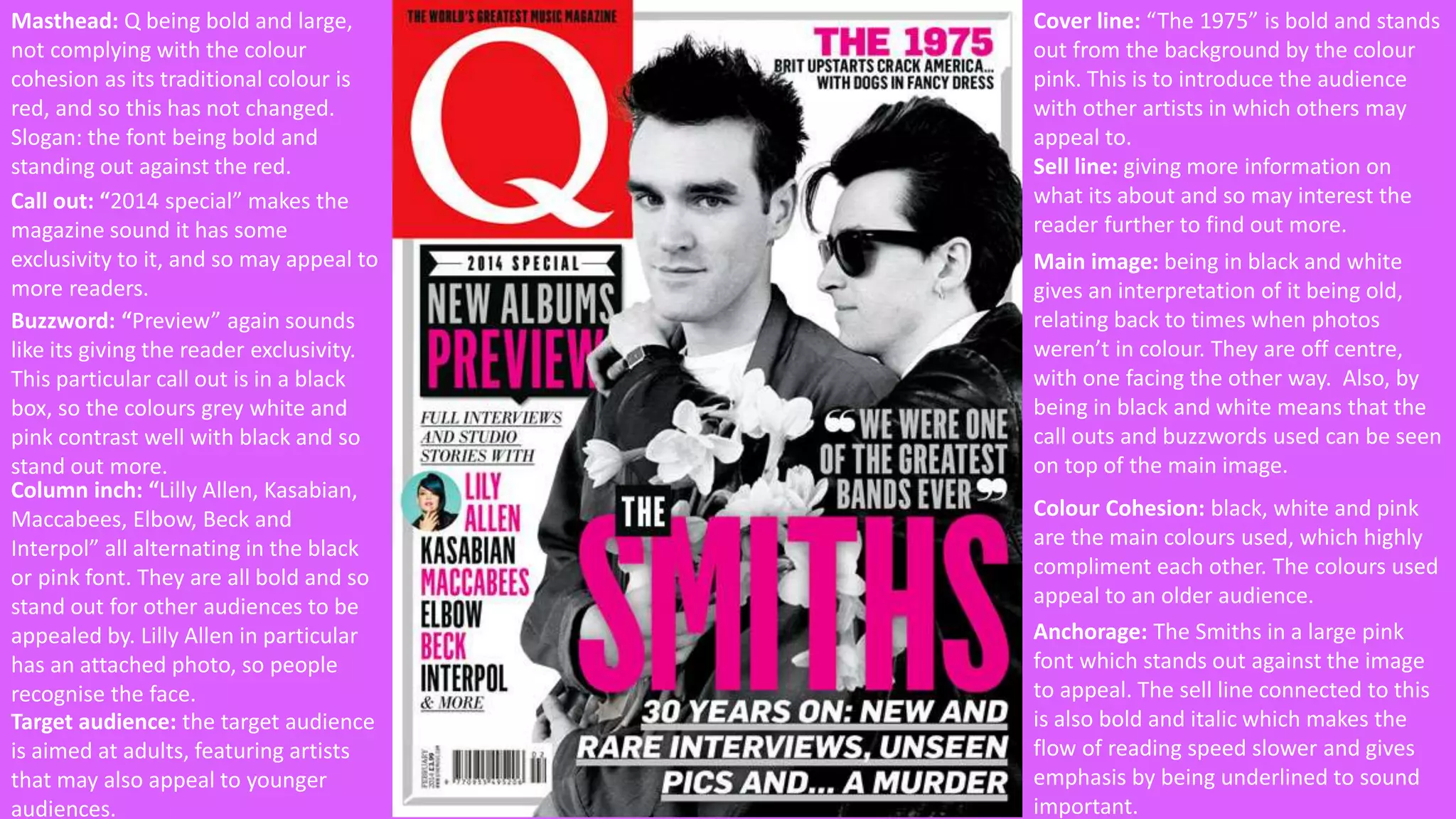
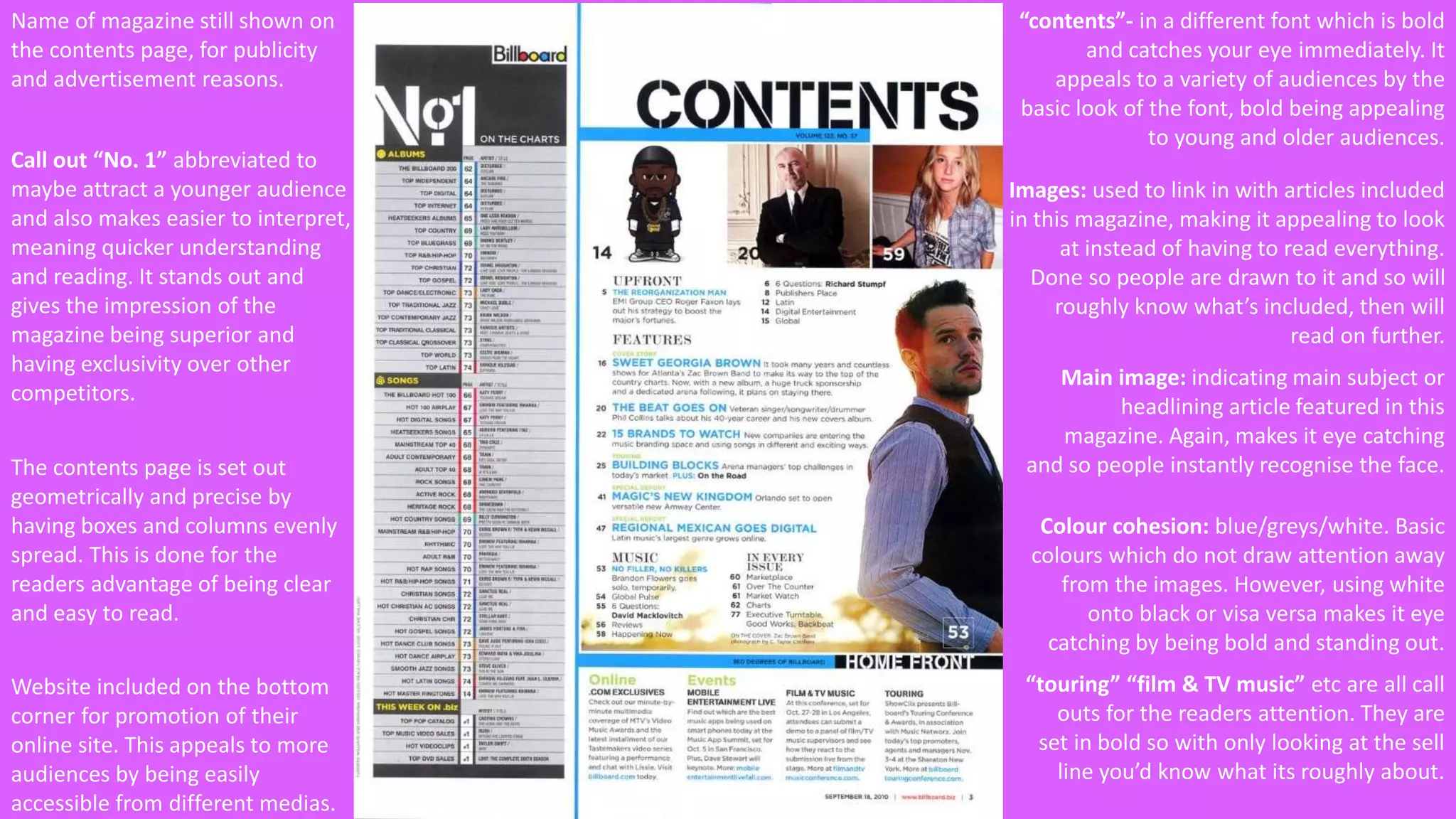
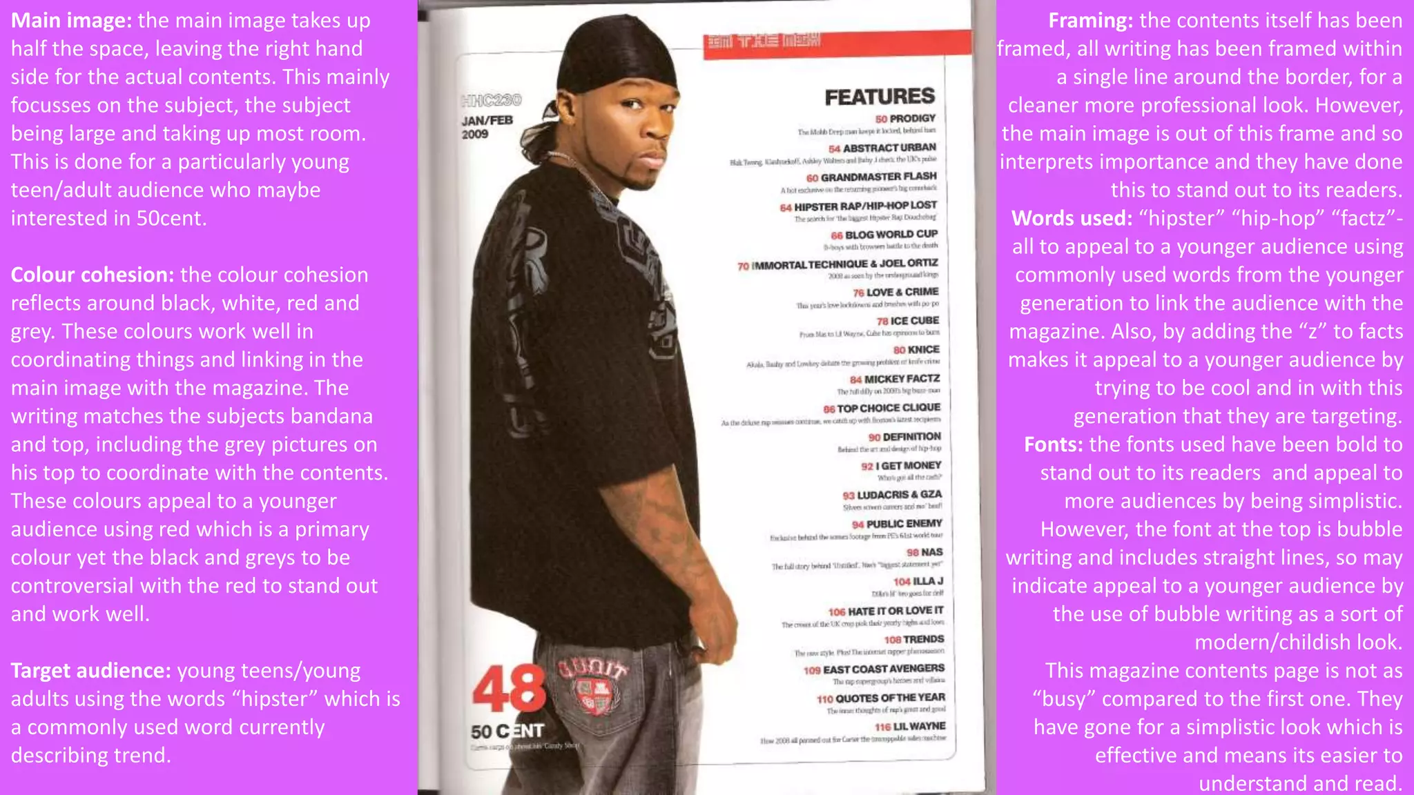
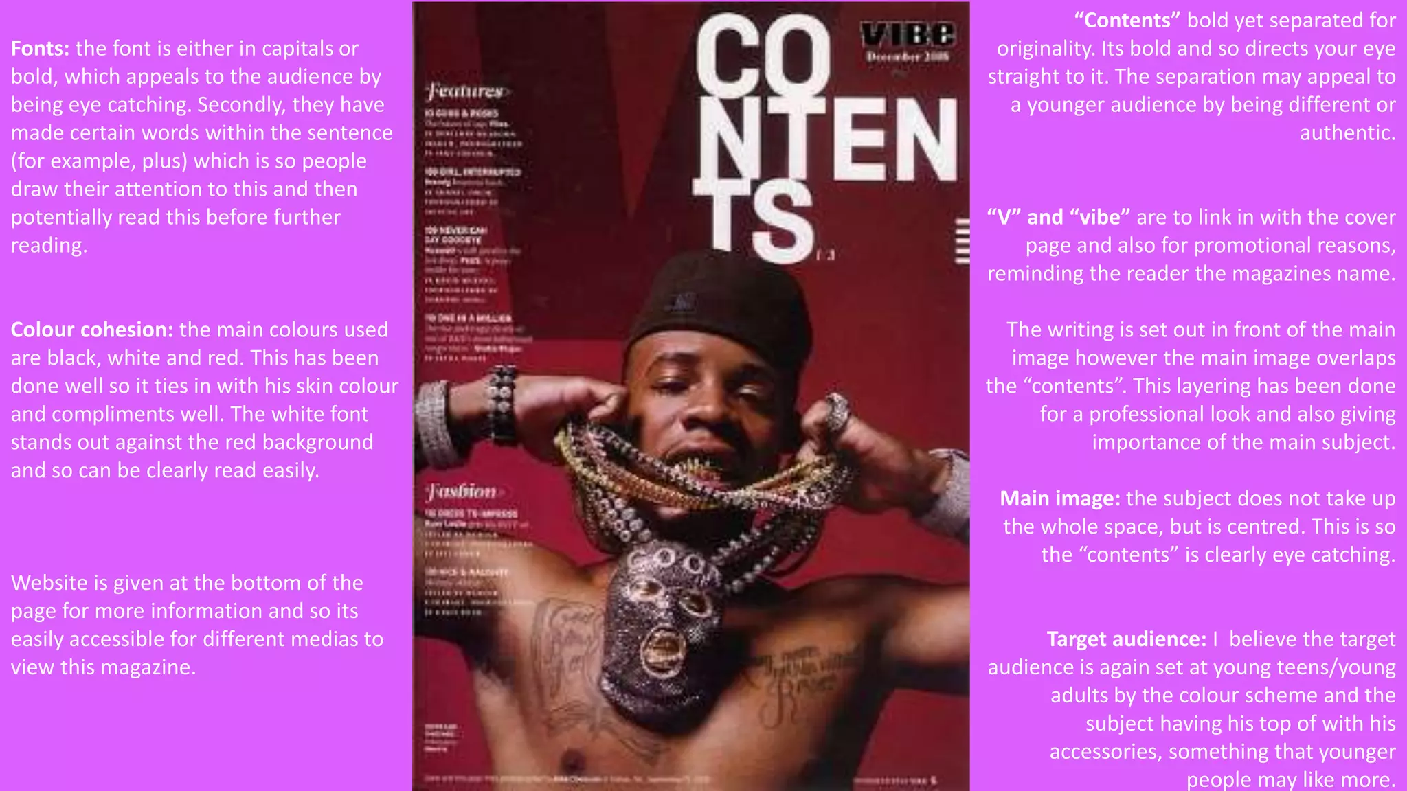
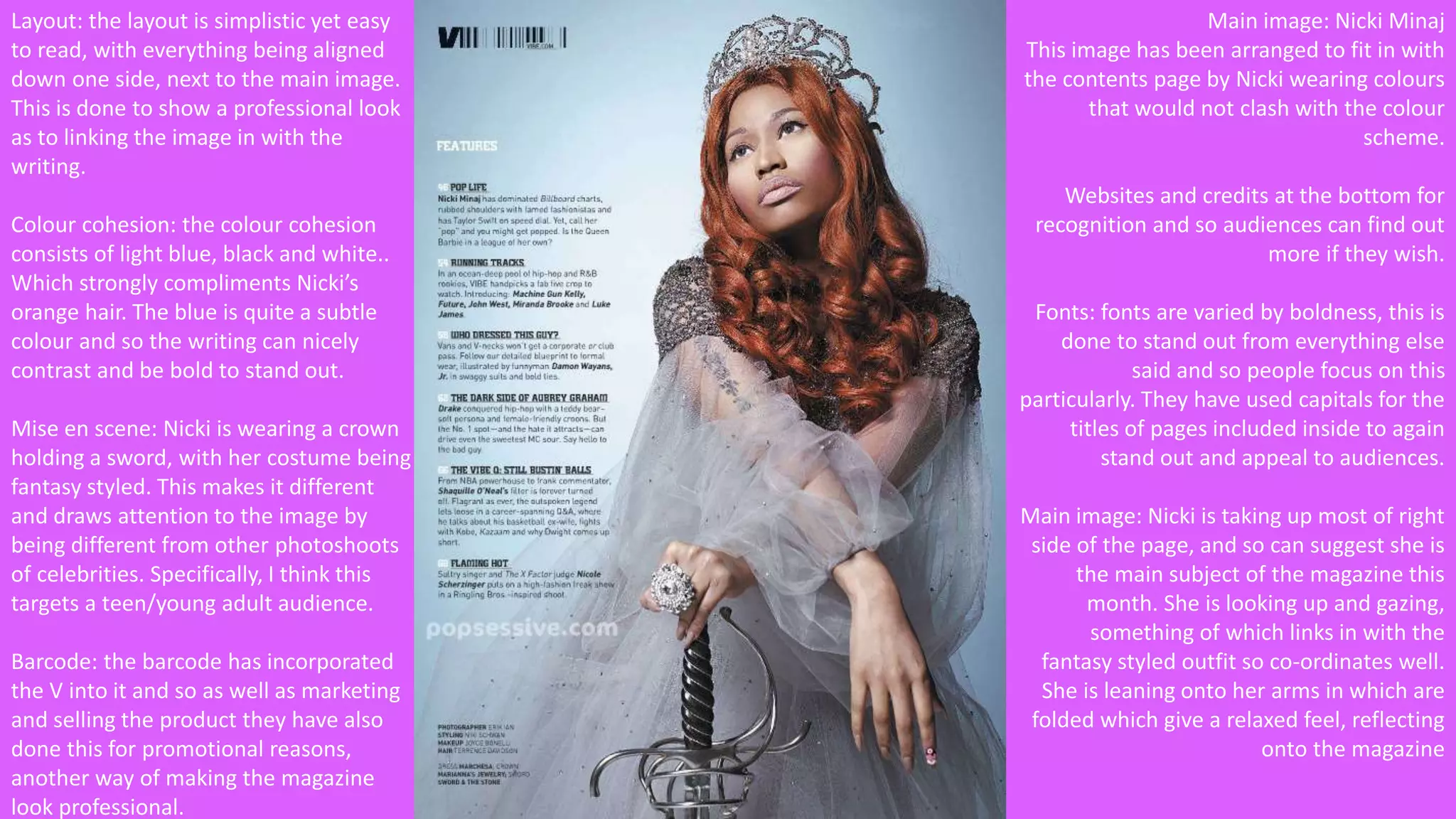
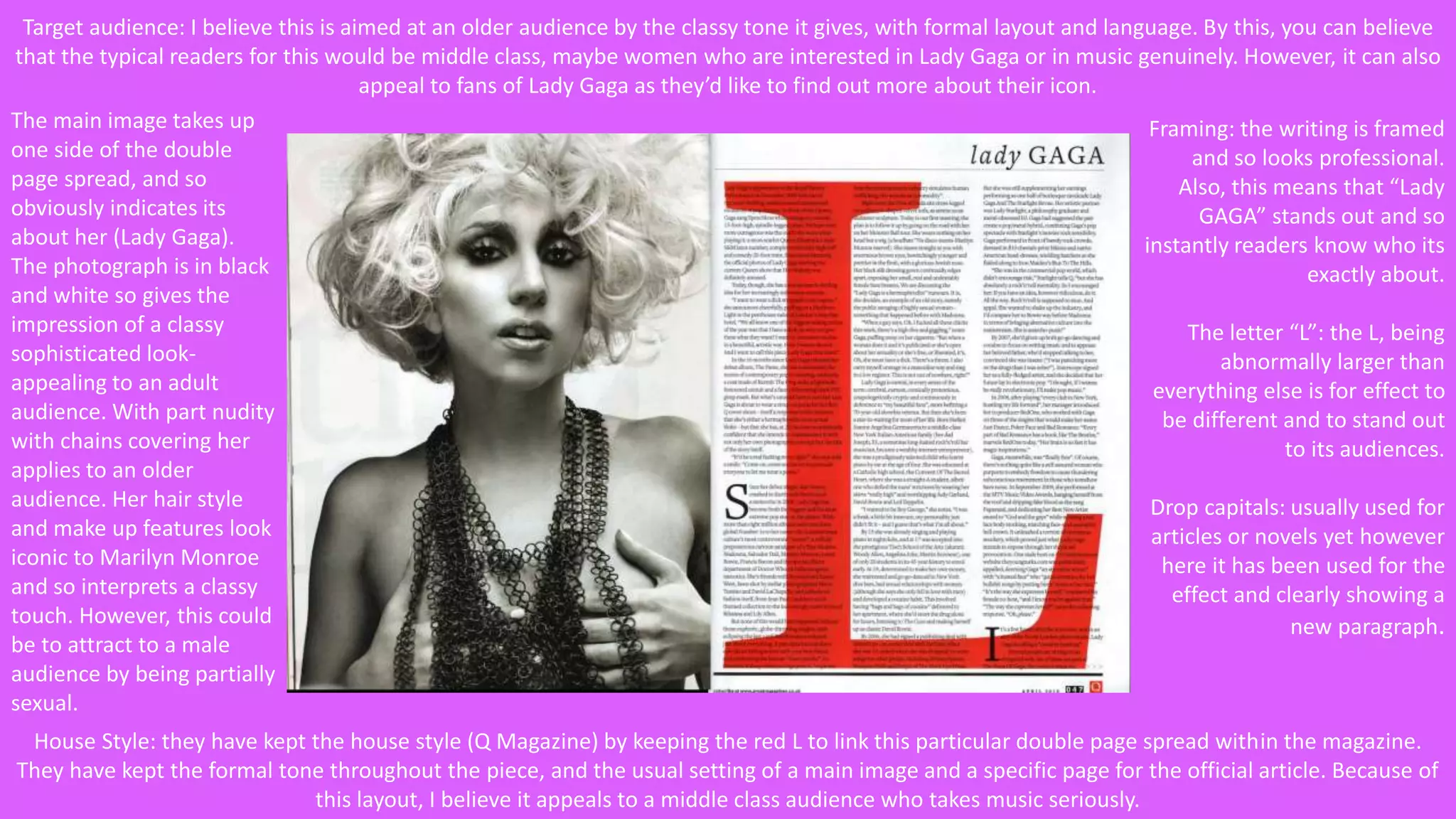
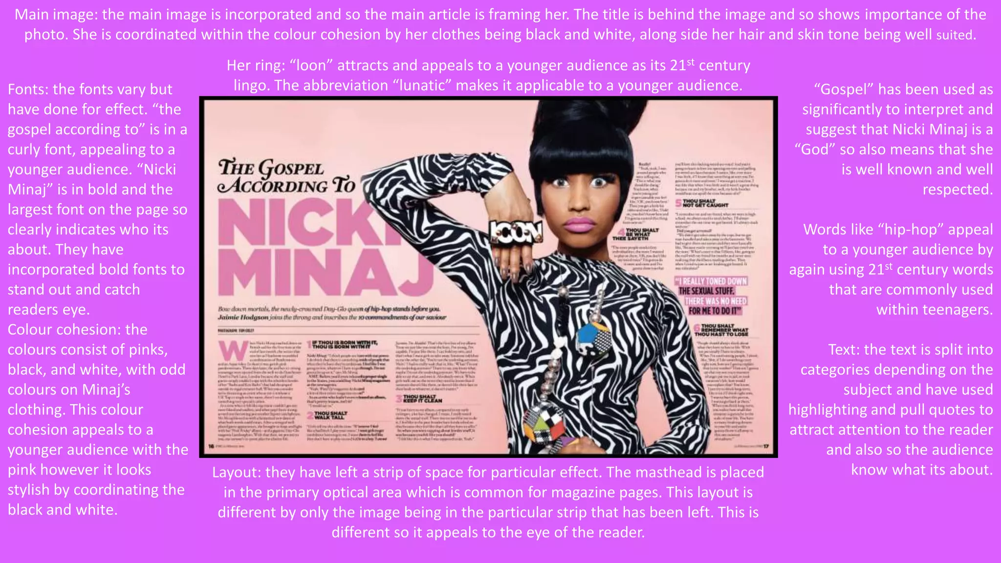
Main Task: Analysing 
Music Magazines
Magazine front covers
Masthead: behind the subject, so 
although its important that 
audiences know what the 
magazine is called, the subject is 
more important to pull readers 
attention. 
“Tom Petty, Avicii and Pal 
McCartney” on the skyline all 
mentioned to pull other audiences 
that like these particular artists 
and not just fans of Lana Del Ray. 
This is done to draw more 
audiences in. 
Cover lines: “Sam Smith” “Eric Clapton” 
and “the tragedy of Baghdad” which is in a 
bold and larger font to draw attention. The 
still of the writing, being elegant and quite 
curved means its easy for the audience to 
read and gives the writing nice flow. 
Anchorage: “Lana Del Rey” in a 
large font, the same font used 
throughout. This is to clearly 
indicate to readers who the issue 
is mainly focussing on. 
Sell lines: giving slightly more information 
about the topic mentioned in the cover 
line. This is done to appeal more to the 
reader. 
Colour Cohesion: the masthead is made 
up of red, white and black. This is then 
represented throughout, using white and 
black for the font, red for spacing the 
column inches. 
Main Image: linking Lana in with the cover 
and making her wear red lipstick. The 
background/foreground applies to the 
colour cohesion and so does not contrast. 
By adding the cat, gives the impression of 
a calm or relaxing impression, interpreting 
an easy read magazine. Also, by her being 
positioned within a bed, draws the males 
gaze by the seductiveness of the image. 
Audience: the font and colour 
cohesion used applies to more of 
a sophisticated young adult to 
adult genre by being simple yet 
effective and not being too 
dramatic with fonts. 
Mise en scene: the cat can be represented 
as a calm animal, indicating that this 
magazine or particular article is for 
relaxing.
Masthead: “VIBE” being bold and 
taking up the width of the cover 
makes it clearly visible. The colour 
yellow stands out against the black 
and white image and rest of the 
magazine and so readers will be 
attracted. Also, its in the foreground 
of the cover and so shows the 
importance of the masthead rather 
than the subject in the main image. 
Skyline: “The Race Issue” is in bold and 
yellow, which attracts attention to the 
readers. The rest is in white, and so does 
not draw as much attention. This is done 
so readers know what the main story in 
this magazine will be. 
Main image: the image is in black and 
white, done so the masthead and call 
outs can be clearly visible and stand out. 
The subject is looking straight forwards 
and the image is very much symmetrical. 
Call outs: varying from bold to 
normal, done to purely to draw 
attention to important features inside 
the magazine. It alternates to keep the 
reader focusing on all of the content. 
Anchorage: “the year Drake became 
King” is linking the main image. 
“Drake” being larger draws attention 
to it and so lets the reader clearly 
know who it is. The font is simplistic 
yet has sharp edges to give a pristine 
look. 
Symbol +: to abbreviate “and” they have 
included the plus symbol to be different 
and to look neat. 
Call out and sell line: the call out being 
bold to draw attention and also the sell 
line to add further information as to why 
they have included this particular person 
in this magazine. 
Barcode: visible for purchasing reasons 
with the appropriate price. 
Colour cohesion: they have made it 
simplistic by sticking to black and 
white, however using yellow to 
contrast this to stand out. 
Target audience: I believe the target 
audience is teenagers to very young 
adults, mainly focussing more towards 
boys. Also, I believe this by the simplistic 
fonts, being either bold or in capitals, 
except “Drake” being in a sharper font to 
stand out.
Masthead: different to usual 
magazines by having it vertically 
down one side, so looks unique and 
may appeal to a younger audience 
for this quirky change. Also, the 
font of the masthead is rounded 
and bold, indicating again a 
younger audience by the style of 
font chosen. 
Main image: the subject is looking 
away while pulling at his shirt, 
which appeals largely to a young 
women/teenage audience by 
showing more skin. The main image 
is in front of the masthead which 
indicates importance and is well 
seen by the readers as the image 
takes up the whole space. 
Credit: done for promotion of 
maybe the photographer or 
designer in this piece for the 
subject. 
Buzzword: “exclusive” to draw attention 
and makes the magazine stand out against 
other magazines by being the only 
magazine with an article on Chris Brown 
giving Billboard exclusivity to its audiences. 
Anchorage: “Maybe I was out of control” 
this is in a different font which stands out. 
This indicates to the reader what the main 
article is about. 
Sell lines: giving more information on 
what’s inside. This is done in a smaller font 
to not draw any excess attention to it. 
Colour cohesion: khaki green, black, white 
and brown. These colours work well, 
working well with his skin tone and colour 
of clothes. Especially his tattoos, the colour 
cohesion has been decided particularly not 
to clash and to combine. 
Call outs: small but by the white font 
means it can stand out against the subjects 
clothes, meaning it still draws attention to 
it. 
Target audience: This appeals to a 
teenage/young adult audience.
Masthead: Q being bold and large, 
not complying with the colour 
cohesion as its traditional colour is 
red, and so this has not changed. 
Slogan: the font being bold and 
standing out against the red. 
Call out: “2014 special” makes the 
magazine sound it has some 
exclusivity to it, and so may appeal to 
more readers. 
Buzzword: “Preview” again sounds 
like its giving the reader exclusivity. 
This particular call out is in a black 
box, so the colours grey white and 
pink contrast well with black and so 
stand out more. 
Column inch: “Lilly Allen, Kasabian, 
Maccabees, Elbow, Beck and 
Interpol” all alternating in the black 
or pink font. They are all bold and so 
stand out for other audiences to be 
appealed by. Lilly Allen in particular 
has an attached photo, so people 
recognise the face. 
Cover line: “The 1975” is bold and stands 
out from the background by the colour 
pink. This is to introduce the audience 
with other artists in which others may 
appeal to. 
Sell line: giving more information on 
what its about and so may interest the 
reader further to find out more. 
Main image: being in black and white 
gives an interpretation of it being old, 
relating back to times when photos 
weren’t in colour. They are off centre, 
with one facing the other way. Also, by 
being in black and white means that the 
call outs and buzzwords used can be seen 
on top of the main image. 
Colour Cohesion: black, white and pink 
are the main colours used, which highly 
compliment each other. The colours used 
appeal to an older audience. 
Anchorage: The Smiths in a large pink 
font which stands out against the image 
to appeal. The sell line connected to this 
is also bold and italic which makes the 
flow of reading speed slower and gives 
emphasis by being underlined to sound 
important. 
Target audience: the target audience 
is aimed at adults, featuring artists 
that may also appeal to younger 
audiences.
Contents pages
“contents”- in a different font which is bold 
and catches your eye immediately. It 
appeals to a variety of audiences by the 
basic look of the font, bold being appealing 
to young and older audiences. 
Images: used to link in with articles included 
in this magazine, making it appealing to look 
at instead of having to read everything. 
Done so people are drawn to it and so will 
roughly know what’s included, then will 
read on further. 
Main image: indicating main subject or 
headlining article featured in this 
magazine. Again, makes it eye catching 
and so people instantly recognise the face. 
Colour cohesion: blue/greys/white. Basic 
colours which do not draw attention away 
from the images. However, using white 
onto black or visa versa makes it eye 
catching by being bold and standing out. 
“touring” “film & TV music” etc are all call 
outs for the readers attention. They are 
set in bold so with only looking at the sell 
line you’d know what its roughly about. 
Name of magazine still shown on 
the contents page, for publicity 
and advertisement reasons. 
Call out “No. 1” abbreviated to 
maybe attract a younger audience 
and also makes easier to interpret, 
meaning quicker understanding 
and reading. It stands out and 
gives the impression of the 
magazine being superior and 
having exclusivity over other 
competitors. 
The contents page is set out 
geometrically and precise by 
having boxes and columns evenly 
spread. This is done for the 
readers advantage of being clear 
and easy to read. 
Website included on the bottom 
corner for promotion of their 
online site. This appeals to more 
audiences by being easily 
accessible from different medias.
Main image: the main image takes up 
half the space, leaving the right hand 
side for the actual contents. This mainly 
focusses on the subject, the subject 
being large and taking up most room. 
This is done for a particularly young 
teen/adult audience who maybe 
interested in 50cent. 
Colour cohesion: the colour cohesion 
reflects around black, white, red and 
grey. These colours work well in 
coordinating things and linking in the 
main image with the magazine. The 
writing matches the subjects bandana 
and top, including the grey pictures on 
his top to coordinate with the contents. 
These colours appeal to a younger 
audience using red which is a primary 
colour yet the black and greys to be 
controversial with the red to stand out 
and work well. 
Target audience: young teens/young 
adults using the words “hipster” which is 
a commonly used word currently 
describing trend. 
Framing: the contents itself has been 
framed, all writing has been framed within 
a single line around the border, for a 
cleaner more professional look. However, 
the main image is out of this frame and so 
interprets importance and they have done 
this to stand out to its readers. 
Words used: “hipster” “hip-hop” “factz”- 
all to appeal to a younger audience using 
commonly used words from the younger 
generation to link the audience with the 
magazine. Also, by adding the “z” to facts 
makes it appeal to a younger audience by 
trying to be cool and in with this 
generation that they are targeting. 
Fonts: the fonts used have been bold to 
stand out to its readers and appeal to 
more audiences by being simplistic. 
However, the font at the top is bubble 
writing and includes straight lines, so may 
indicate appeal to a younger audience by 
the use of bubble writing as a sort of 
modern/childish look. 
This magazine contents page is not as 
“busy” compared to the first one. They 
have gone for a simplistic look which is 
effective and means its easier to 
understand and read.
“Contents” bold yet separated for 
originality. Its bold and so directs your eye 
straight to it. The separation may appeal to 
a younger audience by being different or 
authentic. 
“V” and “vibe” are to link in with the cover 
page and also for promotional reasons, 
reminding the reader the magazines name. 
The writing is set out in front of the main 
image however the main image overlaps 
the “contents”. This layering has been done 
for a professional look and also giving 
importance of the main subject. 
Main image: the subject does not take up 
the whole space, but is centred. This is so 
the “contents” is clearly eye catching. 
Target audience: I believe the target 
audience is again set at young teens/young 
adults by the colour scheme and the 
subject having his top of with his 
accessories, something that younger 
people may like more. 
Fonts: the font is either in capitals or 
bold, which appeals to the audience by 
being eye catching. Secondly, they have 
made certain words within the sentence 
(for example, plus) which is so people 
draw their attention to this and then 
potentially read this before further 
reading. 
Colour cohesion: the main colours used 
are black, white and red. This has been 
done well so it ties in with his skin colour 
and compliments well. The white font 
stands out against the red background 
and so can be clearly read easily. 
Website is given at the bottom of the 
page for more information and so its 
easily accessible for different medias to 
view this magazine.
Layout: the layout is simplistic yet easy 
to read, with everything being aligned 
down one side, next to the main image. 
This is done to show a professional look 
as to linking the image in with the 
writing. 
Colour cohesion: the colour cohesion 
consists of light blue, black and white.. 
Which strongly compliments Nicki’s 
orange hair. The blue is quite a subtle 
colour and so the writing can nicely 
contrast and be bold to stand out. 
Mise en scene: Nicki is wearing a crown 
holding a sword, with her costume being 
fantasy styled. This makes it different 
and draws attention to the image by 
being different from other photoshoots 
of celebrities. Specifically, I think this 
targets a teen/young adult audience. 
Barcode: the barcode has incorporated 
the V into it and so as well as marketing 
and selling the product they have also 
done this for promotional reasons, 
another way of making the magazine 
look professional. 
Main image: Nicki Minaj 
This image has been arranged to fit in with 
the contents page by Nicki wearing colours 
that would not clash with the colour 
scheme. 
Websites and credits at the bottom for 
recognition and so audiences can find out 
more if they wish. 
Fonts: fonts are varied by boldness, this is 
done to stand out from everything else 
said and so people focus on this 
particularly. They have used capitals for the 
titles of pages included inside to again 
stand out and appeal to audiences. 
Main image: Nicki is taking up most of right 
side of the page, and so can suggest she is 
the main subject of the magazine this 
month. She is looking up and gazing, 
something of which links in with the 
fantasy styled outfit so co-ordinates well. 
She is leaning onto her arms in which are 
folded which give a relaxed feel, reflecting 
onto the magazine
Double paged spreads
Target audience: I believe this is aimed at an older audience by the classy tone it gives, with formal layout and language. By this, you can believe 
that the typical readers for this would be middle class, maybe women who are interested in Lady Gaga or in music genuinely. However, it can also 
appeal to fans of Lady Gaga as they’d like to find out more about their icon. 
Framing: the writing is framed 
and so looks professional. 
Also, this means that “Lady 
GAGA” stands out and so 
instantly readers know who its 
exactly about. 
The letter “L”: the L, being 
abnormally larger than 
everything else is for effect to 
be different and to stand out 
to its audiences. 
Drop capitals: usually used for 
articles or novels yet however 
here it has been used for the 
effect and clearly showing a 
new paragraph. 
The main image takes up 
one side of the double 
page spread, and so 
obviously indicates its 
about her (Lady Gaga). 
The photograph is in black 
and white so gives the 
impression of a classy 
sophisticated look-appealing 
to an adult 
audience. With part nudity 
with chains covering her 
applies to an older 
audience. Her hair style 
and make up features look 
iconic to Marilyn Monroe 
and so interprets a classy 
touch. However, this could 
be to attract to a male 
audience by being partially 
sexual. 
House Style: they have kept the house style (Q Magazine) by keeping the red L to link this particular double page spread within the magazine. 
They have kept the formal tone throughout the piece, and the usual setting of a main image and a specific page for the official article. Because of 
this layout, I believe it appeals to a middle class audience who takes music seriously.
Main image: the main image is incorporated and so the main article is framing her. The title is behind the image and so shows importance of the 
photo. She is coordinated within the colour cohesion by her clothes being black and white, along side her hair and skin tone being well suited. 
Fonts: the fonts vary but 
have done for effect. “the 
gospel according to” is in a 
curly font, appealing to a 
younger audience. “Nicki 
Minaj” is in bold and the 
largest font on the page so 
clearly indicates who its 
about. They have 
incorporated bold fonts to 
stand out and catch 
readers eye. 
Colour cohesion: the 
colours consist of pinks, 
black, and white, with odd 
colours on Minaj’s 
clothing. This colour 
cohesion appeals to a 
younger audience with the 
pink however it looks 
stylish by coordinating the 
black and white. 
Her ring: “loon” attracts and appeals to a younger audience as its 21st century 
lingo. The abbreviation “lunatic” makes it applicable to a younger audience. “Gospel” has been used as 
significantly to interpret and 
suggest that Nicki Minaj is a 
“God” so also means that she 
is well known and well 
respected. 
Words like “hip-hop” appeal 
to a younger audience by 
again using 21st century words 
that are commonly used 
within teenagers. 
Text: the text is split into 
categories depending on the 
subject and have used 
highlighting and pull quotes to 
attract attention to the reader 
and also so the audience 
Layout: they have left a strip of space for particular effect. The masthead is placed know what its about. 
in the primary optical area which is common for magazine pages. This layout is 
different by only the image being in the particular strip that has been left. This is 
different so it appeals to the eye of the reader.

Main task

  • 1.
    Main Task: Analysing Music Magazines
  • 2.
  • 3.
    Masthead: behind thesubject, so although its important that audiences know what the magazine is called, the subject is more important to pull readers attention. “Tom Petty, Avicii and Pal McCartney” on the skyline all mentioned to pull other audiences that like these particular artists and not just fans of Lana Del Ray. This is done to draw more audiences in. Cover lines: “Sam Smith” “Eric Clapton” and “the tragedy of Baghdad” which is in a bold and larger font to draw attention. The still of the writing, being elegant and quite curved means its easy for the audience to read and gives the writing nice flow. Anchorage: “Lana Del Rey” in a large font, the same font used throughout. This is to clearly indicate to readers who the issue is mainly focussing on. Sell lines: giving slightly more information about the topic mentioned in the cover line. This is done to appeal more to the reader. Colour Cohesion: the masthead is made up of red, white and black. This is then represented throughout, using white and black for the font, red for spacing the column inches. Main Image: linking Lana in with the cover and making her wear red lipstick. The background/foreground applies to the colour cohesion and so does not contrast. By adding the cat, gives the impression of a calm or relaxing impression, interpreting an easy read magazine. Also, by her being positioned within a bed, draws the males gaze by the seductiveness of the image. Audience: the font and colour cohesion used applies to more of a sophisticated young adult to adult genre by being simple yet effective and not being too dramatic with fonts. Mise en scene: the cat can be represented as a calm animal, indicating that this magazine or particular article is for relaxing.
  • 4.
    Masthead: “VIBE” beingbold and taking up the width of the cover makes it clearly visible. The colour yellow stands out against the black and white image and rest of the magazine and so readers will be attracted. Also, its in the foreground of the cover and so shows the importance of the masthead rather than the subject in the main image. Skyline: “The Race Issue” is in bold and yellow, which attracts attention to the readers. The rest is in white, and so does not draw as much attention. This is done so readers know what the main story in this magazine will be. Main image: the image is in black and white, done so the masthead and call outs can be clearly visible and stand out. The subject is looking straight forwards and the image is very much symmetrical. Call outs: varying from bold to normal, done to purely to draw attention to important features inside the magazine. It alternates to keep the reader focusing on all of the content. Anchorage: “the year Drake became King” is linking the main image. “Drake” being larger draws attention to it and so lets the reader clearly know who it is. The font is simplistic yet has sharp edges to give a pristine look. Symbol +: to abbreviate “and” they have included the plus symbol to be different and to look neat. Call out and sell line: the call out being bold to draw attention and also the sell line to add further information as to why they have included this particular person in this magazine. Barcode: visible for purchasing reasons with the appropriate price. Colour cohesion: they have made it simplistic by sticking to black and white, however using yellow to contrast this to stand out. Target audience: I believe the target audience is teenagers to very young adults, mainly focussing more towards boys. Also, I believe this by the simplistic fonts, being either bold or in capitals, except “Drake” being in a sharper font to stand out.
  • 5.
    Masthead: different tousual magazines by having it vertically down one side, so looks unique and may appeal to a younger audience for this quirky change. Also, the font of the masthead is rounded and bold, indicating again a younger audience by the style of font chosen. Main image: the subject is looking away while pulling at his shirt, which appeals largely to a young women/teenage audience by showing more skin. The main image is in front of the masthead which indicates importance and is well seen by the readers as the image takes up the whole space. Credit: done for promotion of maybe the photographer or designer in this piece for the subject. Buzzword: “exclusive” to draw attention and makes the magazine stand out against other magazines by being the only magazine with an article on Chris Brown giving Billboard exclusivity to its audiences. Anchorage: “Maybe I was out of control” this is in a different font which stands out. This indicates to the reader what the main article is about. Sell lines: giving more information on what’s inside. This is done in a smaller font to not draw any excess attention to it. Colour cohesion: khaki green, black, white and brown. These colours work well, working well with his skin tone and colour of clothes. Especially his tattoos, the colour cohesion has been decided particularly not to clash and to combine. Call outs: small but by the white font means it can stand out against the subjects clothes, meaning it still draws attention to it. Target audience: This appeals to a teenage/young adult audience.
  • 6.
    Masthead: Q beingbold and large, not complying with the colour cohesion as its traditional colour is red, and so this has not changed. Slogan: the font being bold and standing out against the red. Call out: “2014 special” makes the magazine sound it has some exclusivity to it, and so may appeal to more readers. Buzzword: “Preview” again sounds like its giving the reader exclusivity. This particular call out is in a black box, so the colours grey white and pink contrast well with black and so stand out more. Column inch: “Lilly Allen, Kasabian, Maccabees, Elbow, Beck and Interpol” all alternating in the black or pink font. They are all bold and so stand out for other audiences to be appealed by. Lilly Allen in particular has an attached photo, so people recognise the face. Cover line: “The 1975” is bold and stands out from the background by the colour pink. This is to introduce the audience with other artists in which others may appeal to. Sell line: giving more information on what its about and so may interest the reader further to find out more. Main image: being in black and white gives an interpretation of it being old, relating back to times when photos weren’t in colour. They are off centre, with one facing the other way. Also, by being in black and white means that the call outs and buzzwords used can be seen on top of the main image. Colour Cohesion: black, white and pink are the main colours used, which highly compliment each other. The colours used appeal to an older audience. Anchorage: The Smiths in a large pink font which stands out against the image to appeal. The sell line connected to this is also bold and italic which makes the flow of reading speed slower and gives emphasis by being underlined to sound important. Target audience: the target audience is aimed at adults, featuring artists that may also appeal to younger audiences.
  • 7.
  • 8.
    “contents”- in adifferent font which is bold and catches your eye immediately. It appeals to a variety of audiences by the basic look of the font, bold being appealing to young and older audiences. Images: used to link in with articles included in this magazine, making it appealing to look at instead of having to read everything. Done so people are drawn to it and so will roughly know what’s included, then will read on further. Main image: indicating main subject or headlining article featured in this magazine. Again, makes it eye catching and so people instantly recognise the face. Colour cohesion: blue/greys/white. Basic colours which do not draw attention away from the images. However, using white onto black or visa versa makes it eye catching by being bold and standing out. “touring” “film & TV music” etc are all call outs for the readers attention. They are set in bold so with only looking at the sell line you’d know what its roughly about. Name of magazine still shown on the contents page, for publicity and advertisement reasons. Call out “No. 1” abbreviated to maybe attract a younger audience and also makes easier to interpret, meaning quicker understanding and reading. It stands out and gives the impression of the magazine being superior and having exclusivity over other competitors. The contents page is set out geometrically and precise by having boxes and columns evenly spread. This is done for the readers advantage of being clear and easy to read. Website included on the bottom corner for promotion of their online site. This appeals to more audiences by being easily accessible from different medias.
  • 9.
    Main image: themain image takes up half the space, leaving the right hand side for the actual contents. This mainly focusses on the subject, the subject being large and taking up most room. This is done for a particularly young teen/adult audience who maybe interested in 50cent. Colour cohesion: the colour cohesion reflects around black, white, red and grey. These colours work well in coordinating things and linking in the main image with the magazine. The writing matches the subjects bandana and top, including the grey pictures on his top to coordinate with the contents. These colours appeal to a younger audience using red which is a primary colour yet the black and greys to be controversial with the red to stand out and work well. Target audience: young teens/young adults using the words “hipster” which is a commonly used word currently describing trend. Framing: the contents itself has been framed, all writing has been framed within a single line around the border, for a cleaner more professional look. However, the main image is out of this frame and so interprets importance and they have done this to stand out to its readers. Words used: “hipster” “hip-hop” “factz”- all to appeal to a younger audience using commonly used words from the younger generation to link the audience with the magazine. Also, by adding the “z” to facts makes it appeal to a younger audience by trying to be cool and in with this generation that they are targeting. Fonts: the fonts used have been bold to stand out to its readers and appeal to more audiences by being simplistic. However, the font at the top is bubble writing and includes straight lines, so may indicate appeal to a younger audience by the use of bubble writing as a sort of modern/childish look. This magazine contents page is not as “busy” compared to the first one. They have gone for a simplistic look which is effective and means its easier to understand and read.
  • 10.
    “Contents” bold yetseparated for originality. Its bold and so directs your eye straight to it. The separation may appeal to a younger audience by being different or authentic. “V” and “vibe” are to link in with the cover page and also for promotional reasons, reminding the reader the magazines name. The writing is set out in front of the main image however the main image overlaps the “contents”. This layering has been done for a professional look and also giving importance of the main subject. Main image: the subject does not take up the whole space, but is centred. This is so the “contents” is clearly eye catching. Target audience: I believe the target audience is again set at young teens/young adults by the colour scheme and the subject having his top of with his accessories, something that younger people may like more. Fonts: the font is either in capitals or bold, which appeals to the audience by being eye catching. Secondly, they have made certain words within the sentence (for example, plus) which is so people draw their attention to this and then potentially read this before further reading. Colour cohesion: the main colours used are black, white and red. This has been done well so it ties in with his skin colour and compliments well. The white font stands out against the red background and so can be clearly read easily. Website is given at the bottom of the page for more information and so its easily accessible for different medias to view this magazine.
  • 11.
    Layout: the layoutis simplistic yet easy to read, with everything being aligned down one side, next to the main image. This is done to show a professional look as to linking the image in with the writing. Colour cohesion: the colour cohesion consists of light blue, black and white.. Which strongly compliments Nicki’s orange hair. The blue is quite a subtle colour and so the writing can nicely contrast and be bold to stand out. Mise en scene: Nicki is wearing a crown holding a sword, with her costume being fantasy styled. This makes it different and draws attention to the image by being different from other photoshoots of celebrities. Specifically, I think this targets a teen/young adult audience. Barcode: the barcode has incorporated the V into it and so as well as marketing and selling the product they have also done this for promotional reasons, another way of making the magazine look professional. Main image: Nicki Minaj This image has been arranged to fit in with the contents page by Nicki wearing colours that would not clash with the colour scheme. Websites and credits at the bottom for recognition and so audiences can find out more if they wish. Fonts: fonts are varied by boldness, this is done to stand out from everything else said and so people focus on this particularly. They have used capitals for the titles of pages included inside to again stand out and appeal to audiences. Main image: Nicki is taking up most of right side of the page, and so can suggest she is the main subject of the magazine this month. She is looking up and gazing, something of which links in with the fantasy styled outfit so co-ordinates well. She is leaning onto her arms in which are folded which give a relaxed feel, reflecting onto the magazine
  • 12.
  • 13.
    Target audience: Ibelieve this is aimed at an older audience by the classy tone it gives, with formal layout and language. By this, you can believe that the typical readers for this would be middle class, maybe women who are interested in Lady Gaga or in music genuinely. However, it can also appeal to fans of Lady Gaga as they’d like to find out more about their icon. Framing: the writing is framed and so looks professional. Also, this means that “Lady GAGA” stands out and so instantly readers know who its exactly about. The letter “L”: the L, being abnormally larger than everything else is for effect to be different and to stand out to its audiences. Drop capitals: usually used for articles or novels yet however here it has been used for the effect and clearly showing a new paragraph. The main image takes up one side of the double page spread, and so obviously indicates its about her (Lady Gaga). The photograph is in black and white so gives the impression of a classy sophisticated look-appealing to an adult audience. With part nudity with chains covering her applies to an older audience. Her hair style and make up features look iconic to Marilyn Monroe and so interprets a classy touch. However, this could be to attract to a male audience by being partially sexual. House Style: they have kept the house style (Q Magazine) by keeping the red L to link this particular double page spread within the magazine. They have kept the formal tone throughout the piece, and the usual setting of a main image and a specific page for the official article. Because of this layout, I believe it appeals to a middle class audience who takes music seriously.
  • 14.
    Main image: themain image is incorporated and so the main article is framing her. The title is behind the image and so shows importance of the photo. She is coordinated within the colour cohesion by her clothes being black and white, along side her hair and skin tone being well suited. Fonts: the fonts vary but have done for effect. “the gospel according to” is in a curly font, appealing to a younger audience. “Nicki Minaj” is in bold and the largest font on the page so clearly indicates who its about. They have incorporated bold fonts to stand out and catch readers eye. Colour cohesion: the colours consist of pinks, black, and white, with odd colours on Minaj’s clothing. This colour cohesion appeals to a younger audience with the pink however it looks stylish by coordinating the black and white. Her ring: “loon” attracts and appeals to a younger audience as its 21st century lingo. The abbreviation “lunatic” makes it applicable to a younger audience. “Gospel” has been used as significantly to interpret and suggest that Nicki Minaj is a “God” so also means that she is well known and well respected. Words like “hip-hop” appeal to a younger audience by again using 21st century words that are commonly used within teenagers. Text: the text is split into categories depending on the subject and have used highlighting and pull quotes to attract attention to the reader and also so the audience Layout: they have left a strip of space for particular effect. The masthead is placed know what its about. in the primary optical area which is common for magazine pages. This layout is different by only the image being in the particular strip that has been left. This is different so it appeals to the eye of the reader.