
Recommended
More Related Content
What's hot
What's hot (20)
Similar to How our media products challenged and followed conventions
Similar to How our media products challenged and followed conventions (20)
More from MM161195
More from MM161195 (10)
Recently uploaded
Recently uploaded (20)
How our media products challenged and followed conventions
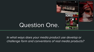
- 1. Question One. In what ways does your media product use develop or challenge form and conventions of real media products?
- 2. Format Conventions “Conventions are the "normal" or standard way of doing things, like taking off your hat when you are inside. It's what people in a certain culture tend to do. It especially applies to publishing.” - VCE IT The format conventions over the traditional conventions of each of the media products created, the magazine cover, the poster and the film teaser trailer, each of which have their own conventions. All three products are very wide in range of conventions, the conventions of a horror teaser will be different to a teen drama teaser but there will still be general conventions made the same, these are the conventions that as a group we followed or decided to change and confroma against. We tried to incorporate a mix of both following the format conventions but also to challenge them, this meaning that it ,makes our work seem professional from having the consistent style typical of the work but also have a note to it which stands out and is memorable from where we went against the traditional conventional rules.
- 3. Conventions - Teaser Trailer There are many different conventions for teaser trailers in general, from the duration of the teaser, to the editing style, the use of music and the graphic elements. For a horror teaser trailer the themes were different to a teen teaser, for instance from the research we did we found that it was common for horror teasers to be quite short in length in comparison to other teaser, and short length would come to an end with a jump scare; we decided to follow this idea. Making our teaser trailer short (around 1 minute) allowed us to have more quick short shots which too was typical of a horror teaser. In some teasers we saw that there would be a constant sequence rather than quick shot, such as the ‘Carrie’ teaser trailer, others would be a compilation of shots from the film itself starting out slow and gradually getting faster, such as ‘cabin in the woods’. By following the conventions of teasers such as ‘cabin in the wood; we were able to really create the atmosphere we wanted, from transitioning to simple slow shots or common areas to then changing to a montage style sequence of more fearful shots, overall creating a clear message for what out film is about and what is involved.
- 4. Conventions - Teaser Trailer Along with this we saw that there were also format conventions to the music used in horror teaser trailers. From researching other teaser of the same genre and having the same themes we were able to see that it was a convention to have an adaptation of a well known christmas carol ( such as ‘Krampus’ and ‘Silent Night’) and have the other diegetic sounds playing other the top, such as dialogue, screamings, and other sounds that may come up in a horror. This is where we began to challenge the conventions, we decided to go along with the adaptation of a christmas carol idea because we really liked it, but this was the only music or sound effect that we had playing over the teaser at all, we didn’t want dialogue to spoil the atmosphere we were trying to create and I think we were successful in making our teaser stand out by not following this convention. Another convention for teaser trailers is the level of information given to the audience from the teaser. As the marketing for a film goes along the audience begin to learn more, the teaser trailer being one of the first things to be released, this means that commonly there isn't a load of information in it, we followed this convention by only giving away our protagonist character, general themes, tagline and release time. This meant that we would keep the audience interested as they would want to know more about the film from what little information was given in the teaser.
- 5. Conventions - Poster The typical conventions for a film poster will be through the layout of the poster itself. In this sense we followed the conventions very close, by having the main protagonist character on the front, with the title seen at the top, billing block at the bottom and a tagline between the two. The main focus is the photo which stands out with its style and graphic elements. Our image used is the part where we challenged the typical format conventions of a film poster. As film posters will be mainly seen by majority of the public it is common for the poster to be suitable for all members of the public to see (ie children), but as our film is a horror we wanted our poster to follow the same brand identity being shown in our teaser and magazine cover, so the poster had to be graphic, showing a common household happy figure being turned into a creepy bloody version of itself to sell our film. Although this being said, horror movie posters do commonly have a fear factor to them and this is what we did, so in general terms for poster conventions we were challenging but in the sense of horror as genre we were quite conventional. We saw that there was a mix of either a suggestive horror movie poster image or either a clear horror element to the image such as the carrie movie poster and the it movie poster.
- 6. Conventions- Magazine Cover For the conventions to a magazine cover feature, a film will commonly adhere to the house style of the magazine as a brand and then has its own influence on the magazine in a slight way, perhaps through the colouring or font style used. As horror films go, they are not always large blockbuster moves and these are the films which are most likely to feature of popular magazine covers for film such as Empire, Total film and Sight & Sound, this was found through my research. This meant that we had to find a horror film magazine, which we did, and then follow its conventions whilst also making it about our film feature. As seen in my journal we were able to have our film style image fit well with the house style of HorrorVille magazine, we added in our image, coloured it and then used the house style of fonts, other images and titles from the magazine to complete the look. For horror films it seemed conventional to show the ‘horror’ protagonist character on the front of the magazine, this was done before by Horrorville magazine so we decided to follow to make our feature seem more realistic. This part of the project seemed more difficult as it was hard to see where we crossed the line from the magazine surrounding our film too much which would o been unrealistic of the magazine and its conventional forms.
- 7. Conventions - Horror Genre Not only did we follow and challenge the format conventions of a teaser trailer, poster and magazine cover feature but we also challenged and conformed in ways t the horror genre of films. It was seen that showing the scary main character to a horror film would be used and sometimes the character wouldn't be seen at all, we decided to show ours as it was an important theme to the film as a whole and would give the audience information to the film which we didn't do much of, so showing this character was important in not only suggesting ideas to the audience but also to follow a brand identity. This idea of having the character as a main selling point was also used in the IT film and the krampus film, and this character heavily influences the film's brand identity throughout. We also followed the style and iconography typical o a horror film, this allowed our production to seem more professional and realistic as a film. The main way we followed this style was through eh pae and editing of the teaser, it is very typical for a horror film teaser to begin slow with longer shots and then have a turning point where the teaser picks up pace, tension and becomes more fearful for the audience to view. Ending with a jump scare, I think our teaser was conventional as a horror teaser but also had its own individuality to it.I think as a group we were successful in both following and challenging conventions in our three productions.