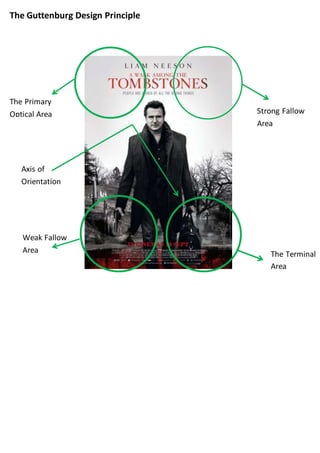
1. The Guttenburg Design Principle
The Primary
Optical Area Strong Fallow
Area
Weak Fallow
Area The Terminal
Area
Axis of
Orientation
2. Primary Optical Area
The star of the film (Liam Neeson),
The title,
The tag line
An image of Liam Neeson
The producer has chosen to put all these in the specific part of the poster
because that’s the primary optical area. That area is where we all look first; the
name of the star is at the very top. This is important because if the audience
will notice Liam Neeson is a well-known actor and will get them to look into
the film more. The title is also important for the audience to know what film it
is. An image of Liam Neeson will also get the audience’s attention, this is incase
you weren’t aware of the actors name or just couldn’t see it most people know
who he is.
Strong Fallow Area
The strong is similar to the primary optical area; this is where the title, tagline
and the star of the film is placed also. Because this area is at the top of the
page next to the primary optical area the most important things are in these
two areas. The producers have done this purposely because the top of the
page is where we look first (left to right).
Weak Fallow Area
A gun – genre convention
The weak fallow area is part of the poster where the not so important things
go, for example most magazines put the barcode in this area. This is because
when we look at a poster of front cover we look from the top left corner to the
bottom right. There is a gun in Liam Neeson’s had in this area of the poster.
This is because the gun is a convention of the genre; the producers also put
this there purposely so the audience has an idea of what genre the film is.
3. Terminal Area
The cross
Release date
This area is one of the main areas as well as the primary optical area. When
looking at a poster of cover of a magazine we look from the top left to the
bottom right. The terminal area is in the bottom right area. Usually the release
dates are positioned there. On this poster there is a cross as if Liam Neeson
was stood in a graveyard, this is gives the audience a clue to what kind of film
this is going to be.
Axis of Orientation
Axis of orientation is the direction we look at something, for example if you
was to look at the poster above you would look at the top left corner (primary
optical area) to the bottom right corner (the terminal area).
Genre codes and conventions
There a quite a few genre codes and conventions in this poster. From looking
at the poster we know this film is an action thriller, in a weak fallow area there
is a gun in Liam Neeson’s hand this suggests there is going to be action. In the
terminal area there is a cross and he looks to be stood in a graveyard, this
suggests it is also a thriller. The very bottom of the poster is red; this could
mean there would be a lot of blood involved within the film.
Anchorage
Liam Neeson has been put in the centre of this poster. He has starred in other
films, taken and taken 2. These films have been a success and Liam Neeson is
well known. The producers have put him in the middle of this poster using him
as bait. The audience will look at the film star on the poster and will be
anchored to it, this means they will read more about the film.
4. Modes of address
As i have said previously, Liam neeson is in the centre of the poster. He is looks
straight on and when the audience look at the poster they will feel as if he was
looking directly at them. This helps involve the audience when looking at and
reading the text.