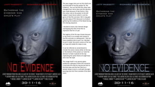
1. The two images here are my first draft and
my final draft of my film poster for ‘No
Evidence’. You can tell that the colour was
changed from red to blue and this decision
was made because of two factors. One,
the colour red on the poster to the left
makes it more horror which is not the
genre of the film and also I felt it may give
the plot away of film because its all about
gathering the evidence of the blood during
the shaving sequence.
I decided to have a bar themed design
overlapping the title of the film to
represent that he is in jail.
The tagline of the fim was chosen because
in my mind It is so simple and unique to
the film and also is a selling point. I did not
have anywhere else to put it so I decided
to put it under the actors names at the top
so it was still visible for views to see.
It can be referred as conventional to
include the actors names either at the top
or the bottom of the poster so I took the
decision to have it placed at the top
replicating the same theme of a light blue
and a bar like style
The image itself in my opinion gives
audiences a glimpse of who this character
is and also hint that he may be evil due to
the blue eyes and the fact that he Is
almost shown to be in a cell with the light
pouring onto him from outside of the dark
room
2. Comparison to a real movie poster
I decided to base my poster on the
film ‘ The Martian’ because of how
that poster struck me as a target
audience member. The unique close-
up shot of the character looking
towards camera is also something
rare for film posters.
I also based features of my film
poster to typical film poster
conventions to include a tagline, the
actors name, release date and have
all the production companies and
people involved in the production
written in the typical ‘steel tongs’
font on Photoshop.