
Recommended
More Related Content
What's hot
What's hot (20)
Viewers also liked
Viewers also liked (19)
Similar to Inspired Film Posters
Similar to Inspired Film Posters (20)
Recently uploaded
Recently uploaded (20)
Inspired Film Posters
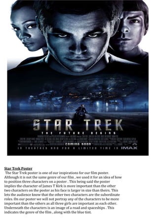
- 1. Star Trek Poster The Star Trek poster is one of our inspirations for our film poster. Although it is not the same genre of our film , we used it for an idea of how to position three characters on a poster . This being said the poster implies the character of James T Kirk is more important than the other two characters on the poster as his face is larger in size than theirs. This lets the audience know that the other two characters are the subordinate roles. On our poster we will not portray any of the characters to be more important than the others as all three girls are important as each other. Underneath the characters is an image of a road and spaceships . This indicates the genre of the film , along with the blue tint.
- 2. Colombiana Poster The tagline on this poster indicates one of the themes of the film. This gave us inspiration to use a tagline on our poster. The tagline compliments the image as the gun represents vengeance and Zoe Saldana represents beauty. The yellow tint implies The setting is also shown with an image of Rio de Janerio favelas and New York city, giving the audience the setting of the film.
- 3. We used the salt poster as inspiration for ours as it depicts to images of her slightly back to back which gave us an idea for ours. We could place our characters on our poster just like on salts but instead of two figures there would be three. The images in the background also gave us an idea to put faded images of our setting on our poster.
- 4. The salt magazine cover gave us inspiration for the layout of our poster . We liked the image and the colours used as they had a crime theme feel to it. We also liked the way she looked on the poster which was very similar to the style of our characters.
- 5. This magazine covers image was much more vibrant which stood out to us. we was inspired by this to use a more 3d image of us when producing the mag cover as it will have the same effect of making the character appear to be coming out of the page.
- 6. The image of the charlies angels cast on this magazine cover gave a very welcoming feel to it. We realized we didnt want to use such an innocent image of our characters on the mag cover because it would drag away from the film characters that they are and concentrate more on them as the people they are outside of film. On our mag cover we would like the audience to feel like they can tell what the genre is and an idea of the characters we are .