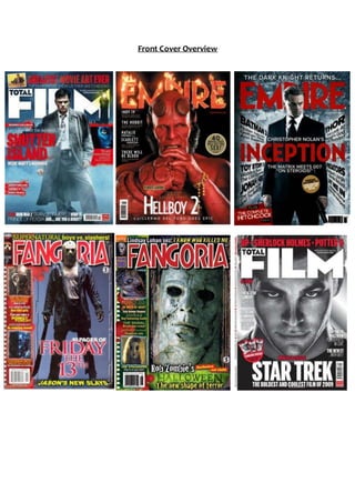
2. Each of the six front covers are all film magazines from three well-known, respected and
successful magazine brands: Total Film, Empire and Fangoria. Although the magazines
have different target audiences, with Total Film and Empire aimed at film fanatics and
Fangoria being specifically targeted at Horror fans, they each successfully promote the
film in question. They are each designed with the intention of attracting film fans and
making them want to buy the magazine and watch the films featured. By comparing
these front covers, it is likely that I will find common patterns and shared features used
by all Film Front Covers to promote films successfully.
Each of these front covers follows the general and layout conventions of a magazine
front cover. There are expected features in the form of a main image that dominates the
cover, along with multiple sell-lines surrounding the image that relate to the articles
inside. Four of the six front covers use feature article photographs; however the quantity
varies between these four, with Fangoria having the most. They each feature their
signature masthead in a central position at the top of the frame. The mastheads are
presented in the magazine’s signature font and are the largest text in the frame.
Although they follow a similar layout, Total Film and Empire create a much more
professional and polished look and feel than Fangoria, which looks more ‘amateur’. This
could be due to the fact that Fangoria is created just for a more niche audience of horror
fans. This means it requires a less slick and more pronounced horror-like presentation to
appeal to the audience and reflect the genre it serves. Whereas, Empire and Total Film
usually feature Big Blockbuster type films that everyone will know about and will want to
see. This requires that they create a professional and sophisticated looking front cover
that reflects the professionalism of the target audience and their serious love of film.
On each of these front covers, it is a male character/actor that dominates the frame. This
is due to the fact that most of the films that these three magazines promote focus
around a male main character or protagonist. By featuring the main character on the
front cover, the target audience instantly recognises the film that is being promoted and
will want to buy the magazine to read about it. Also, each of the front covers portrays
the feature model as the character, rather than the well-known actor who plays him. This
enables the audience to understand straightaway that the magazine in question is one
that promotes and celebrates film. In addition to this, it will heighten the magazine’s
appeal to the audience as it instantly tells them that the featured article will talk
specifically about the film, rather than the actor who features in it. For example, the
Fangoria issue promoting Halloween features Michael Myers on the cover. The fact that
he is in character means that the audience can at a glance recognise that the magazine is
promoting Halloween. Whereas, if the main image was of Tyler Mane, who plays Michael,
it is unlikely that the reader will know at a glance that Halloween is the featured article of
that particular issue. If Tyler Mane were featured it would also reduce the overall effect
3. of the front cover in terms of provoking a sense of terror, drawing audience interest and
intrigue and signalling that Fangoria is a horror film mag.
In four of the six front covers, the character is making direct address to fully engage the
audience reading the magazine. This means that the audience will instantly feel a strong
connection between themselves and the character on the front cover, which will, in turn,
encourage them to feel drawn in more effectively and to be intrigued enough to wish to
know the fate of the protagonists in the film. In the case of Michael Myers and Jason
Voorhees on the Fangoria front covers, the use of direct address will amplify and increase
terror, as the audience will feel that these horror maniacs and staring menacingly at
them. The use of direct address could also help to reflect the confidence of both the
antagonist, in Fangoria, and the protagonist in Empire and Total Film. It also features a
well-known actor that the TA would want and expect to see featuring in a film magazine.
This would draw in the TA, as they would see their favourite actor from their favourite
film on the cover and want to buy the magazine. The shots themselves tend to vary
between Close Ups and Long Shots. Each magazine doesn’t appear to have a
conventional shot that they use for each issue, it appears to depend on the issue and the
film it is presenting. Some films would require a long shot that exposes the whole of the
male character’s costume, whereas for others a close up is enough just to show the
characters face as he may be the ‘face’ of the franchise. For example, the Empire Front
Cover promoting Inception uses a medium long shot. This allows the whole costume and
props used for DiCaprio’s character to be in the frame whilst he still remains in character.
It also helps to present the genre of Inception. Whereas, the Fangoria front cover
promoting Halloween features a close up shot of Michael Myers. As his mask is so well -
known and he is the face of the Halloween franchise, the audience would see this close
up shot and instantly know what film Fangoria is promoting.
Although each front cover has different strong colours schemes, each features black and
red as prominent colours within that colour scheme. This helps to create a mysterious
and evil tone to the magazine front covers and also helps them to grab attention on the
news stand. The combination of red, black and white are seen as universally effective,
while primary colours like these appeal to a core male target audience; all three of these
magazines are targeted at largely male audiences. Each issue appears to change the
colour scheme in order to compliment the film they are promoting, with only key
features like the mast-head staying the same. For example, with regards the edition of
Empire where it features Hell-Boy on the front cover, the front cover is dominated by
Black, orange and red. This helps to compliment the image and the narrative of the film
as it features colours that we associate with hell and fire. Also, the signature masthead is
presented in orange, rather than white, and looks like its on fire as if paying homage to
and celebrating and reflecting the film. This is something very uncommon in the
magazine industry as most magazines try to make their front cover look as similar as
possible so it is easily recognisable. However, the fact that Empire is a well -known and
well respected magazine gives it the ability to adapt the front cover in-line with the
narrative of the film that it is promoting, creating the ultimate effect for film fanatics.
Plus, Empire knows that their loyal fans will recognise the general typography used for
4. the masthead and repeated layout elements on the front cover. Whereas, the Fangoria
front covers use mostly red, black and green which further reflects the horror genre. This
will allow horror fanatics to instantly recognise the Fangoria front cover as being part of
a horror magazine.
In each of the six magazine front covers, the masthead is perfectly placed at the top of
the frame, in a bold signature font so the audience instantly know which magazine it is.
The masthead is also the largest text on the frame to entice the audience to pick up the
magazine before being drawn in further to buy the magazine by the main image. The
magazine Fangoria is specifically designed to promote the horror genre with the
typography and colour used for the title connoting blood and gore. The feature-article
photographs used on the two Fangoria front covers tend to be more gruesome and
graphic than those featured on the front covers of Empire and Total Film that rarely even
feature FAPs. The gruesome imagery and ‘amateur’ look of Fangoria helps to promote its
brand identity and reflect the genre it predominantly promotes. Fangoria also features
numerous sell-lines related to articles inside that issue that will appeal to the audience
and entice them to buy the magazine. For example, the Friday the 13th issue of Fangoria
features the sell-line; ‘Supernatural boys vs. Slashers!’ This would appeal to the target
audience as it informs the reader that this issue is going to feature all of the best
Supernatural and Slasher antagonists in a fierce comparison battle to see which
antagonist will come out as the best. In contrast, the Empire and Total Film front covers
only feature a couple of sell-lines on each issue. The sell-lines that do feature usually only
present the title of a film that features in the issue. This informs the reader that the
majority of that issue will be based on the blockbuster featured on the front cover, with
other blockbuster films making an appearance in the magazine bringing first look
exclusives with them. This would appeal to the niche film magazine reader who wants to
learn more about the films. This appears to be a clear convention of film magazines that
don’t specifically promote one genre. As Empire and Total Film are well-established and
successful magazines targeted at film fanatics, they rarely feature horror films on their
front cover. This is due to the fact that horror films do not appeal to such a mainstream
target audience, who expect big blockbusters to be promoted by Total Film and Empire
like Star Trek and The Hobbit. When a horror film appears on the front cover, it is usually
as a special edition. Empire and Total Film tend to promote films from within the Action
Adventure and Sci-fi genres. This is because these are the films that are aimed at the
widest audience, and are usually the biggest blockbusters as they require high levels of
special effects to create the films. There appears to be a sort of hierarchy of films and
genres in Total Film and Empire. They tend to focus solely on Action Adventure and Sci-fi
films, pushing aside genres that aren’t as ‘Highbrow’ such as Horror and Rom-Coms.
There are symbiotic links that occur repeatedly between magazine front covers, film
posters and trailers which help the audience identify which film the promotional piece
belongs to. For example, the Fangoria issue promoting Friday the 13th features a long
5. shot of Jason, the psychopathic serial killer, standing with his legs wide apart with his
enormous machete-like weapon clasped in his right hand. The shot, the mise-en-scene
used in this shot, and his body position are exactly the same as the image used for the
promotional poster. By using a similar image, Fangoria will spark a recognition and the
reader will instantly see the front cover of Fangoria, or the film poster, and know it is
promoting Friday the 13th.
Each of the six front covers features the masthead at the top of the frame in the
signature font. Each magazines masthead is presented in an uppercase sans serif font.
This reflects the fact that the TA of each magazine is largely male as the mastheads
appear very masculine. The different styles of film magazines are further reflected by the
fonts. For example, Total Film and Empire feature a plain and simple uppercase san serif
font that looks professional. Whereas, Fangoria’s masthead reflects the amateur and
horror specific style of the magazine. This is reflected in the way some of the letters are
at a slight angle and the white outline around the letters. Each of the mastheads help to
reflect the type of audience the magazines are aimed at and reflects the content of the
magazine.
Having carried out this overview, it is clear that Empire, Total Film and Fangoria each
have their own brand identity and signature look that can be easily recognized by its
target audience. This is maintained through the repetition of stylistic features from issue
to issue and is a great way of helping the magazine succeed and maintain a loyal fan
base. However, they each follow similar layout conventions that allow for the successful
promotion of the film of the cover and share key conventions of Film Magazine Front
Covers.