TAM AdEx 2023 Cross Media Advertising Recap - Auto Sector
Q5
1.
2. How did you attract/address your audience?
~Colour Scheme
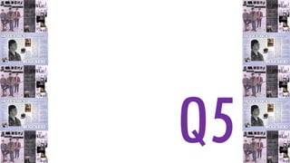
Back in the planning stage of my coursework, I clarified a very simple
colour scheme which was demonstrated in the digital dummies I created.
Illustrated on the sides, it has been shown that I have remained true to my
initial ideas. I found out in my research that the colour purple represents a
sense of ambition and luxury and this could simply attract an audience of
motivation and sophistication. But also in my findings, it was discovered
that the colour provides a sense of tranquillity and naturalness which
remains unbiased to any specific audience type or preferred music genre.
The classic blacks, whites and greys are also neutral to any particular
audience preference and they work wonderfully as base colours in which
you can add a signature colour to. With the connotations attached to the
these colours, I think it is fair to say that they attract a large proportion of
the spectrum of society, like I intended when establishing my target
audience. When I was looking at the magazines I thoroughly researched, a
colour scheme continued throughout the magazine is uncommon, so in
evaluation I think that my magazine is unconventional in that manner but I
would also argue that this provides a very professional look in contrast
with other magazines and it has a relaxed persona and attitude which will
grasp a significant amount of interest.
3. How did you attract/address your audience?
~Page Layout
Regarding the layout, I carefully formatted each page to ensure I could achieve maximum
interest of as many different people possible. Firstly, the cover page is very minimalistic, with
few design features to guarantee it will not be too overwhelming. My intention was to
produce something clean with the focus on the well executed elements present on the page.
This was in aim to entice an audience appreciative of professionalism and or the casual style.
In terms of the contents page, the layout is much more orderly with a clear divide of contents
and images. Any text that overlays the background and the shading, is inviting to read as it is
a contrast to the layer in which it is placed on. Also the writing has been positioned on the
left half of the page, making it very natural and easy for the audience to read. Extra images
accompanying the named contents are placed on the right of the page in correspondence to
the listings beside it. The purpose of constructing the page like this was to put faces to names
of the artists and in turn this could encourage the reader to continue pursuing through the
magazine as a result of the layout being very visually pleasing and well interconnected.
Finally, the double page spread. The layout is fairly normal in some manners, for example the
text is conventionally laid out in the column format which is comfortable and familiar for the
reader of my magazine. This normality is appealing for most readers. Unconventionally, the
title runs over both pages which I think is attractive to the eye as it is very inviting as it
dominates the page.
In evaluation, I would say I have placed each media feature in a position of reason with
consideration of attracting as many people as possible.
4. How did you attract/address your audience?
~Photographs
When looking at the photographs I have taken and edited during the production stage of my
coursework, I think that they are the most attractive aspect of the entirety of my product and most
media forms. They’re designed to function as the visually pleasing element amongst the textual
information. The cover page image has been styled in that manner in aim to attract my broad
audience with the unconventional camera work – the distance capturing a full length shot of my
models, making the relationship between the audience and the models less intense and personal,
like I consistently have stated, the image remains neutral to bias of one particular genre or attitude.
However, the persona that is portrayed is very intriguing with the body language being so relaxed
the audience fascinated to know more. In evaluation, some could argue that this would be
disinteresting but it is important to stick to your intentions and I think that this image allows my
product to access a greater selection and number of people with the this particular image.
In regards to the contents page images, I think that the collage is extraordinary and alternative to
compliment the rest of the magazine. Among the collage, it incorporates photos of the duet both
formal and informal which is nice to see when reading about life of the famous, sometimes it can be
too pretentious, so the natural images will be appealing for our readers. The close-up shots do allow
the reader to engage with the artists in the photographs on a more personal level.
Lastly, the double page spread. Like the close-ups used on the contents page, the main image on this
spread has the same impact. I think that this is enticing for our readers, especially since the article is
focused around the subject of the close-up image. The group image makes the connection between
“Flynn” and the band themselves. Finally, there are two more informal, self taken photographs
which are attractive to the eye because they contrast the two formal studio shots that have been
taken. Most types of people will be more familiar with this style of photograph which is comforting
for our audience.
5. How did you attract/address your audience?
~Typography
The fonts styles will be contributing to the attraction of many buyers and readers of my
magazine and a selection of different designs will keep the attention of the readers throughout.
Purposefully, I made the typography of the Masthead – title of the magazine- particularly
abstract so that it remains the main focus of the product because if my magazine was re-issued,
this feature would be a constant in every issue after; it would be the way in which my customers
would be able to recognise it amongst the other competing issues. Underneath, the coverline
has a black background which contrasts the lightly coloured background so this juxtaposition is
recognised and captures the audiences attention. Manipulating text in terms of their font is a
good way to prioritise significance on a page, allowing the consumer to work their way though
the information in order of importance.
To attract the audience’s attention with the text styles on the contents page it was important to
get the balance right with complementing the elegance of the images yet enough contrast hold
its own. I think I captured this balance. I would say that the hint of purple with the fonts, neatly
connects the text with the more visual elements creating a very nice final product.
My final point that I would like to make would regard the typography used on the double page
spread. In the production, I wanted to utilize the variety of similar styles so that it would be in
keeping and no particular text would dominate another. Although, the variation helps clearly
define each section.
In summary, I would say that my product has used different fonts for definition, creating an
order of importance and to compliment the rest of the dynamics on the page, which in turn,
works as an appeal for my audience.