
Recommended
More Related Content
What's hot
What's hot (20)
Similar to What have you learnt from audience feedback
Similar to What have you learnt from audience feedback (20)
Recently uploaded
Recently uploaded (20)
What have you learnt from audience feedback
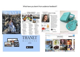
- 1. What have you learnt from audience feedback?
- 2. Focus Group Deciding an image for my front cover was hard for me so I decided to consult with my focus group.
- 3. Focus Group After creating a first mock up of my magazine with one of my subtitles as ‘homes galore’ after speaking to my focus group they thought it would be better to make the front cover more ‘regional appropriate’ so I decided to change the caption to ‘seaside living’ as Thanet is a seaside town. I found there feedback helpful and I preferred the ‘seaside living’ caption a lot more. I felt as though it then helped the readers to relate to the magazine more if it was based more on where they live.
- 4. Focus Group When talking about my billboard I showed my focus group the first option of a Billboard with an idea I was inspired for from a fashion magazine. Although some of them liked it others said it looked ‘too messy’, ‘unclear as to what it was advertising’ and ‘not what a lot like a regional magazines billboard would look like if they imagined it in their heads’. Because there weren't a lot of codes and conventions for regional magazine billboards this was a good thing to go off in order to get the best possible outcome. By using this feedback I created a simpler design that held a similar concept which the group liked better. I have highlighted in red the final production.
- 5. Other feedback - Front Cover “I think the person is too far back and small on the page, it would possibly look better if you zoomed in and making them slightly bigger” Listening to this feedback I did zoom in ever so slightly and liked the way it helped the text to frame the model better. “Some of the text fades into the background making it slightly harder to read at lighter bits of the rock, maybe by adding a shadow it would help improve this problem” After seeing what it looked like with some of the text in shadow I felt it made it look less aesthetically pleasing and less like a professional regional magazine. I didn't feel as thought it was to much harder to read so I kept it how I had it originally”
- 6. Other feedback - Contents Page “It feels as though the two images on the edge are the same, it is only at a closer look you can tell they're slightly different, by making them different it might make it look a bit better and not like a repeat image” After hearing this comment I changed one of the images, but then felt as though the layout looked strange how it was but I did agree that they looked like the same image so I decided to move them round completely and experiment with different formats and layouts until I found one I liked and the person agreed it looked better. I found this feedback helpful and improved the quality of my contents page. “I think it is well laid out and informative which is what I would be looking for in a magazine” This comment was good to know as it informed me that I had appealed to my target audience and there wants.
- 7. Other feedback - Editors Page “Maybe change ‘a note’ to something different as note implies something short whereas the text is fairly long” I took this advice and changed ‘a note’ to ‘a letter’. It still fits the codes and conventions of a normal regional magazine and now it fits better and links to the text more. “I like the image as it is a bit different and fits well with the colour scheme of the page and makes it aesthetically pleasing, helping to break up the text.” This was helpful as I was originally unsure about the image so it helped me to realise what the audience wanted.
- 8. Other feedback - Advertisement Page "I like the simplicity of it. You advertise the products well, it is clear what you are advertising" This was useful to get positive feedback on my advert page as I didn't feel I had to change anything and the audience liked it, which means if it was in real life they would more likely want to buy it.
- 9. Other feedback - Billboard “Having two many electrical appliances over crowd the bill board a bit so maybe simplifying it will help it look tidier” By being told this I learnt that less is sometimes more and a more simple design can be effective. I reduced the amount of electrical appliances to only 4 which gave it a more professionalaesthetically pleasing look. "I like the colour blue used as the background" After hearing this I realised and learnt blue is used a lot in social media. Many brands for example Facebook, Twitter, Paypal, internet explorer use blue in the branding and logos. By seeing my blue background it would help to create a connection between the magazine and social media without the audience realising what there brains are doing.
- 10. Other feedback - Website “The page looks too spaced out and not like a regional magazine website” I struggled with the first website creator (Weebly) and so after hearing this feedback I decided to change to a different one (Wix). Without hearing this I may not have changed and therefor learnt which one was better and easier to use for future reference. "Although the articles look interesting some more about things to do in the local area would be good as that is the kind of thing I want to know” This was good target audience feedback as it gave me insight into what my target audience would want. I added a few more articles on where to eat and things to do in the local area but still kept some other articles to fit a variety of different wants and needs.