
Recommended
More Related Content
What's hot
What's hot (20)
Similar to Magazine front cover analysis
Similar to Magazine front cover analysis (20)
More from jamiedawsonvyners
More from jamiedawsonvyners (20)
Recently uploaded
Recently uploaded (20)
Magazine front cover analysis
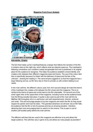
- 1. Magazine Front Cover Analysis Interstellar - Empire The font that makes up the masthead features a design that reflects the narrative of the film, it contains stars on the night sky, which reflects what we interpret space as. The masthead is following conventions as it contains it easily recognisable font and is positioned in its original place for the audience to recognise. This helps the audience establish a brand identity and creates a link between their different magazines (past and future). The use of the colour dark blue is specifically because it is linked with the darkness of space and the fear of the unknown - drawing the reading in. The name empire suggests to us that the magazine has a large following and we, as film fans rely on them to provide us with content relating to our needs. In the main sell line, the different colours used, font, font size and design all match the theme of the masthead, this creates a link between the film shown and the magazine. This is to reinforce the theme of space and so link back to the film interstellar. ‘On set and out of this world’ again links to the space them of the magazine, including humor as the audience know how the filming actually took place. A quote is also used as part of the main sell line by Matthew McConaughey who is a well known and well respected actor, director, producer and writer. This will encourage people to buy the magazine and watch the film as they would respect his opinion and trust his views. “The grandest adventure we will ever see on film”tells the audience that the film is full of surprises and has an amazing storyline - therefore attracting them and encouraging them to watch it in the cinema. This is seen in sort of another puff located partly behind the main sell line. The different sell lines that are used in this magazine are effective to try and attract the target audience. The sell lines vary in genre to try and attract as many people as possible if
- 2. they are not interested in interstellar. “Can sherlock win an oscar” is included within this magazine in order to try and attract sherlock and oscar fans into buying their magazine to read this article. “Still the world's biggest movie magazine” located under the masthead suggests it's the best and most popular film magazine, and has been for a while. It indicates it is read by many people of a wide audience that they are able to attract through various sell lines. The sell lines again are also trying to attract another audience through “Scariest movie of the year revealed”. If you are not a fan of interstellar, a horror film is used to attract more people to the magazine. The puff is located in a place that covers up some of the masthead. This can be effectively completed as they are so well known that their brand identity is still easily recognisable to their target audience. The colours of the puff (silver and white) reflects the narrative of the film as it is the same colour as the spacesuit the actor is wearing as the main image. In this case, the puff is not promoting a sell line or an offer but rather that the magazine has been sold for 25 years. This encourages the reader to buy the magazine as they feel they can trust them. The skyline “inside Christopher Nolan’s science-fiction masterpiece” is used again to promote the main image and sell line. “Masterpiece” depicts to the audience how the film is very advanced and would be fascinating to watch. The skyline is rather large in comparison to other empire issues which can be seen as a way of promoting to the audience how good they believe this film is. It is conventional to have a skyline is a film magazine. The red banner at the bottom right hand side of the page regarding a different topic to interstellar creates a huge contrast to the theme of the rest of the page as the tones and colours are all blue white and grey tones, having a red banner at the bottom makes it clear to the viewers that it is totally separate and isn't related to any of the interstellar content. This will enable people to understand that there are more than one topics within this magazine so if they aren't interested in interstellar then there is still some content that may interest them. The red ensures they won't disregarded it and presume it’s related to interstellar, forcing them to look at it. In regards to the main image, the background is a snowy picture, which relates to the narrative of the film as it is set on another planet to Earth. Again the white colour scheme is used on his own costume as it reflects the character's innocence and purity to the audience. The main image on this film magazine front cover is a medium close up shot. This allows the characters costume to be part of the image as well as displaying the characters facial expressions in detail. This shot is effectively used as we can see that the character looks concerned about something, this will reflect the narrative that's partly displayed by his costume. Conventions are followed with this as the main image features the main character of the film, portraying he is the hero and will be popular with the audience. The positioning of the main character shows us that he is determined but also feels lost at the same time, this is also seen with the use of a close up shot of his face. The colours used on this magazine front cover play a huge part in promoting the film as they strongly relate to the narrative of the film, and so attracting fans. It sets the science fiction
- 3. theme which is hugely popular within the film industry with lots of fans and followers. Having this will ensure they are more likely to purchase the magazine as it is easily identifiable to that sub-genre. Maleficent - Total Film The masthead of this total film magazine is maintaining their usual brand identity by following the conventions of where it is placed and the colors it is in. In this issue, the masthead has been covered up by part of the image. This is because the masthead isn't as important as the image, this is because the magazine is well known and the masthead will still be recognisable to the target audience. Total film is such a big brand that the editors have more freedom/creativity in terms of how they can design their covers, they don't need to display the whole masthead as their brand is still recognisable. It is conventional to have the main character of the film to feature on the front cover of a magazine, this is why they have used an image of Maleficent on the cover. However this isn't the only reason. Maleficent is played by Angelina Jolie who is a very famous hollywood actress, this is likely to attract more people to view the film and by the magazine as she is easily recognisable to the audience. The audience may want to know what new film she is in and what character she plays to require her to be seen in that makeup and costume. Direct address is another common convention that features in this image, this is where the image is looking at the audience. This makes them feel directly targeted by the actress herself and will encourage impulse buyers to buy the magazine. The image of Maleficent is a mid shot, this enables her head wear and costume worn on her upper body to all be in shot. However
- 4. as her costume is a very similar colour to the background it almost blends in, drawing very little attention to the details of her costume. This leads our attention to be draw to the face of the character, as it is a totally different colour which is white and stands out due to how bright it is. The reason for this is because it is another way of drawing the audience to the face of the character and enabling them to recognise that it is Angelina Jolie, which attracts more people to the magazine. The costume she is in is synonymous with fairytale and fantasy films, further signalling genre. Her costume is dark which presents to us that she is a negative character throughout the film. However, her makeup being very bright and white suggests that she has a pure side to her which you will be able to see within the film. The background of the main image is meant to resemble the set of the film in which it is located. The character lives in a woodland area and when mist falls on the forest during the night, what you would see resembles the background to this image. As well as this, the blurry background not only resembles the forest but also reflects the mystery that features in the narrative of the film. The skyline that is located at the top of the page above the masthead says “massive epic movie preview”, this is located here as it is another way of getting the attention of the audience. “Epic” is used to draw the audience in and help them make a decision on the film based on the reviews - in this case it is epic. The word “preview” suggests they will be seeing this content before other people, and the buzzwords “massive” and “epic” also make the strap line more interesting for the audience. Not every magazine features a skyline and so this is a unique method or further attracting the target audience. The main sell line “epic blockbuster issue” again features the word “epic” which is a buzzword and is used to showcase the film and attract the target audience. Conventionally, it is the largest piece of text on the page other than the masthead which will immediately draw the reader's eye to it and encourage them to read it. The color scheme of the main sell line is similar to the rest of the page, white and blue. This helps the sell line remain part of the film as is still relates to the main image. There are more sell lines located underneath the banner which are again used to promote other films in this issue. They are all arranged together and are a smaller text compared to the other sell lines. This is done as it ensures that people are aware that the content on Maleficent is more important to the magazine, however there is still more content on other topics/films. For example, 'Avengers: Age of Ultron', sin city 2 and more information on 'Interstellar'. Although these are included, they are in a smaller more basic font than the strap line and masthead are, which suggests that they are not the main attraction. A sell line promoting godzilla is larger than these as they are promoting it more. This is easily recognisable when you compare their location within the page. The godzilla sell line is in a conventional place, however, the other less important films are not. The godzilla film sell line
- 5. is located in an important place when looking at the rule of thirds and z line formations. This helps draw the reader into the magazine and will encourage them to purchase this issue. The banner that is located underneath the main sell line is used again to stand out on the page and attract the target audience. It is used to promote additional content to the reader and so create an illusion that they are receiving more for their money. The colour of this banner which is yellow is specifically prominent. This is the case as it will draw the eye to this part of the page next. The puff is conventionally used in this issue to promote what else is inside the magazine. As previously mentioned, this is used effectively as it will give a false impression that there's more content than there actually is in the magazine. The colour of the puff again fits in with the rest of their magazine bt also effectively stands out on the background of the main image. As the color scheme reflects the film narrative maleficent. It is a disney film with a storyline surrounding magic and mysterious creatures, the front cover has been designed to reflect this and the colours play the biggest part in this. Furthermore, throughout the film she becomes a relatively scary and unpredictable character. There are also a fair amount of dark tones on the front cover of this magazine as well, these are meant to reflect the her darkside that evolves throughout the narrative of the film. The front cover has a focus on the film Maleficent, however when analysing, I noticed there is some content on the cover that isn't related to the film Maleficent. This has be singled out from the film as it has attention drawn to it by creating a contrast in the colours of content relating to Maleficent and the colors of content not. Everything that is not related to Maleficent is yellow, there is no content on Maleficent that is yellow, they have been kept totally separate for the reader ease when reading.
- 6. Captain America The Winter Soldier Cover - Empire Again, following conventions, this empire magazine's masthead is located at the top of the page in a bold stand out font. It is the same colours and font used on each magazine which maintains brand identity and attracts their target audience to buy the magazine. The colours used in this masthead in this issue directly relate to the film being promoted. Captain America’s shield features lots of red which creates a link with the masthead. In the main sell line that has been provided, buzz words such as ‘limited’ has been used singly to attract the target audience and create lots of attention to this film in particular. This sell line is in silver as it links with the metallic background that we can see behind the image of Captain America, it also links in with his metal shield. The main sell line is located in a conventional place in the fact of the height of it. It is positioned however to the left of the image to try and make the image more attracting to the audience and to make them want to look at the full image. This is also because the shield is located here and it is very important to the narrative of the film, and so it should not be covered.
- 7. A puff is used in this issue to promote that this is a 25 year anniversary for the company. This is used specifically to try and encourage the reader to buy the magazine as they will see it is being truthful and of a good quality if people have been buying it for 25 years. The location of the puff is important here as they did not want to cover any of the image - as previously mentioned with the sell lines. It is located over the masthead as the brand is still easily recognisable and aso would not affect the target audience. Again the puff is also located in silver which fits in nicely with the metallic background, this creates a link between the magazine and the film which is being featured. Now in regards to the presentation of this magazine front cover, it is different from previous and newer issues that have come out since. Usually Empire have a glossy or shiny finish to their covers but this one is matte. This is because matt is generally seen to be more expensive and as this addition is a special edition celebrating the 25th anniversary it makes it look more of a luxury item. When analysing the colours on this magazine front cover, the puff and the sell line as previously mentioned are in a silver colour. This matches the silver on Captain America's costume and shield as well as the background - this is creating a symbiotic link between the film and the magazine. The silver used also connotes luxury which goes hand in hang with the matt finish and celebrating the 25th anniversary. Also, The masthead, exclusive sell line and parts of his shield are all red, red has connotations of danger and violence. Super heros often are dressed in red for this reason as it excites the audience and encourages them to watch the film. For the main image, unconventionally three characters from the film have been used. In regards to positioning, Captain America is positioned in the centre at the front so it is clear that he is the most important character in the film. A medium long shot has been used so that his whole outfit and shield are on show, making it easier for people to recognise him as the very popular marvel superhero. The shot is taken from a relatively low angle and he is looking slightly down upon the camera, this reflects his dominance and power he has over the normal person. Although he is wearing a mask, it is a relatively revealing mask, leaving a lot of his face uncovered and on show, this implies he has nothing to hide and is an good character in the narrative of the film. He has his shield on the floor in front of him, this suggests that he wishes for his shield to be on show and noticeable however he doesn't feel threatened as he is not holding it in front of him. The star on the shield which is has chosen to have on display reflects the american flag and the fact he is american - this is used a a signal of hope for the americans who watch this film.