
Recommended
More Related Content
What's hot
What's hot (20)
Similar to Analyzing Q Magazine's Market Position and Competitors
Similar to Analyzing Q Magazine's Market Position and Competitors (20)
More from harrymyerswest
Recently uploaded
Recently uploaded (20)
Analyzing Q Magazine's Market Position and Competitors
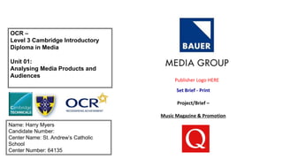
- 1. OCR – Level 3 Cambridge Introductory Diploma in Media Unit 01: Analysing Media Products and Audiences Name: Harry Myers Candidate Number: Center Name: St. Andrew’s Catholic School Center Number: 64135 Set Brief - Print Project/Brief – Music Magazine & Promotion Publisher Logo HERE
- 3. Focus Publisher and Product Publisher Product Bauer Media Group is a European based media company, headquartered in Hamburg, Germany that manages more than 600 magazines over 400 digital products and 50 radio and TV stations around the world. It was founded in 1875 by the Bauer's and has been passed down ever since. Their offices are located all over Europe and some in Australia. They are gradually moving onto their 6th generation since 2010. they have used some catchy slogans, one of their most popular and most recent is ‘We think Popular’. The old name ‘Cue’ was there for the meaning of cueing for a record or cue for a record. Q (magazine) is a popular music magazine published monthly in the United Kingdom. Q was founded in 1986 by Mark Ellen and David Hepworth, who were dismayed by the music press of the time, which they felt was ignoring a generation of older music buyers who were buying CDs — back then still a new technology. Q (m) – 44,050 - total in circulation from 2015. Its price is reasonably expensive depending on the target audience, it starts from £3.99 and specialises mainly in rock but also indie and alternative. They now have expanded into radio and TV, also hold annual music awards. Bauer Media : http://www.bauermedia.co.uk/brands
- 4. Ownership Structure In 1875, Ludolph Bauer has just turned 23 when he sets up a printing plant in Hamburg to produce business cards. As well as taking on various printing jobs, he launches the local advertising newspaper Rothenburgersorter Zeitung. This is later followed by Extrablatt am Montag and eventually in 1926 by Rundfunk-Kritik – a radio magazine which quickly reaches sales of over a half a million copies weekly. Sister company: Sister company is Bauer H Bauer Publishing, headquarters in Hamburg, Germany, Europe's largest privately owned publishing group. The publish magazines such as ‘Bella’ Net worth: It was in February of that year Kohlberg & Co. and Canadian businessman W. Graeme Roustan purchased the company for $200 million from Nike, which had acquired Bauer for $395 million in 1995. Bauer's sales were about $160 million and it was losing money when Nike sold it. Yvonne Bauer is the fifth generation of her family to run Bauer Media Group, she has a net worth of $3.2 billion. www.bauermedia.co.uk
- 5. Operating Model Yvonne Bauer Andreas Schoo Jorg Hausendorf Witold Wozniak
- 7. Brand Ideology/Ethos Slogan “We think popular” is Bauer media group slogan. “We” implies that as an organization they like to bring everyone together and get involved with their audience. The verb “think” suggests that everyone Is together as one and they look to the future of the company and all want the same thing. The word “popular” portrays their goal with their company and where they want to be in the years to come Values Bauer media group have four values, which are ‘create, collaborate, challenge and respect’. This shows how the company is run and how the staff works together to make a quality magazine buy challenging and respecting each other. History Bauer Media Group is a European based media company, headquartered in Hamburg, Germany that manages more than 600 magazines over 400 digital products and 50 radio and TV stations around the world. It was founded in 1875 by the Bauer's and has been passed down ever since. The Ocean blue could represent the amount of water in the world which everywhere, and this could link to their companies goals. The white shape in the corner could be there to tell their customers that they're there to make new products with purity. Source: https://www.bauermedia.com/en/company/history/
- 8. Technological Convergence Technological convergence is making something accessible through multiple different devices so it can access a wider audience, this also cuts down the price it costs to print hard copy’s of the magazine. Q have a synergy with multiple social networks as they know that their main target audience uses social media and rarely watch’s TV, so they have accounts on multiple platforms. YouTube subscribers 4,382 Instagram followers 17.4k Twitter followers 135.9k Facebook likes 137,913k
- 9. Technological convergence https://twitter.com/qmagazine?lang=en-gb - Q magazines Twitter Page https://www.facebook.com/QMagazine/ - Q magazines Facebook Page https://www.youtube.com/user/Q4music - Q magazines YouTube
- 10. Associated Products Magazine Radio Digital TV Kiss radio is Bauer medias most popular radio station. Kiss radio is England’s largest multimedia brand for people aged from 15 to 34 year olds, with 4.6m listeners every week. 4 music is UK’s no.1 music channel, it brings the latest in hit music, talking about the most popular stars at this current time. It is known for playing some of the best music, entertainment and comedy shows for all its youth audiences. Some of their core artists that have featured: Justin Bieber, Ed Sheeran, little mix, Katy Perry, the weekend, Rhianna, any of the one direction boys, Calvin Harris and Zara Larsson. Bauer produce few Television programmes such as Kiss and 4music. They do not make much from this as the channels are not as popular as their magazines or digital products for instance.
- 11. Market Position Magazines 0 50,000 100,000 150,000 200,000 250,000 300,000 350,000 308,938 67,518 40,003 18,462 43,235 total In conclusion to the bar chart, it clearly shows that NME has the highest circulation which is above 300,000 thousand. Other magazines such as Kerrang are one one of the lowest because they are held back by their chosen which is Rock Time INC UK, 352,171 Bauer Chart Title Time INC UK Bauer Time INC UK has a larger Magazine circulation than Bauer. This is mainly due to the magazine ‘NME’ which sells the most. Yet Bauer £2489.5million and Time INC Uk’s net worth is worth £431.1million, no where near the amount Bauer is worth. Yet thei circulation is better. http://www.ppa.co.uk https://www.pressgazette.co.uk/magazine-abcs-big- falls-in-womens-lifestyle-sector-for-glamour-marie- claire-and-grazia/
- 12. Publisher Competitors Hearst was founded on march 4th 1887 by William Randolph Hearst. This magazines publishes 22 brands owns a wide variety of newspapers, magazines, television channels and television stations. Time INC on the 28th of November 1922 by Britton Hadden and Henry Luce. Time Inc. owns a magazine and publishes over 100 magazines brands and is also based in New York City. Was founded by Conde Montrose Nast in 1909. It is an American based company who currently publish 22 magazine brands. Burda style was founded by Aenne Burda who wanted to expand her family business. Burda style (previously Burda Modern) published their first magazine in 1950. it is a fashion magazine that is based in Offenburg, Germany. Was founded by William Randolph in 1910. London based publisher company that was bought by Hearst in recent years.
- 13. Magazine Competitors Kerrang! Magazine is now published by Wasted Talent, Bauer Media sold it earlier this year. Their first issue was published on the 6th of June 1981 as a one off, however it carried on. Its founder was Alan Lewis and current editor is Sam Coare. It is an English magazine based in London. Including P&P you can order a copy of Kerrang! for £3.35. MOJO is published by Bauer Media monthly and their first issue was 15th October 1993. Including P&P you can order a copy of MOJO for £5.25 from their website. The founding editor is Paul Du Noyer. MOJO has been online since 2001. Uncut is published by Time Inc. UK, their first issue was in May 1997. It is published monthly and is based in London. The current editor of the magazine is John Mulvey. Including P&P you can order a copy of Uncut for £6.93. NME is published by Time Inc. UK with their first issue being the 7th of March 1952. The founder of NME is Theodore Ingham. The magazine is published weekly with the current editor being Mike Williams. NME is free and is distributed at various locations around the UK every Friday, such tube stations, train stations, universities, music venues and selected retailers.
- 14. Purpose and meaning of Q magazine Q magazine have several purposes, they follow their slogan ‘The UK’s biggest music magazine’ as it connote that Q have a lot of relevant content which has got them the title of being known as the best UK music magazine. As they like to be confident with their slogan saying they’re ‘The UK’s biggest music magazine’ this means they have a lot of competition with other music magazines from all genres, such as Kerrang!, a rock n roll magazine known and bought by a lot of people. Furthermore, the purpose of Q is to ‘inform and educate’ (Katz) the audience on new music and artists out in the industry and they do this monthly.
- 15. Form and style With ‘Q magazine’ they mainly like to use the same regular colours every time they publish a new magazine, the colours they prefer to use to use is red, white and black. This means that they like to keep their style the same which could suggest that they are consistent with their content and they always be of the high standards that their reader expects. The size of the magazine is always the same which is roughly 30.6cm by 22.2cm. Further to this, they like to keep their form the same every monthly publish with their logo in the top right, and then a new featuring celebrity in the middle and all important exclusive information around them.
- 16. Form and style In comparison to ‘Q’ magazine Kerrang does keep their magazine quite similar as they like to remain with the same colours on every cover: Red, black and white. All these colours are to go with the chosen genre which is mostly Rock. These colours all represent a certain thing, red connotes: blood and fire but can also be associated with love, passion, desire, heat and determination. This can be linked to how Kerrang like to be when it comes to releasing their magazines. The colour black portrays: mystery, negativity, strength, seriousness. It also can be seen as a formal, elegant and prestigious. Lastly, the colour white suggests: light, success, purity and positivity. The dimensions of the magazine is near enough the same as any other: Kerrang 28.5cm by 21.3cm
- 17. Magazine Production Process Date of publication – For the first step in making a magazine is to set up a date for when to release it. This means that when you release it to the general public it will be a finished product. After it is official, it is important to be working with a schedule. This Is another version of a plan that is needed to be followed after each of the steps occur. Managing the schedule – Further to this, following the date of publication this is another important step. To make my magazine successful then I will need to make sure that I follow my schedule. Also, I will need to manage the schedule because if there were obstacles to occur will need to make sure that I come out with my magazine still meeting the deadline. Reasons such as this makes following the schedule extremely important. Editorial and budgetary decision – for this step, following the production process of a magazine is the editorial decision. The editorial decisions involve the magazine’s editorial team assembling and deciding what topics will be covered in the next issue of the magazine. The editorial team talk about the various contents that will make the magazine. In my magazine I will have great content that I intend to do some background research that the public will more than likely want to read. Content acquisition – this step is most definitely the more important step that is need when publishing a magazine. This is because without the content we simply cannot have the magazine in the first place. Therefore, content needs to be the most concentrated section to making a magazine. There are two major ways that content can be gathered for a magazine. Firstly, is the house-staff writers and the second way is through external writers that are made to write on a given topic. At this point, artwork and graphics are worked on and developed. The artwork is illustrations and pictures that are going to be in the magazine. Graphics are the pictures of images that are designed with a computer program.Source: http://hosbeg.com/the-magazine-production-process/
- 18. Production process (Q and Kerrang!) I had sent the publishers of both these magazines of inspiration trying to get a response to do with help for my own magazine that I am in preparation of creating. After that, I received a response clearly stating that they are no longer the owner of “Kerrang!” Magazine.
- 19. Genre Q is a magazine that is based in the UK, they primarily include interviews with some of the most well-known artists that are relevant in the ways of music. Further to this, by including a wide variety of genres they make sure that they are getting the love and passion of the music across in the magazine. This is achieved because the owners of this magazine, Bauer, they are able to do this by targeting the specific audience that will be able to follow the magazine and express their love and passion for the magazine.
- 20. Front cover analysis of Q The Masthead: Located in the top left of the page, standing out more anything else on the page. Barcode/Date/Price: The barcode is located in the bottom left corner, this is so the price and date is able Cover lines: These are here to help the magazine to sell as they provide the reader with news of possible exclusives to do with well-known celebrities. Main image: The main image is a close up picture of ‘Florence’. As she is positioning of the photograph is fitted to take up the whole of the front page to catch the eye of the reader. The main image goes behind the Masthead because even though the main image is there to attract readers it is not as important as what the brand is trying to sell. Pull quote: The pull quote used “ I feel so alone” is there to make the audience want to read the article as they will want to find out why she feels ‘alone’. Main headline: The main headline is ‘Florence’ which is identifying who the main image is of. Puff promotion: This is used to promote something, in this case it was “ Zane Lowe, where’ve all the guitars gone?’ this is used to attract more readers as people who are fans of Zane Lowe will see his name on the front cover will feel intrigued to read how his interview went. Anchorage text: This is used to pull in more readers as it builds suspense as the audience will want to know what makes Florence feel on the edge. Strap line: “discover great music” is a confident quote which would be used to make people want to read the magazine as they would believe it’s the best magazine to discover the best music.
- 21. Double page spread analysis The main part to this double page spread is the chosen model, Ed Sheeran. Using someone as popular as him, it’s a great way to attract more people who are a fan of him into reading the magazine. Further to this, the background, Q has chosen the background to be the houses of parliament, this goes back to the idea that Ed Sheeran is an extremely important artist in the UK. This is the use of a pull quote. Q magazine has done this to let people to know that in this magazine he is referred to several times and is a key part to this magazine. Another technique used was speech and bold text: “I’M BRINGING GINGER BACK!”. The use of bold letters and speech is to pull people in as they want to see what their idol has to say on the subject. Further to this, the use of Red text on the word is so that it will stand out a lot more. The use of a stand first is to add to the importance of the pull quote as it gives the reader an idea of what is to come in the magazine. The technique used here is a drop capital. They have used the colour scheme for the magazine which is red and white, also adding in the bold and big red text which is there to contrast against the rest of the writing which is black and white. The use of the drop capital is once again used to entice people into reading the article which would add together the model choice, stand first and the pull quote.
- 22. Heading: The Q logo is a reasonably small font, suggesting that the magazine is well known, this means that there would be no need to have a bigger font. Sub-heading: Having ‘feature’ there is a way in which they are able to attract the audience’s attention. Advertising things such as “pro green exclusive track” is there to make the reader feel like they are getting information they cant get anywhere else. Plug: “140 songs to download now” is there to attract the audiences attention. This stands out making the reader want to flip straight to page 58. Tagline: “discover great music”. This is there to entice the audience to read more of the magazine as they want to go and discover more great music as they are believed to find it in Q magazine. Main image: The close up of Lana Del Ray shows her staring directly at the camera as if she is staring at the audience, this is used to make the people seeing the magazine feel like they need to buy it. Page numbers: The use of bold writing and the colours of red and white are both used to make it all stand out. This is there to give It more importance and make the readers flick to the page immediately. Colour scheme: The colours used on the front page are very simple, this is to link it with the traditional ‘Q’ magazine red and white. This is because the magazine isn't about its look but is 100% focused on giving their audience reliable content that is interesting. Layout: For this magazines layout it is very specific in there placement and likes to keep it all in order and relevance. This is all good because it makes it an page to read, which could then entice more and more readers as they will prefer to read something that is quite simple. Form of address: In this magazine they write using informal text and occasionally rude. This I because the target audience of ‘Q’ is mainly towards an older audience which is the reason for the inappropriate language. However, this is because it would make the reader feel more comfortable reading it. Contents page analysis of Q
- 23. Website annotations The tab at the top with all their pages allows us to explore with what they like to show on their website. This is very important to have on the page as it gives people the chance to get shortcuts to wherever they want to go and look. For example, having “The Latest Issue” gives their audience the chance to explore their more recent issue of their magazine. The top right corner shows all their social platforms that they use to keep up to date with their followers. This is great way to make your magazine bigger as more and more people are able to find out about the magazine. This part of their website is where you are able to vote for someone to win in their awards ceremony in 2017. This is a good addition to their website as it gives the people who visit the website something to do instead of just read everything they’re able to interact with the magazine and the awards. Having this feature on their website is great for their magazine especially as its only small it tells us that its being forced upon anyone who is interested in the magazine. Subscriptions are great for a magazine because it gives the editors of the magazines a clear image of how their magazine is doing after every issue is released. With this magazine hosting awards allows them to get more publicity especially if it included bigger artists that are well known. This would be great for the magazine as It shows their importance and popularity in making magazines as they have been given the chance to host their own awards ceremony.
Editor's Notes
- complete questions
- Fill the space White background portray that Bauer wants to stand out
- Separate slide for synergy
- Create a table of similarities and differences for the following: Associated Products Slogan Readership figures (Circulation) Technological Convergence
- Uncut Kerrang NME Mojo