
Recommended
More Related Content
What's hot
What's hot (20)
Similar to Anya- Ancillary task evaluation
Similar to Anya- Ancillary task evaluation (20)
More from Anya Szelewska
More from Anya Szelewska (15)
Recently uploaded
Recently uploaded (20)
Anya- Ancillary task evaluation
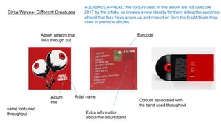
- 1. Circa Waves- Different Creatures Artist name Album artwork that links through out Album title Colours associated with the band used throughout Barcode AUDIENCE APPEAL: the colours used in this album are not used pre 2017 by the artists, so creates a new identity for them telling the audience almost that they have grown up and moved on from the bright blues they used in previous albums. same font used throughout Extra information about the album/band
- 2. Circa Waves- Different Creatures Tour posters and websites match the same scheme as album Album artwork that links through out AUDIENCE APPEAL: the colour is bright and doesn’t appear in many other albums which makes it stand out from others same font used throughout Social media links- colour and font similar to one used in album and website, flows well Synergy between two products (digi packs and website).
- 3. Don Broco- Automatic Album title Artist name Barcode Record label Track list Same colours used on both the back and the front of the digipack Colour associated with the band
- 4. Don Broco- Automatic Same font used for the artists name which they used through out their social media. Same font used for the track list and tour dates. Similar style used in tour poster and album artwork AUDIENCE APPEAL: contrast between dark colours to appeal to their audience as they are a rock band and bright colours to stand out and even appeal to a new audience. Tour posters.
- 5. Mura Masa Artist name Artists names featured on the album Simplistic branding with black and white and block text AUDIENCE APPEAL: the vintage style photos will appeal to the audience as many of them may relate to the style as they look ‘home taken and appeal to the genre of electro pop, hip-pop and alternative R&B. The artists names include in the Digi packs will also interest the audience as seeing big names such as A$AP ROCKY can entice Track list
- 6. Mura masa Website Simplistic branding with black and white and block text the same as the album artwork and tour posters AUDIENCE APPEAL: Tour poster Synergy between two products (digi packs and website).
- 7. Catfish and the Bottlemen- The Ride Artist name Track list Album title AUDIENCE APPEAL: the colour black appeals to the audience as the colour is used very much in the genre of music ‘rock’. The black and white used in both their first album and the second album The Ride tells the audience that the band haven't rebranded themselves and that the audience shouldn't’t worry as they are still the same band that they were when The Balcony came The ride logo Record label Colour associated with the band. Extra information about the album/band
- 8. Catfish and the Bottlemen- The Ride Artist name The ride logo The same colour scheme used through-out, same text used and the ride logo is again used through out. Colour associated with the band. AUDIENCE APPEAL: The black and white theme appeals to the audience through out as it flows and can be easily recognized as the bands product. Synergy between two products (digi packs and Social media links- Same colour and font used as rest of the text Ticket links Website