Kisan Call Centre - To harness potential of ICT in Agriculture by answer farm...
4th fc
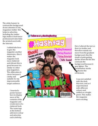
1. Here I altered the text so
that it is bolder and
therefore stands out
more from the gradient
background. Also the
shade of pink getting
darker down the list this
contrasts the
background because it
gets lighter. The
exclaimation marks
emphasise the
excitement.
I inserted a
poster banner
here to display
more of the
contents of the
magazine and
create more of a
cluttered look.
The name tags
at the bottom
add more colour
and advertise
each celebrity.
The white banner to
contrast the background
draws attention to the
magazines twitter this
helps to advertise.
Including the twitter
logo makes it look more
professional it also links
the printed word with
the internet.
I added tabs here
to give the
magazine another
dimension. Also it
makes the
magazine look
more cluttered
and vibrant this is
good because it is
similar to other
pop magazines.
The alliteration is
clever because it
catchy and
suitable for my
impressionable
target audience.
I was not satisfied
with the dark
blue text, and so I
experimented
with different
colours and
settled on a bright
green. This makes
the magazine
more exciting.