Enhancing Consumer Trust Through Strategic Content Marketing
Powerpoint on my school magazine (1)
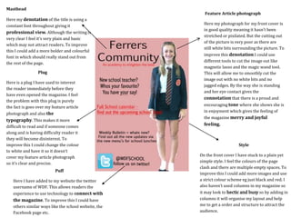
1. Feature Article photograph
Here my photograph for my front cover is
in good quality meaning it hasn’t been
stretched or pixilated. But the cutting out
of the picture is very poor as there are
still white bits surrounding the picture. To
improve this denotation I could use
different tools to cut the image out like
magnetic lasso and the magic wand tool.
This will allow me to smoothly cut the
image out with no white bits and no
jagged edges. By the way she is standing
and her eye contact gives the
connotation that there is a proud and
encouraging tone where she shows she is
in enjoyment which gives the feeling of
the magazine merry and joyful
feeling.
Style
On the front cover I have stuck to a plain yet
simple style. I feel the colours of the page
clash and there are multiple empty spaces. To
improve this I could add more images and use
a strict colour scheme eg just black and red. I
also haven’t used columns in my magazine so
it may look to hectic and busy so by adding in
columns it will organise my layout and help
me to get a order and structure to attract the
audience.
Masthead
Here my denotation of the title is using a
constant font throughout giving it
professional view. Although the writing is
very clear I feel it’s very plain and basic
which may not attract readers. To improve
this I could add a more bolder and colourful
font in which should really stand out from
the rest of the page.
Here is a plug I have used to interest
the reader immediately before they
have even opened the magazine. I feel
the problem with this plug is purely
the fact is goes over my feature article
photograph and also the
typography. This makes it more
difficult to read and if someone comes
along and is having difficulty reader it
they will become disinterest. To
improve this I could change the colour
to white and have it so it doesn’t
cover my feature article photograph
so it’s clear and precise.
Puff
Plug
Here I have added to my website the twitter
username of WDF. This allows readers the
experience to use technology to connect with
the magazine. To improve this I could have
others similar ways like the school website, the
Facebook page etc.
2. Headline
This is the bold heading for my
contents page which is equally very
important as the Headline needs to
grab the reader’s attention. I have
ensured it stands out and I have
underlined it to grab the readers
eye. The typography of the title
yet is very plain and consistent
throughout and doesn’t say much
about the magazine itself. To
improve this I could have a variety
of fonts and colours to grab the
reader’s eye and to give it a more
professional tone.
Blank empty space
On my contents page it has a
very simple and plain mode of
address which is a negative
when trying to sell a magazine.
To improve this I could add
more variation to the page.
This could include rotating
pictures or adding a
background which will brighten
the page and to add a more
chatty tone.
Mise-en-scene
Centred contents text
Here I have the contents of my
magazine. I have a border around
the text to make it stand it and to
bolden the typography as the
clarity is black on white. I have been
very brief with the information
which may be a negative aspect as
it’s the first page the reader will
turn to and it’s important to have
catchy and interesting phrases to
encourage them to read on. To
improve this I could use more
appealing language and words to
improve the house style and
slightly lengthen the subheadings to
ensure the audience opens the next
page and are eager to read. I
additionally could change the
typography so is different from the
headline to make it charismatic and
interesting.
Here I have provided images which have meaning. In the top image it shows a girl hard working which portrays
a well academic school. This is important as it immediately adds meaning and value to the school which will
want to attract parents. To add Mise-en-scene more I could add more of a variety of images and use eye contact
in an image to add more of a exciting and mysterious tone.
3. IPhone 5s Camera
Here for my feature article
photograph I used an iPhone to do
this. This was beneficial and the
outcome was a high pixel quality
photograph. When taking this picture
I had a high amount of concentration
as I had to get the light , angle and
position all correct. This was a long
shot and the persons eye contact was
looking straight into the camera
lensew whilst smiling.
Magic want tool
I used the magic wand tool to
cut around my article
photograph. This was
beneficial because it allowed
me to be accurate and
precise with my cutting and
also it automatically selected
the correct aspects in which I
wanted to delete.
Text tool
I used the text tool to add
text to my magazine. This
was beneficial because it
allowed me not only to
enter text but edit it and
able to change the colour,
font and position.
Eraser Tool
I used the eraser tool too rub
out any extra white bits round
that I didn't need. This was
beneficial because it was quick
easy and accurate.
Fill Tool
I used the fill tool
to change the
colour of my
background pink.
This is beneficial
because it makes
the magazine seem
more interested
and compact and
adds a more chatty
tone.