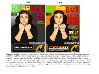
1. As you can see I have improved my front cover by changing the my fonts and the background colour of my magazine to show
that I have used forms of convention to take in my audience interest to make my magazine stand out more to them. In my
magazine I changed my master head to a bold fading font, with bright and vibrant colours of the Rastafarian flag as reggae
originally was started in that region. Also in my front cover I have added a bit more text compared to my first draft as I wanted
my audience to know more about what they will see In the magazine beforehand. In my second/ final draft I place a quote on
my models hand, which is a famous quote by a well know reggae artist Bob Marley to let my audience know that this is reggae
theme magazine about well known artist.
Draft 1 Final
2. From my draft to my final product you can see that I have made changes to my font and my background, I also added more
information to let the readers know more information about what’s happening. I changed the font because the first one too
pain and wouldn't attract my target audience, which is why I changed it to a much bolder font because I wanted it to be more
appealing and stand out more. I also added a quote to brighten up my audience.
Draft 1 Final
3. In my double page spread I rearrange my text
as the composition did not look easy to read
and was all around the page making it look
more confusing for the audience to read. I
had also had blended/ contrasted my title
“RESPECT” to make it look more vibrant also
to make my text standout even more I added
a shadow to my text to make it loo as if it is
coming out of the page, I made my gradient
lighter to make it look less dull. I rearrange
the composition of my picture because it did
not look right being right next to my main
image. I placed a pull quote in my double
page spread using the colour scheme of my
magazine, to make it contrast, I also placed
the pull quote in that specific area because
there was too much space.
Draft 1
Final