Fostering Friendships - Enhancing Social Bonds in the Classroom
Step by step dps (2)
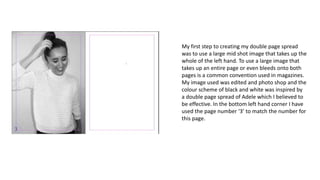
1. My first step to creating my double page spread
was to use a large mid shot image that takes up the
whole of the left hand. To use a large image that
takes up an entire page or even bleeds onto both
pages is a common convention used in magazines.
My image used was edited and photo shop and the
colour scheme of black and white was inspired by
a double page spread of Adele which I believed to
be effective. In the bottom left hand corner I have
used the page number ‘3’ to match the number for
this page.
2. My second step into created my double page
spread was to add my headline. I used two
different colours in a fun font to mirror the
personality of my interviewee and also link to
the pop genre of my magazine. The colours
used also match my colour scheme of black
and purple giving a sense of professionalism.
3. Thirdly, I added a drop capital onto my double
page spread In the colour purple (to match
my magazine. Drop capitals are a commonly
used and popular magazine convention as
they add emphasis to your article and show
clearly where your magazine article begins
adding significance to your magazine and
drawing your readers into the article. I then
added a summary of what was to be included
in the article. My text size is 8 pt which
through research I found is the typical size for
the majority of text on double page spreads.
The questions I have put in purple text to
separate the from the answers, in black, and
to match my colour scheme.
4. Finally , to complete my dps I added the
entirety of the interview using a range of
question that I gathered from peers In my
class. They told me what they would want to
ask their favourite artists. Furthermore I added
a bold purple quote to break up the interview
and make the layout more professional,
appealing to look at. The quote also overall
summarises the entire interview and gives the
vibe I wanted convey to my readers and also in
conclusion gives a good idea of the persona of
the band in my interview- ‘The Other side’.
5. Here I have further edited my
double page spread after deciding
to add the website of my
magazine to the bottom of my
page to advertise my magazine
further. I also decided that the
image needed a pull quote as this
is a convention used in many
magazines on their double page
spreads and It also grabs the
reader’s eye. In addition to this I
believe the headline looks more
effective in just one colour rather
than black and purple and also
looks more professional. I also
discovered how to remove the
text boxes from my page on
InDesign and now believe the
page looks better and
professional.
6. I have now changed my
double page slightly.. I have
moved the ‘We all have
dreams…’ text I believe into
a better section and added a
black dotted border around
the pull quote to match the
colour scheme and make the
pull further emphasised.