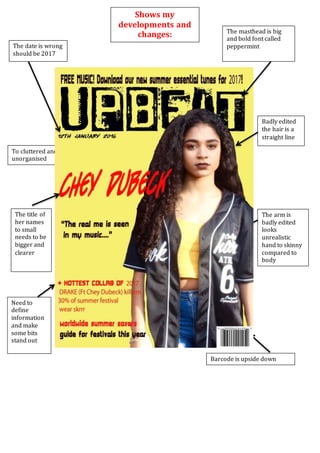
1. To cluttered and
unorganised
Barcode is upside down
The title of
her names
to small
needs to be
bigger and
clearer
Need to
define
information
and make
some bits
stand out
The arm is
badly edited
looks
unrealistic
hand to skinny
compared to
body
Shows my
developments and
changes:
The date is wrong
should be 2017
and smaller
Badly edited
the hair is a
straight line
The masthead is big
and bold font called
peppermint
2. The date is
corrected and
smaller font size
The font has
been changed,
and the red is
black to draw
attention to
the first line
only
Her name is
lower and
bigger size to
draw more
attention to it
I moved all
fonts around
and
rearranged all
very lines so
it’s not as
cluttered.
I rotated the barcode6 different style fonts
on cover
3. Swapped
fonts of
different
cover
lines and
titles
around
Kept the
same
picture
and
style
layout
There is a big gap between each of the
titles
The
contents
masthead
doesn’t
stand out
enough
and font
is out of
place for
style
Dark yellow
background
4. Changed the font of the
contents
The font for
the featured
topics will
change.
Added her
Instagram account
Added a
link to
clothing
brand
5. Changed the
font of the
titles and the
page
numbers.
More clearly
swirly font
Inserted a picture of
wireless from 20016
Different
yellow font
Layout
same all
over but the
layout is
tighter
6. The layout is clear and same
yellow background
The brand
label is
skrrrit
blends in to
the
background
There is a round sticker in
the corner advertising
wireless
2 columns of an article
The title and catch
phrase is in bold
fonts and colours to
catch your attention
7. The title and heading of the
cover has been centred to
draw more attention to it
Put photography
and article names
The pull quote is bold, red
and catered between the
article
There is a
page
number in
the corner
More
information
added to the
sticker
Advertisement
for wireless and
a pull quote of
the event
Moved more
to the right
more space
for the article