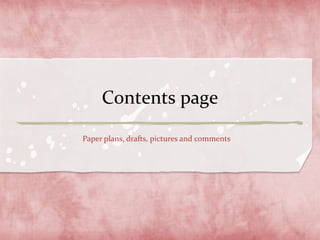
3. Contents page:
Draft one
This is my contents page with the
original Pulse font title. I don’t
think this looks right as it doesn’t
really fits in with my house style.
There is also too much spare space
which can be filled up with more
information to inform my target
audience.
4. Contents page:
Draft two
On my second draft I changed the title
to fit the house style. I prefer this
because it carries on my house style
which will appeal to my target audience
and conveys the basic magazine
conventions. There still isn’t much
information on it though and it looks
boring and too plain.
5. Contents page:
Draft three
On my third draft I added more
pages under a new sub-heading ‘you’
this makes the target audience feel
they can get involved and helps
them get to know the magazine
more. There still is a lot of blank
space on this contents page, so I
want to add more things that fit
in with the house style.
6. Contents page:
Draft four
This is my final contents page. I like this
because it displays the basic magazine
conventions. All the space is taken up
which means there is no gaps. It is also
very organised and makes it look
professional. It also has institutional
presence which a good magazine should
have. I have kept the house fonts and
colours so everything runs smoothly.