
Recommended
More Related Content
What's hot
What's hot (14)
Viewers also liked
Viewers also liked (14)
Similar to Front Cover so far
Similar to Front Cover so far (20)
More from carlajacquesasmedia
More from carlajacquesasmedia (17)
Recently uploaded
Recently uploaded (20)
Front Cover so far
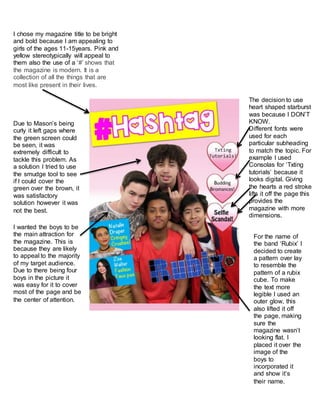
- 1. I chose my magazine title to be bright and bold because I am appealing to girls of the ages 11-15years. Pink and yellow stereotypically will appeal to them also the use of a ‘#’ shows that the magazine is modern. It is a collection of all the things that are most like present in their lives. The decision to use heart shaped starburst was because I DON’T KNOW. Different fonts were used for each particular subheading to match the topic. For example I used Consolas for ‘Txting tutorials’ because it looks digital. Giving the hearts a red stroke lifts it off the page this provides the magazine with more dimensions. I wanted the boys to be the main attraction for the magazine. This is because they are likely to appeal to the majority of my target audience. Due to there being four boys in the picture it was easy for it to cover most of the page and be the center of attention. Due to Mason’s being curly it left gaps where the green screen could be seen, it was extremely difficult to tackle this problem. As a solution I tried to use the smudge tool to see if I could cover the green over the brown, it was satisfactory solution however it was not the best. For the name of the band ‘Rubix’ I decided to create a pattern over lay to resemble the pattern of a rubix cube. To make the text more legible I used an outer glow, this also lifted it off the page, making sure the magazine wasn’t looking flat. I placed it over the image of the boys to incorporated it and show it’s their name.