
Recommended
More Related Content
What's hot
What's hot (16)
Viewers also liked
Viewers also liked (18)
Similar to Unit 18 evaluation
Similar to Unit 18 evaluation (20)
More from nabking
More from nabking (15)
Recently uploaded
Recently uploaded (20)
Unit 18 evaluation
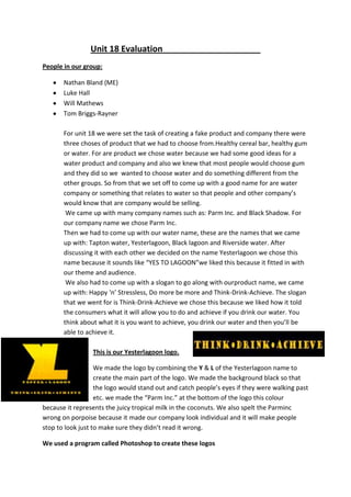
- 1. Unit 18 Evaluation People in our group: Nathan Bland (ME) Luke Hall Will Mathews Tom Briggs-Rayner For unit 18 we were set the task of creating a fake product and company there were three choses of product that we had to choose from.Healthy cereal bar, healthy gum or water. For are product we chose water because we had some good ideas for a water product and company and also we knew that most people would choose gum and they did so we wanted to choose water and do something different from the other groups. So from that we set off to come up with a good name for are water company or something that relates to water so that people and other company’s would know that are company would be selling. We came up with many company names such as: Parm Inc. and Black Shadow. For our company name we chose Parm Inc. Then we had to come up with our water name, these are the names that we came up with: Tapton water, Yesterlagoon, Black lagoon and Riverside water. After discussing it with each other we decided on the name Yesterlagoon we chose this name because it sounds like “YES TO LAGOON”we liked this because it fitted in with our theme and audience. We also had to come up with a slogan to go along with ourproduct name, we came up with: Happy ‘n’ Stressless, Do more be more and Think-Drink-Achieve. The slogan that we went for is Think-Drink-Achieve we chose this because we liked how it told the consumers what it will allow you to do and achieve if you drink our water. You think about what it is you want to achieve, you drink our water and then you’ll be able to achieve it. This is our Yesterlagoon logo. We made the logo by combining the Y & L of the Yesterlagoon name to create the main part of the logo. We made the background black so that the logo would stand out and catch people’s eyes if they were walking past etc. we made the “Parm Inc.” at the bottom of the logo this colour because it represents the juicy tropical milk in the coconuts. We also spelt the Parminc wrong on porpoise because it made our company look individual and it will make people stop to look just to make sure they didn’t read it wrong. We used a program called Photoshop to create these logos
- 2. This is the logo for our company I designed our company logo in Photoshop and made it a palm tree because we are based in the Caribbean and it makes our company look lively and fun we also made the colour of the writing on the bottom of the logo this colour because it represents the juicy fresh milk from the coconuts grown on the palm tree. The programs that I used Adobe Photoshop CS5.1 – For the logos. Microsoft Word – For all the word documents and research etc. Prezi – For our power point in our presentation. Adobe Premiere Pro CS5.5 – For the creation of our advert. Google – For collecting our research. I think that I have improved greatly when it comes to designing logos and pictures on Photoshop and can produce a great piece of work using it. Using Prezi for our presentation was a little difficult because we hadn’t used it much but after a while we got the hang of it again and produced a great PowerPoint. The same thing with the Prezi applied to premiere pro, once we stared using it a bit more we got the hang of it again and were able to produce a good advert. Adverts Print adverts- This is the magazine that I made for our print adverts task.I chose to make the magazine cover a beach with the sea behind it because our palm tree fits seamlessly into it and I thought that it was a great way to incorporate our company logo into the cover I also added our yesterlagoon logo into it. Luke made the train advert he made his in the same style of mine for the same reasons I did mine so we could incorporate our company logo he also added our yesterlagoon logo.
- 3. Will created the bus advert and he incorporated one of the pictures of our bottle that we took and blended the whole thing into the sky he also used our yesterlagoon logo. This is Tom’s website banner. He used a picture that we took of our yesterlagoon bottle next to a recycle bin. This tells people that we support recycling. Step by step Gide on how I created the magazine cover using Photoshop for our print advertisement task. Tools that I used: Move tool Rectangular marquee tool Lasso tool Quick selection tool Crop tool Eye dropper tool Brush tool Eraser tool Blur tool Smudge toolALL THREE IN ONE TAB. Sharpen tool Text tool Ellipse tool Zoom tool
- 4. 1) First I made the base of the magazine cover by adding a blue background for the sky. 2) Next I made the sand and the sea for the base of my magazine cover and made the sand ripples for were the bottle will be partially in the sand. 3) Then I added in the palm tree and the water bottle which will have our yesterlagoon logo on it. 4) I also added our yesterlagoon logo onto the bottle because then people will have a better understanding of what the magazine cover is about, we also added in some birds in the sky to make it look a bit more alive.
- 5. 5) Next I added in the Parm Inc. text underneath the palm tree (it’s a pinkie white colour so you might not be able to see it very well on the print screen.) 6) Then I added in some clouds to fill up the sky and make it a bit more believable. 7) Next I added in some more detail into the clouds and the sea (you probably can’t see it on this screen shot but it is there.) 8) Then I finished off the clouds because I realised that one had a hole in it. Then I added in some more birds to help make the sky more believable.
- 6. 9) After that I added our yesterlagoon logo but removed the black background so it didn’t look too out of place. I also added in our slogan “THINK-DRINK- ATCHIVE” to go along with the logo. 10) Next I added in a barcode to make the magazine cover look a bit more like a real one. I also added some vital information to let the consumers know that it will help restore natural electrolytes in your body. 11) Then just to add a bit more detail to the magazine I added in a yellow border across the top and left side to help make it all stand out, I also made it yellow because it ties in with the colours of our logo. 12) Last of all to finish it off I added in a little bit of text that says “READ MORE ABOUT OUR NEW WATER INSIDE” I did this to make it seem more like an actual magazine covet and that there’s more information inside. In conclusion I think that our advert and water banners/posters went very well.