
Recommended
More Related Content
What's hot
What's hot (20)
Similar to Campaign PDF
Similar to Campaign PDF (20)
Recently uploaded
Recently uploaded (20)
Campaign PDF
- 2. Our campaign aim: We chose body image as the main focus of our campaign as we feel it is something we’ve all experienced and is a big issue in today’s society. We feel the influence of social media on adolescents has a large impact on their body confidence and pressurizes them to strive to be someone they are not. By creating our campaign, we want to help our target audience accept themselves, learn to have a positive body image and confidence in who they are. We also want to tell them it’s ok that they don’t look like the celebrities or the “Instagram famous” as what they see on social media is very rarely true. Essentially, we want to spread self-love, positivity and kindness. To do this, we have chosen the following platforms: • Posters & Billboards out in public spaces. • A Mirror Installation for the public to interact with. • A Short Film to promote our campaign and message. • T-Shirt Designs for our supporters. • Infographic Leaflets to reach a wider audience. • “Kindness Cards” to spread positivity, kindness and happiness. • A Website for us to keep the public up to date with our campaign • And more.
- 3. Our Design.
- 4. Colour Scheme. During the initial design process, we agreed that a colour scheme was very important. We felt that having a colour we’d use throughout our platforms would enable the public to recognize our campaign – a great example we took inspiration from was Macmillan and their use of green. We chose teal – a mix between green and blue. We felt this was a strong colour and looks gender neutral. To work along side the teal, we chose white and two shades of grey – with a shade of pink on the website.
- 5. Aa Bb Cc Dd Ee Ff Gg Hh Ii Jj Kk Ll Mm Nn Oo Pp Qq Rr Ss Tt Uu Vv Ww Xx Yy Zz Aa Bb Cc Dd Ee Ff Gg Hh Ii Jj Kk Ll Mm Nn Oo Pp Qq Rr Ss Tt Uu Vv Ww Xx Yy Zz Aa Bb Cc Dd Ee Ff Gg Hh Ii Jj Kk Ll Mm Nn Oo Pp Qq Rr Ss Tt Uu Vv Ww Xx Yy Zz Aa Bb Cc Dd Ee Ff Gg Hh Ii Jj Kk Ll Mm Nn Oo Pp Qq Rr Ss Tt Uu Vv Ww Xx Yy Zz Light Book Medium Heavy Avenir. We’ve tried to use Avenir throughout our campaign to make sure the design was consistent. We think it’s clear to read, fresh and looks modern.
- 6. Initial Logo Design. From mind mapping and talking we decided we liked the idea of including the lotus flower for our logo due to the meaning behind it – plus it being a lovely shape. We decided to experiment first to see what worked. These ones to start are just the lotus with no name, we wanted to experiment and see if it would work this way. Whereas they do look nice, they are a little too “feminine” for what we’re aiming for.
- 7. Here are a few more initial designs, again as an experiment to see what worked. We included out campaign name this time, but we all decided that they were all a bit to femine when it came to the shape. (the first 6 are for purely to see what a mix of colour would look like.)
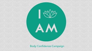
- 8. Final Logo Design We wanted our logo to be plain and simple but eye-catching and modern. After initial designs, we discussed ideas and decided to include a lotus flower within our logo. The lotus flower is associated with purity, beauty and enlightenment and it brings a clean, fresh look to the campaign design which we’ve used it throughout. For a lot of the platforms we’ve just included the lotus on it’s own away from the full logo – we hope that our campaign would become big enough that people would recognize it just from this. It’s a design that looks great on all our platforms and we’ve used it in teal & white. On some elements, like our personal business cards, we’ve used the circle with just the lotus on it. It still represents our campaign logo, without “I AM”.
- 10. Poster
- 11. Initial Poster Design. During the process of designing our campaign, we played around with different ideas when it came to the poster. We chose to produce some shocking posters to get the viewers attention and decided the theme should be body-image related, so our designs included eating disorders, something that effects both genders. After looking over the poster`s again and visioning them up in public, we realized they would be far too deep. Considering out campaign revolves around improving body-image and positivity, these are a bit too strong. Our campaign needs to be light and positive throughout.
- 12. We decided to pursue a more positive vibe and liked the idea of a typographic poster with a small graphic. We chose “I am more than just a size” as it supports our message that we should be happy in our own skin and shouldn’t be defined by the number on our clothes, also because it starts with “I AM”. We liked these posters but after some feedback from an outside source, decided to change the graphic as we were advised that the weighing scales came across a little contradictory and negative.
- 13. We chose posters as they are a great way to advertise throughout large locations and reach to a wide audience. After experimenting with different content and techniques, we chose to go with a typographic poster with a small graphic along side. We chose typographic as they tend to stand out and it puts all the focus on our message. We chose to create a small graphic of a person who is formed by many parts from other people, and – along side our message – this is meant to show the viewer that we are not defined by our size and outer appearance, but who we really are deep down. This poster is especially powerful as it fits it with the pressure by social media to be a certain size so we can be society’s definition of “perfect.” We went with a simple duo-colour design using teal and white, an effect that was inspired from punk posters. We kept it simple so the lack of colour and graphics didn’t take anything away from the message. Final Poster Design.
- 14. The original poster and the poster in a real-life situation to help us see how it’ll look.
- 15. Bus adverts would be one of the biggest platforms we would use, as it reaches out to the whole public around a massive space. Cardiff would be our first choice, especially the University travel system.
- 16. T-shirts
- 17. We thought t-shirts would be a great idea because our supporters can spread the message by wearing them – they are a good way to show loyalty and support. Many campaigns we researched had very successful t-shirt designs. We wanted to design products that would appeal to the teenagers – simple yet getting the message across. The more diverse variety we have available, the more successful we hope they would be. Here are a few we have designed:
- 18. Here are some of our favourite designs on models to give us a real idea what they’d be like. We found some copyright images and popped our logo on in different sizes. We experimented by placing just the logo on the far right model, very small in the corner like you find on t-shirts by brands such as Lacoste, All Saints, Hollister etc.
- 19. With this one, we’ve stuck with our traditional colour scheme of teal and light gray. We included a popular quote by Roald Dahl, as it does summaries our campaign message perfectly. We chose a sweater as it’s unisex and they’re a popular item of clothing with teens. We tried to keep the design simple but include all the information we need.
- 20. We designed this t-shirt with both genders in mind. We wanted to show the pressure that we feel from society and what we see online and say that it’s fine that we’re not like this and we think it’s a quirkier t-shirt that will hopefully appeal more to our audience! All of out t-shirts would be available to order on our website, with part of the proceeds to go to chosen charities within body-image and possibly mental health.
- 21. Kindness Cards
- 22. One of our ideas were these Kindness Cards. Whilst researching we found other ideas that are meant to spread a little positivity and we wanted to make our own. For the front, we kept it simple with our lotus background being in our traditional teal and flipping out logo to white to really make it pop. We included our website underneath and our hashtag. We also wrote “hashtag us to get involved” as getting these on social media by people who receive them would be great advertisement for us. On the back of the bottom left card, we’ve gone with a slight reversal of colours so the card stands out. We’ve kept the content simple, a box where we/the public can write a lovely comment on the person they’d like to give it to. We wrote “You Are” above it as a play on our logo, so it works nicely. We included @IAmEnough to advertise out IG and twitter. On the bottom we wrote “Please be friendly to the enviroment and dispose of this correctly (either passing it on to someone else or by recycling!)” We did this so people would hopefully pass it to another stranger, and they’d do the same over and over so it falls into many people’s hand. Not onto to spread happiness and kindness, but to spread out campaign also.
- 23. Here’s another design we produced for a little variety. Much like the other card, it’s designed to pass person to person although with this one we’ve included a small mirror, with a nice comment underneath. The idea of this is so people would keep them in their purses/wallets because having a mirror is really handy! (They’d be wallet size.) Each time they’d use it they’d see our logo/social media and possibly people near them who may be inclined to visit our media.
- 24. We would make both of these available for schools, collage, universities and work places to order for their own use.
- 26. A basic idea of what our mirror installation would look like – minus boards around it, a title reading “The mirror distorts your view” and tables featuring all of our campaign information.
- 27. The mirror installation is designed to get the general publics interest. Rather than aim this at our target audience, we wanted everyone to get involved as we felt it was important to reach out for a wider circle and make more people feel more body-positive and happy. We distorted mirrors - like the ones you find in a circus – to create a bit of fun. The message we want to send with this installment are the fact that mirrors distort our view from reality. We look in the mirror and focus on what we dislike about ourselves and make it a bigger issue than it is. The distorted mirrors don’t allow passers by to get a clear perception of what their body and features truly look like. We would have another mirror (either behind the 3 or at the end to replace one of them) so once they’ve seen themselves all distorted, they see their real selves and it doesn’t look so bad! Primarily, we want people to have fun! We want to send our message but also want people to walk away feeling a little more positive and happy. We would have boards next to the mirrors, or behind which would display all of our information and little post-it notes where we would ask people to write down an answer for one simple question: What wouldn’t you change about yourself? This is so people can think of the positives about their body and what they do actually like, so we can promote “happy thoughts” instead of looking at yourself with self-loathing and negativity.
- 28. The second mirror instalment we’d like to produce is a single two-way mirror where we’d ask 2 people to sit either side. On the one, the participant will see their reflection and we’d like them to talk about their insecurities and also what they like about themselves. On the reverse would be someone else sitting and writing what they like about the other – we’d experiment by using both strangers and friends. We’d get them to write on post-it notes and stick it to the mirror. At the end, they one talking about themselves will read what the other has wrote. Our aim for this is to try flip someone’s negative opinion about certain elements and features, by showing them the opinions of either a stranger or a friend who knows them on a deeper level. We want them to realise that their view on their appearance and personality is distorted and stepping back and getting a complement from someone else can boost their esteem and help them feel more body-positive. Our logo & hashtag will feature on all post-it notes.
- 29. Short Film
- 30. A brief storyboard for our short film.
- 31. Rather than an advert, we want to produce a short film revolving around our mirror instalments, which we’d put on our website/blogs etc. To begin with we’d have the construction of the instalments sped up until we start filming people walking by and interacting with the distorted mirrors, filming them write notes and posting them up. We’d film us handing out the leaflets and writing on/handing out the Kindness Cards. We’d also film peoples views and opinions of our campaign and instalments, and how their body image has been effected (especially by social media.) The other part of our short film will be the recording of the second instalment with the 2 people sitting either side of a double sided mirror, to film their reactions and opinions before, during and after the experiment. The post-it notes for the installation would have I AM logo on the bottom corner which would be shown during the promotional video
- 32. Teaser trailer would be made up of sped-up footage of either the installation being built, or the public walking around the installation. Text overlaid on top would provide details of the campaign and further information.
- 33. Leaflet
- 34. The leaflet is one important element for us to get our campaign and message out there in differentways. Not only can we hand them out, but we can leave them in places such as doctors surgeries & hospitals, clothes/vanity shops, supermarkets, schools and restaurants. We’ve included basic information about our campaign and more importantly information on how to help yourself achieve a more positive body-image. We’ve also included advice on how they can spread positivity and happiness. We hope that by reading this, they’ll visit our website for further information and to join in, and hopefullyspread word. The will be available to order for free for schools, collages and universities.
- 35. Front cover
- 38. For those little extras, we thought it would be a nice idea to get stickers put on mirrors in clothes shops like River Island, New Look, Topshop etc. It’s one of the many places adolescents feel pressured to look and dress a certain way and these stickers could help relieve the pressure whilst advertising out campaign. Plus, if anyone took a “selfie” they could hashtag us to help with social media advertising. We would produce many more designs, suitable for both genders.
- 39. These are stickers we’ve designed so that we can place them around the place, whether it’s on bus stops, mirrors, walls and more. They would be plain with just our logo and hashtag on them with room for us or others can write nice messages on them. We think mirrors would be a particularly good place to put them and will hopefully make people’s day!
- 40. Website App AND
- 41. We all agreed that a website was extremely important for our campaign. The internet is very popular with the general public, especially adolescents who our campaign is targeting. Our website is where we can include everything we do, help for our visitors and links to help support us and purchase our products. Our website was made through Wix (due to lack of time to get to grips with Dreamweaver!) and we’ve tried to make it simple, clean but full of the necessary information. We’ve used the same design throughout all out platforms. www.iamenough.wix.com/iamenough For the navigation bar, we kept it simple with only 6 pages available (with a sub page in “We Are” for information about us campaigners. We learnt to only include necessary information so we didn’t over clutter our website and make it look messy. We chose the white logo as it really stands out from the teal patterned background.
- 42. This is the home page that the visitor will see first. We kept it very simple, with the logo taking dominance. We did this to assert the fact that it is the I Am campaign. We included the navigation bar below. For this page, we chose to only use teal and white (with a shade of pink for the selected page) as these are our main campaign colours. “We are” is a play on our campaign name and tells the visitor what our story is and our campaign aims. This is the important page as it establishes the importance of our campaign.
- 43. This is off a drop down option from “We Are”. It’s all about us campaigners and we felt this was important to include as we’d like our campaigners to get to know us. We’ve also linked our campaign links so we can gather a social media campaign. This self-help page is self-explanatory. Here, we have included lists that people can take advice to achieve positive body-image and self love.
- 44. Our kindness page is where we share all the good we’ve tried to do in the local area. It will include photos of our stickers in public places – many photos that fellow campaigners have sent it – and kindness cards on peoples persons. This is also where we will show our video and write how well our kindness cards and stickers have done, with comments from people who have used them themselves. Support is a very important page as we felt we wanted to direct people to other helpful sites if they’re still struggling. We’d like to link and be partners with great campaigns and brands such as Mind and Lush.
- 45. This final page is where we advertise our products for the public to purchase. This is obviously important as it is “free advertising” and it’s great to see our supporters wearing our products and sharing our message. Below will also have live feeds to our facebook, twitter and instagram where people can keep up to date and follow.
- 46. Our website is available as an app too under “I Am Enough” via the AppStore and the Play Store. It is also phone friendly on browsers.
- 47. Social Media
- 48. Social media is very important to our campaign. It’s where we will keep up with our supporters in real time, load all of our information and advertise to get more people on board. Our social media sites will work along side our website and vice versa. We’re very lucky because #iamenough is yet to be used on Instagram! We’d also have a Twitter, we have yet to make that!
- 49. I AMcampaign by: Loren Coad Jake Graham-Dobrowolny Aimee Hunt Emmeline Meborn-Hubbard James Neale Presentation by Loren Coad