Download to read offline
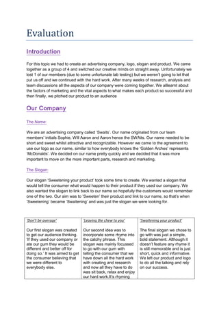


The document summarizes the process an advertising group went through to create an advertising company, including developing a logo, slogan, product, and pitching their idea. Some key points: - The group of 4 students created a company called "Swaits" from their initials. They selected the slogan "Sweetening your product" to describe what their company would do. - They developed several logo designs before settling on one incorporating their initials "S" and "W". - Their product was chewing gum, which they packaged in colorful, informative wrappers. - After weeks of work, they pitched their idea to an audience with a simple PowerPoint presentation focusing on their logo and slogan.


