
Recommended
More Related Content
What's hot
What's hot (18)
Viewers also liked
Viewers also liked (20)
Similar to Digipaks
Similar to Digipaks (20)
Recently uploaded
Recently uploaded (20)
Digipaks
- 1. DIGIPAKS
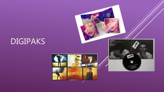
- 2. WHAT IS A DIGIPAK? Is it often used for CD singles or special editions of CD albums. Digipaks often consist of a gatefold ( book style ) paperboard or card stock, with one or more plastic trays which are used to hold the CD or DVD The word ‘Digipak’ came to be used to describe all soft CD packaging. Digipaks were first created by MeadWestvaco, and their product, called Digi-Pak, is trademarked. However as the format because more popular, more manufacturers are beginning to use it.
- 3. HOW DO THEY BENEFIT THE ARTIST? The front of the digipak will have some aspect of what the artist represents and what their genre is. The digipak will most likely theme a message about the artists image. This links to emphasizing the artists brand image which increases the popularity of the artist The digipak also shows the creative approach the artist is taking throughout their music and the image they are trying to get across to the audience. Digipaks benefit the artist and their music as its promotional aspect of the music industry which helps bring awareness to the artist and therefore sells the artist and encourages consumers to buy and listen to their music. Buying a digipak could show your loyalty to the artist because in todays day and age people are downloading and streaming music instead of buying the album.
- 4. RIHANNA – DIGIPAK ANALYSIS - LOUD Characters This digipak only features Rihanna herself – as one character. She is shown as a close up shot of her face on the front of the album, with striking, bold red hair. She also has matching red lipstick on – these striking colours relate well to the title of the album “loud”. She is shown to be looking down, not making any eye contact with the camera suggesting her to be shy and innocent. Rihanna is known for being a RnB artist however this album cover goes against the stereotypical conventions of a RnB artist as women of the RnB genre are normally shown in a ‘sexy’ style, which Rihanna has done in previous albums. Even though Rihanna has created a CD of this genre, she has gone against the conventions to how a more innocent side to the love theme rather than the stereotypical objectivity of women and the sexual side of love Narrative There seems to be a narrative to this digipak as the inside album artwork sets a fairy-tale like setting, showing that the CD may be a story about love because roses are an iconic symbol of love. Which in the album the majority of the songs relate to this, some however there are a few which aren’t so ‘innocent’ Iconography Roses are iconically used within this digipak, featuring on the inside artist as well as on the CD art. The symbolism of the rose shows innocence and love and relates to the love theme of the CD tracks. “only girl in the world” and the colour red can relate to danger which links to the risky songs like “s&m” Setting On the inside artwork, Rihanna is shown lying on a bed of red roses. This gives off a storybook atmosphere as she appears in a dream like state. The princess – like dress shows Rihanna as innocent as if in a fairy-tale, with the roses showing love in the females life. This goes against the CDs RnB genre as it is more stereotypically representative of a more indie genre. The use of lighting captures the artists facial features in the best way, making her look more appealing, it also emphasises the focus on the artists face and made-up facial features. Style There is a strong use of the colour red within the digipak which is a strong emotional colour connotating love and possibly danger. This could be relating to the emotional songs featured on the CD. The artist is also shown in a white dress, connotating innocence which relates well to a fairy-tale vibe. The vivid colours relate to the title of the album as the boldness of the red is striking and eye-catching to the audience. The text on the front shows the letters rather spaced out in capital letters, which suggests the loud aspects of the name.
- 5. BEYONCÉ - DIGIPAK ANALYSIS – I AM SASHA FIERCE Characters In this album cover the only character is Beyoncé herself and she is positioned in the middle of the album cover taking up the majority of the room, making her the main focus. She is looking directly into the camera, making it look like she is starring directly into the eyes of the person buying the album. On the front of the cover she is seen to be looking innocent, however on the pack is the complete opposite, she is dressed in minimal clothing posing in a sexual manner. She takes the opposite approach to Rihanna and uses a simple black and white contrast instead of vibrant colours Narrative There is a contrast of narrative with this album cover. the fact that she uses two contrasting pictures for her album and the title being “ I am Sasha Fierce” may suggest she has an alter-ego, showing she has a innocent and sexual/aggressive side Iconography The only colour theme for this album is black and white which could suggest loneliness linking to the song “If I Were A Boy” or independentness linking to “diva”. By Beyoncé doing this is shows that she has two different personalities Setting On the back of the album Beyoncé is seen to be led in an empty room, led on her side starring directly in the camera. This portrays her as being fearless and Diva like. In contrast the front which is her stood in front of a white backdrop, taking up the majority of the frame, this shows her innocent side as she is wearing minimal makeup. Style The only colours used in this digipak are black and white which are quite simple and plain but the use of lighting brings out the structure of Beyoncé's face which makes her more appealing to the audience. The text use is very simplistic which means it wont take any attention off of Beyoncé's face